AEOHH FESTIVAL
BRAND
In 2005, All Eyes On Hip Hop began as a live music and a party concept in a small town in northern Belgium. When they moved to Ghent, their ambition and reputation grew rapidly and steadily. Today they collaborate with venues, festivals and music organizations to expand their audience and unite people from all over Belgium.
IDENTITY
In 2005, All Eyes On Hip Hop began as a live music and a party concept in a small town in northern Belgium. When they moved to Ghent, their ambition and reputation grew rapidly and steadily. Today they collaborate with venues, festivals and music organizations to expand their audience and unite people from all over Belgium.
AEOHH continues to do what it does best: creating an enjoyable and inclusive environment for everyone who loves hip hop music.
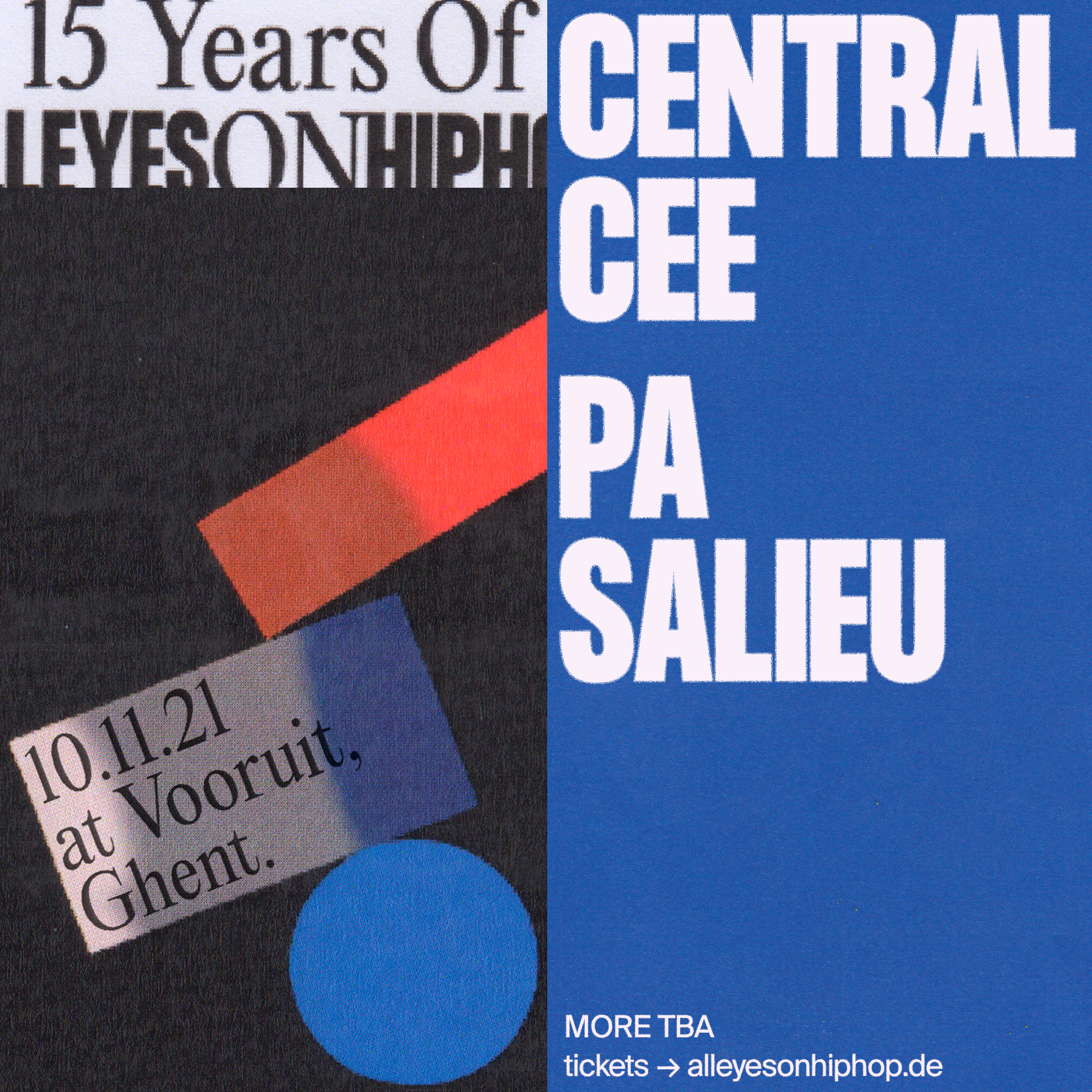
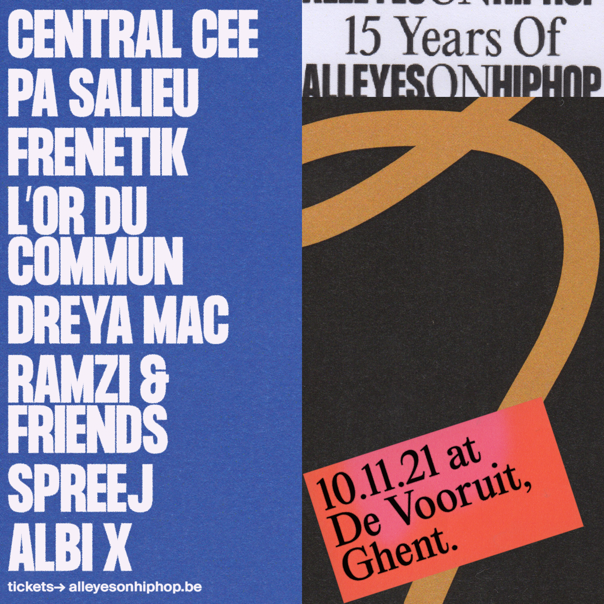
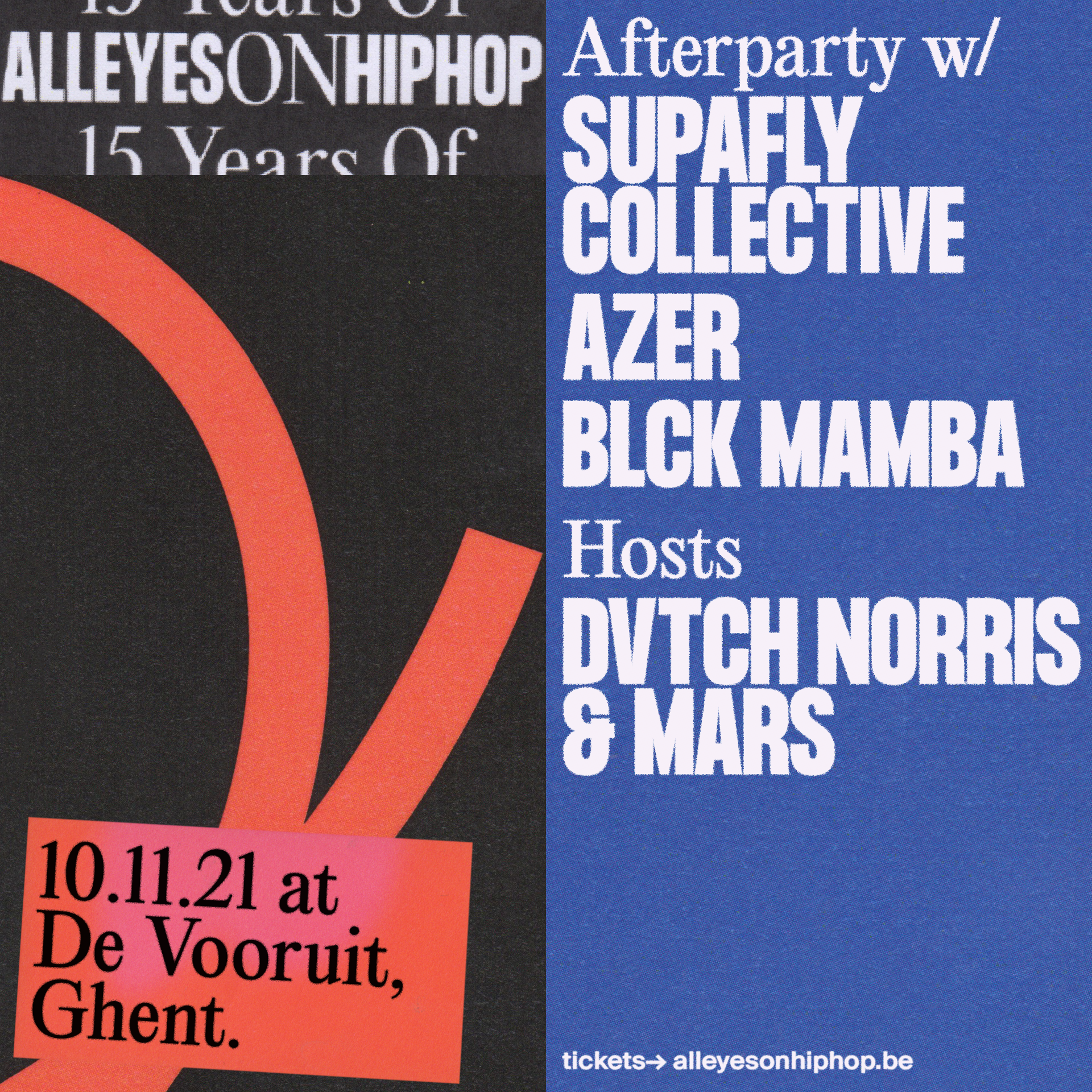
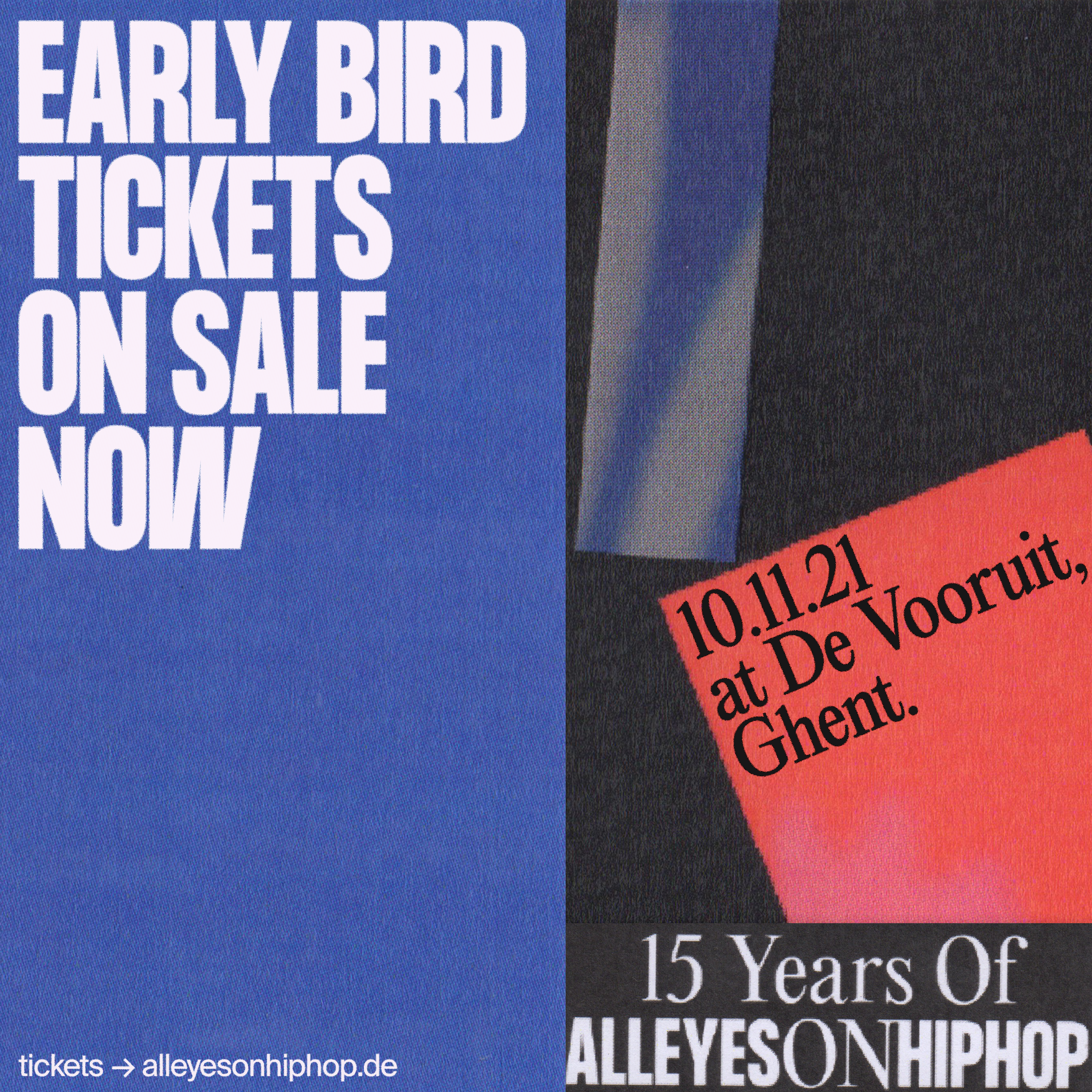
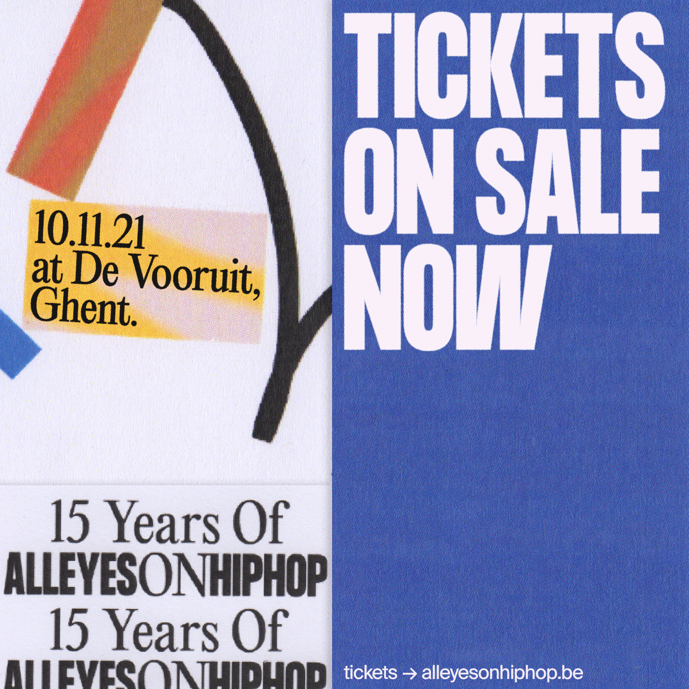
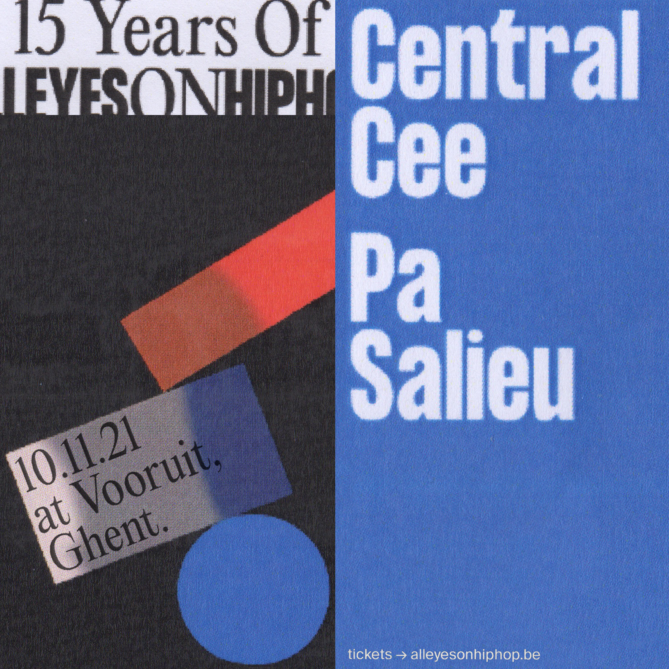
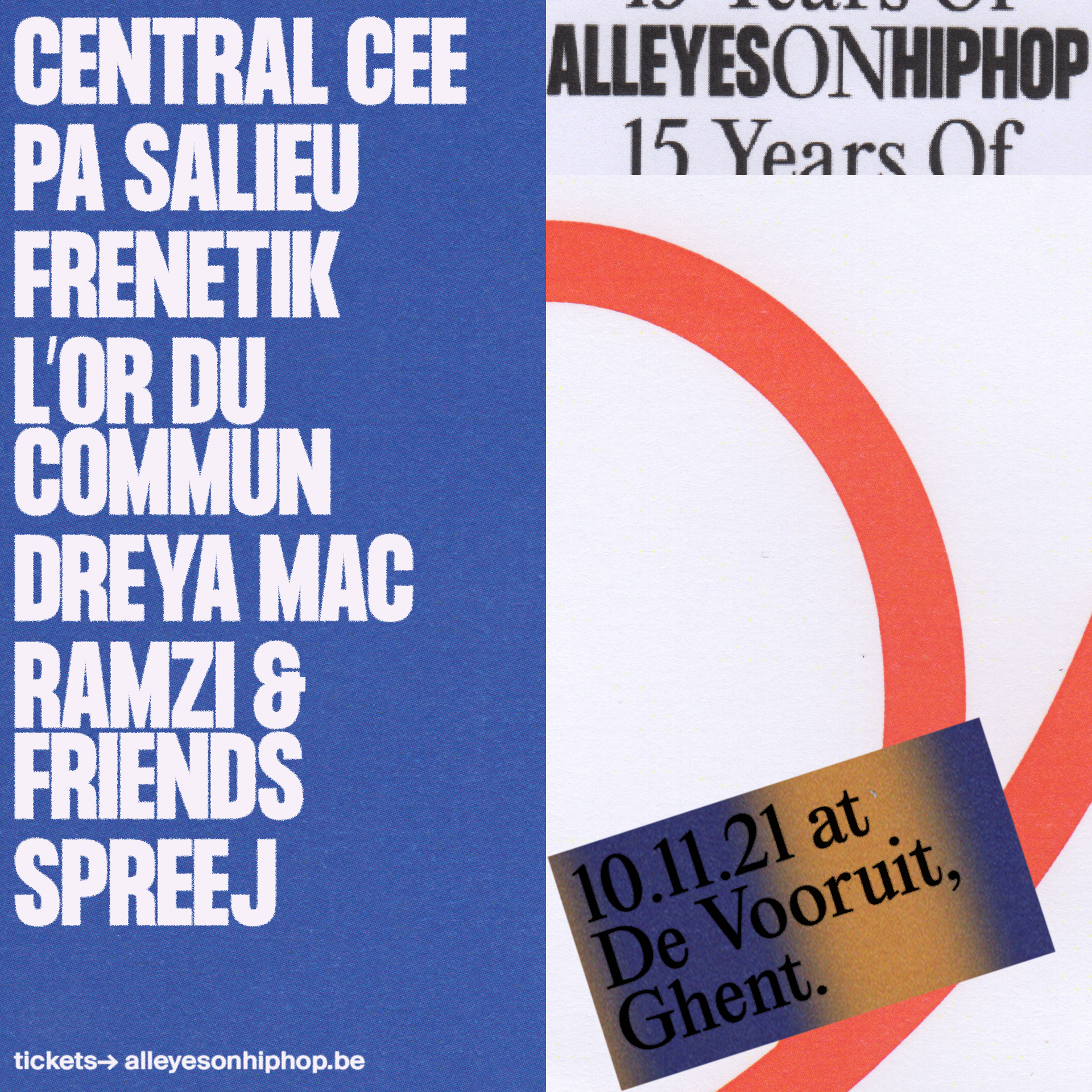
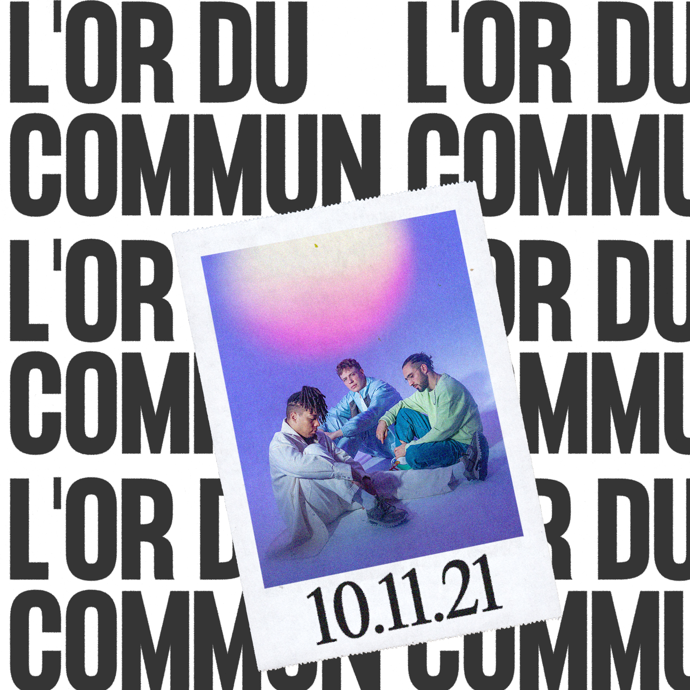
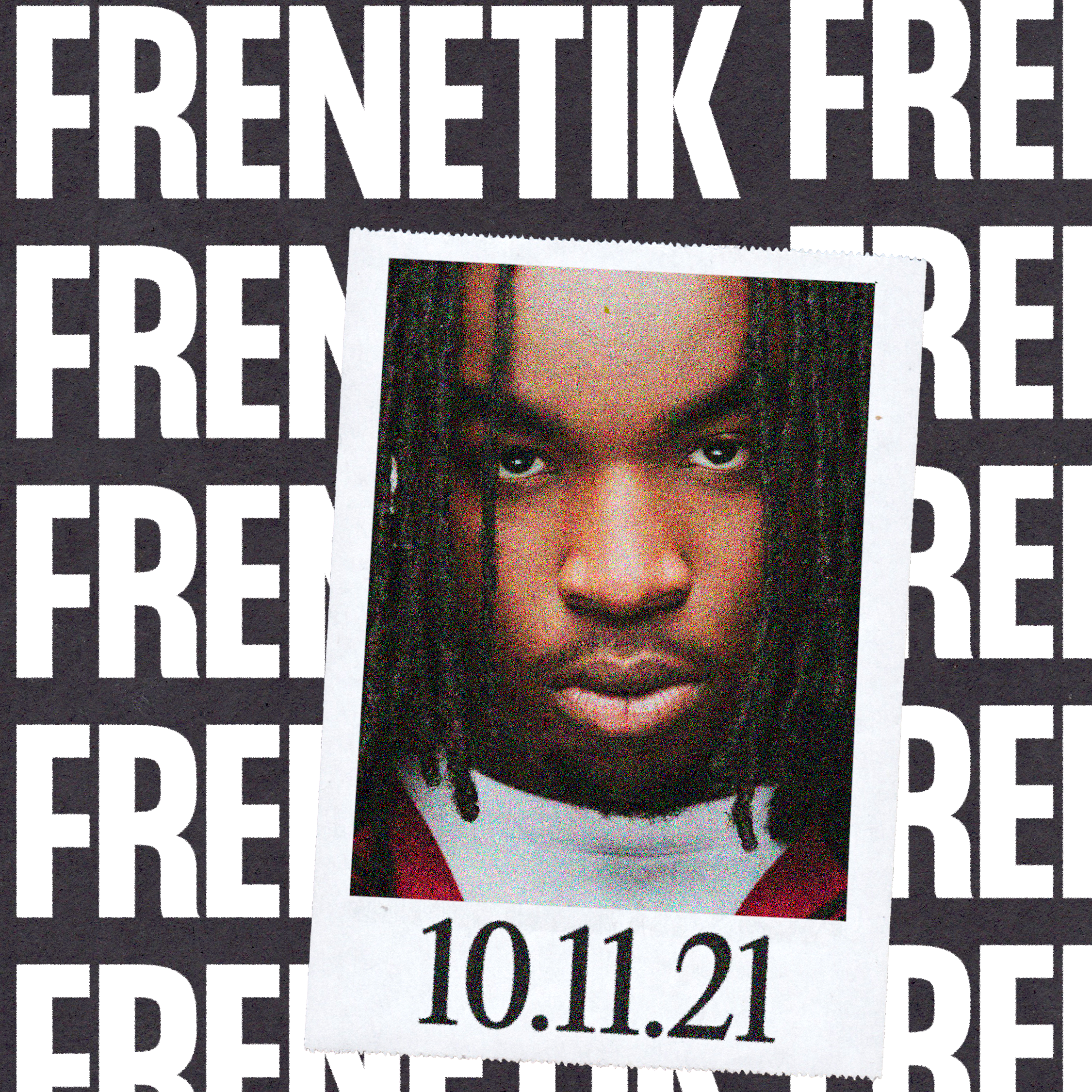
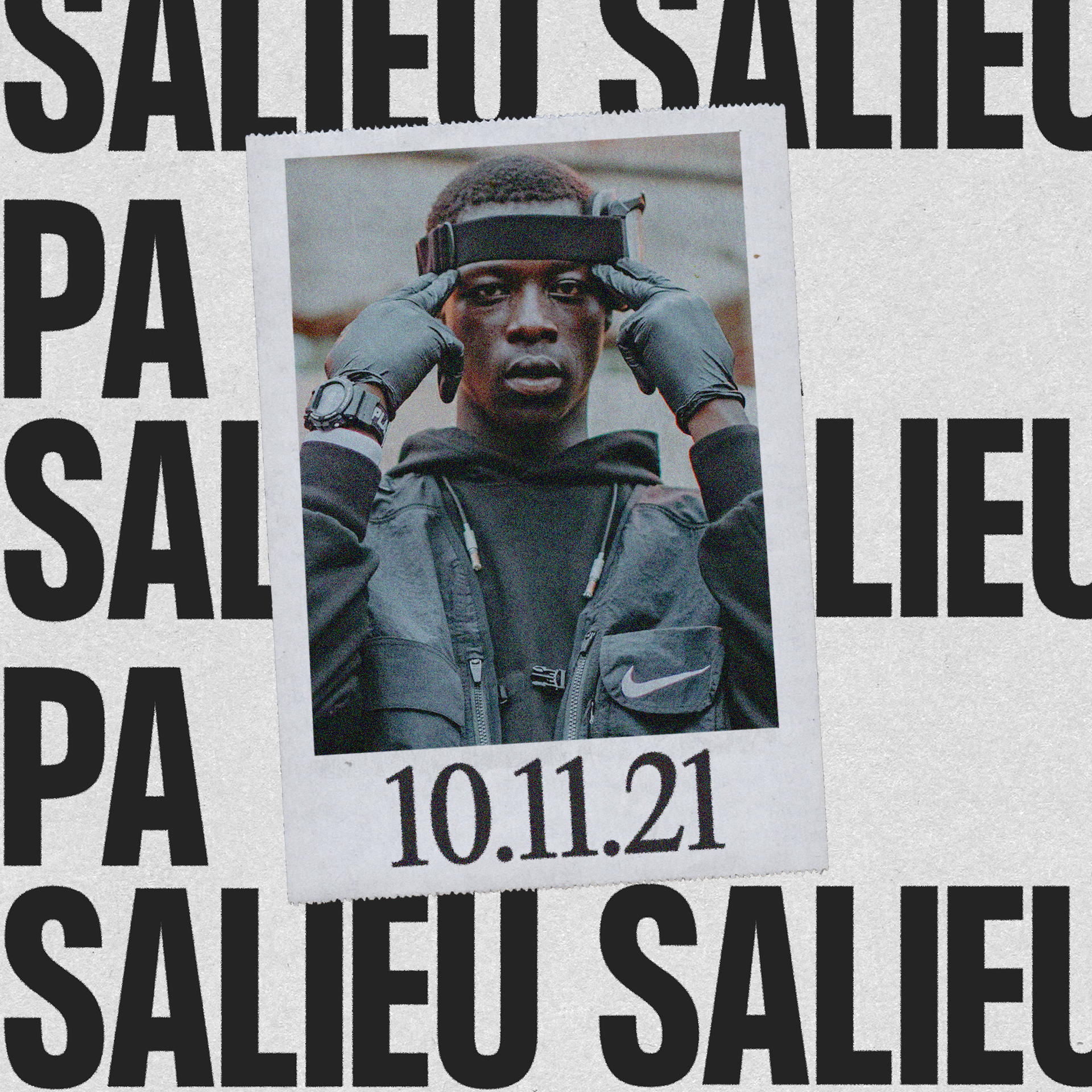
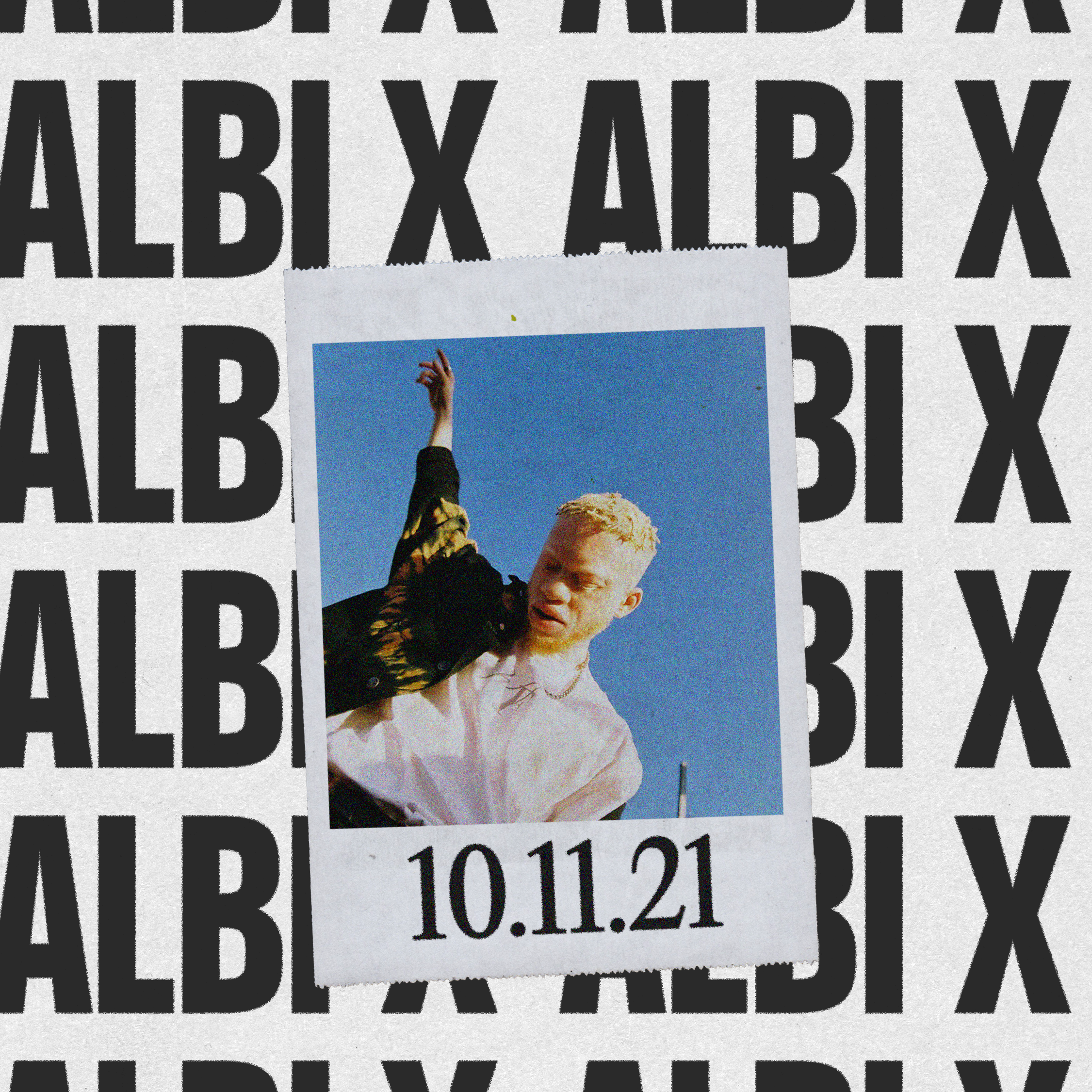
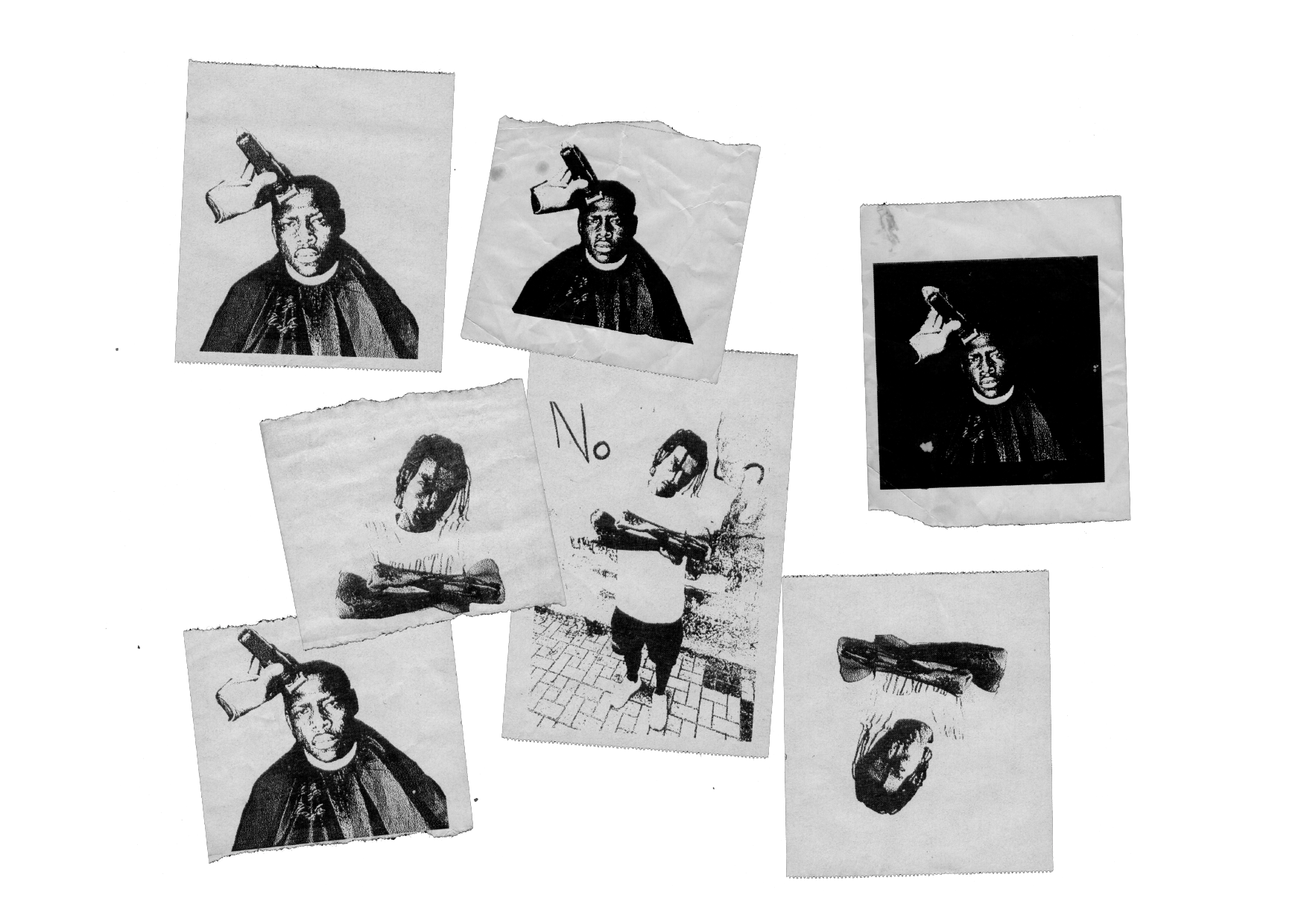
IDENTITYIt’s our first 100% analog and modular identity. Where the protagonists are geometric shapes and large, bold typography. The information is separated by blocks, thus having a dynamic and playful identity.
The letters All Eyes On Hip Hop come together to form the AEOHH festival symbol and logo.
The color palette is simple, with pure and basic colors. Each year a representative color is chosen, blue was the first color of the festival.
The letters All Eyes On Hip Hop come together to form the AEOHH festival symbol and logo.
The color palette is simple, with pure and basic colors. Each year a representative color is chosen, blue was the first color of the festival.