NIKE PROGRESS
BRAND
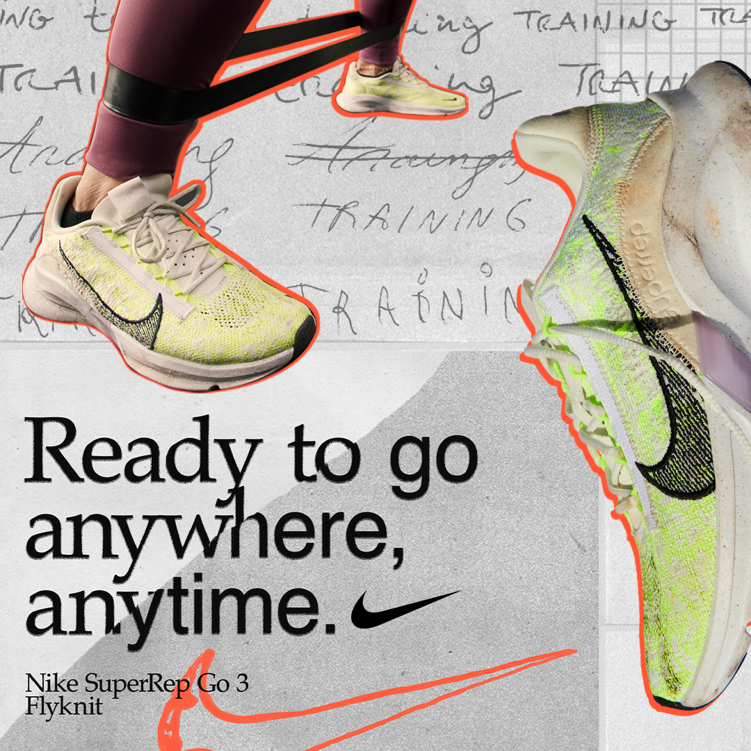
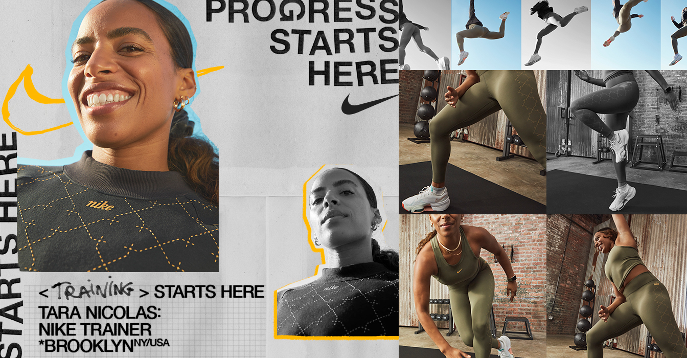
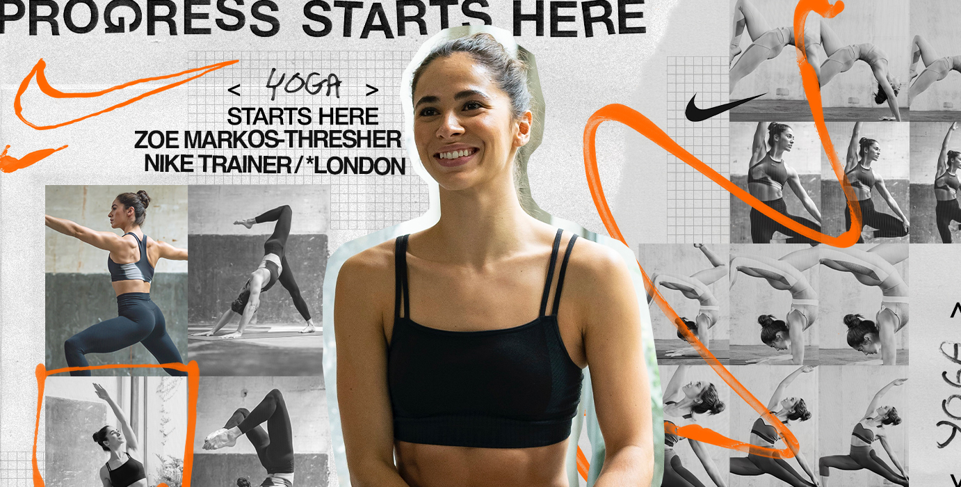
Nike discovered after the pandemic that people no longer used gyms to exercise but their own home or the street. They also noticed that the important thing behind physical exercise was no longer to achieve an athletic body but to improve personally day by day, prioritizing their mentality.
IDENTITY
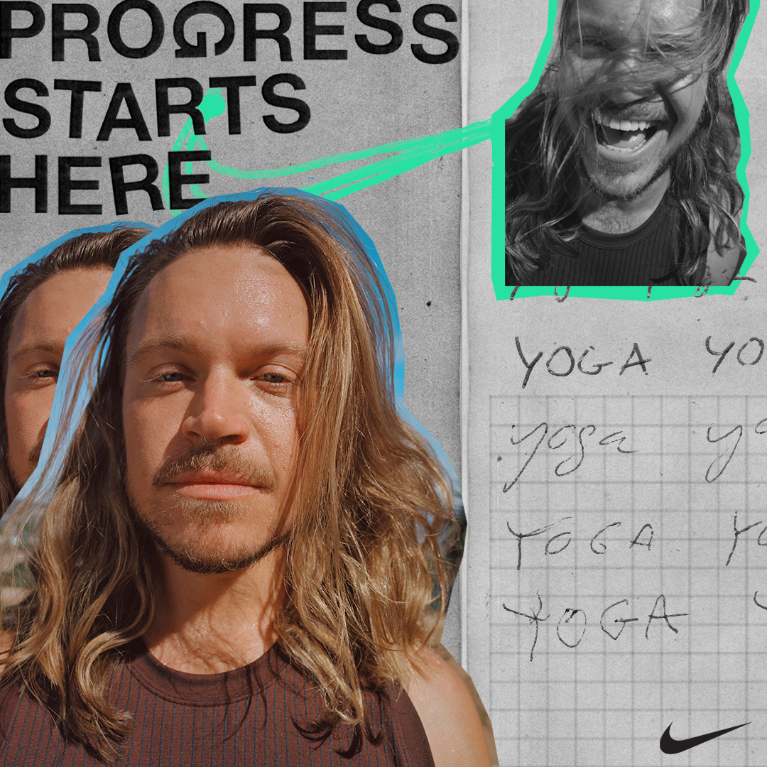
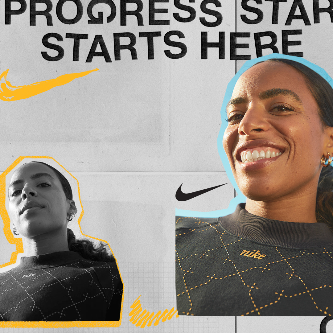
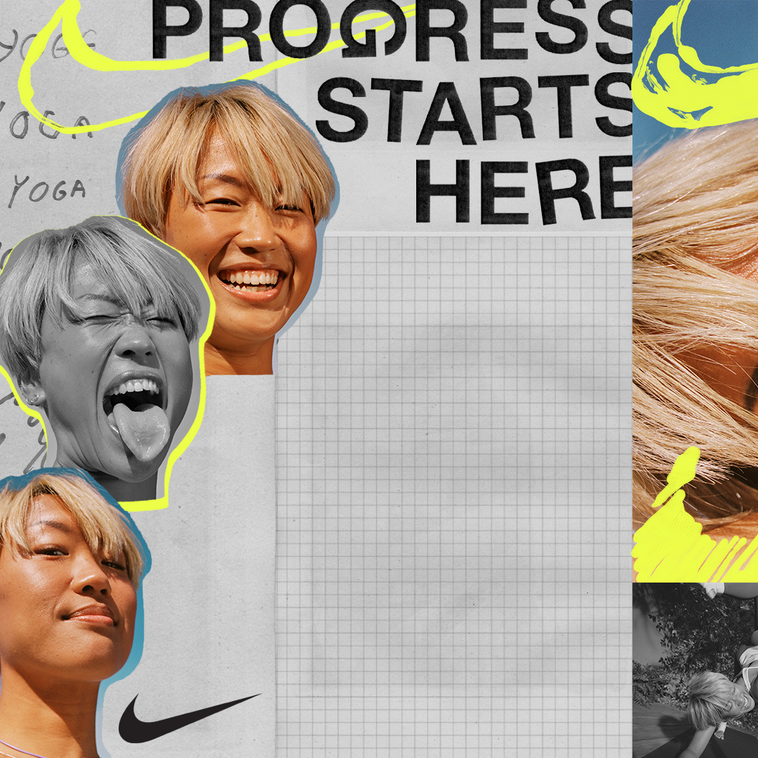
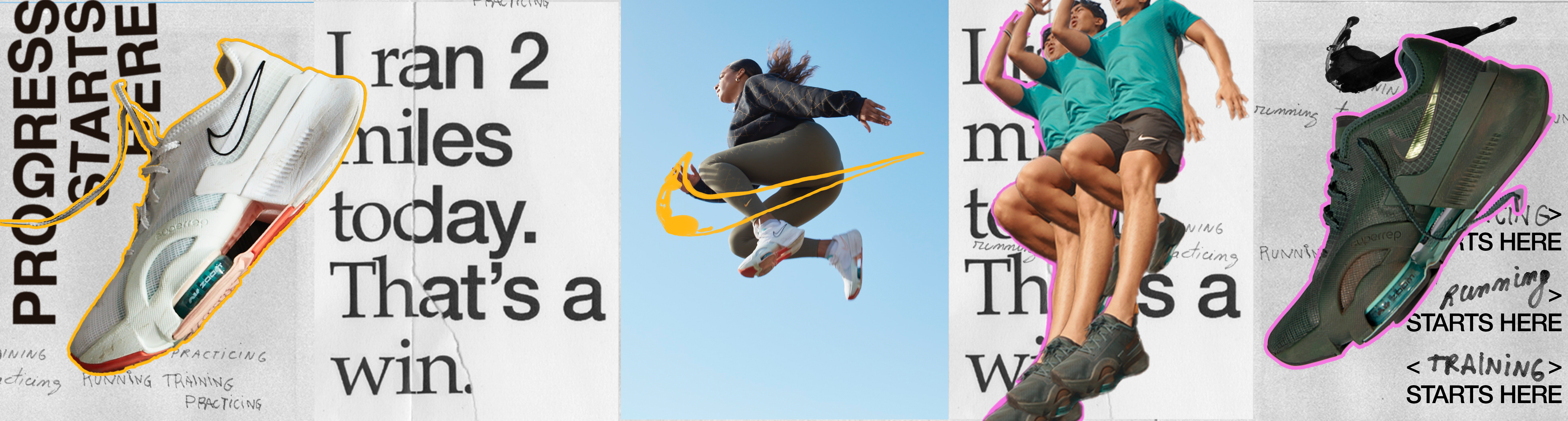
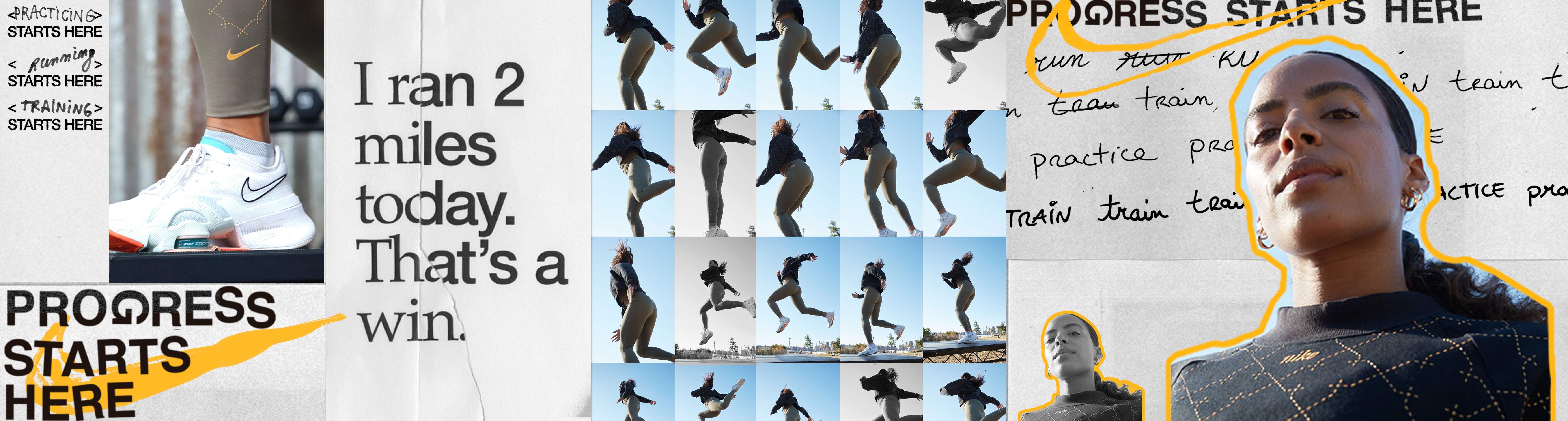
The logo emphasizes the effects of humans by being all made analogically. The process of work gave the results to the final logo, by having errors such as the rotated or spacing of the G. In the same way that the swoosh happens to be, on some occasions, drawn by hand.
Nike discovered after the pandemic that people no longer used gyms to exercise but their own home or the street. They also noticed that the important thing behind physical exercise was no longer to achieve an athletic body but to improve personally day by day, prioritizing their mentality.
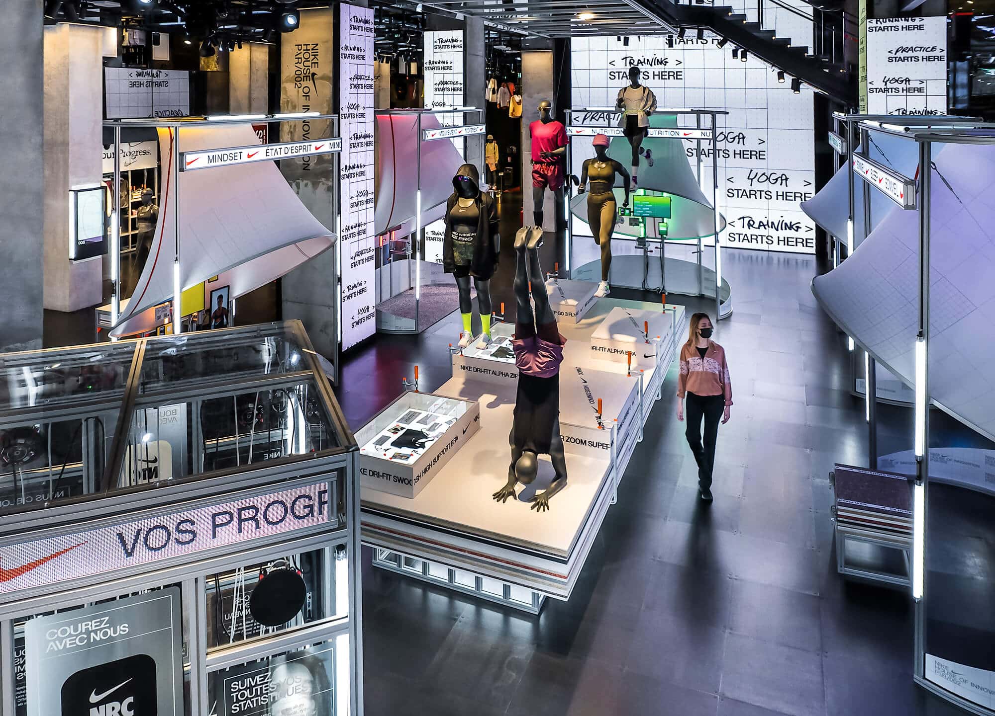
With this, they carried out a rebranding of the brand where the focus is more about progress than on the objective, emphasizing the process and the small advances or daily errors in sight and irregular compositions, using the error as end game.
IDENTITYThe logo emphasizes the effects of humans by being all made analogically. The process of work gave the results to the final logo, by having errors such as the rotated or spacing of the G. In the same way that the swoosh happens to be, on some occasions, drawn by hand.
The entire identity is made analogically, by using papers, clippings, handwriting, etc.
At the same time, it incorporates a very lively and energetic color palette due to the optimism behind the concept.