VISO PROJECT
BRAND
Viso project is a brand from Spain based in New York that seels proucts for the house with an artisan and cool touch. What makes the brand unique is their sensibility to details and their contemporaneity.
IDENTITY
Viso project is a brand from Spain based in New York that seels proucts for the house with an artisan and cool touch. What makes the brand unique is their sensibility to details and their contemporaneity.
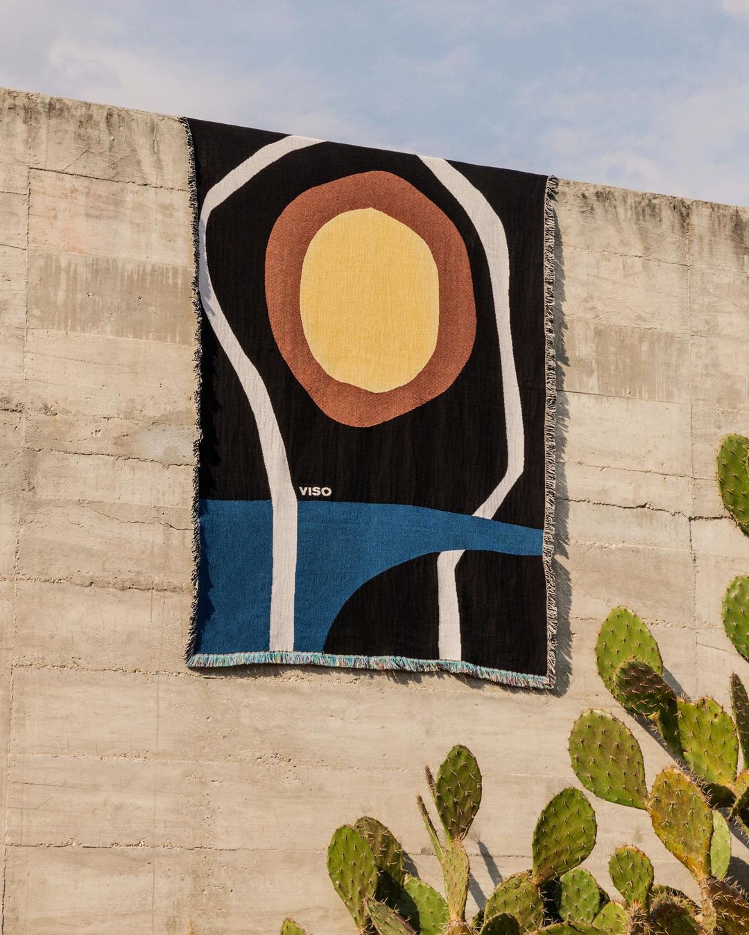
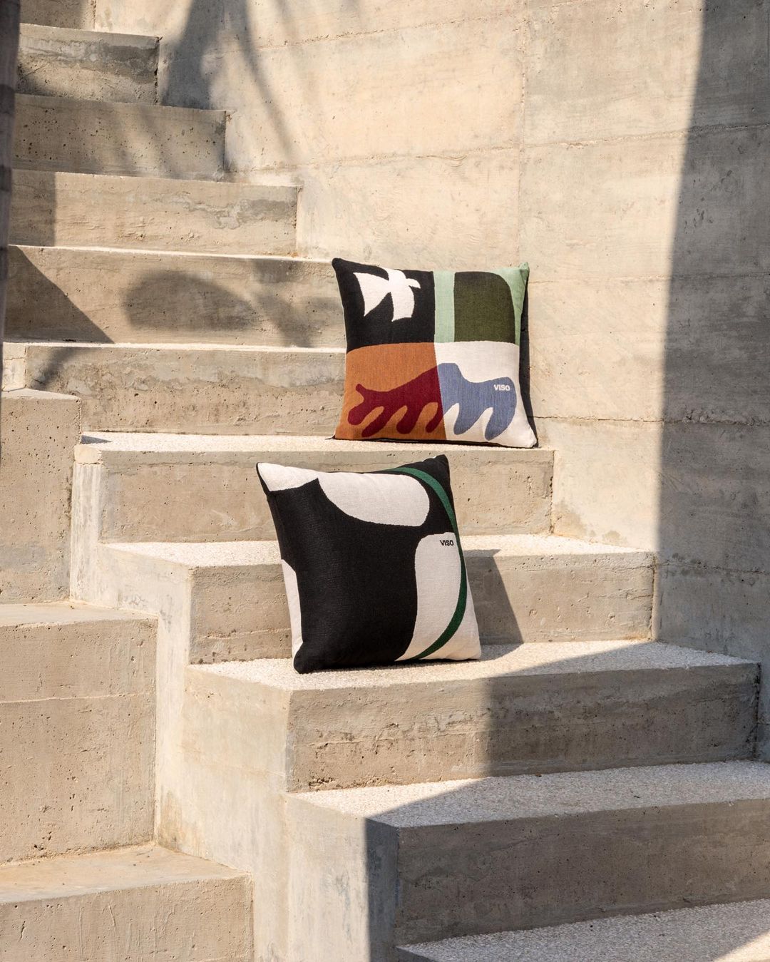
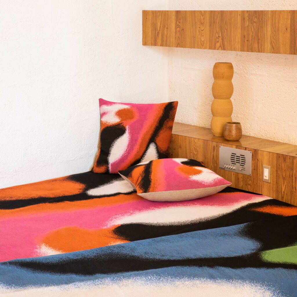
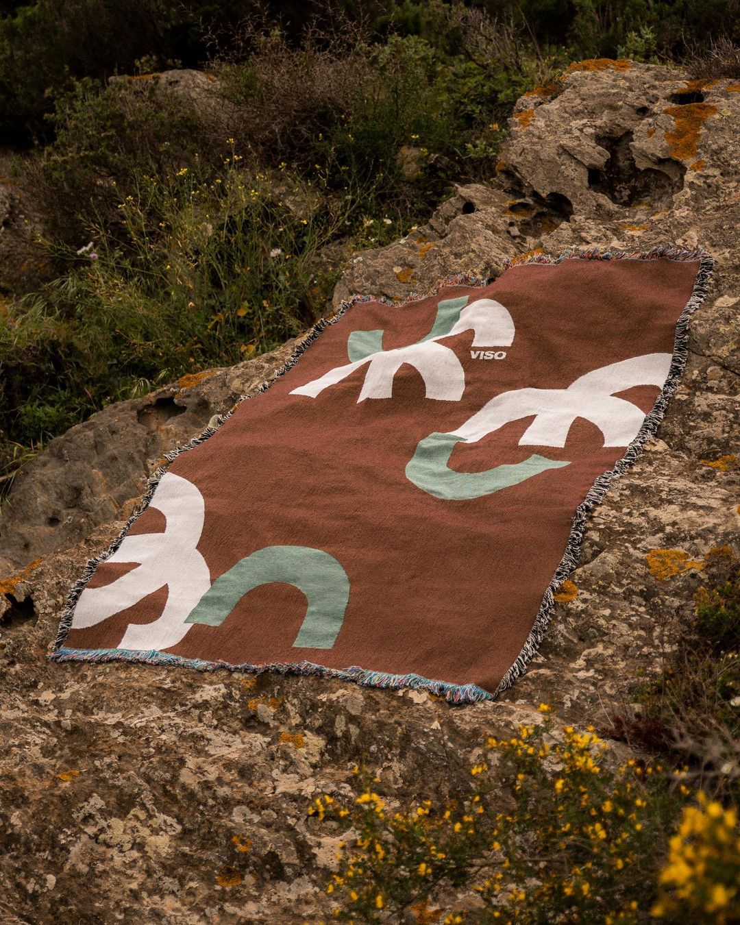
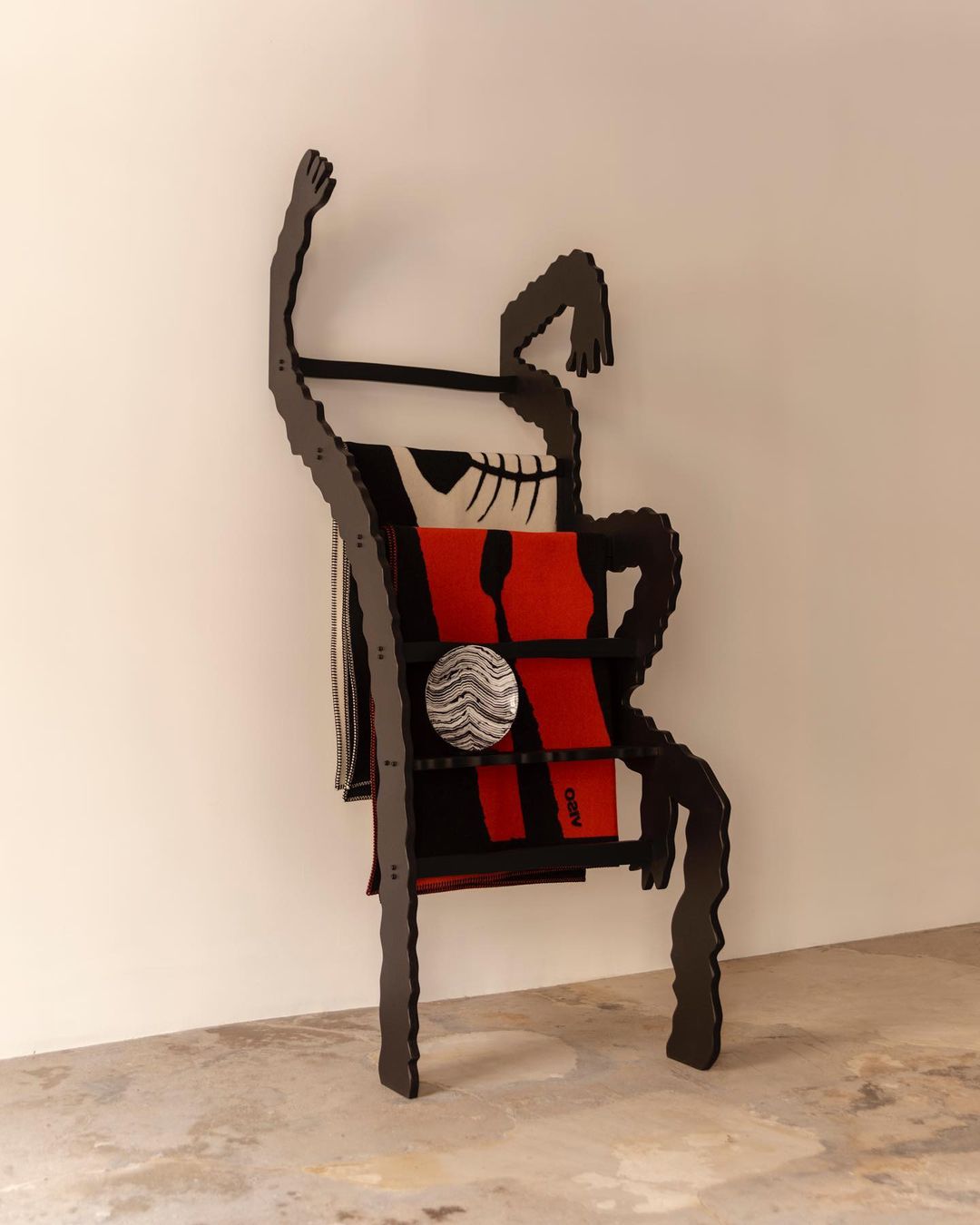
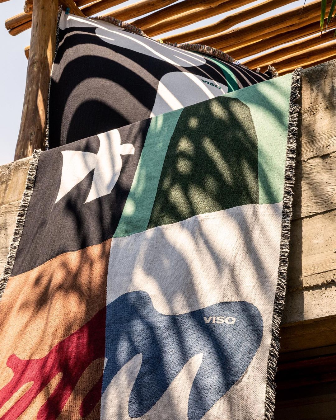
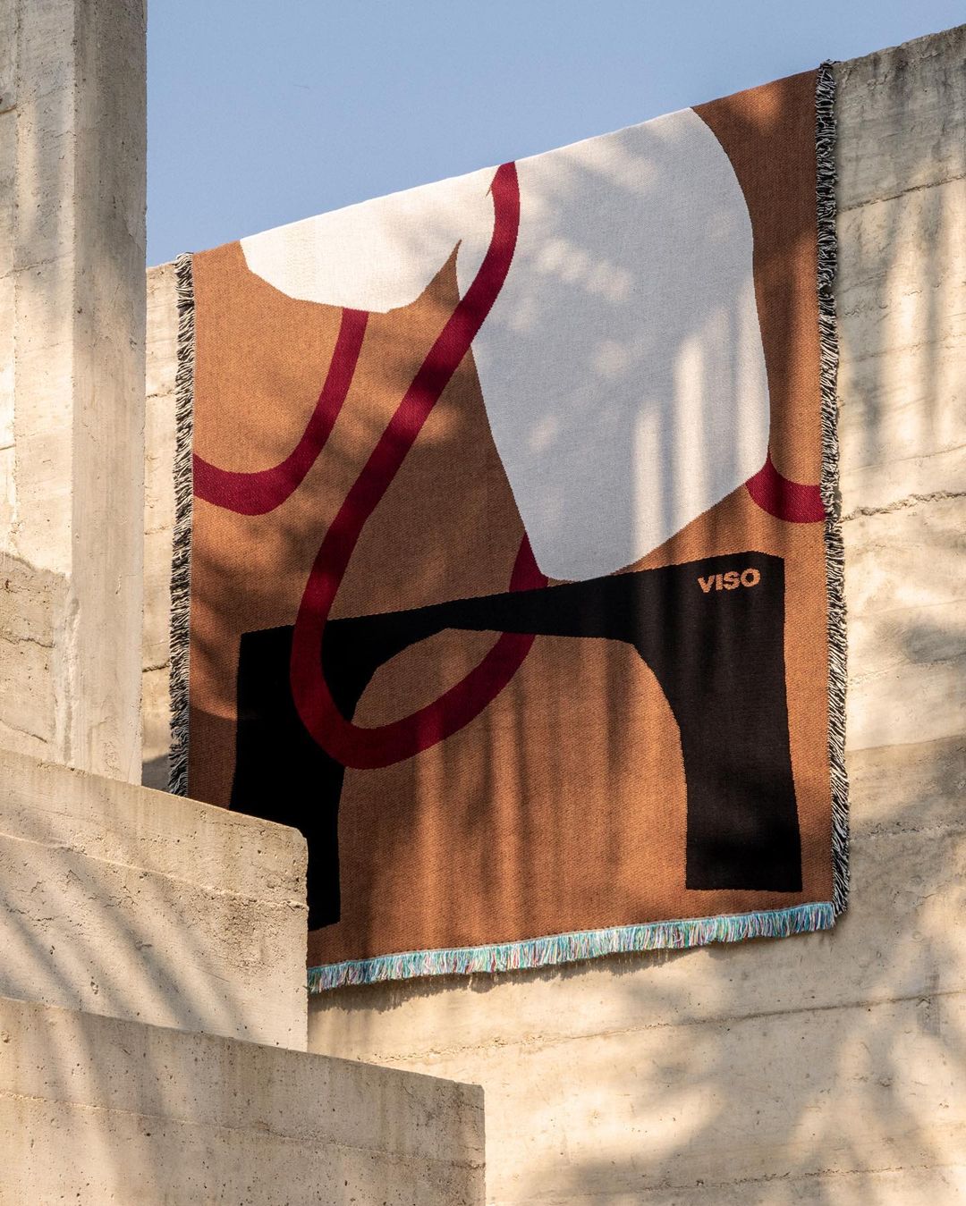
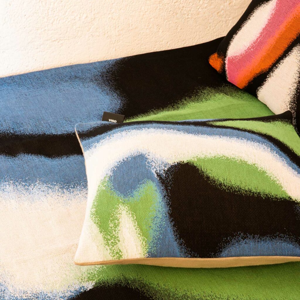
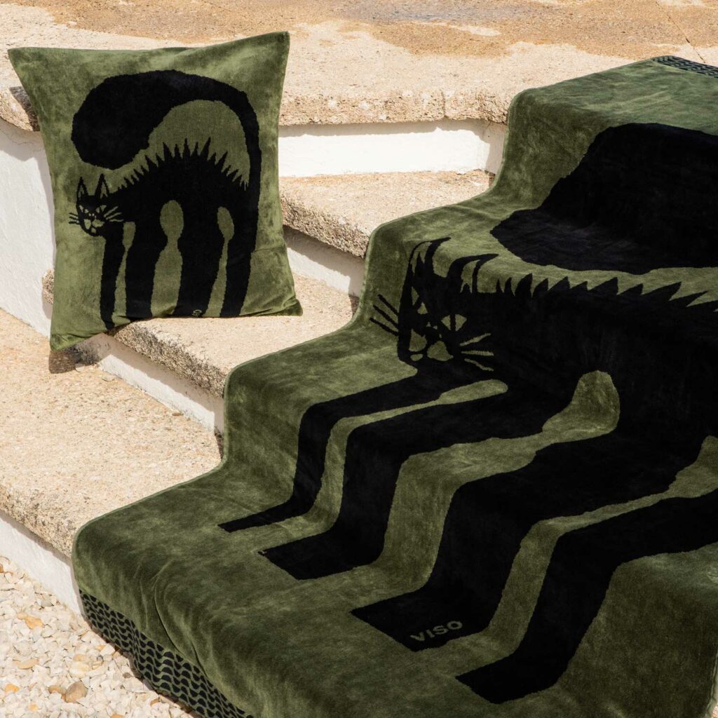
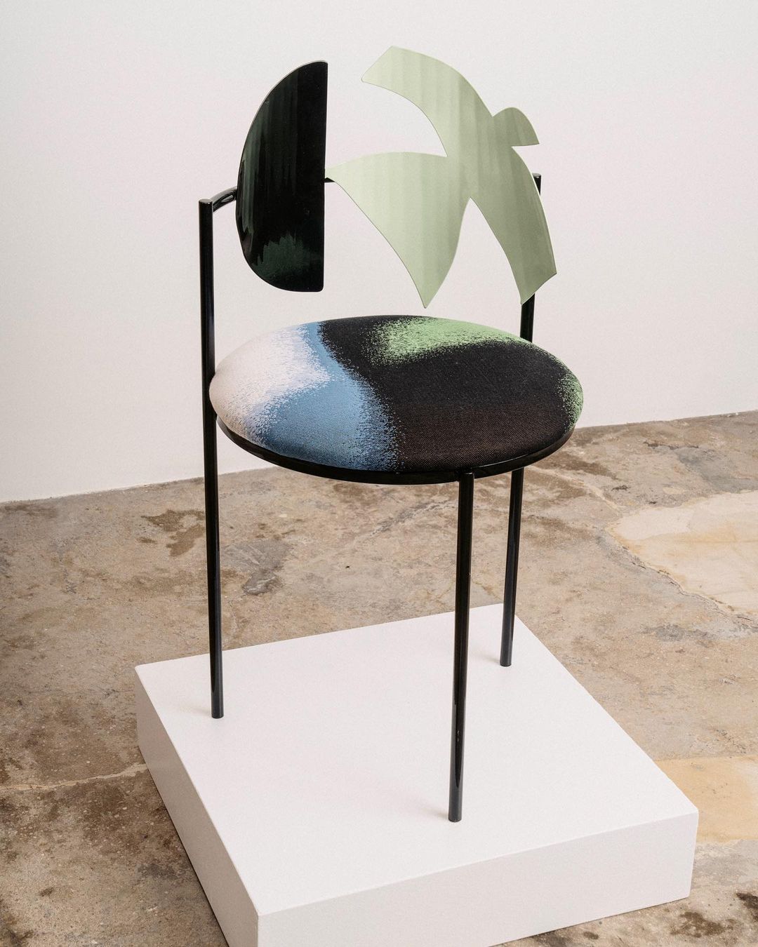
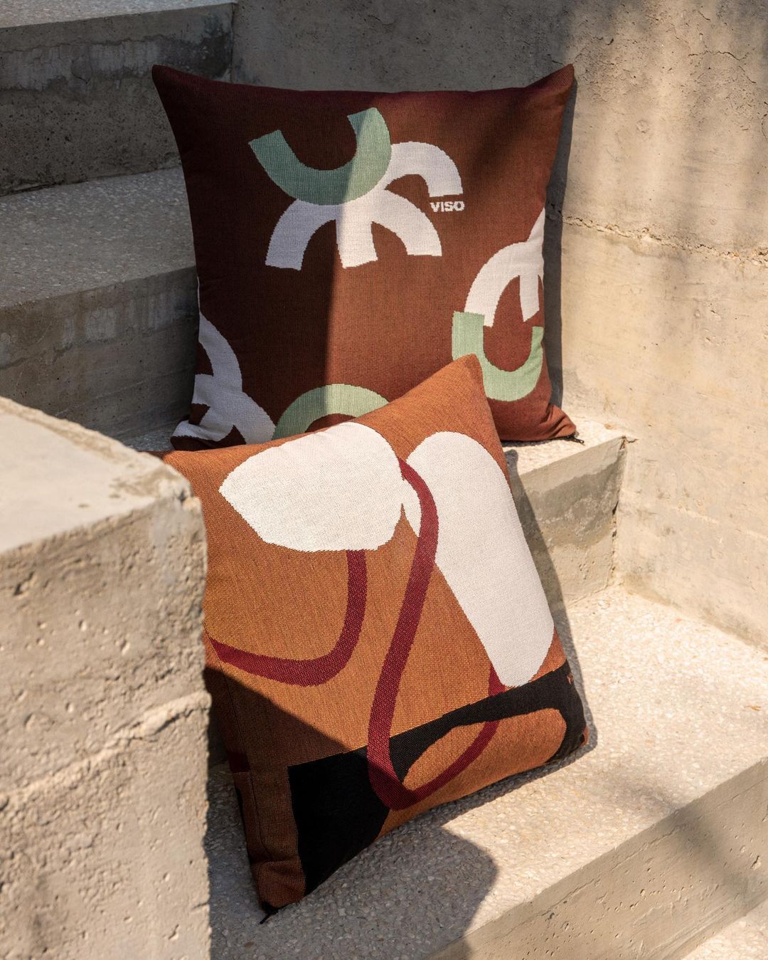
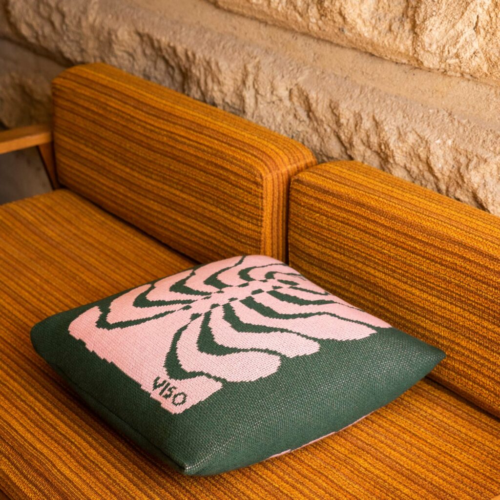
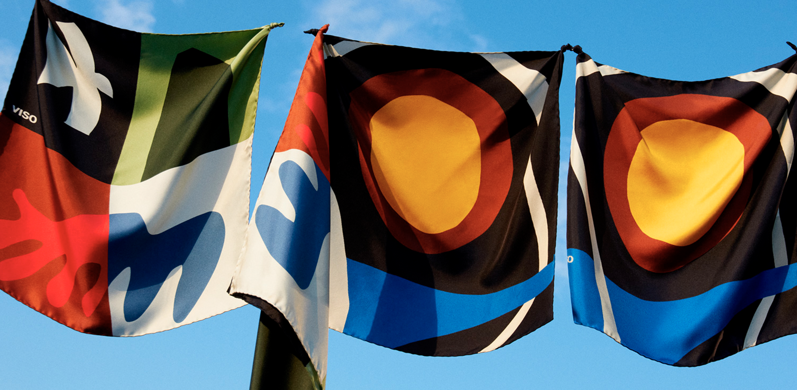
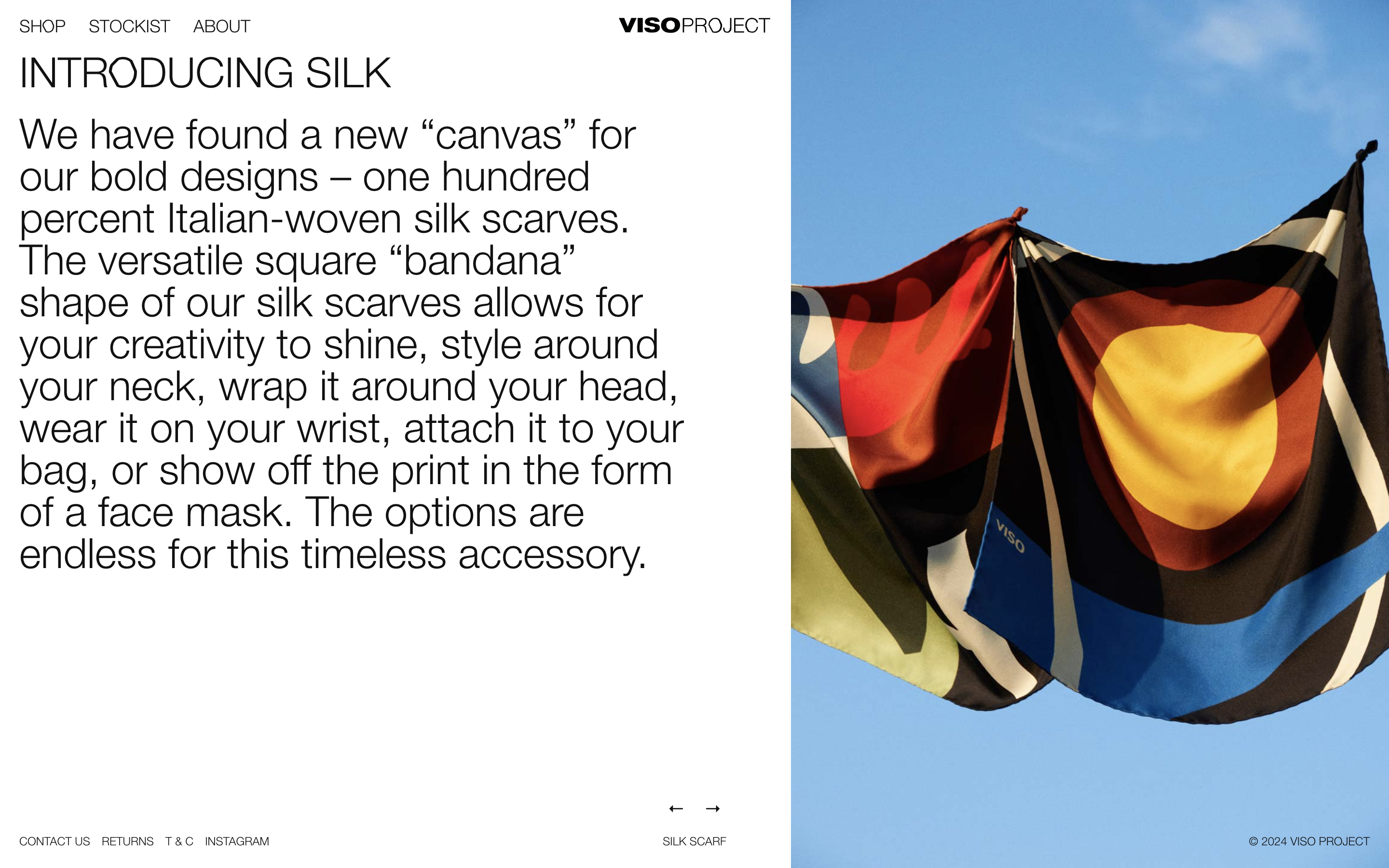
The products have a dynamic, abstract and organic designs with a mediterranean touch.
IDENTITYWe redesigned their logo VISO adding the word PROJECT. Our aim was to make the O the most important symbol of their new identity, which was inspired by a piece of furniture.
The identity was built by geometric and abstract shapes, taken from the products, that when put together, they form the word VISO, as if they were a puzzle. The chromatic palette varies each season, but always has 4 colors that work in harmony together.
The identity was built by geometric and abstract shapes, taken from the products, that when put together, they form the word VISO, as if they were a puzzle. The chromatic palette varies each season, but always has 4 colors that work in harmony together.