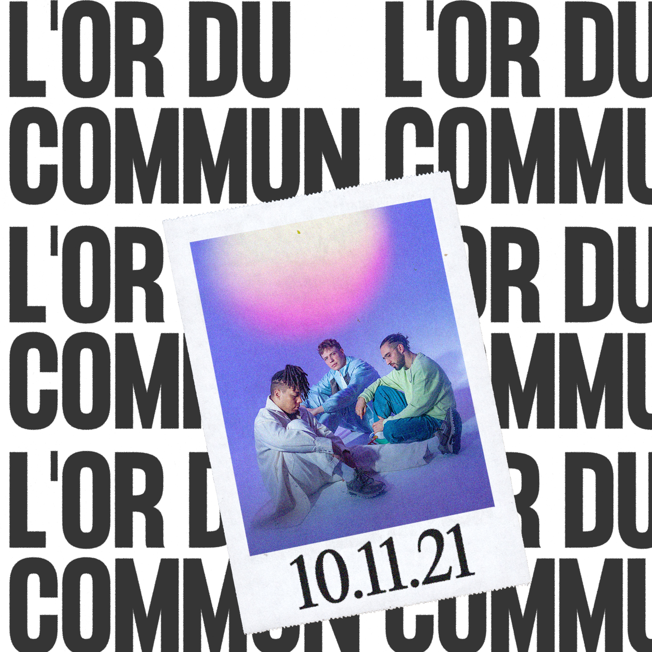
ILLIT
‘MAMIHLAPINATAPAI’
BRAND
ILLIT is a K-pop girl group created by BELIFT LAB, formed by five multinational members: YUNAH, MINJU, MOKA, WONHEE, and IROHA.
IDENTITY
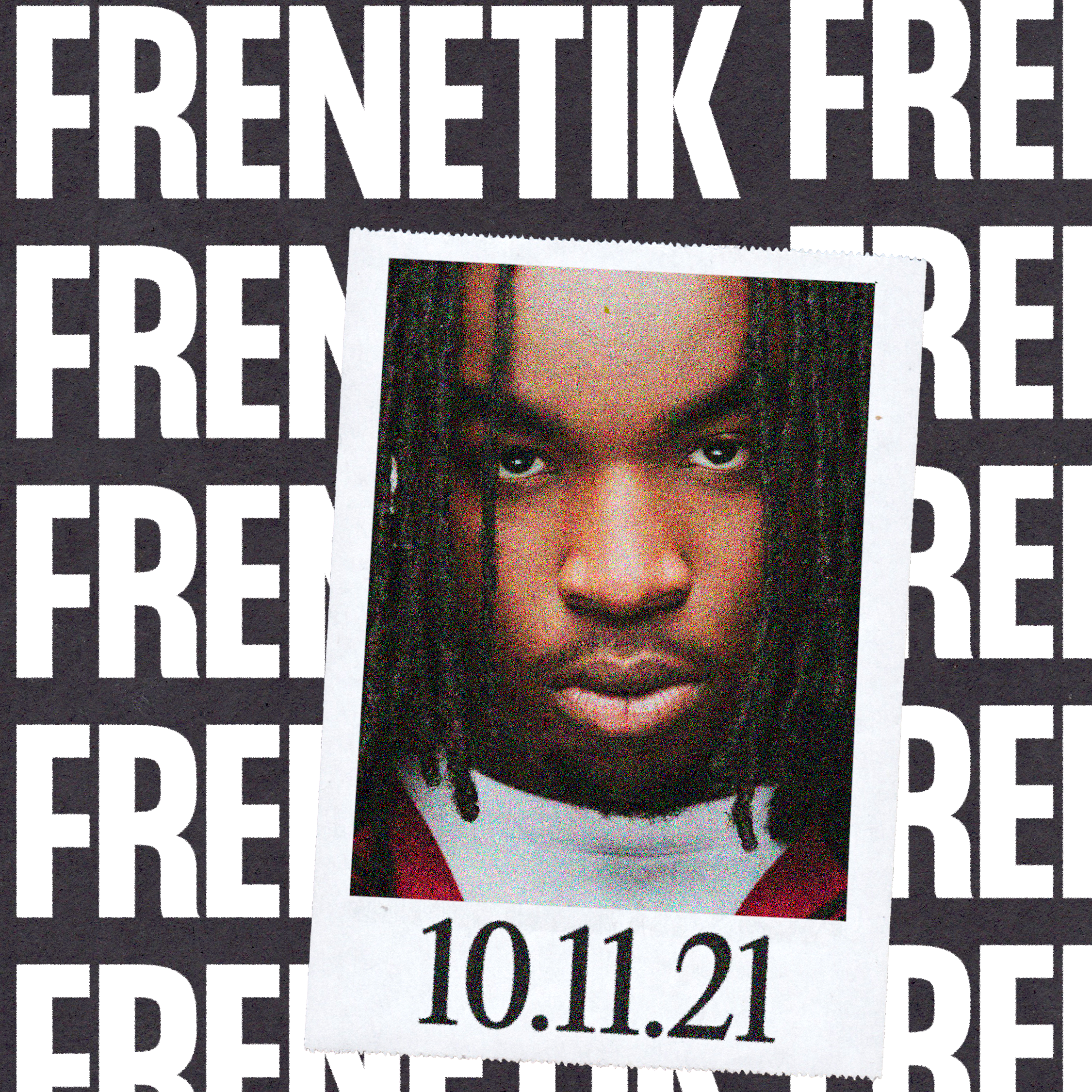
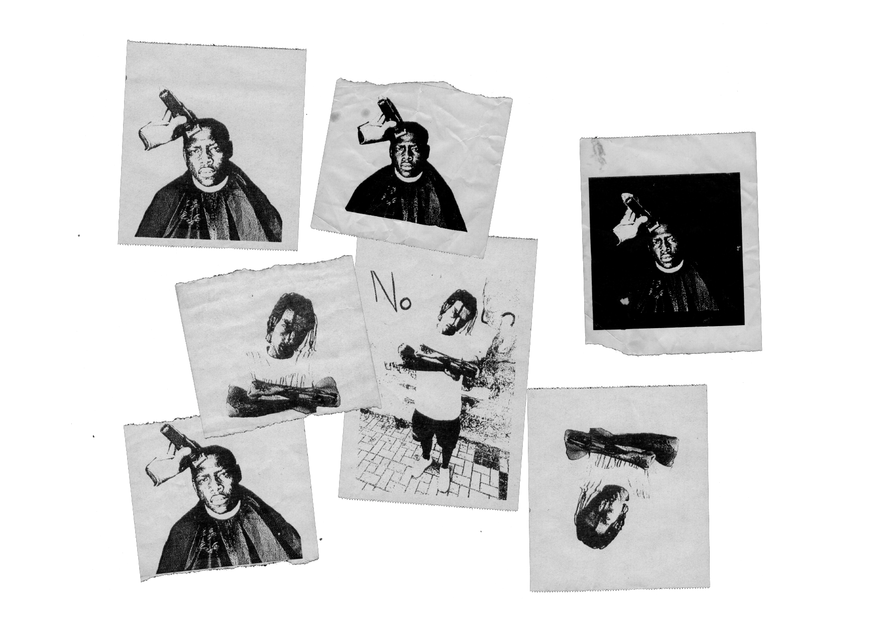
Development of collages, illustrations, and icons for the physical versions GRWM, FREE RIDER, and IT’S ME.
ILLIT is a K-pop girl group created by BELIFT LAB, formed by five multinational members: YUNAH, MINJU, MOKA, WONHEE, and IROHA.
For their 4th Mini Album “MAMIHLAPINATAPAI”, the group explores the emotional tension between attraction, closeness, and uncertainty, translating contemporary youth culture into a playful, intimate, and emotional visual universe.
IDENTITY
Development of collages, illustrations, and icons for the physical versions GRWM, FREE RIDER, and IT’S ME.
The pieces were created using photographs of the members as a reference, reinterpreting objects, accessories, and elements present in the sets to build the visual imaginary of each album.


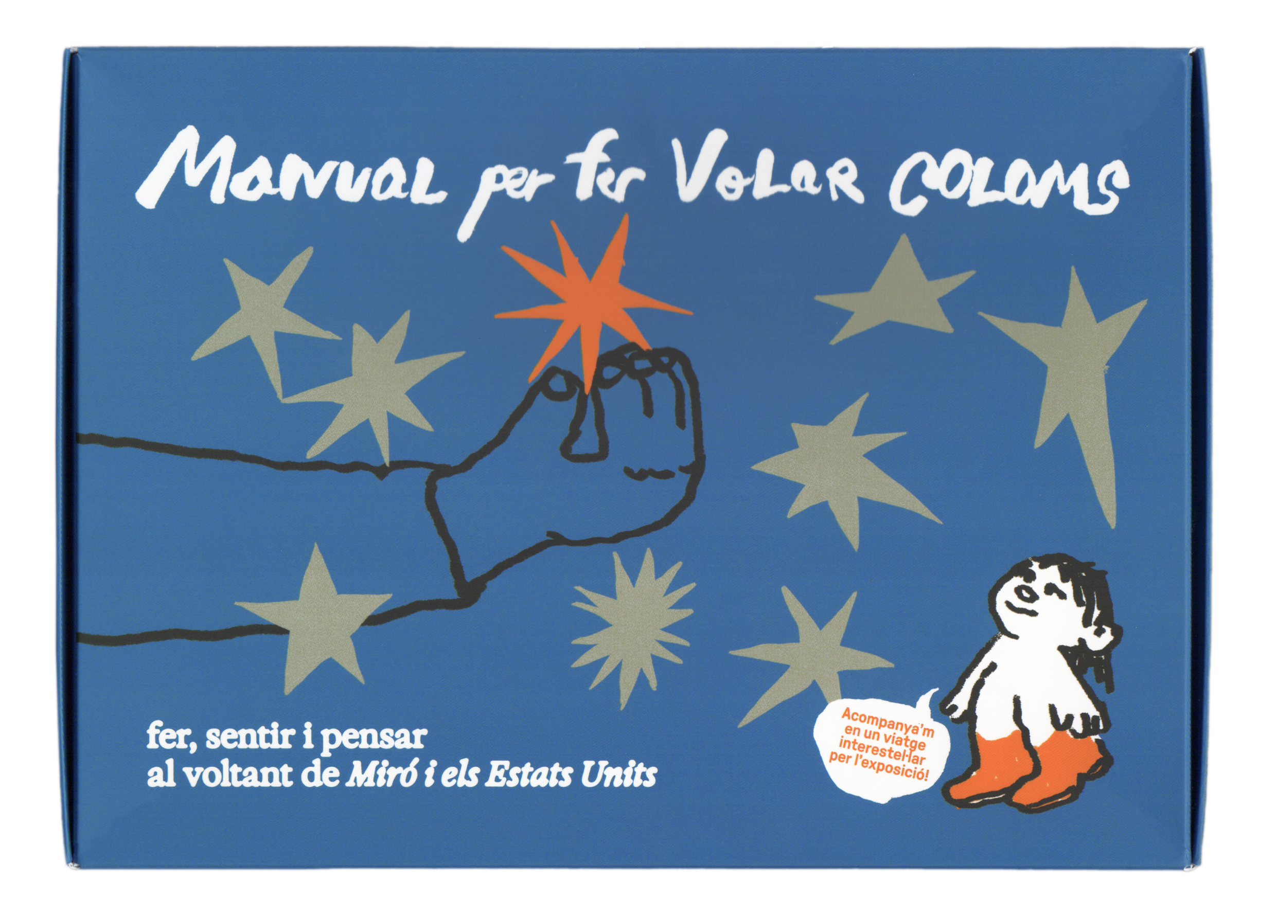
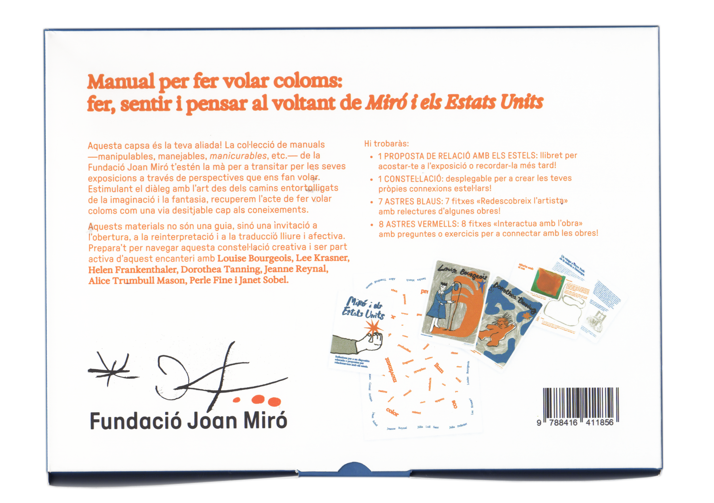
MANUAL FOR CHASING RAINBOWS Nº01
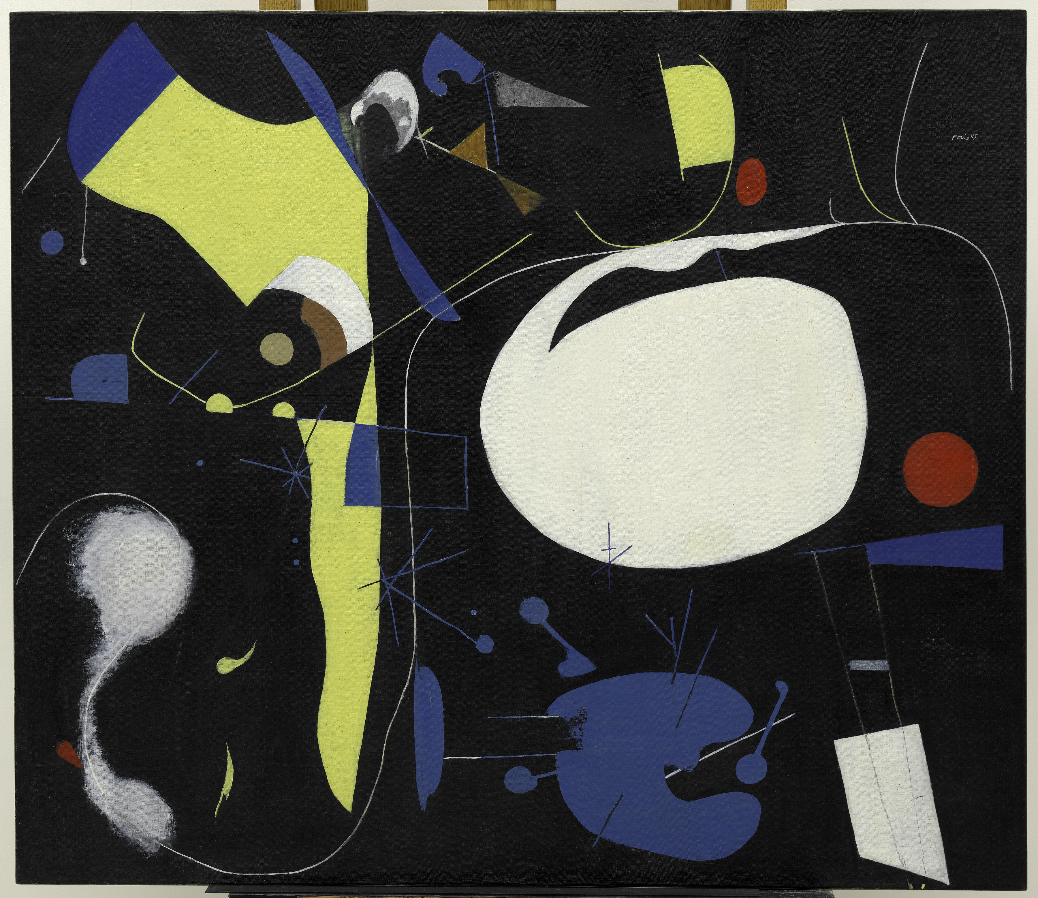
MIRÓ AND THE UNITED STATES
BRAND
Manual for Chasing Rainbows is an interpretive companion to Miró and the United States, a playful toolkit that invites visitors of all ages to explore through the body, the eyes and the imagination.
IDENTITY
The first manual takes the exhibition context as a starting point and distills a three-color palette drawn from the works and reinterpreted from the U.S. flag.
Manual for Chasing Rainbows is an interpretive companion to Miró and the United States, a playful toolkit that invites visitors of all ages to explore through the body, the eyes and the imagination.
Created by local artists, the manual brings together a guide and activity cards to activate the visit, linking the works like a constellation.
IDENTITY
The first manual takes the exhibition context as a starting point and distills a three-color palette drawn from the works and reinterpreted from the U.S. flag.
The visual language mixes naïf illustrations with a dynamic graphic system featuring onomatopoeia and speech bubbles that encourage dialogue and interaction.
A human touch runs through the project via hand-drawn lettering and illustration, echoing the identity’s core idea: the hand.
CLIENT
Fundació Joan Miró
SERVICES
Brand analisis
Creative direction
Art direction
Identity
Editorial
Illustrations
Packaging
YEAR
2025
LINKS
Website
Instagram Article by Núvol
Fundació Joan Miró
SERVICES
Brand analisis
Creative direction
Art direction
Identity
Editorial
Illustrations
Packaging
YEAR
2025
LINKS
Website
Instagram Article by Núvol


EKIPA
BRAND
Ekipa is a global booking agency specialized in electronic music. It represents both emerging and established artists with a strategic and creative approach.
IDENTITY
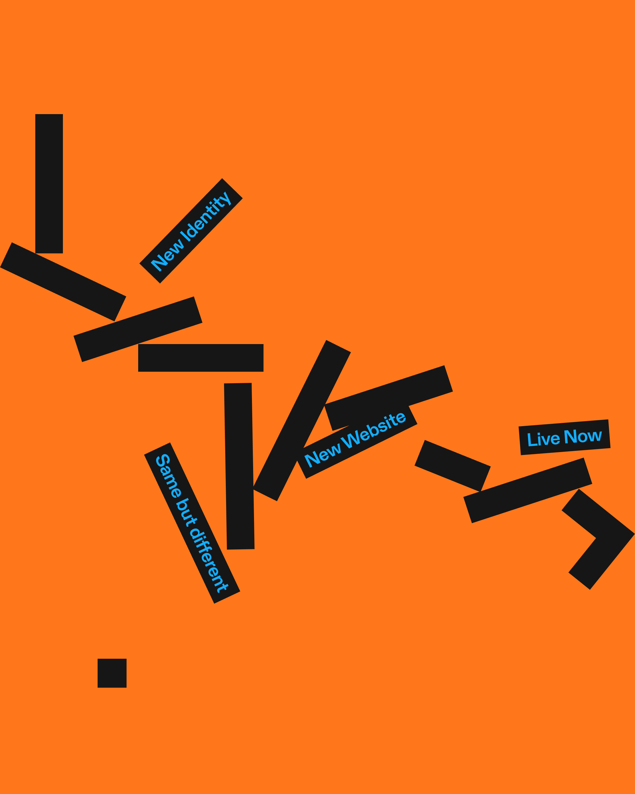
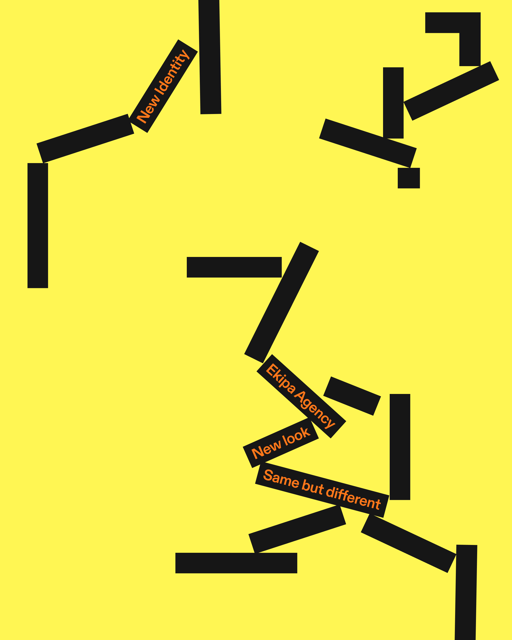
The new identity is built around the concept “Outside the Box”, translating Ekipa’s mindset into a geometric and deconstructed system.
Ekipa is a global booking agency specialized in electronic music. It represents both emerging and established artists with a strategic and creative approach.
The rebranding aimed to update its identity, creating something similar yet renewed, reflecting the agency’s maturity and its growing connection with fashion and brands, while keeping its energy and collaborative spirit intact.
IDENTITY
The new identity is built around the concept “Outside the Box”, translating Ekipa’s mindset into a geometric and deconstructed system.
The main logo is deconstructed to its minimal expression: a square and two moving rectangles; symbolizing openness, movement, and collaboration. An estrident yet refined color palette, neutral Swiss typography, and dynamic modular compositions merge playfulness with professionalism.


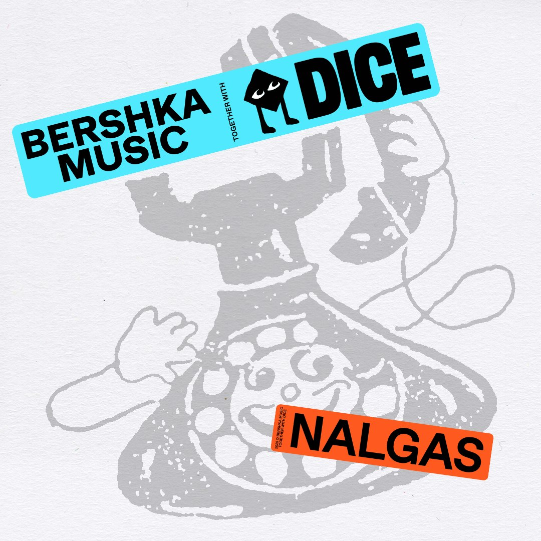
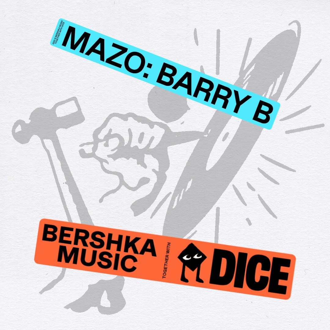
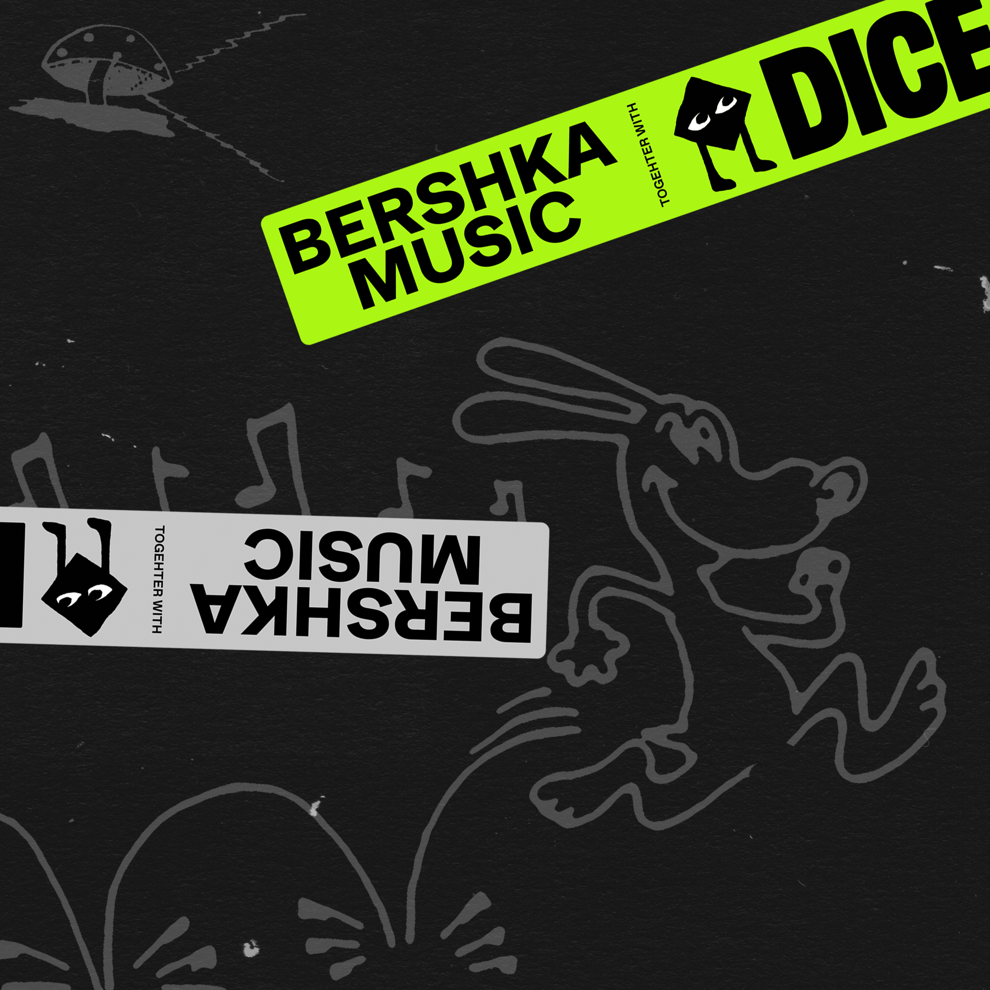
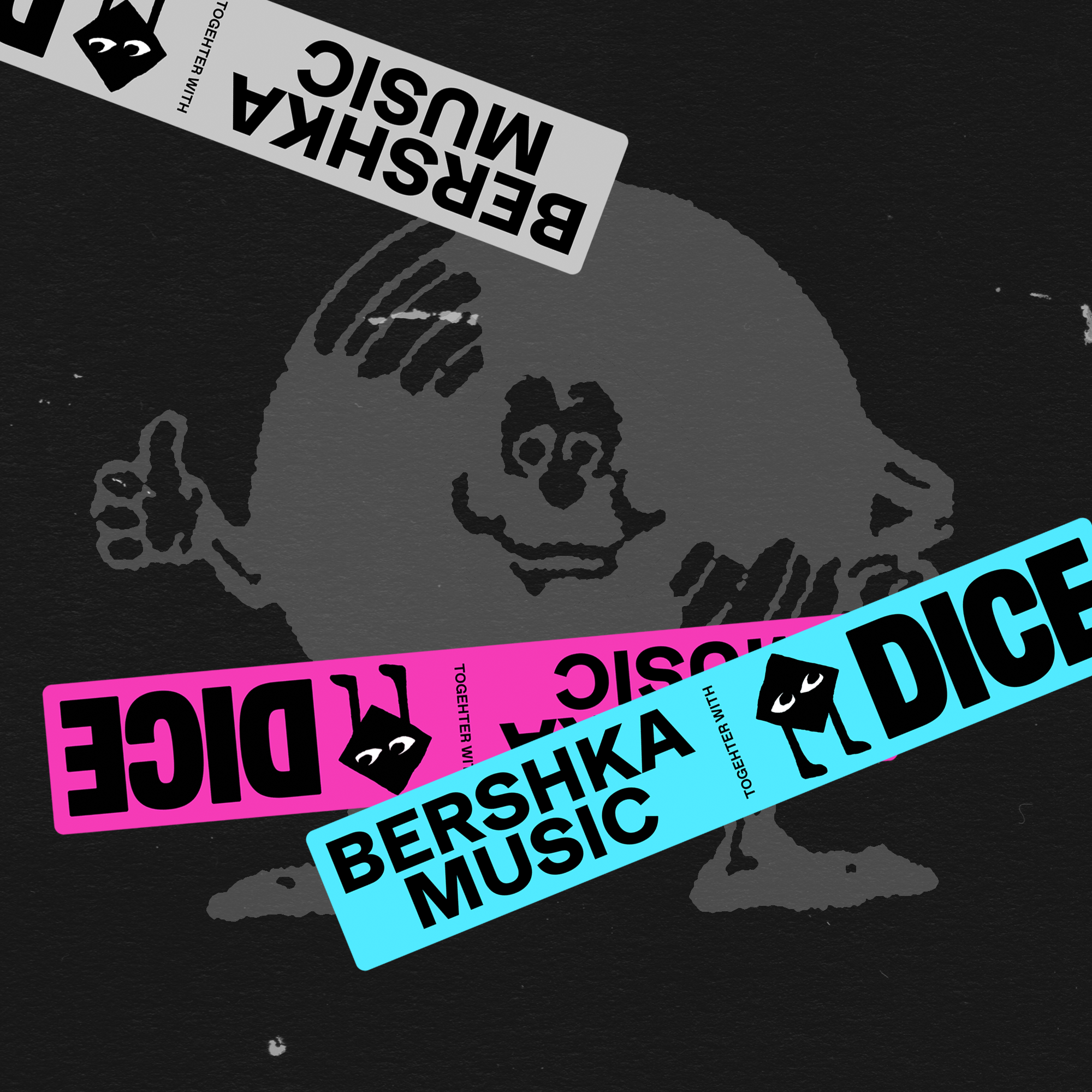
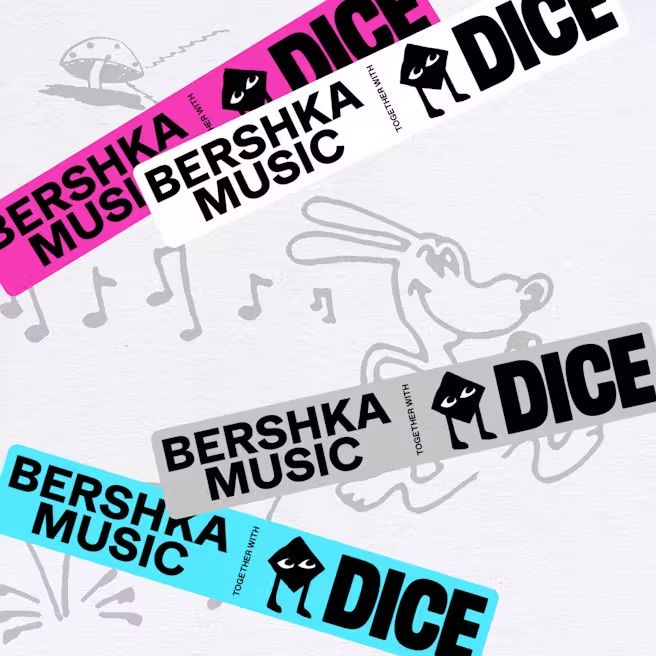
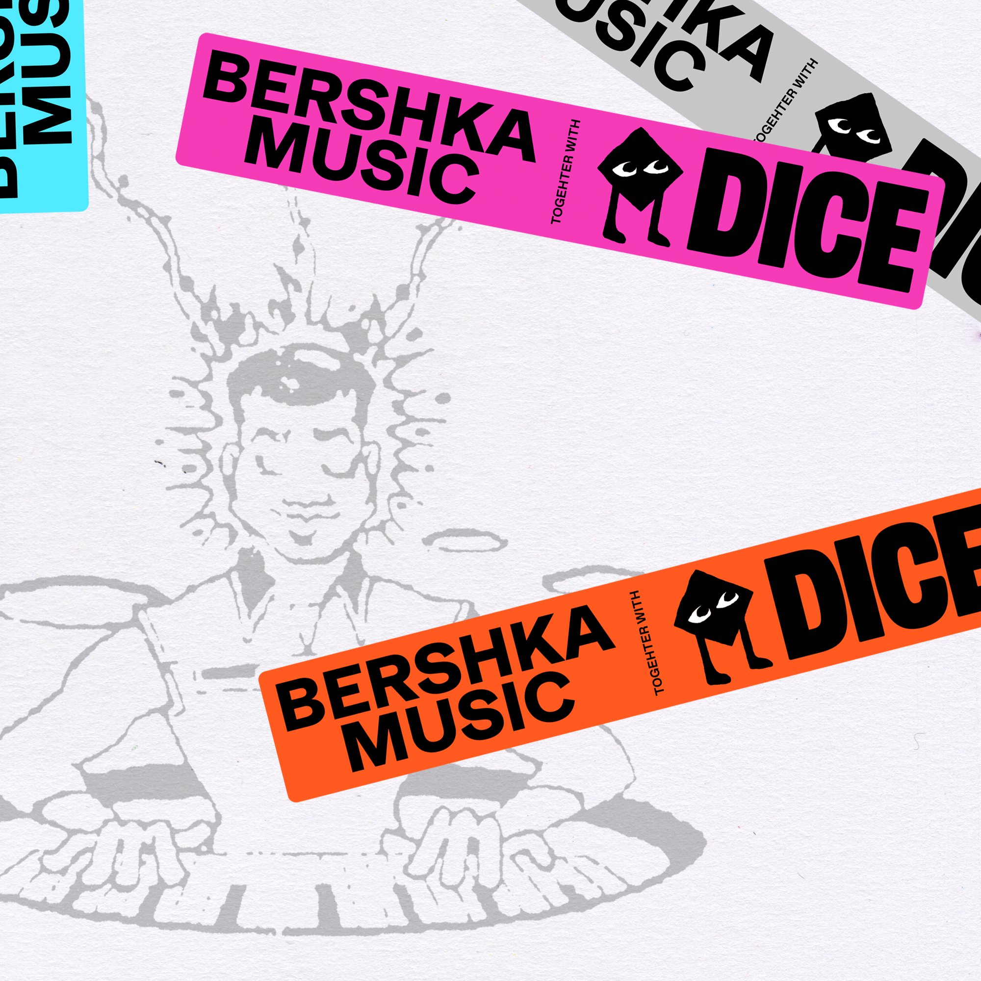
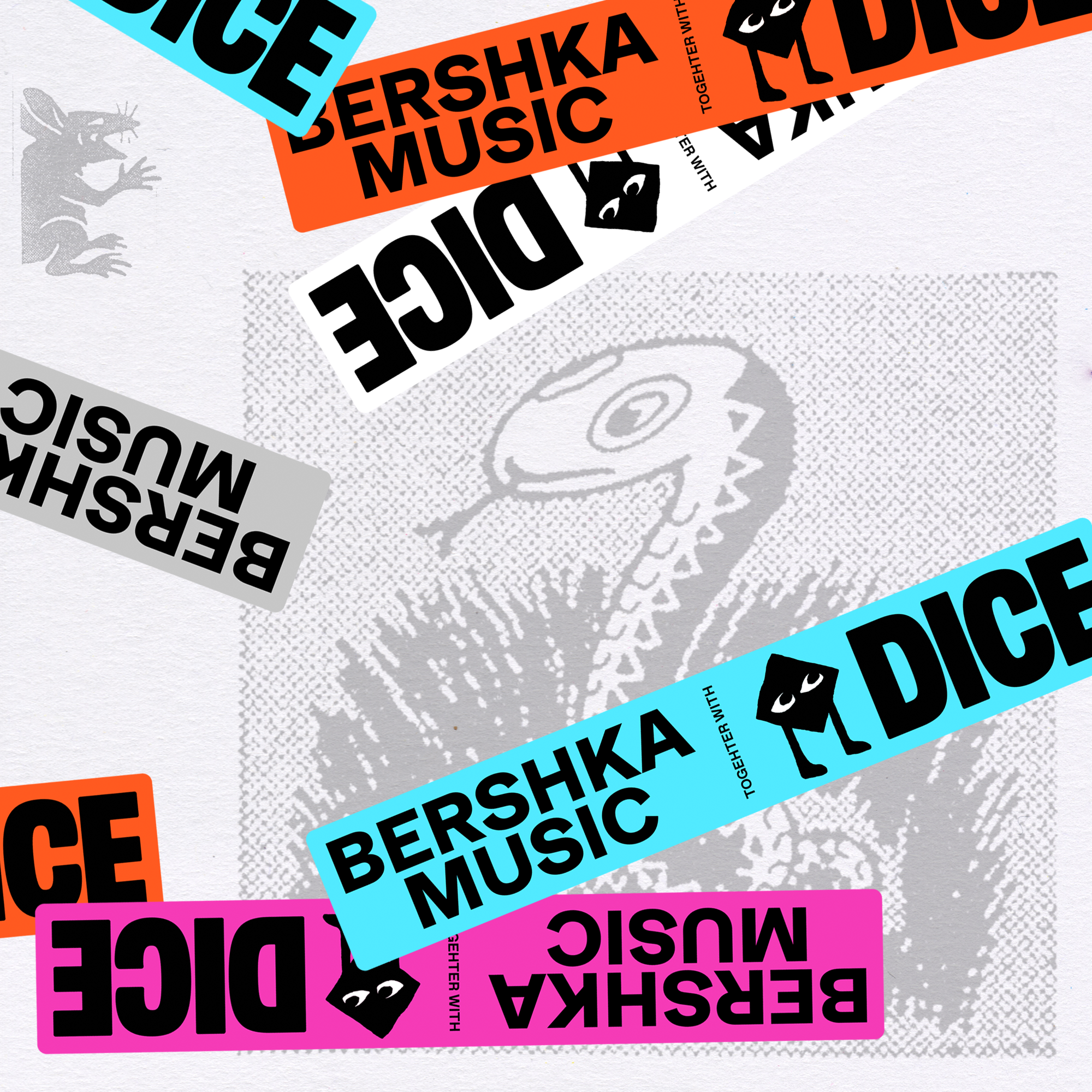
BERSHKA MUSIC together with DICE
BRAND
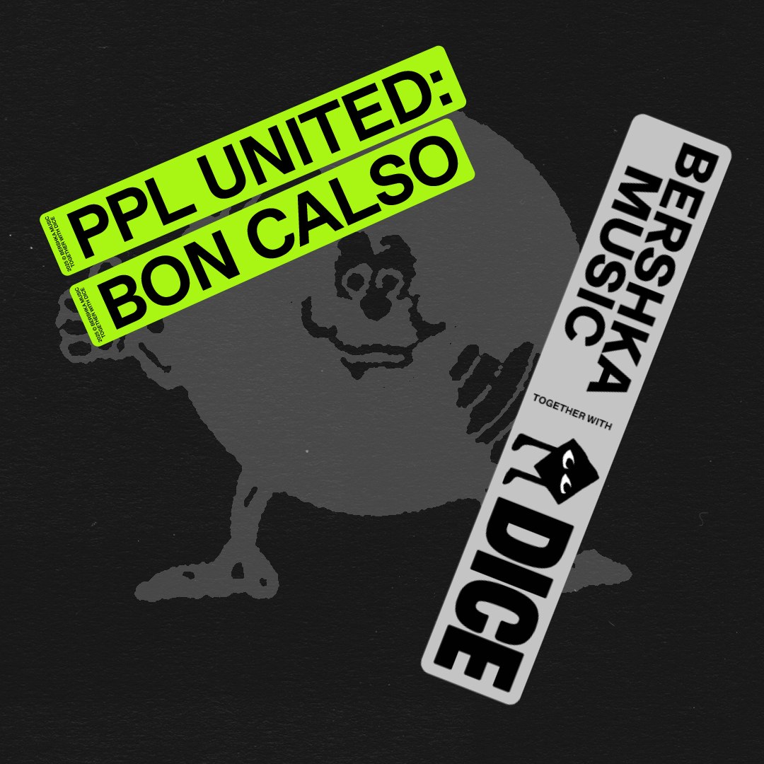
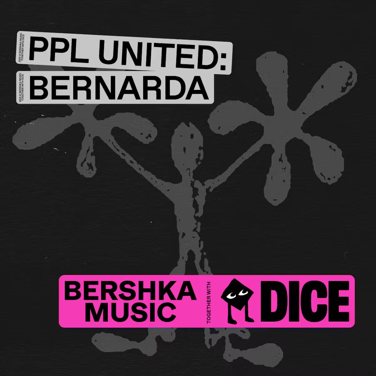
Bershka and DICE are working together on a campaign throughout 2025 to define the brand’s relationship with music; to find a deeper connection with their fans and allow them to access authentic content and experiences. Bershka and DICE seek to create an image between the two brands that allows the project to be identified through different channels.
IDENTITY
The lock-up logo takes the shape of a sticker—a living symbol that connects Bershka Music and DICE. Flexible and disruptive, it breaks the usual take on traditional branding and becomes an expression of community and movement.
The 2025 visual identity draws inspiration from the energy of streetwear, embracing a rebellious and youthful aesthetic. Moving typography coexists with a black-and-white universe, where stickers that stand out with eye catching colors add contrast. A visual system in constant evolution—free, expressive, and as alive as the music it represents.
CLIENT
DICE & Bershka
SERVICES
Brand analisis
Creative direction
Art direction
Identity
Campaign
Graphic Design
Digital content
Artworks
YEAR
2025
LINKS
DICE
Highxtar magazine Metal magazine
DICE & Bershka
SERVICES
Brand analisis
Creative direction
Art direction
Identity
Campaign
Graphic Design
Digital content
Artworks
YEAR
2025
LINKS
DICE
Highxtar magazine Metal magazine


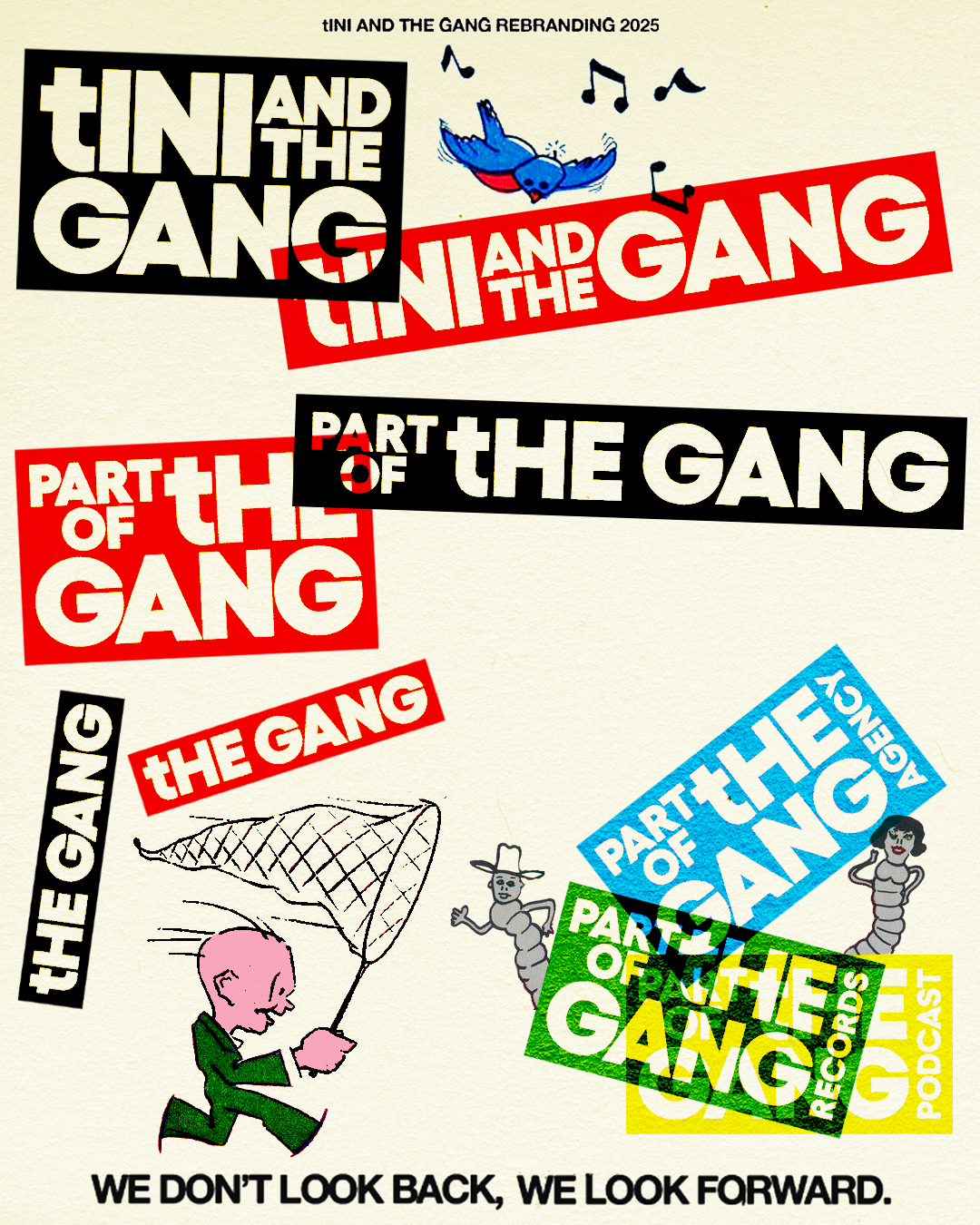
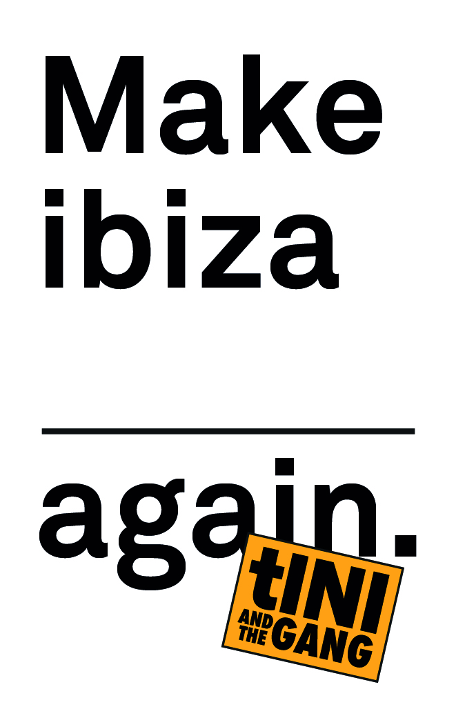
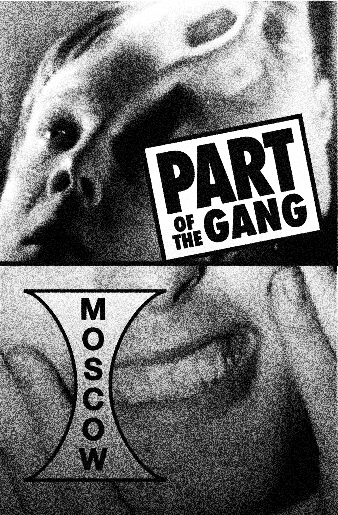
tINI ANG THE GANG
BRANDtINI & the Gang are the parties curated by DJ and producer tINI, a space where community and underground music meet. More than events, it's a global family, a shared energy and a declaration of independence within the electronic scene.
IDENTITY
The tHE GANG logos fuse streetwear influences with a geometric and rational approach, creating a straightforward and minimalist aesthetic. Each variant fits within a rectangular shape, but is used dynamically and without fixed rules, reflecting the freedom and spontaneity of the project.
tINI & the Gang are the parties curated by DJ and producer tINI, a space where community and underground music meet. More than events, it's a global family, a shared energy and a declaration of independence within the electronic scene.
In 2018 we created the first visual identity and, now in 2025, we have redesigned the brand to amplify its message: tHE GANG takes center stage and the iconic lowercase “t” of tINI becomes the central axis of the logo and its variants, reinforcing the collective spirit of the project.
IDENTITYThe tHE GANG logos fuse streetwear influences with a geometric and rational approach, creating a straightforward and minimalist aesthetic. Each variant fits within a rectangular shape, but is used dynamically and without fixed rules, reflecting the freedom and spontaneity of the project.
In addition to the rebranding, we designed the entire graphic image for the 2018 and 2019 seasons.
In 2018, we went for a naïf, cheerful and fun aesthetic, full of vibrant colors and flat geometric shapes.
In 2019, the image evolved towards a more raw approach, influenced by underground and raver graphics, with memes and animals as the central concept.
CLIENT
tINI
SERVICES
Creative direction
Art direction
Identity
Campaign
Graphic Design
Digital content
Artworks
YEAR
2018-2025
LINKS
Instagram
tINI
SERVICES
Creative direction
Art direction
Identity
Campaign
Graphic Design
Digital content
Artworks
YEAR
2018-2025
LINKS
2018
![]()
![]()


2025
![]()
![]()


2025
![]()
![]()
![]()
![]()
![]()
![]()
![]()
![]()


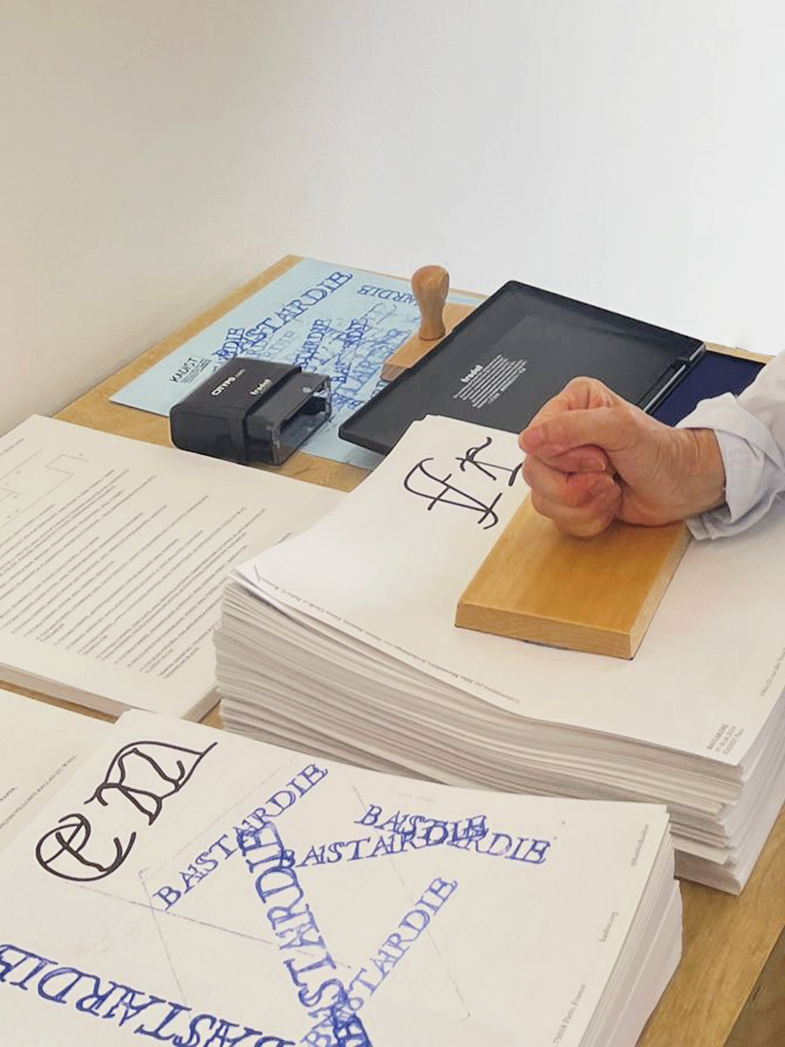
BASTARDIE
BRANDBastardie is a series of events and an exhibition at KADIST Paris that explore slang, jargon, and broader unconventional language practices, often referred to as ‘bastard’. The project aims to investigate their capacity to subvert official languages and broaden the scope of our expression.
IDENTITY
We made an experimental and provocative graphic, aligned with the spirit of the exhibition that questioned and subverted traditional visual norms.
Bastardie is a series of events and an exhibition at KADIST Paris that explore slang, jargon, and broader unconventional language practices, often referred to as ‘bastard’. The project aims to investigate their capacity to subvert official languages and broaden the scope of our expression.
IDENTITYWe made an experimental and provocative graphic, aligned with the spirit of the exhibition that questioned and subverted traditional visual norms.
Creating a chaotic design that defies legibility, using typical archival media, how to print it and a catalog with a print that you can print there, focusing on the letters "Bastardie" that deconstruct the classic Garamond.


GOOD GIRL SNACKS
BRANDGood Girl Snacks is about creating Gen Z’s favorite snacks for girls.
IDENTITY
Good Girl Snacks is about creating Gen Z’s favorite snacks for girls.
Is the only snack company of market competition that builds for Gen Z. The brand builds flavor innovation by infusing Middle Eastern flavors with the traditional American. The company wants to expand its range to other products in the future. They want to cultivate a community of people that care about snacks and aesthetics.
IDENTITYThe identity has as its concept friendship, with positive thinking and healthy life. GGS aims to create a community and to do so we have created two characters, GG, a young entrepreneur who represents the co-founders, and PIK, a deconstructed cucumber, who together have adventures and have fun. The identity has many colors, all of them bright and cheerful, which are combined with fun fonts and illustrations.
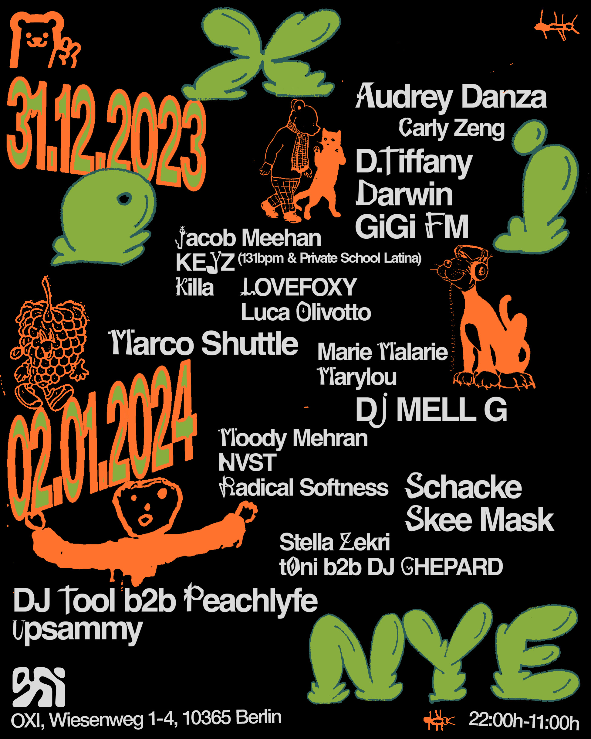
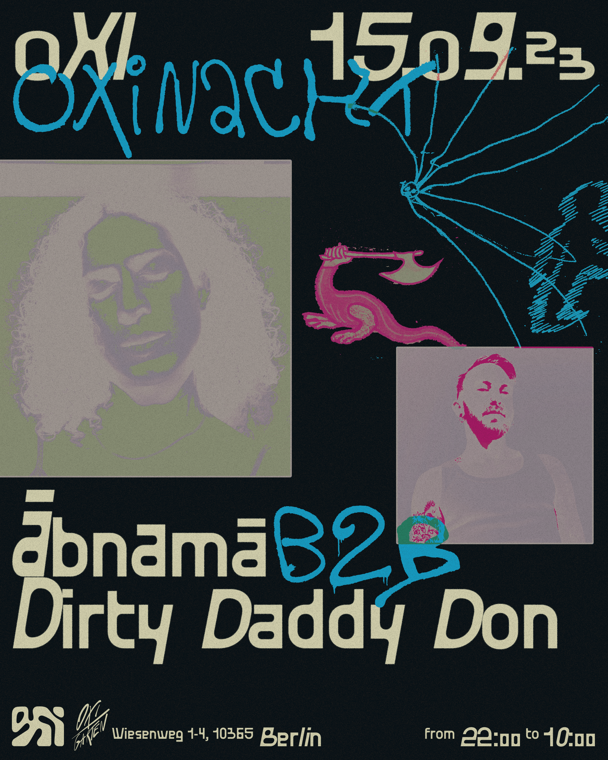
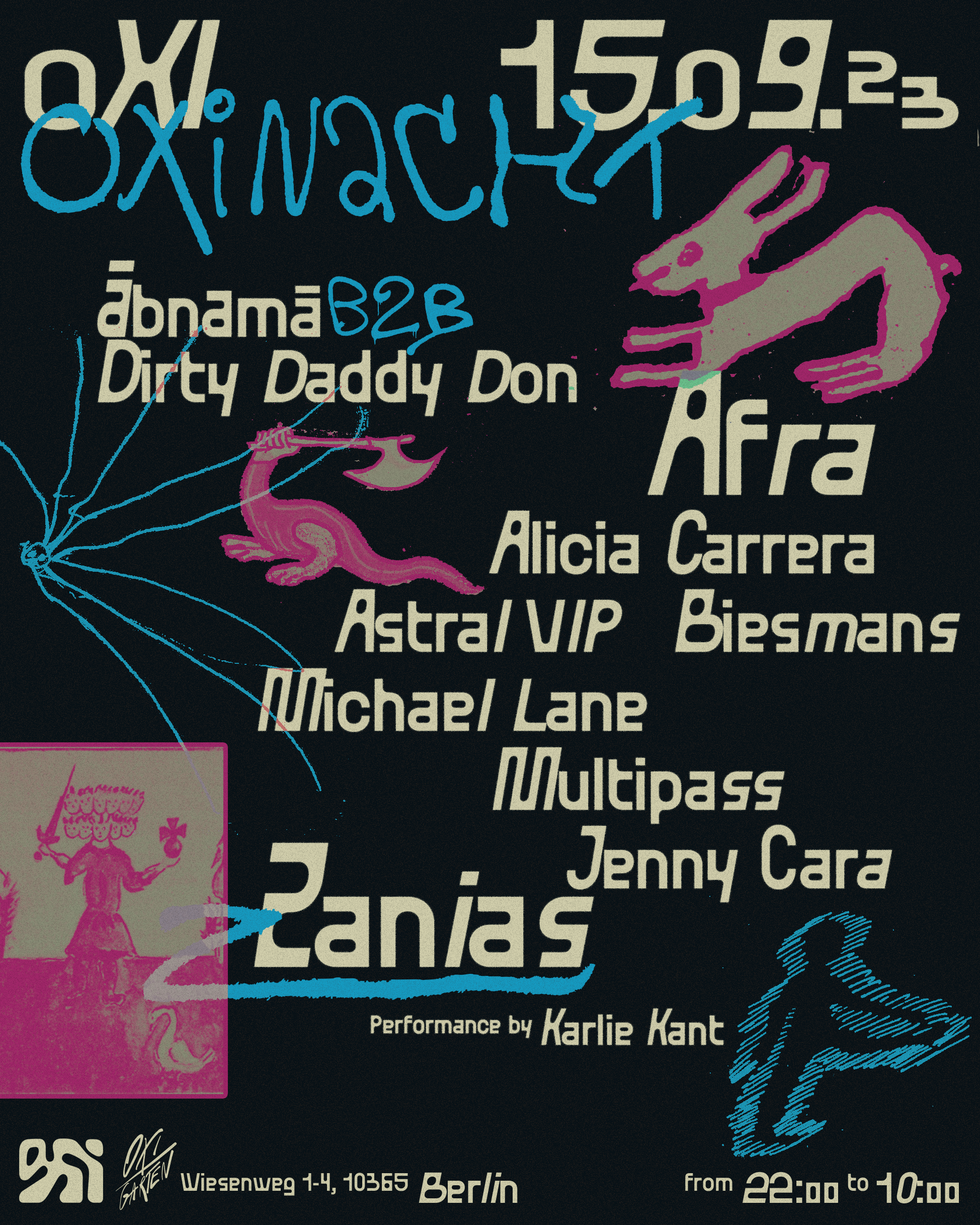
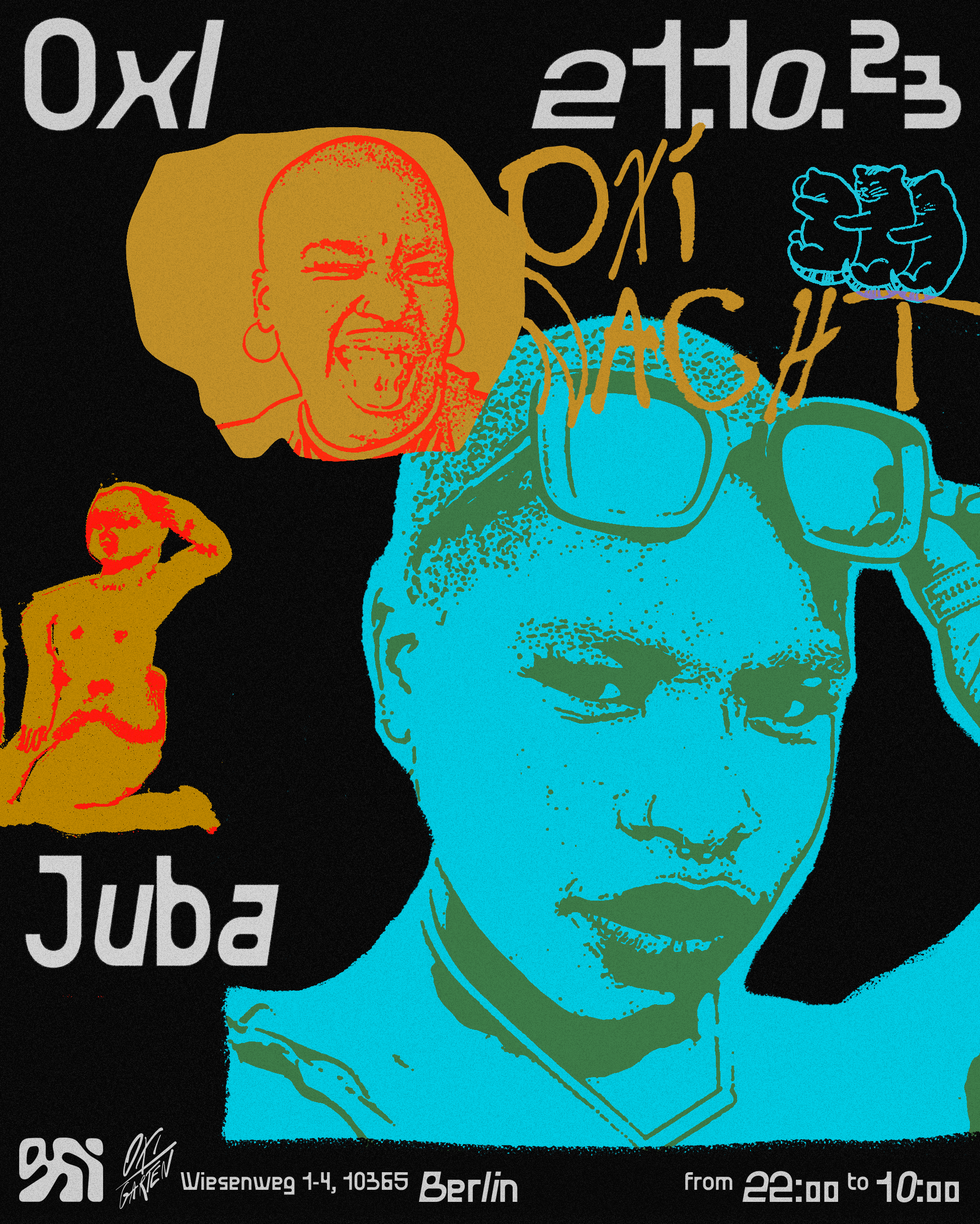
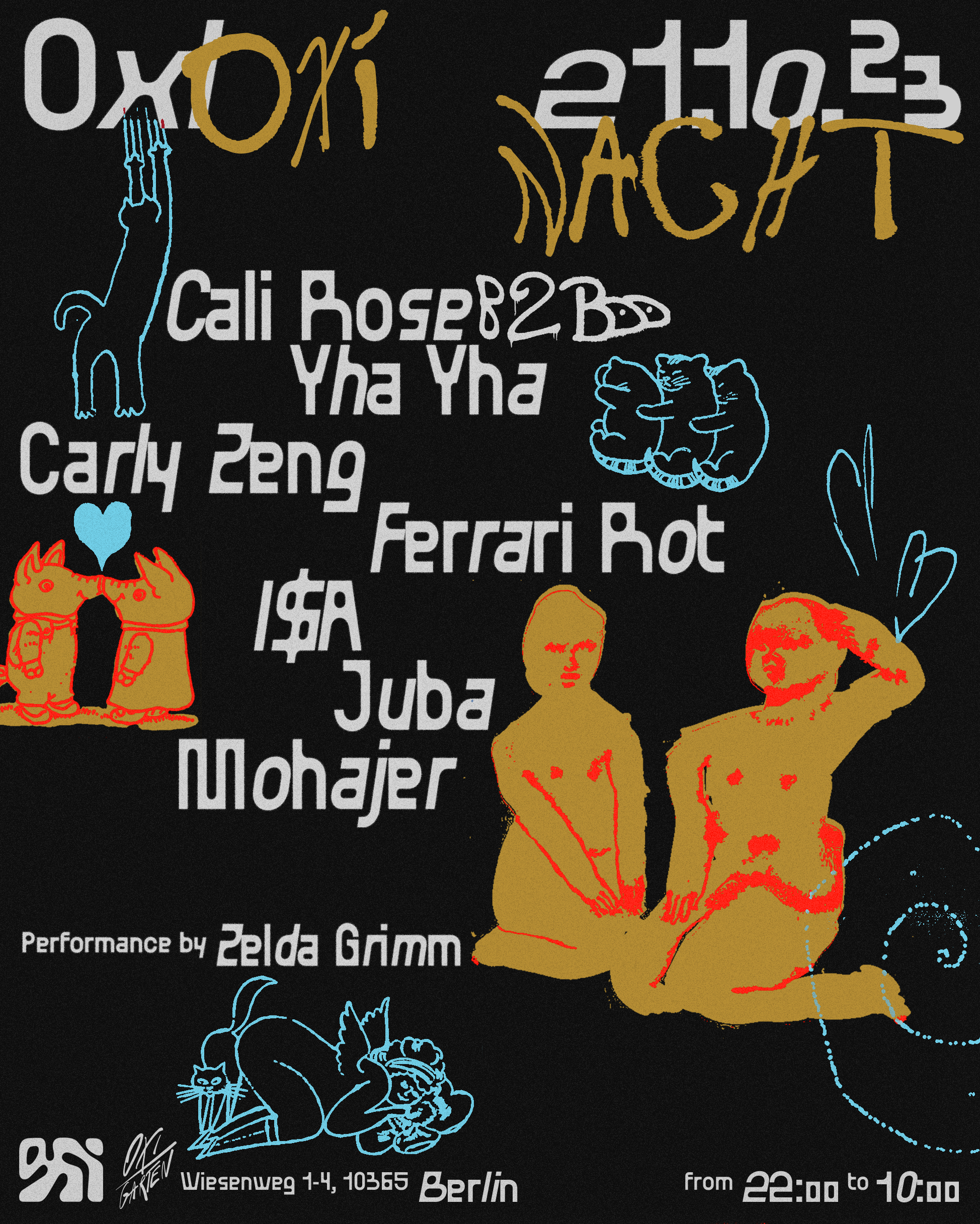
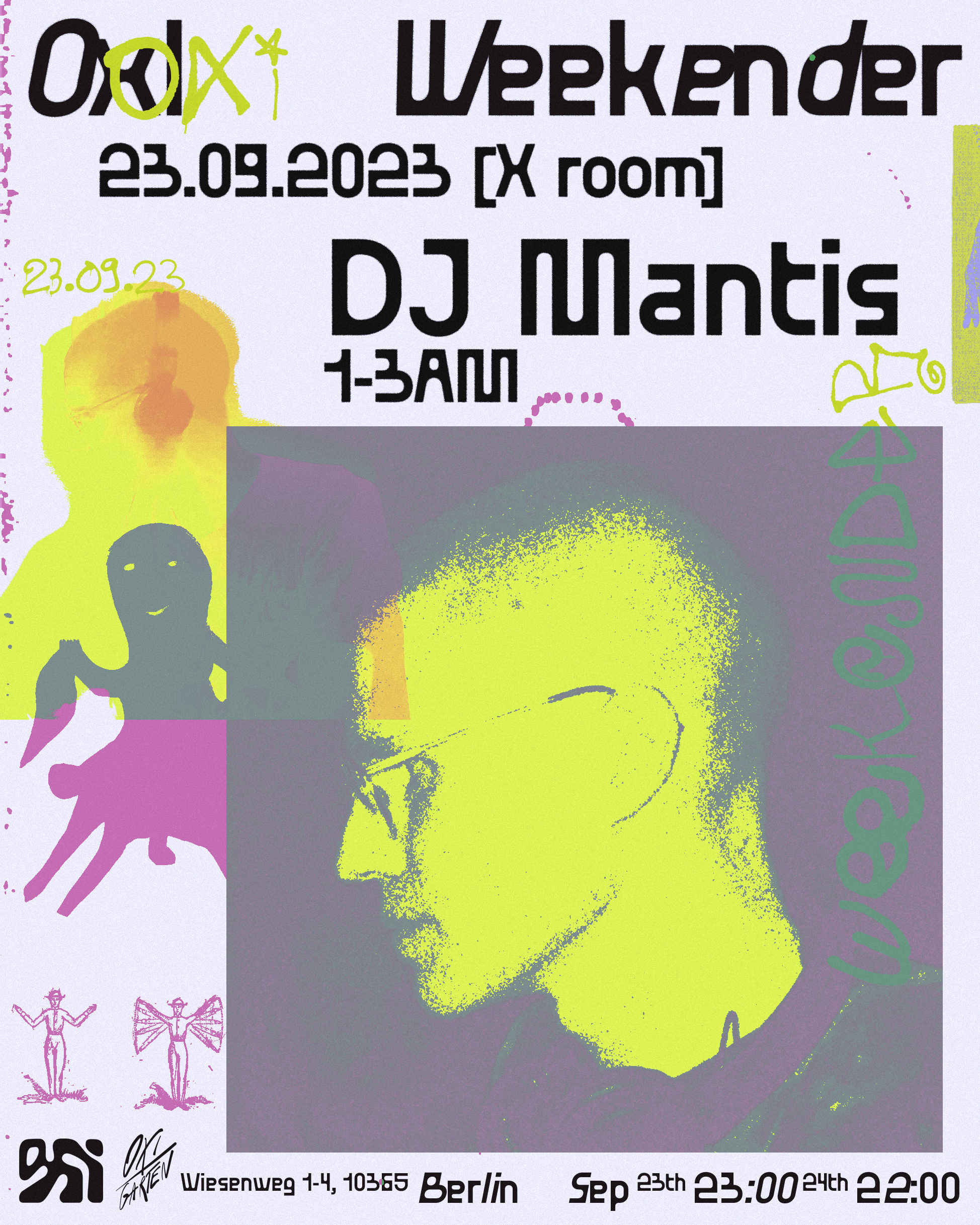
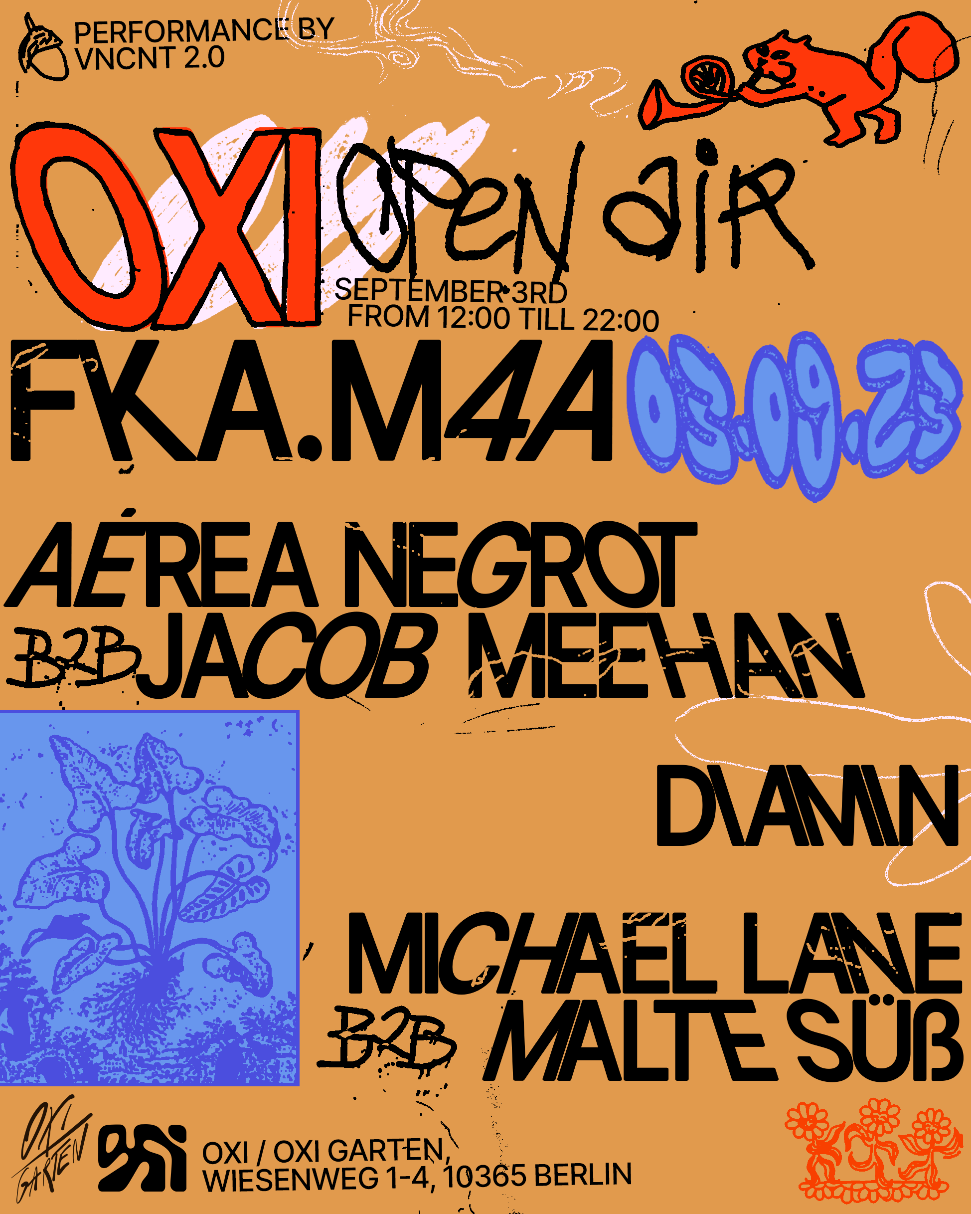
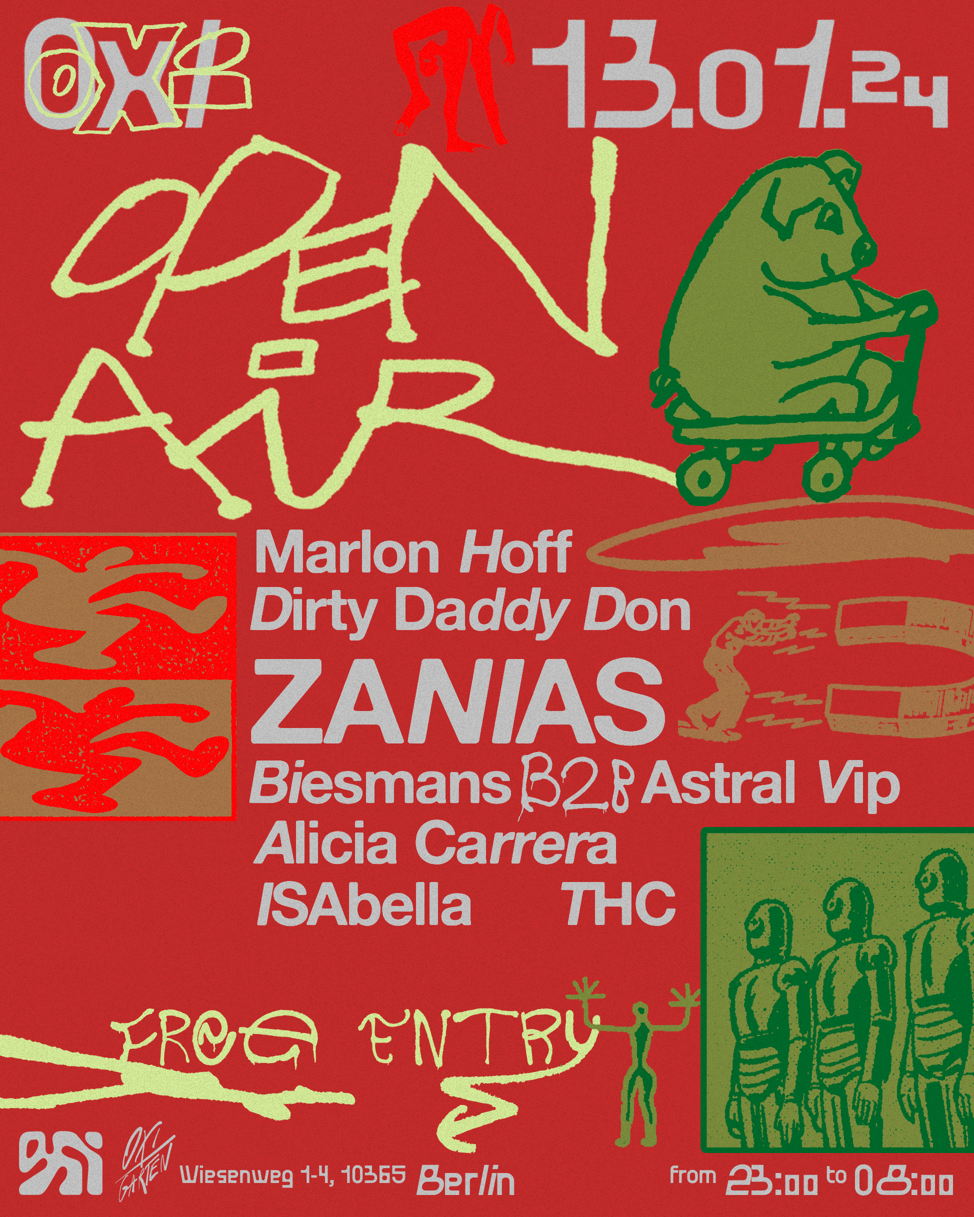
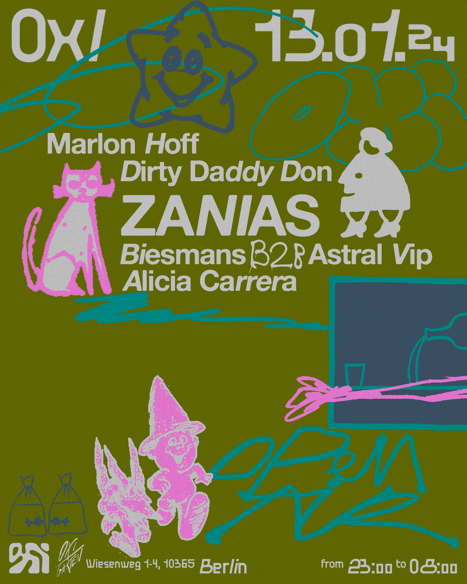
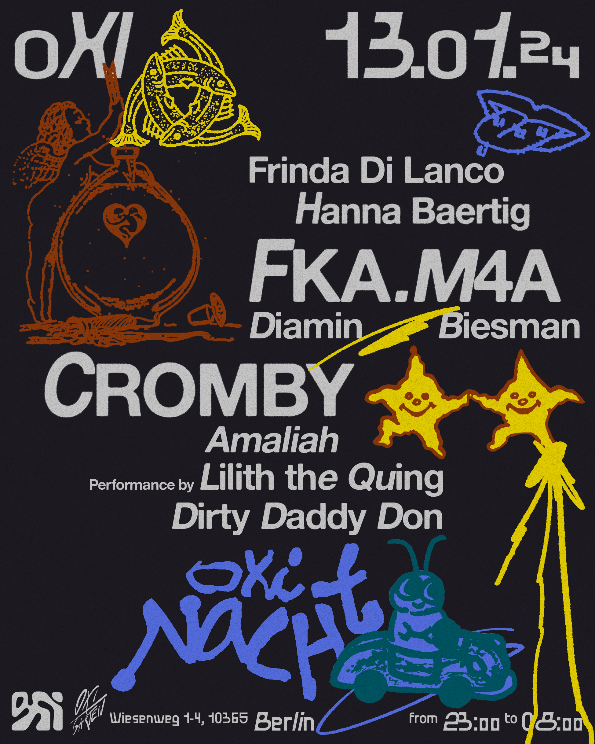
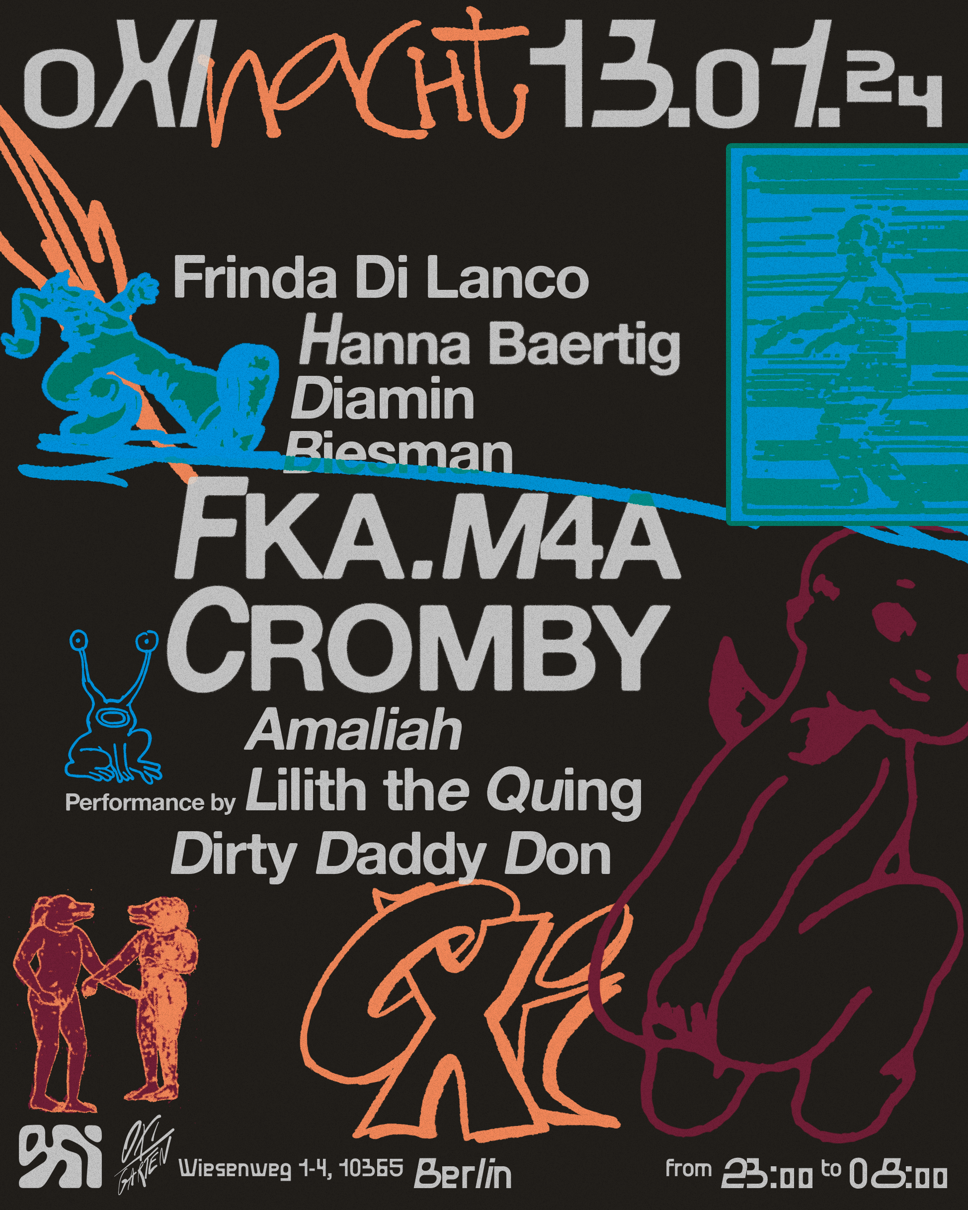
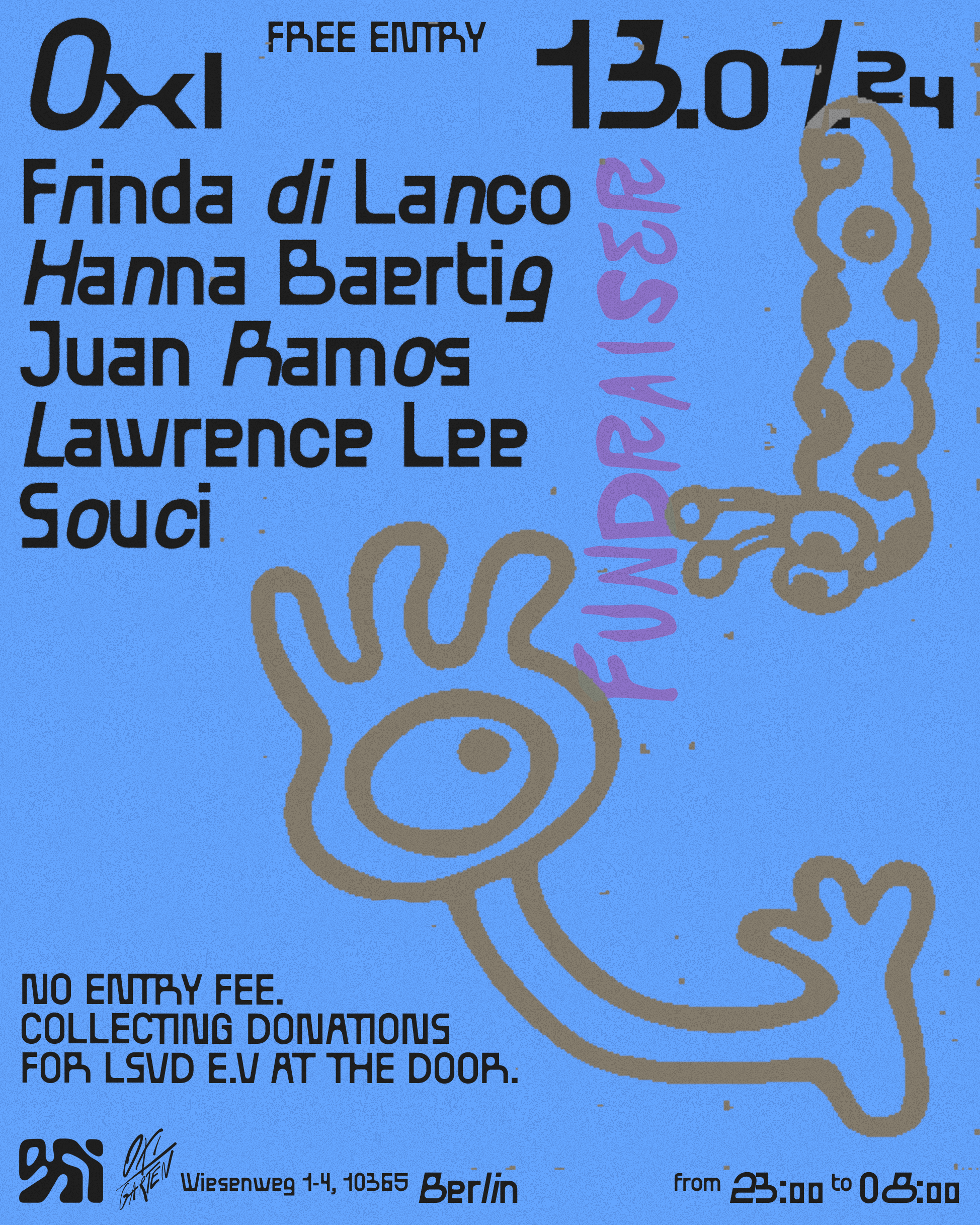
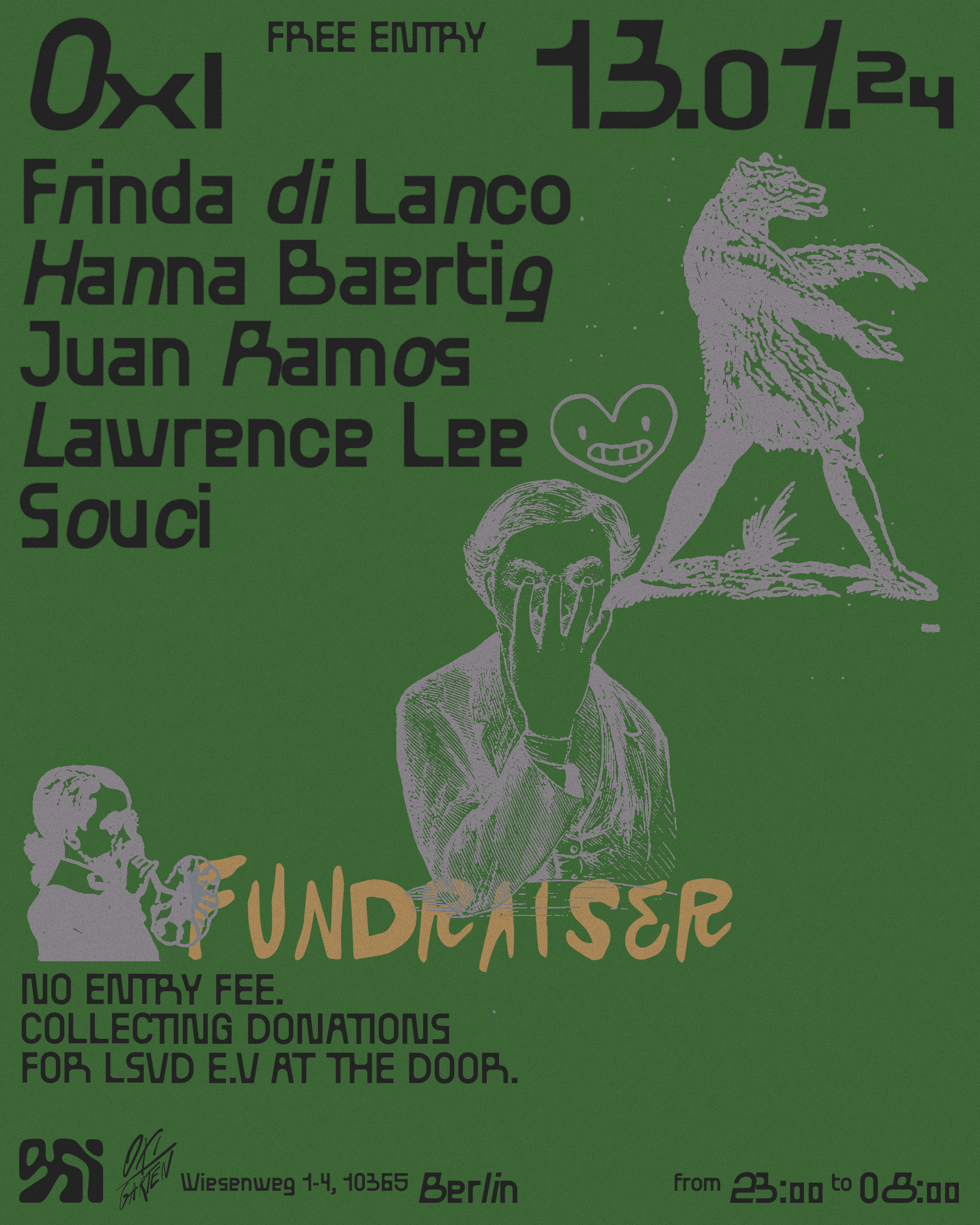
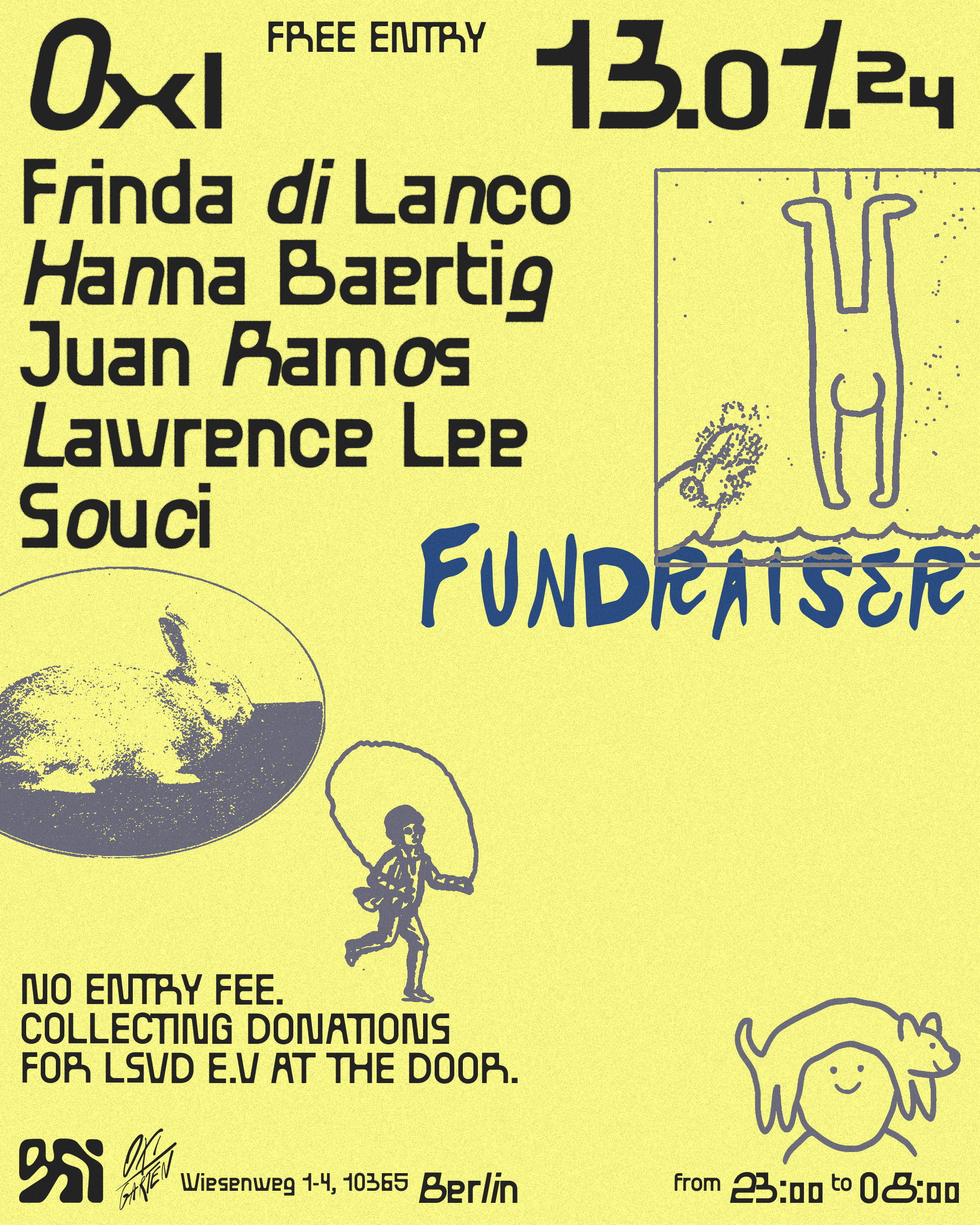
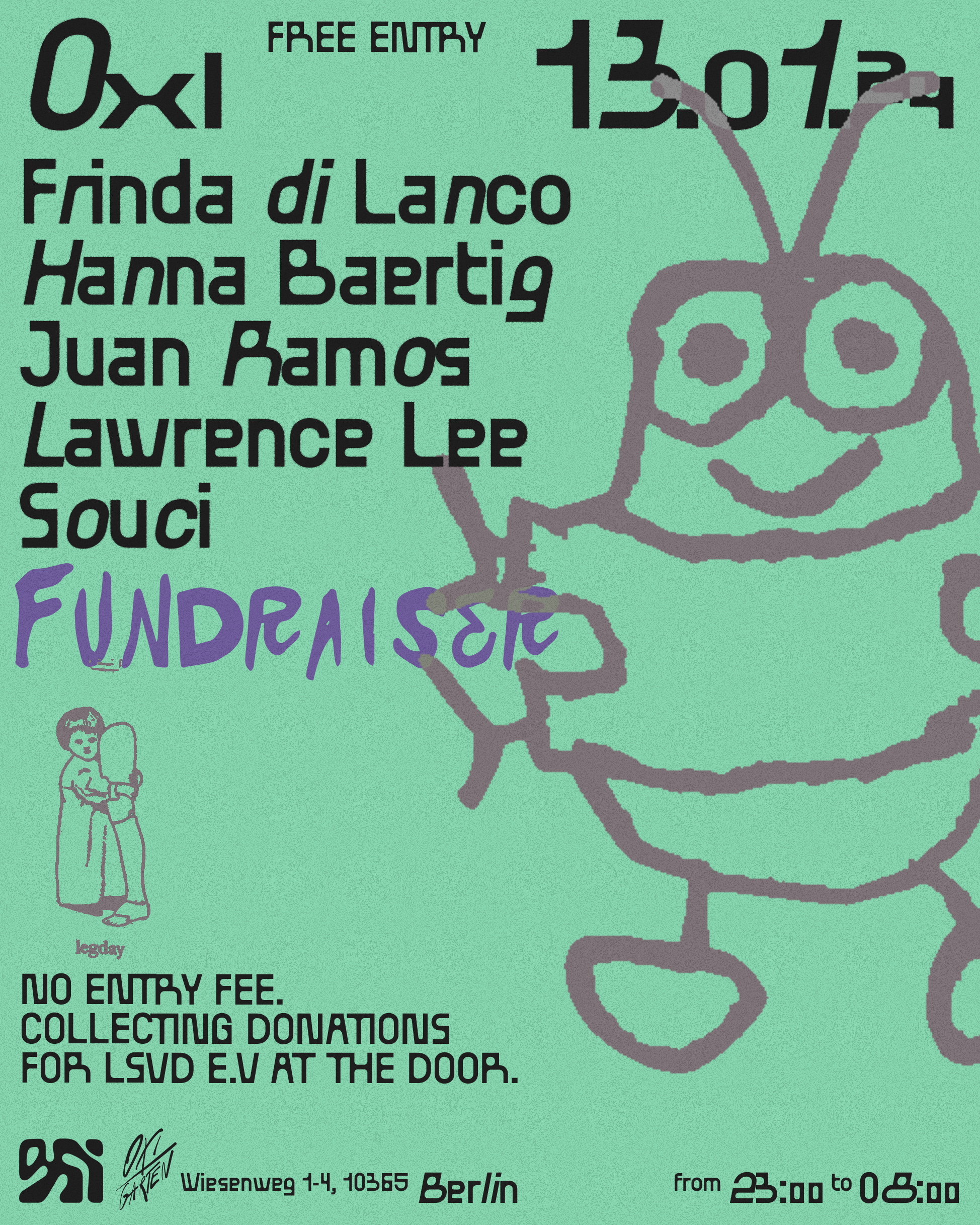
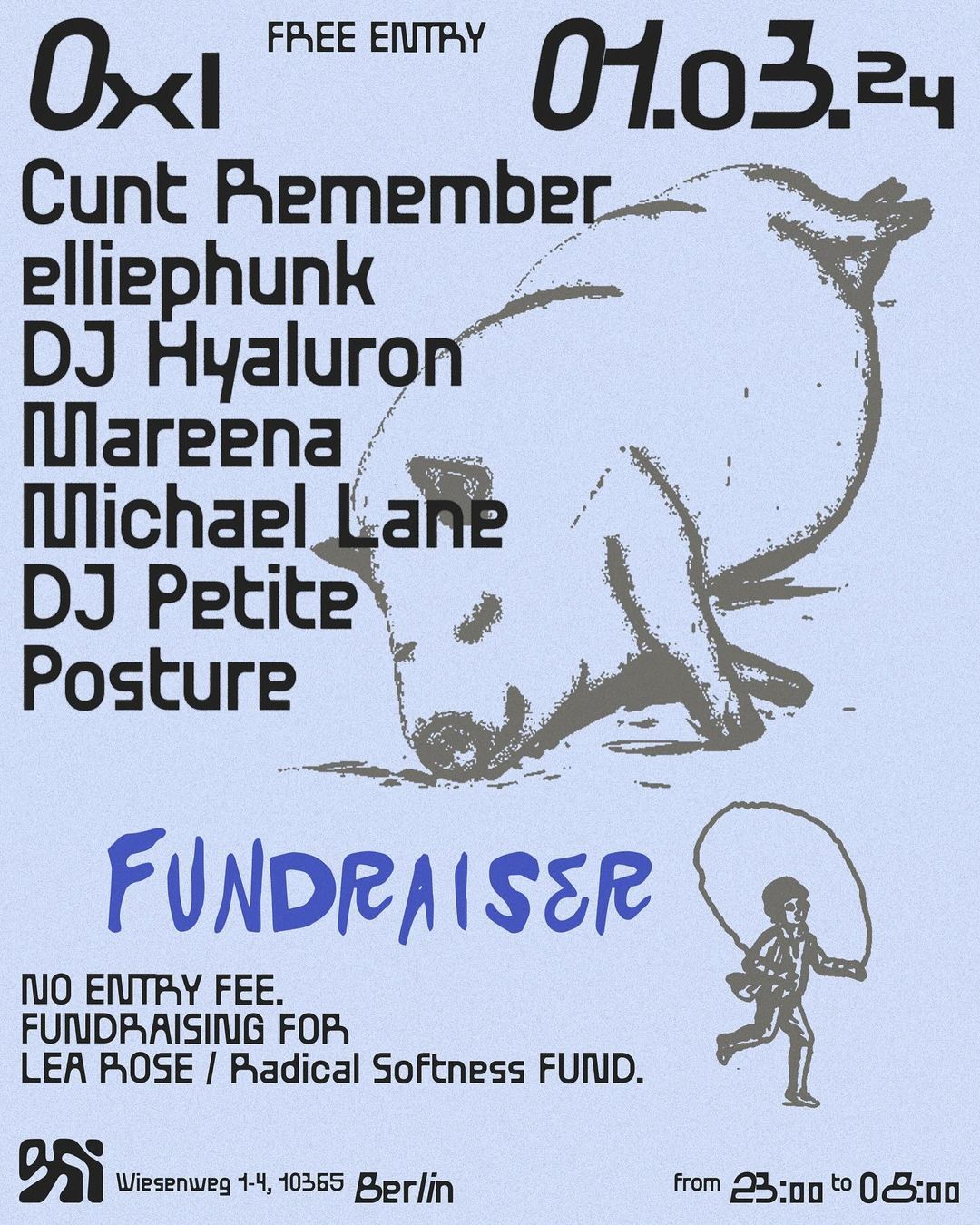
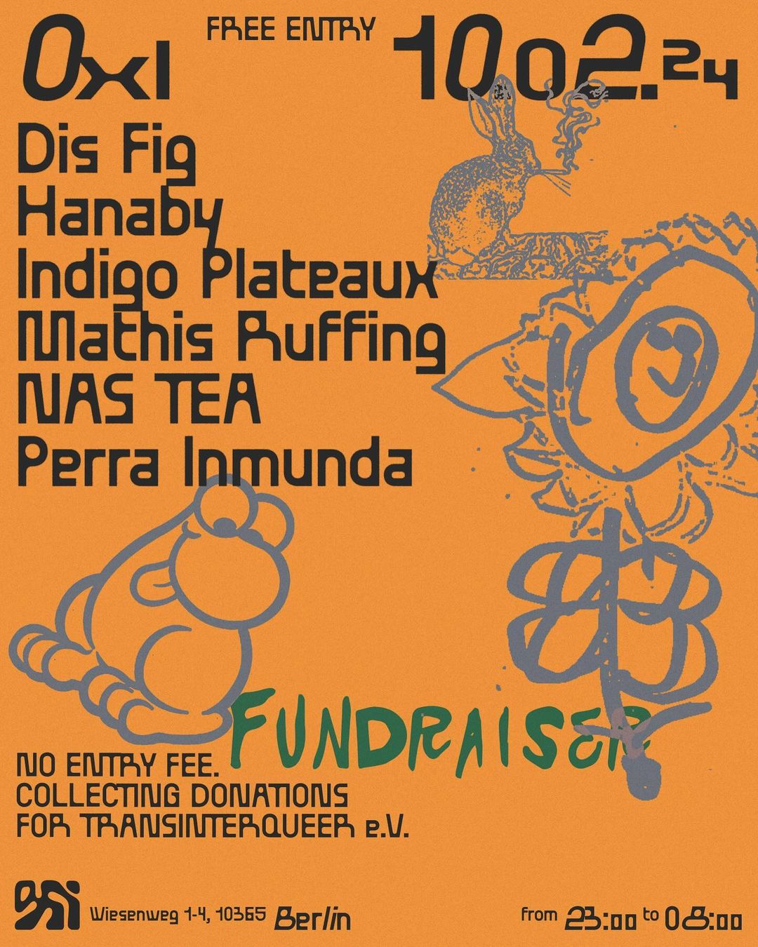
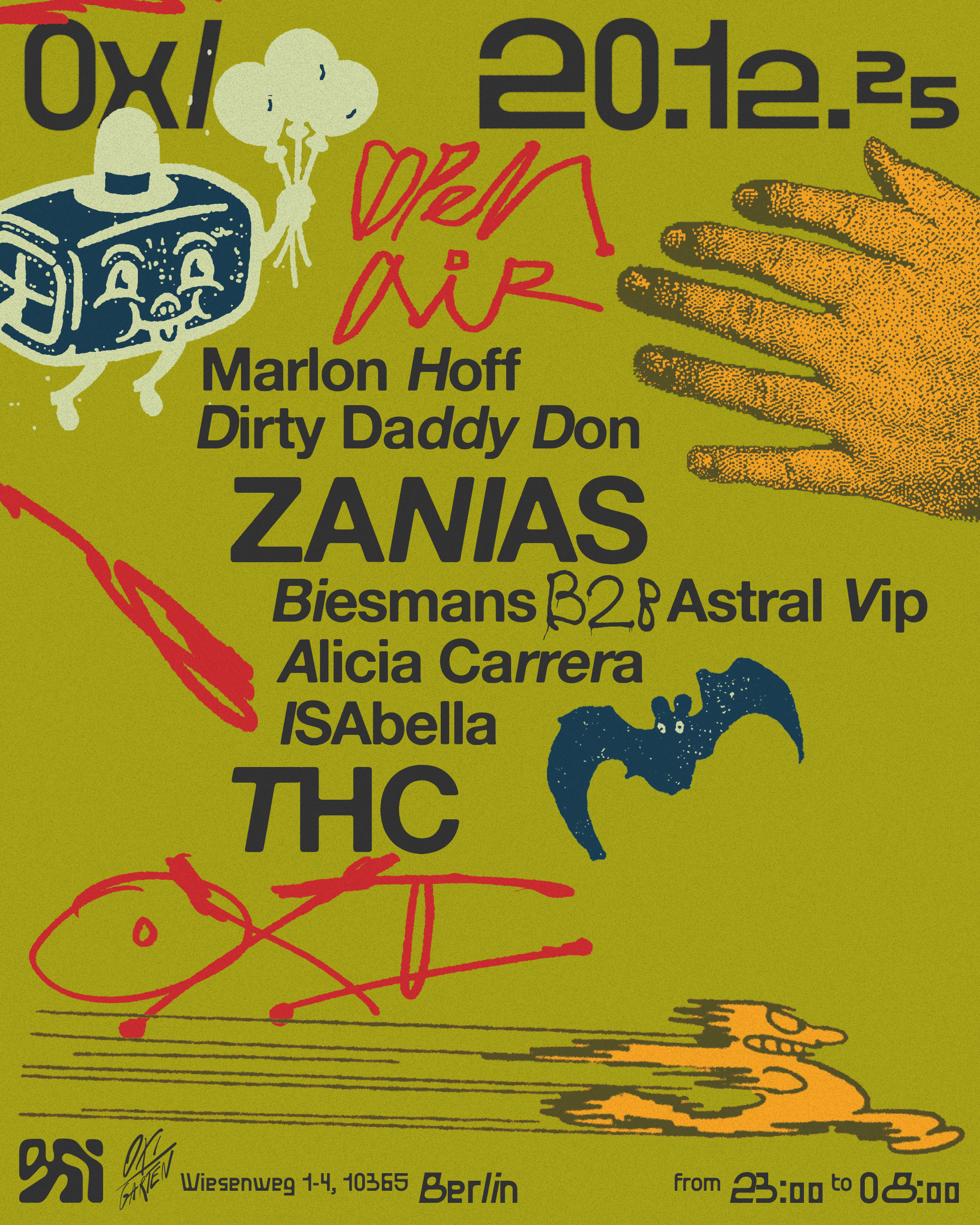
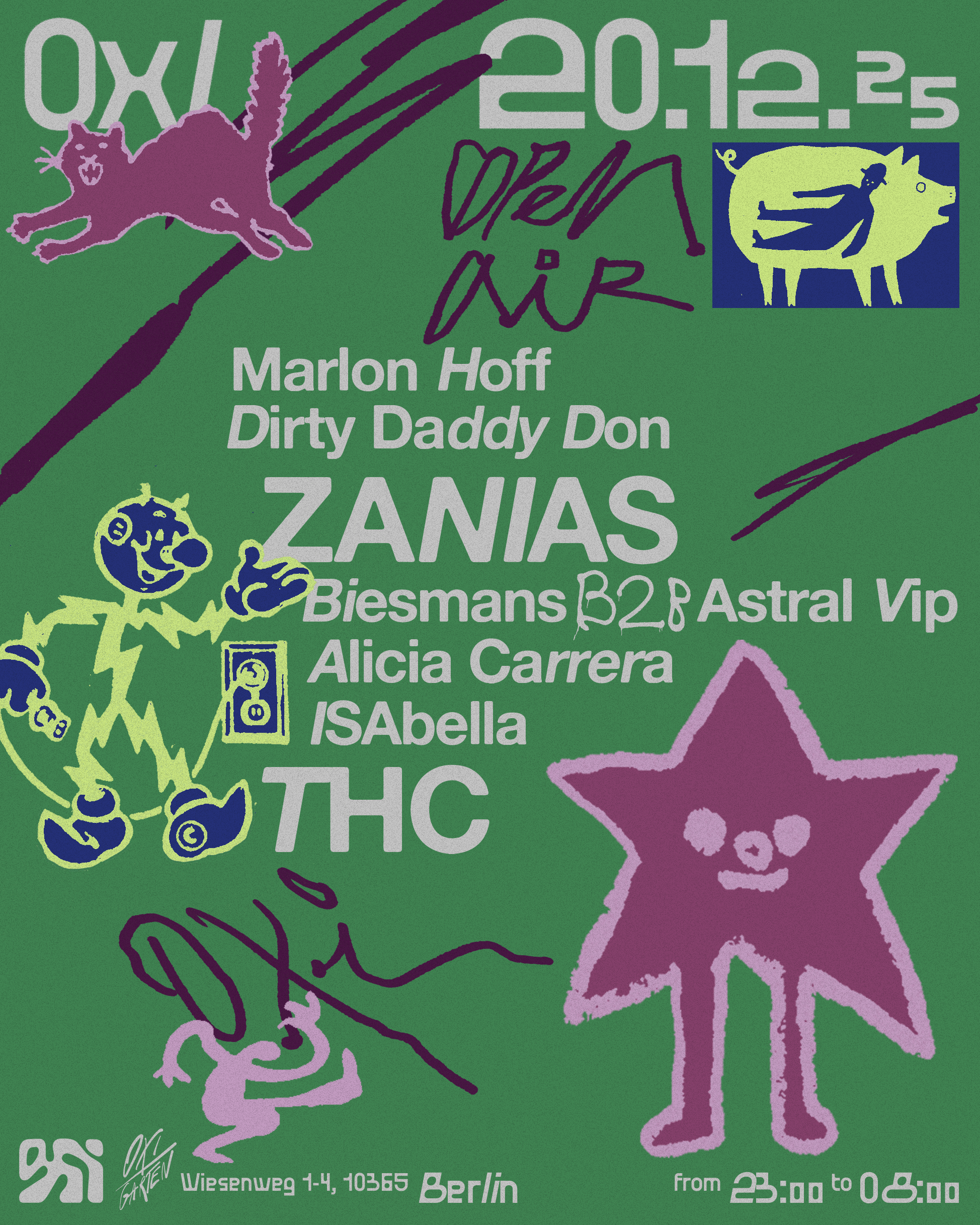
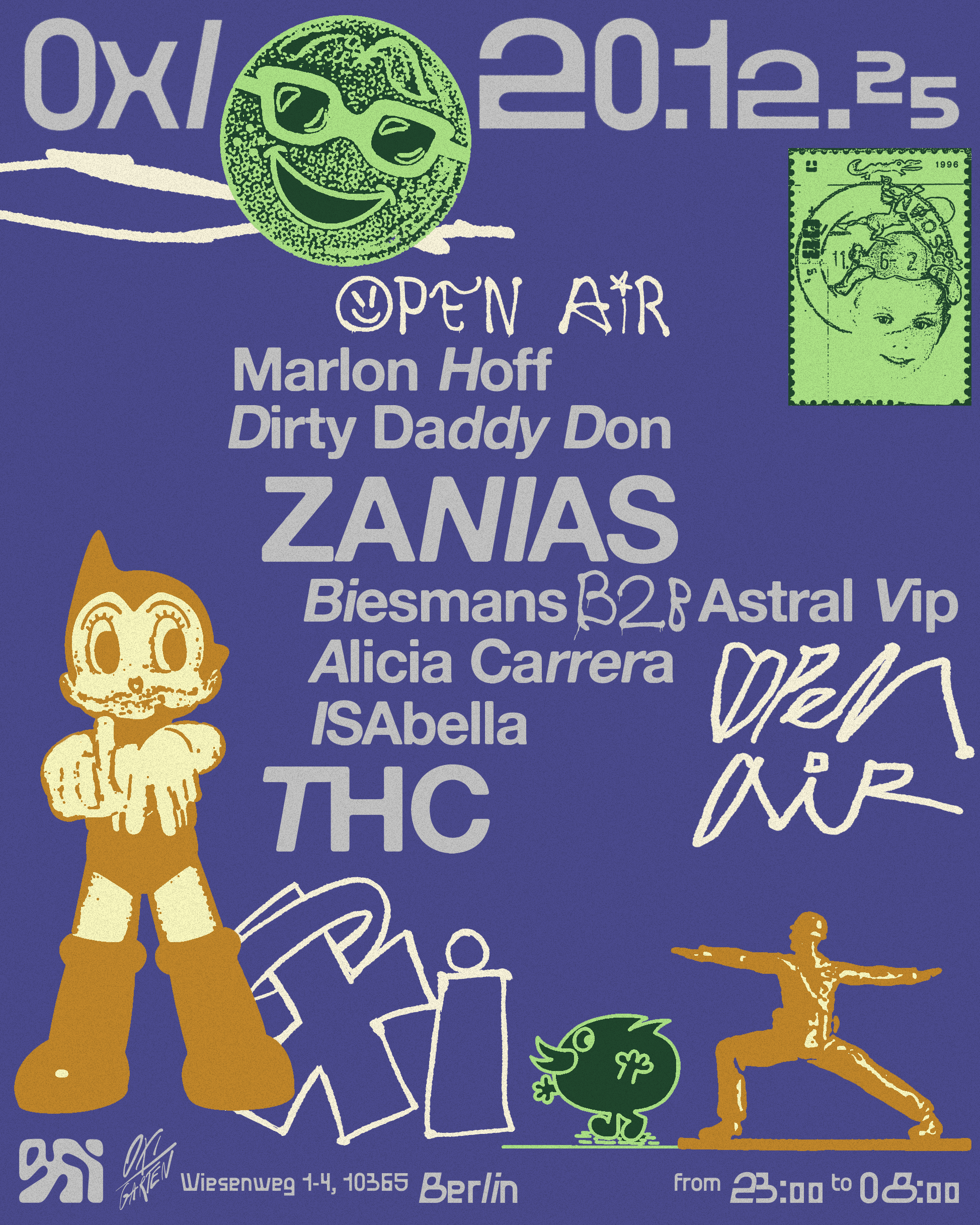
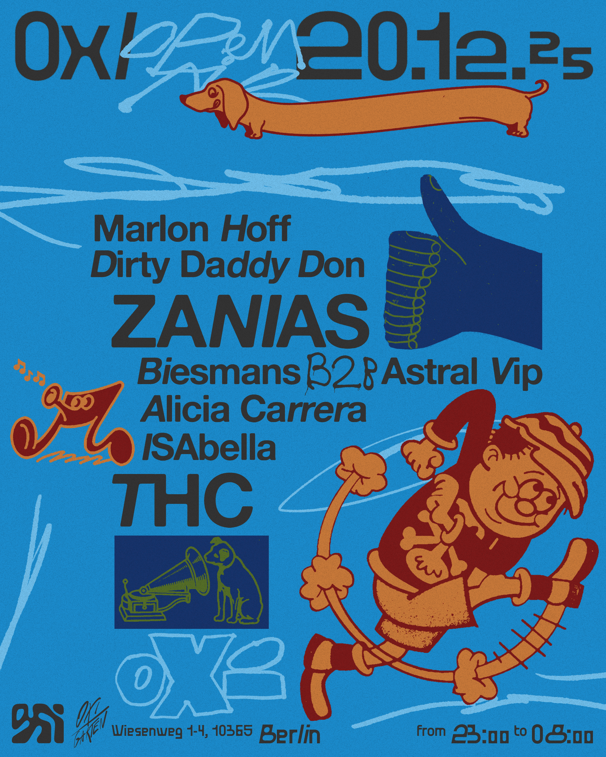
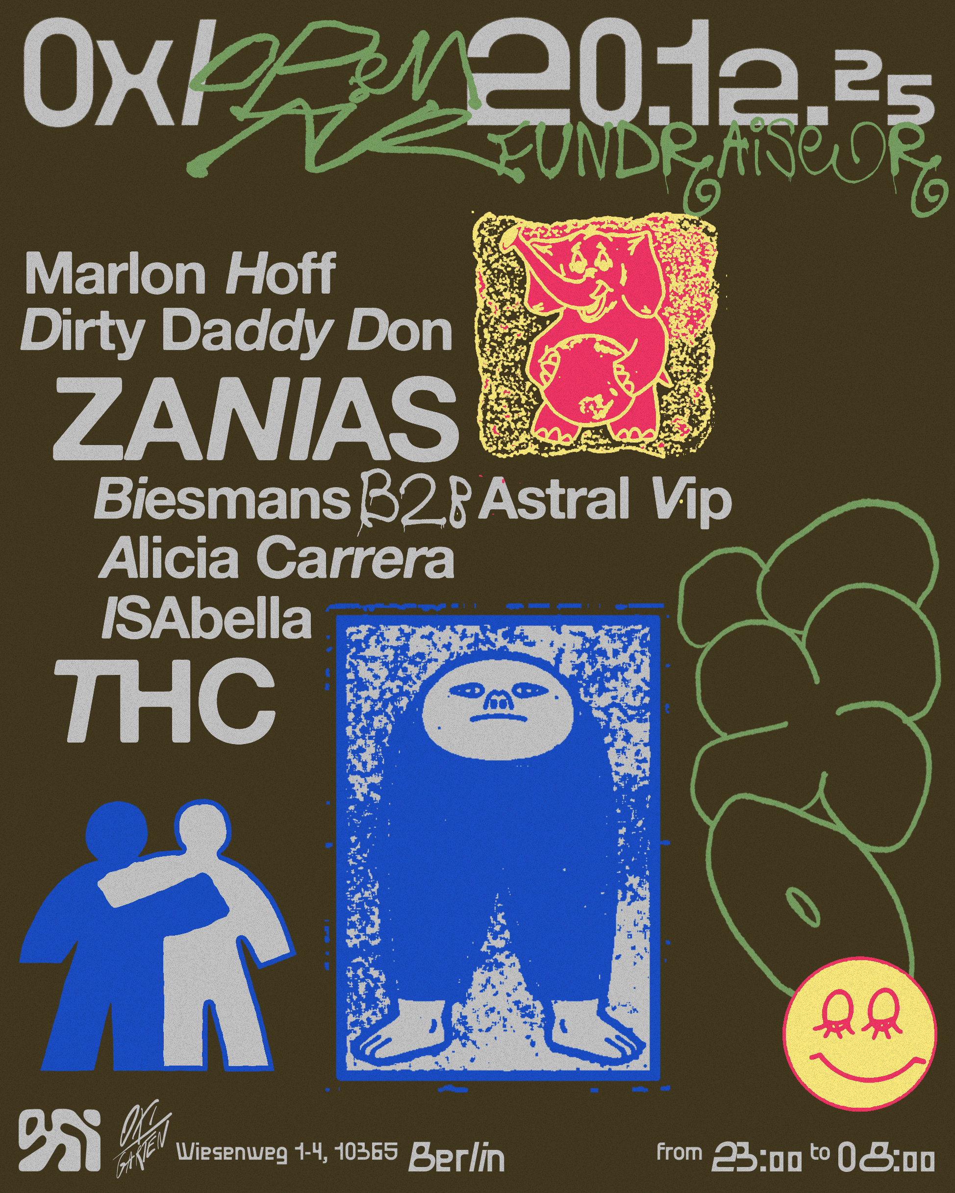
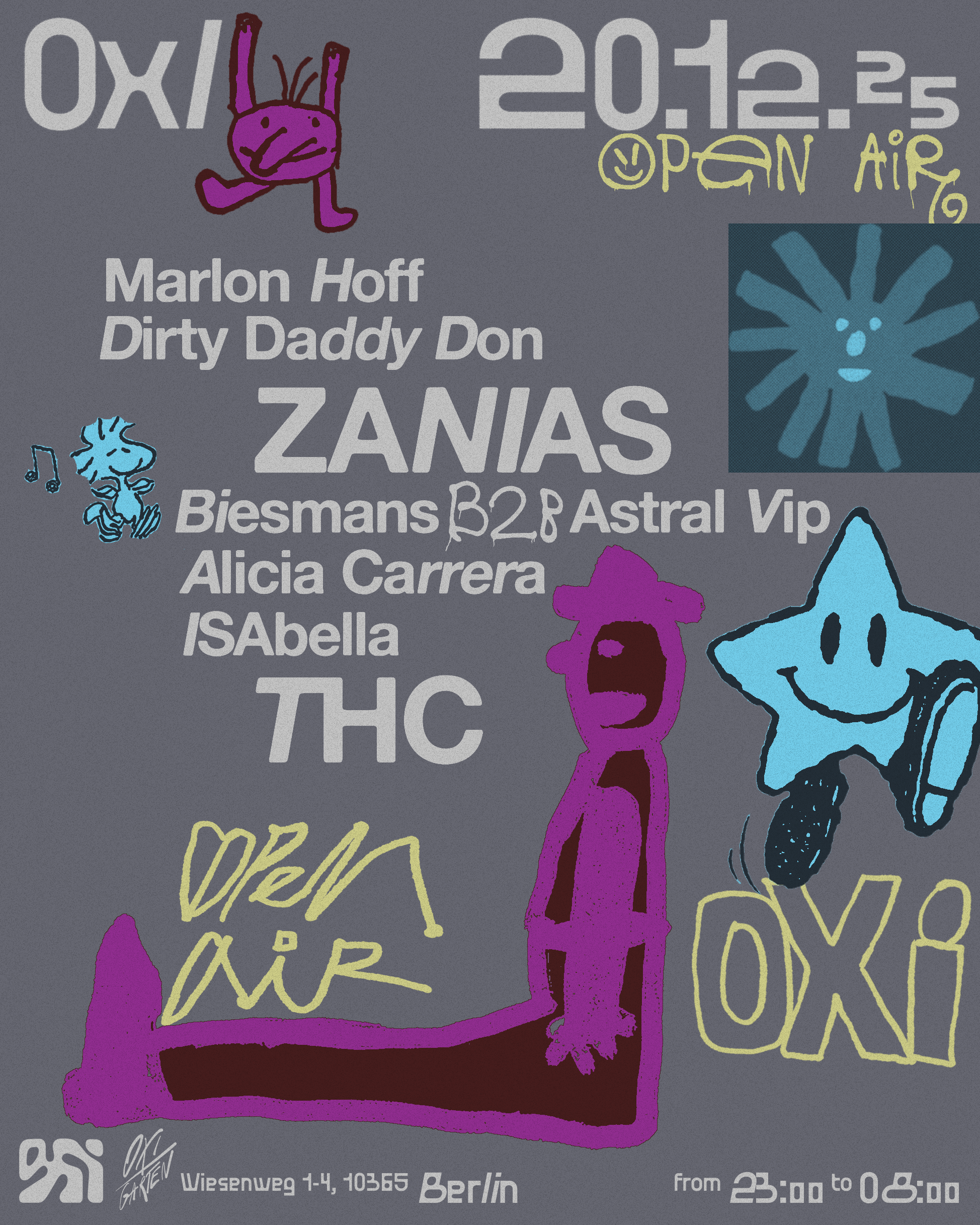
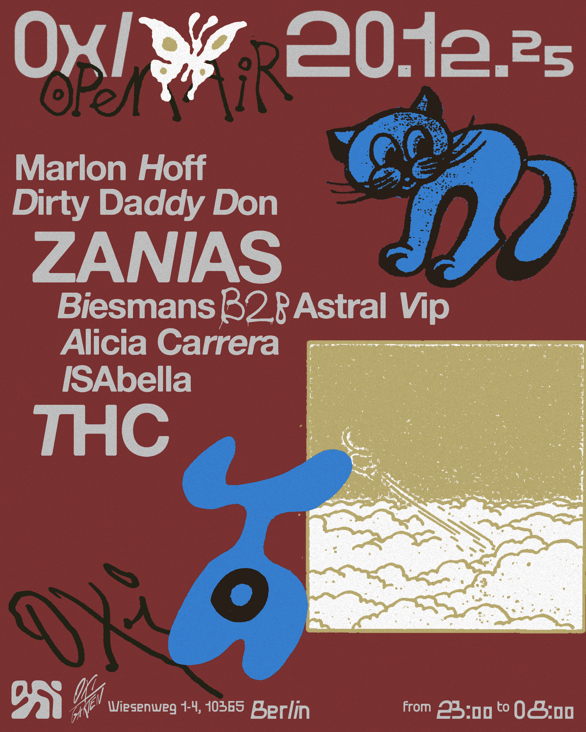
OXI CLUB
BRANDLocated in Friedrichshain, OXI is a vibrant, queer-friendly nightclub known for its inclusive, body-positive atmosphere, cutting-edge sound systems, and industrial design. We developed the concept of plurality for OXI, uniting its diverse spaces—physical venues, programmed events, and activities—into a cohesive identity.
IDENTITY
OXI’s visual identity blends digital and analog with an eclectic, retro, and comic-inspired style, creating a friendly, festive vibe that matches the club’s energy. Each month, three key colors drive visual cohesion, evolving with time.
Located in Friedrichshain, OXI is a vibrant, queer-friendly nightclub known for its inclusive, body-positive atmosphere, cutting-edge sound systems, and industrial design. We developed the concept of plurality for OXI, uniting its diverse spaces—physical venues, programmed events, and activities—into a cohesive identity.
OXI is where music, art, and community are in constant evolution.
IDENTITY
OXI’s visual identity blends digital and analog with an eclectic, retro, and comic-inspired style, creating a friendly, festive vibe that matches the club’s energy. Each month, three key colors drive visual cohesion, evolving with time.
Flyers feature custom typography and fluid shapes derived from the logo, adapting to each event while maintaining brand consistency.
The result is a unique, flexible identity that captures OXI’s experimental essence.
CLIENT
OXI
SERVICES
Brand Analisis
Strategy
Creative direction
Art direction
Identity
Illustrations
Templates
Artworks
YEAR
2023-2024
LINKS
Instagram
OXI
SERVICES
Brand Analisis
Strategy
Creative direction
Art direction
Identity
Illustrations
Templates
Artworks
YEAR
2023-2024
LINKS


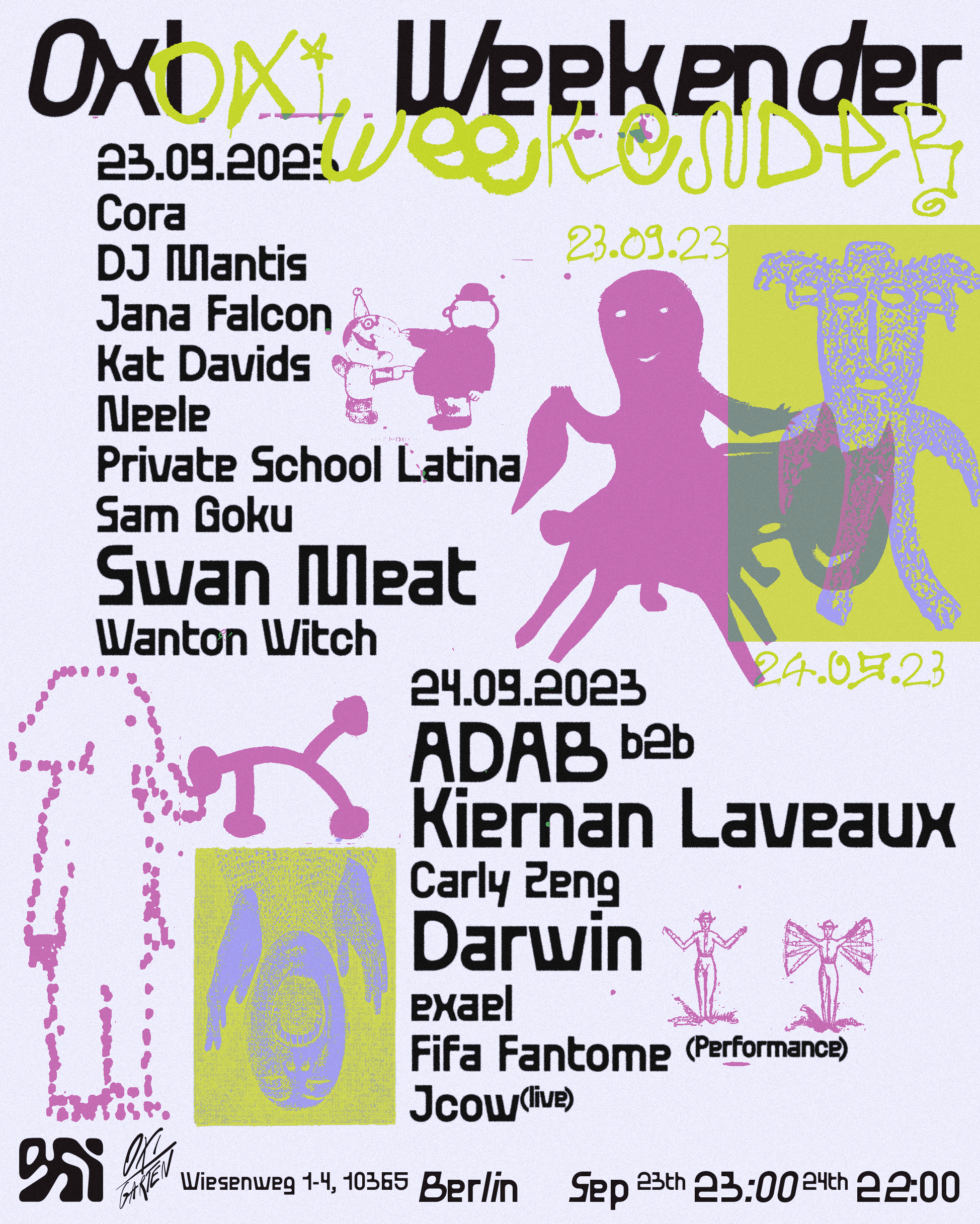


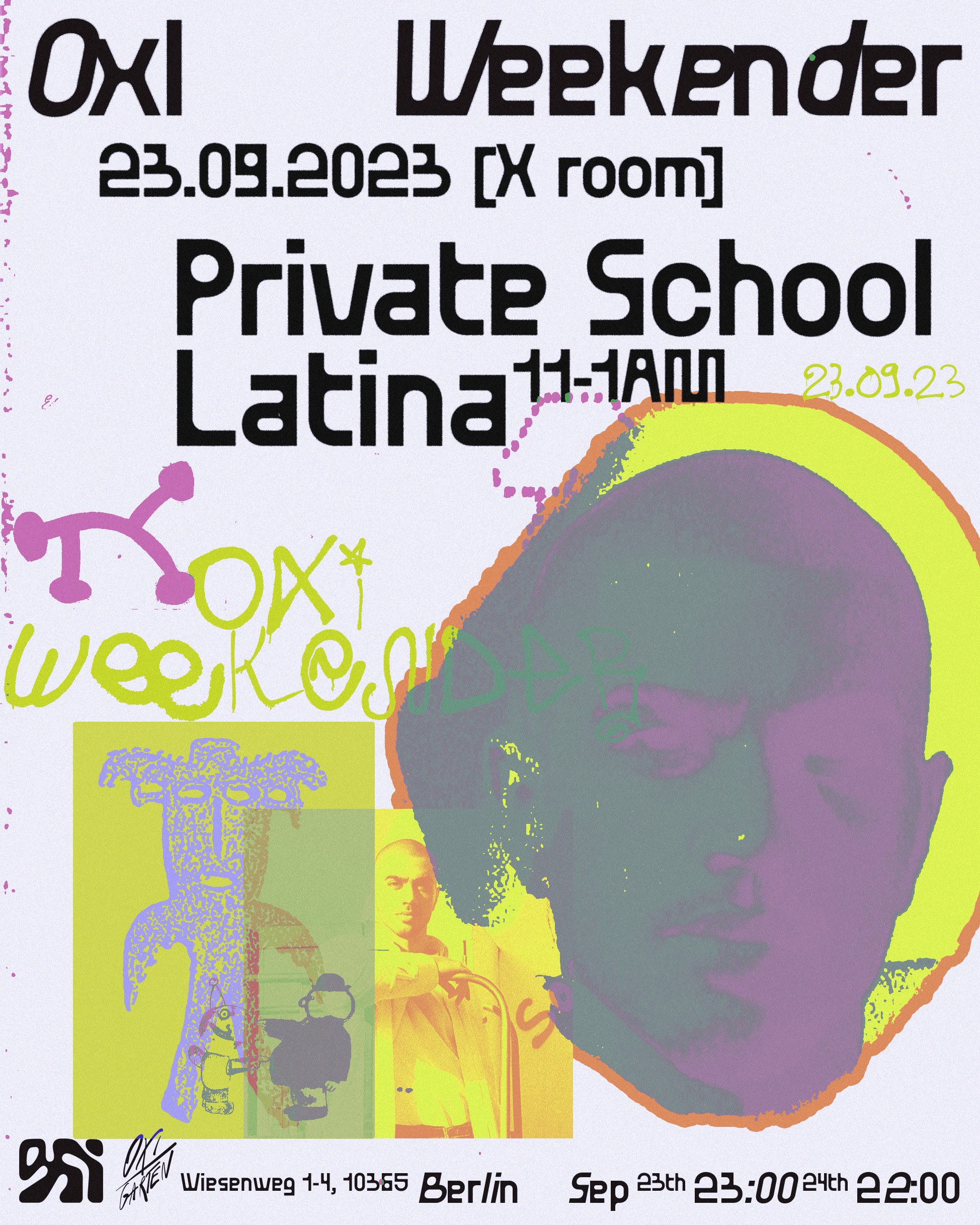

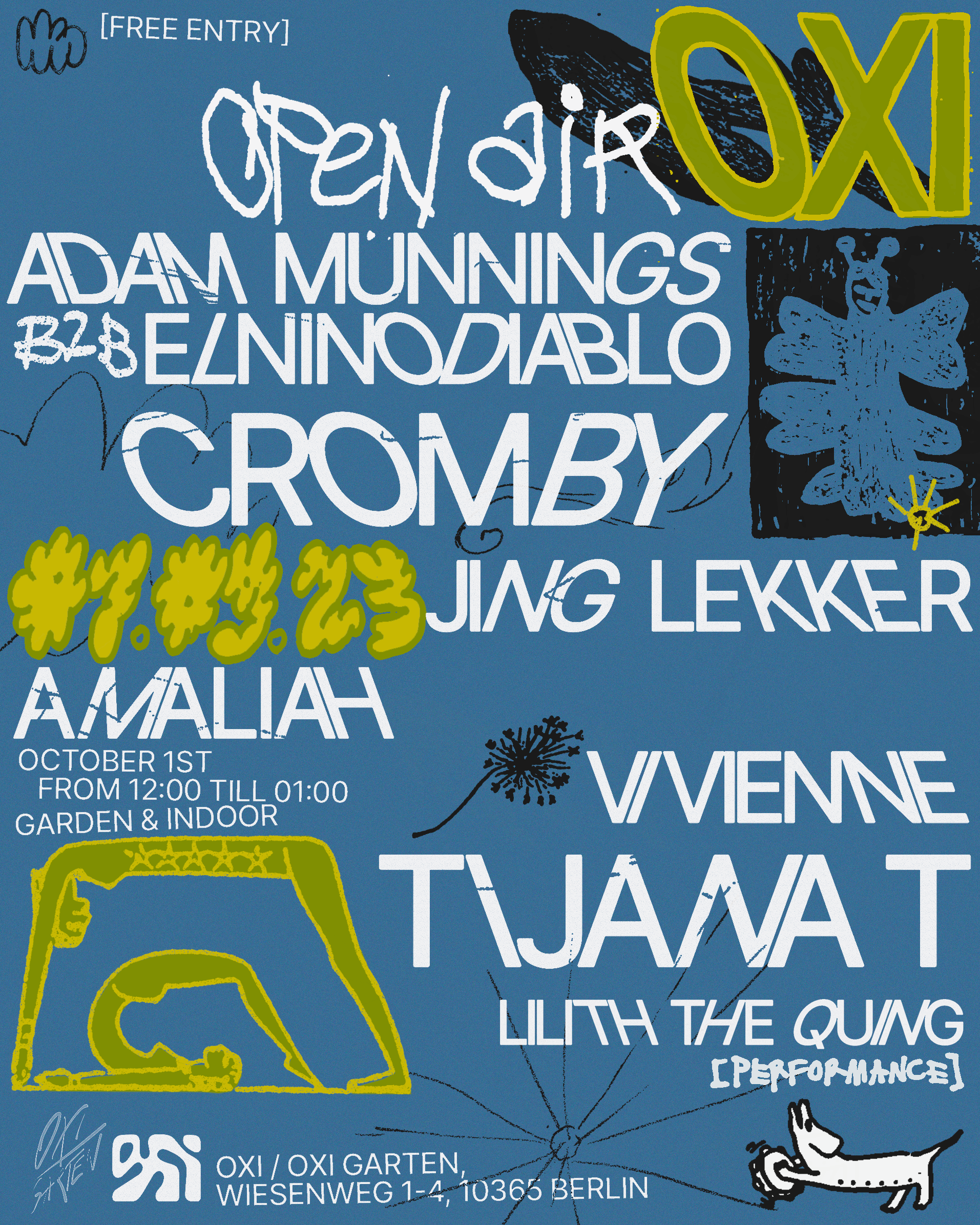
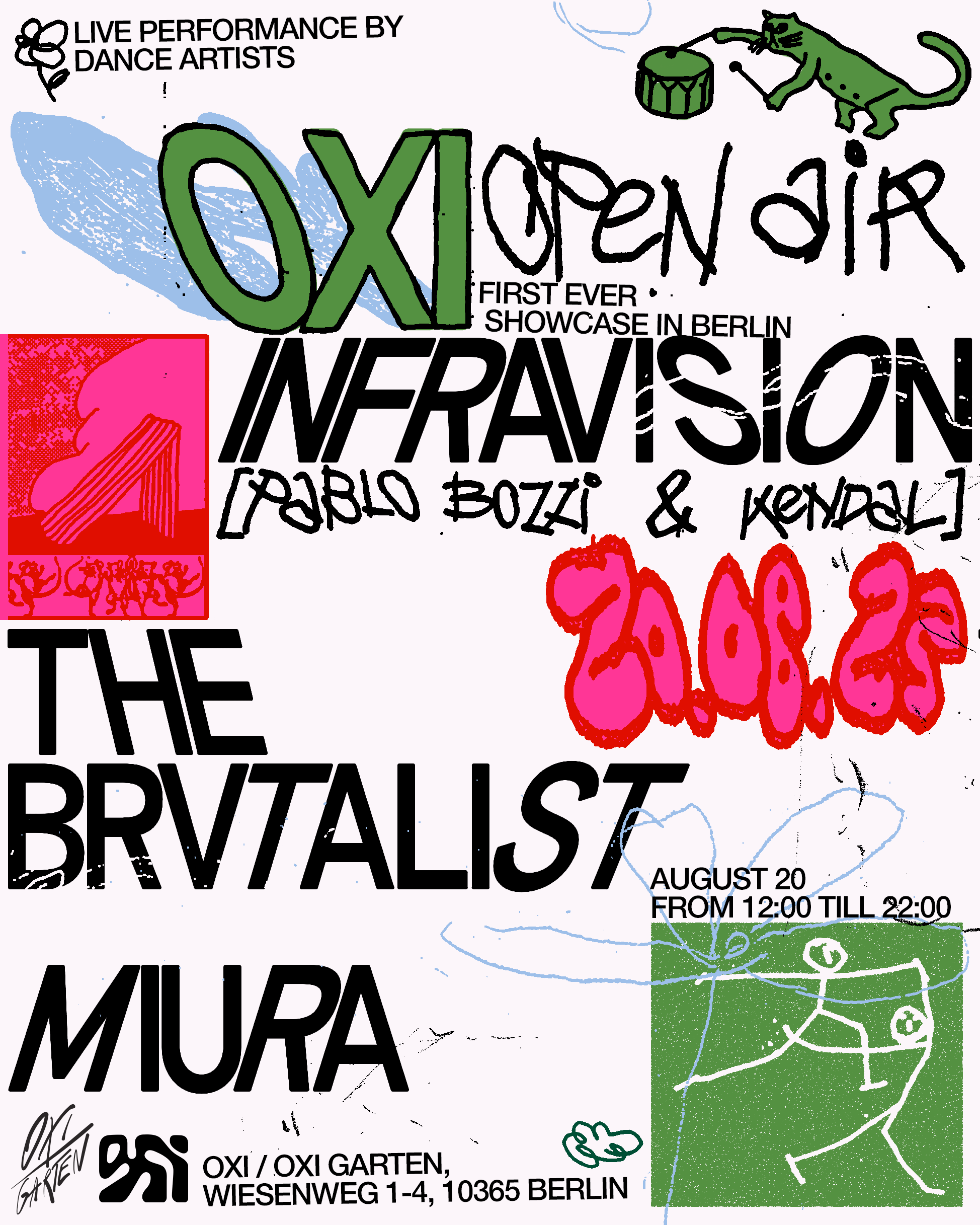

EVENT TEMPLATES


GOOD GIRL SNACKS
BRANDGood Girl Snacks is about creating Gen Z’s favorite snacks for girls.
IDENTITY
Good Girl Snacks is about creating Gen Z’s favorite snacks for girls.
Is the only snack company of market competition that builds for Gen Z. The brand builds flavor innovation by infusing Middle Eastern flavors with the traditional American. The company wants to expand its range to other products in the future. They want to cultivate a community of people that care about snacks and aesthetics.
IDENTITYThe identity has as its concept friendship, with positive thinking and healthy life. GGS aims to create a community and to do so we have created two characters, GG, a young entrepreneur who represents the co-founders, and PIK, a deconstructed cucumber, who together have adventures and have fun. The identity has many colors, all of them bright and cheerful, which are combined with fun fonts and illustrations.


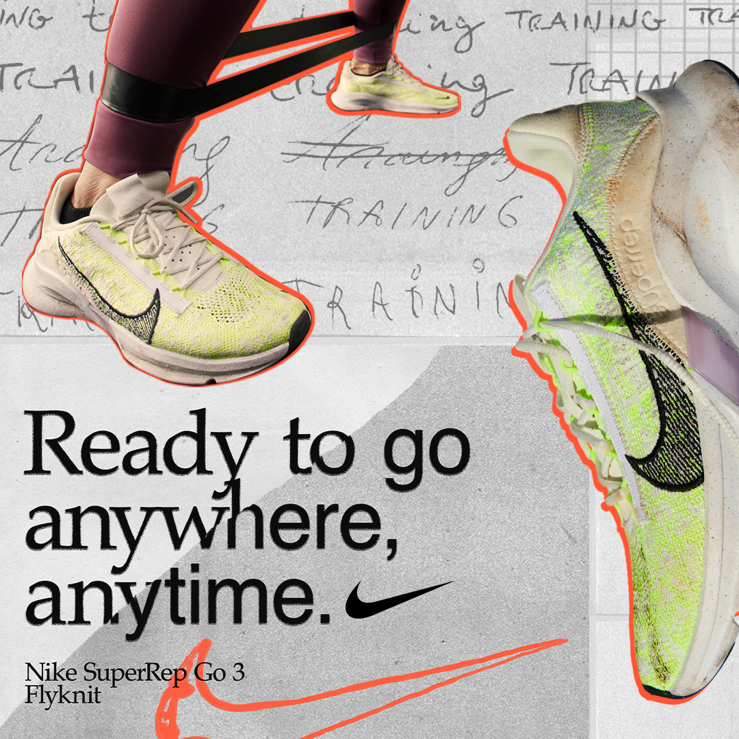
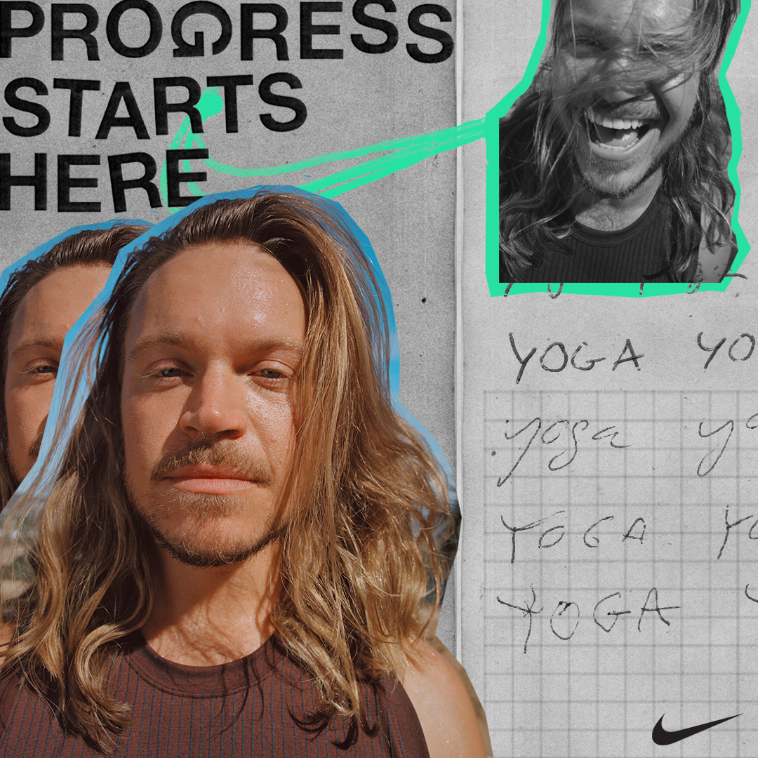
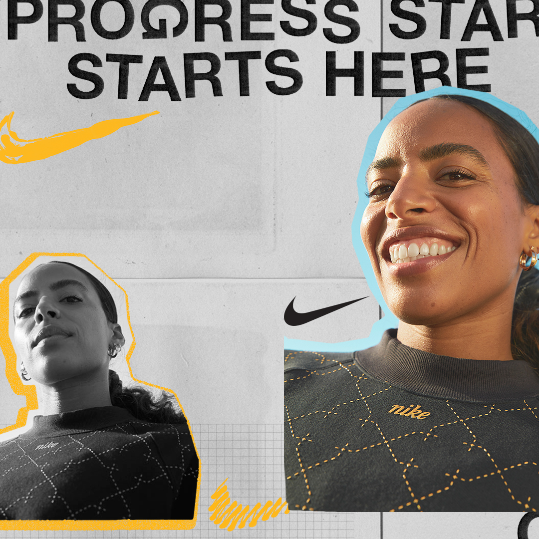
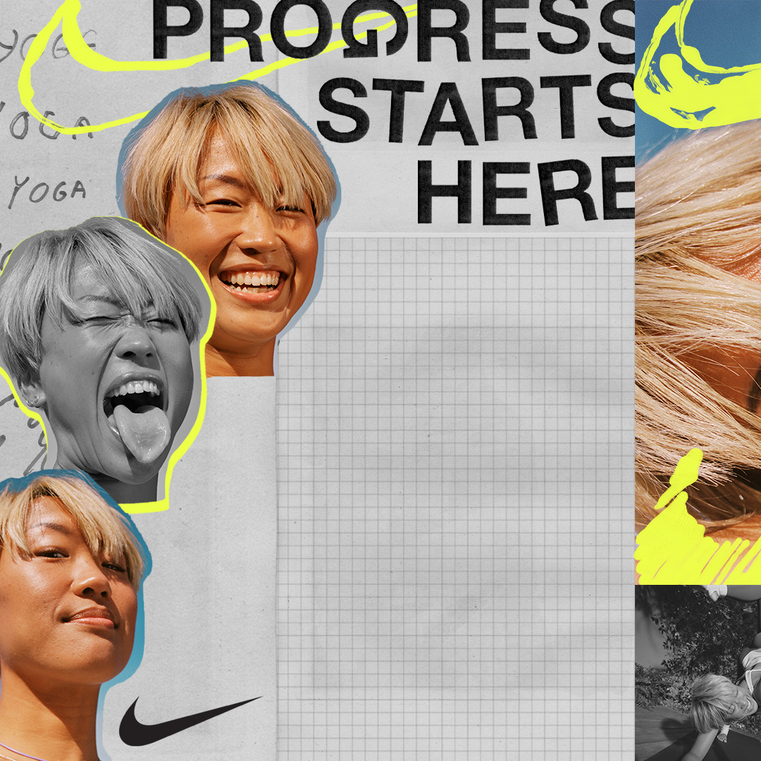
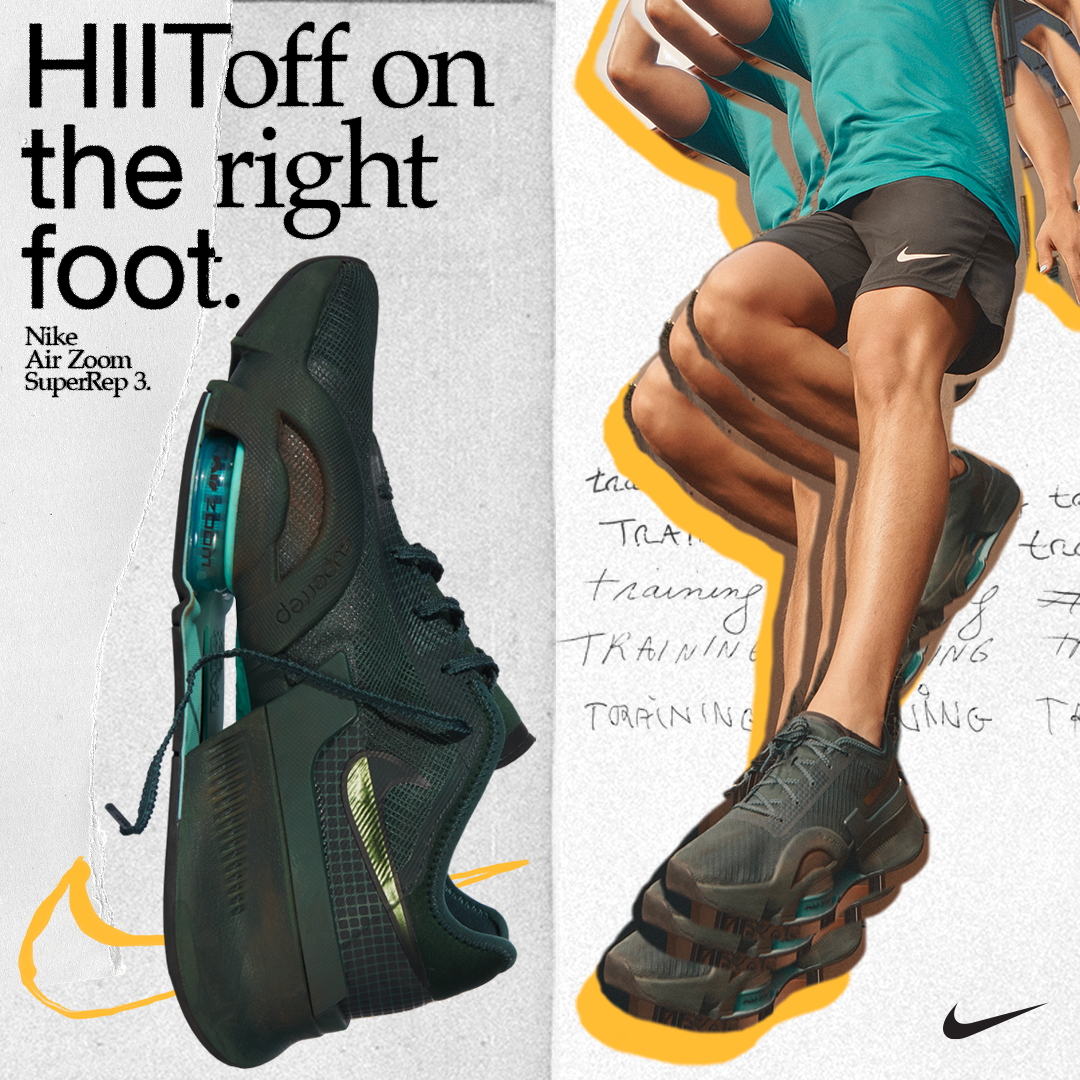
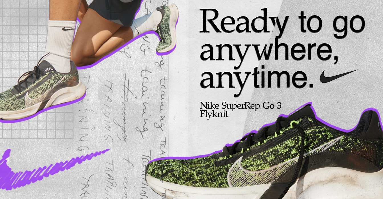
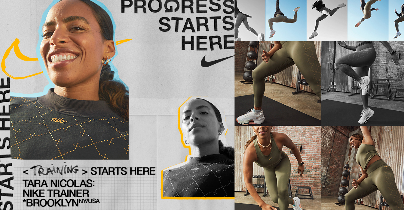
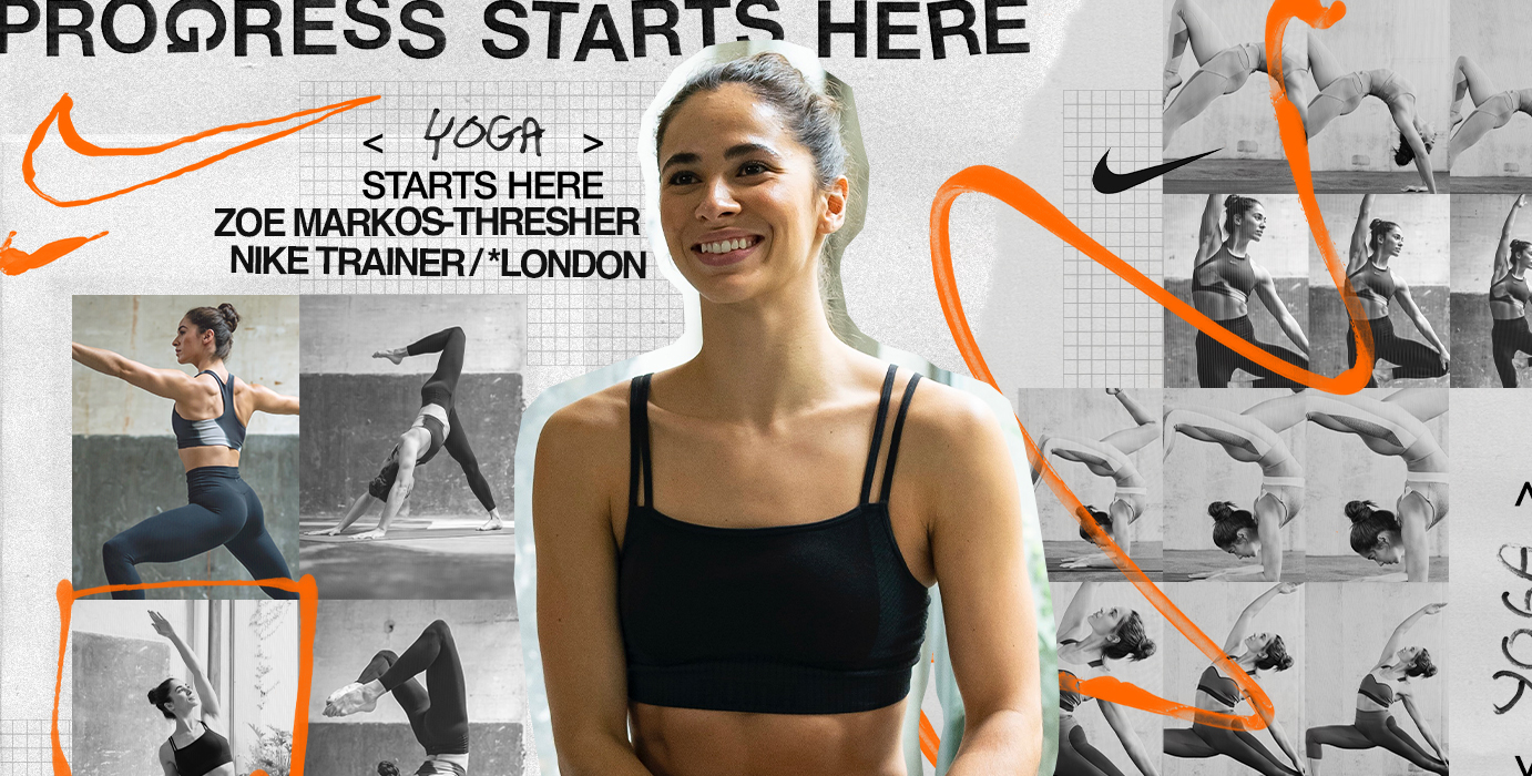
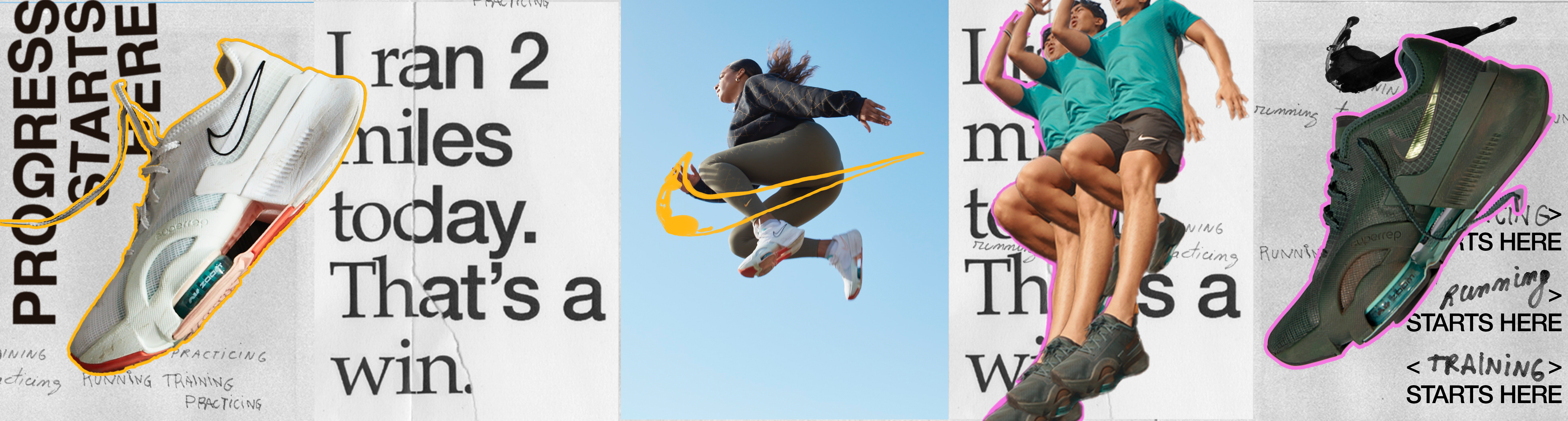
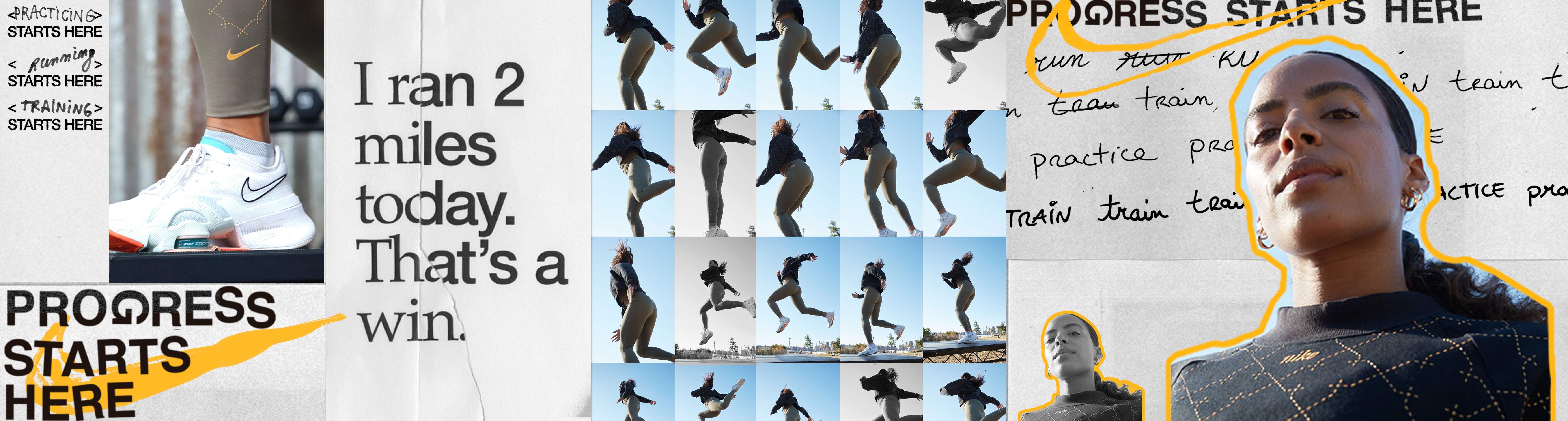
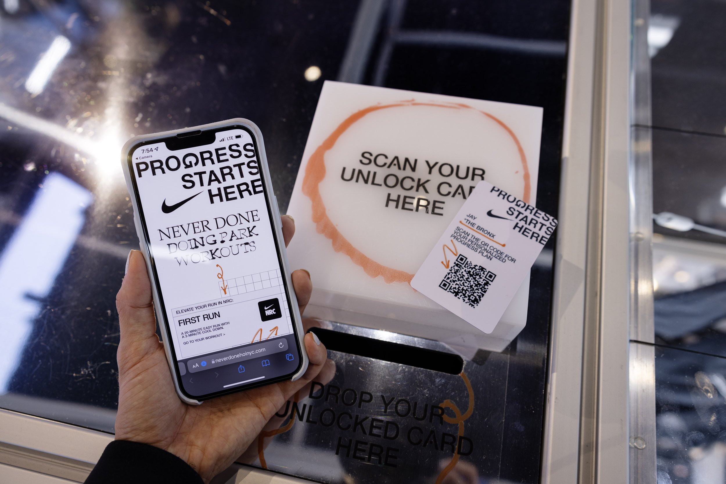
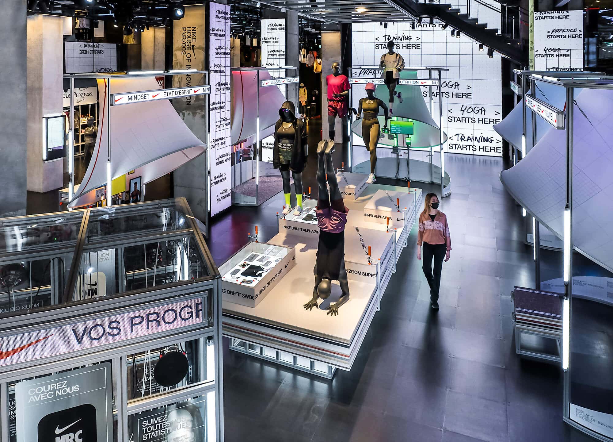
NIKE PROGRESS
BRAND
Nike discovered after the pandemic that people no longer used gyms to exercise but their own home or the street. They also noticed that the important thing behind physical exercise was no longer to achieve an athletic body but to improve personally day by day, prioritizing their mentality.
IDENTITY
The logo emphasizes the effects of humans by being all made analogically. The process of work gave the results to the final logo, by having errors such as the rotated or spacing of the G. In the same way that the swoosh happens to be, on some occasions, drawn by hand.
Nike discovered after the pandemic that people no longer used gyms to exercise but their own home or the street. They also noticed that the important thing behind physical exercise was no longer to achieve an athletic body but to improve personally day by day, prioritizing their mentality.
With this, they carried out a rebranding of the brand where the focus is more about progress than on the objective, emphasizing the process and the small advances or daily errors in sight and irregular compositions, using the error as end game.
IDENTITYThe logo emphasizes the effects of humans by being all made analogically. The process of work gave the results to the final logo, by having errors such as the rotated or spacing of the G. In the same way that the swoosh happens to be, on some occasions, drawn by hand.
The entire identity is made analogically, by using papers, clippings, handwriting, etc.
At the same time, it incorporates a very lively and energetic color palette due to the optimism behind the concept.


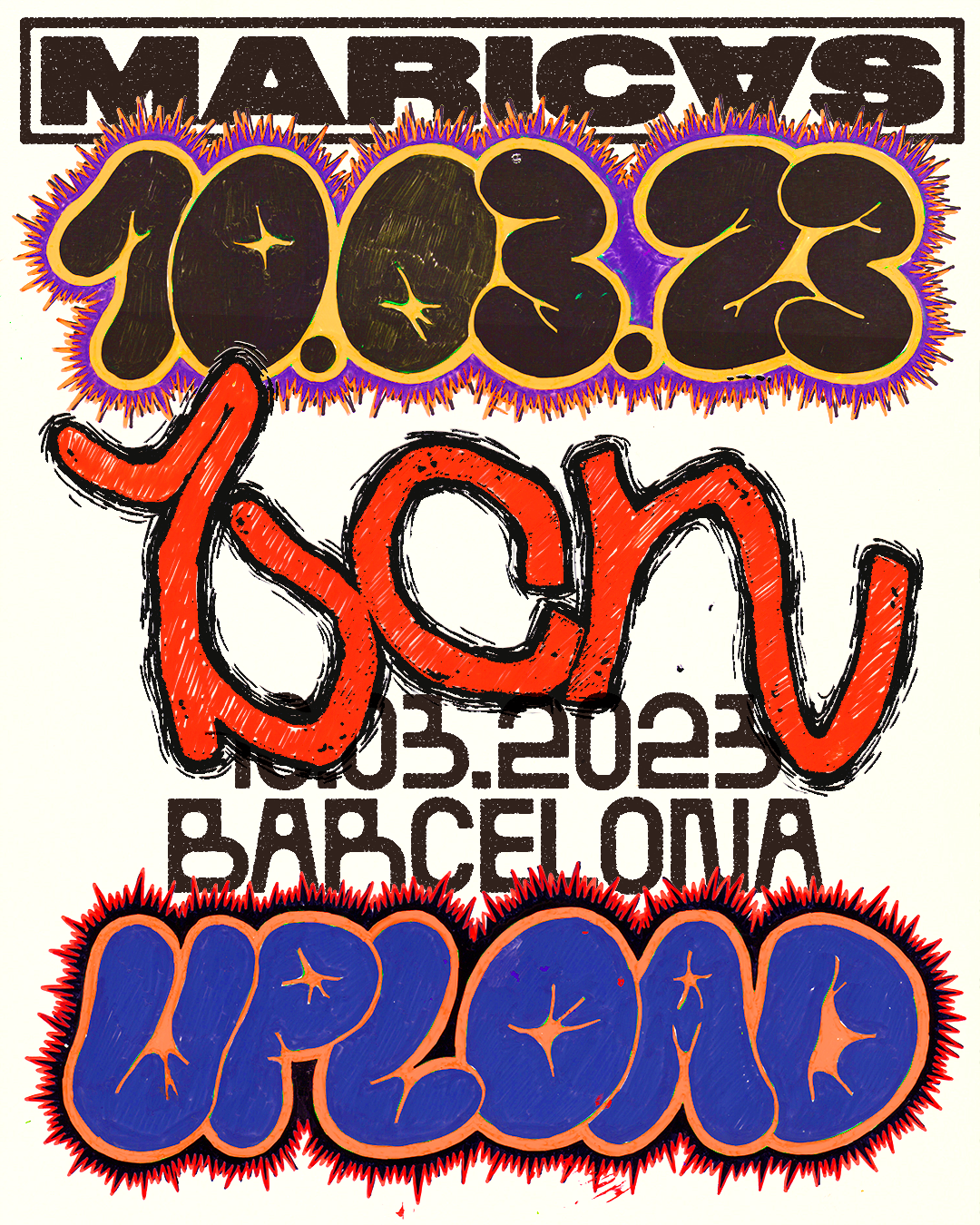
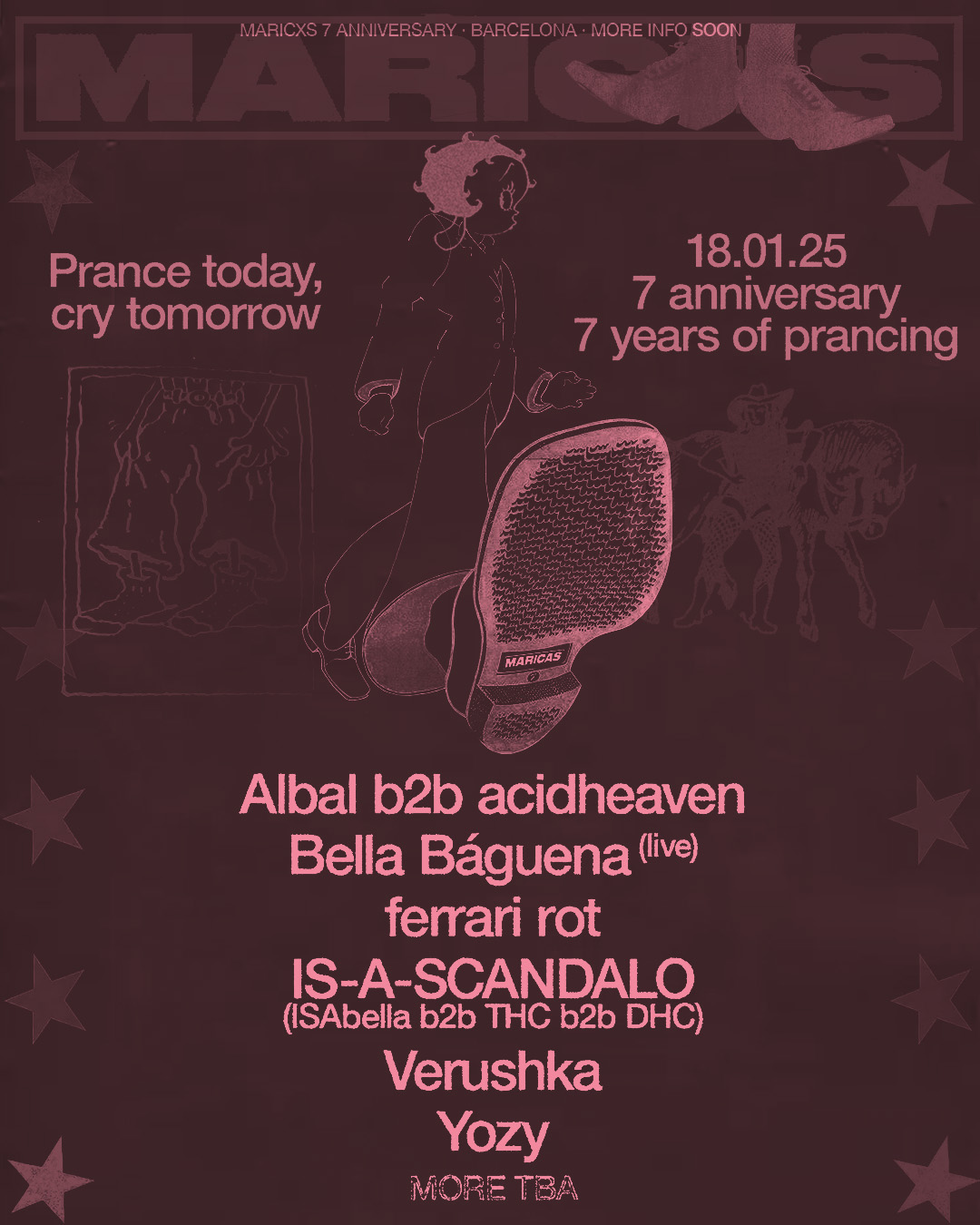
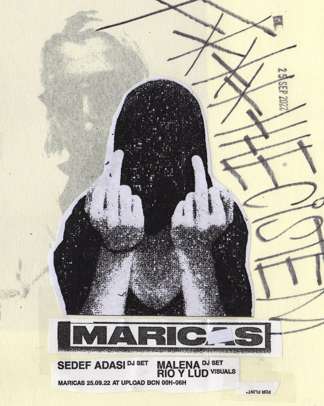
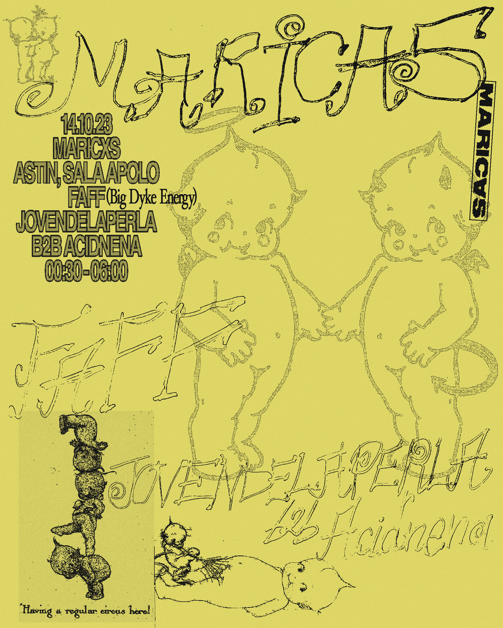
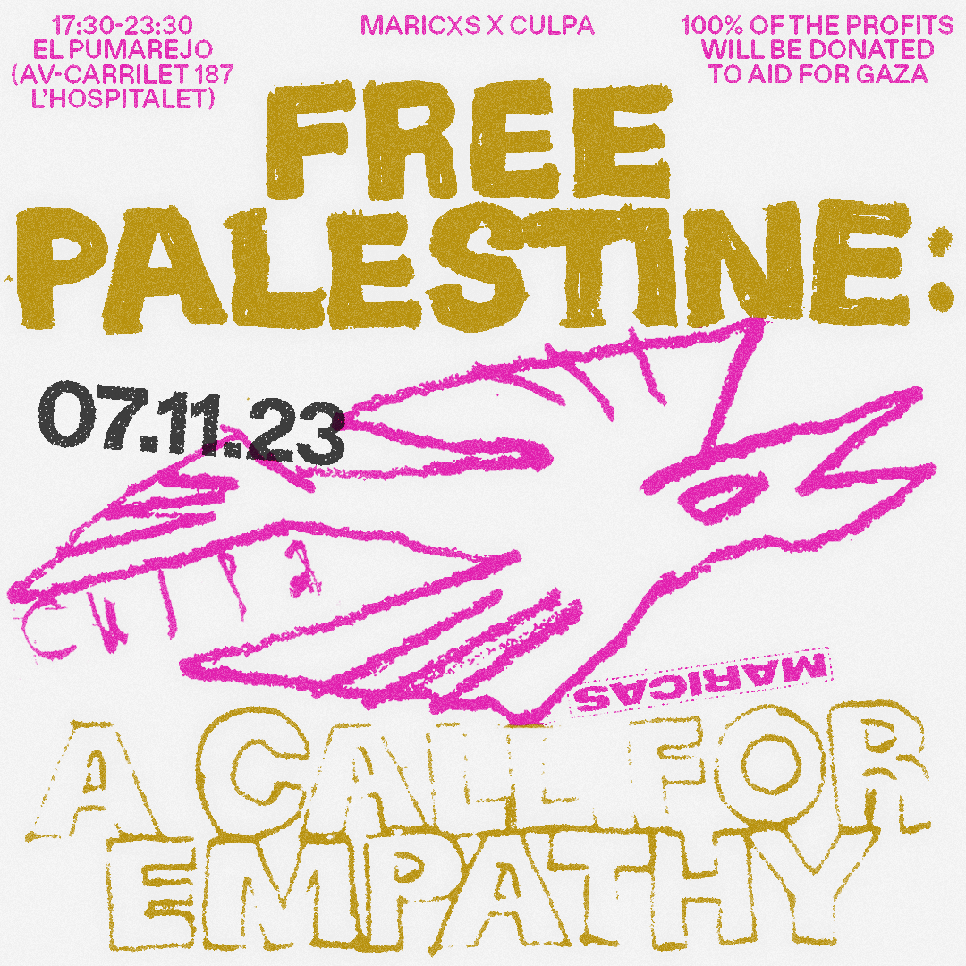
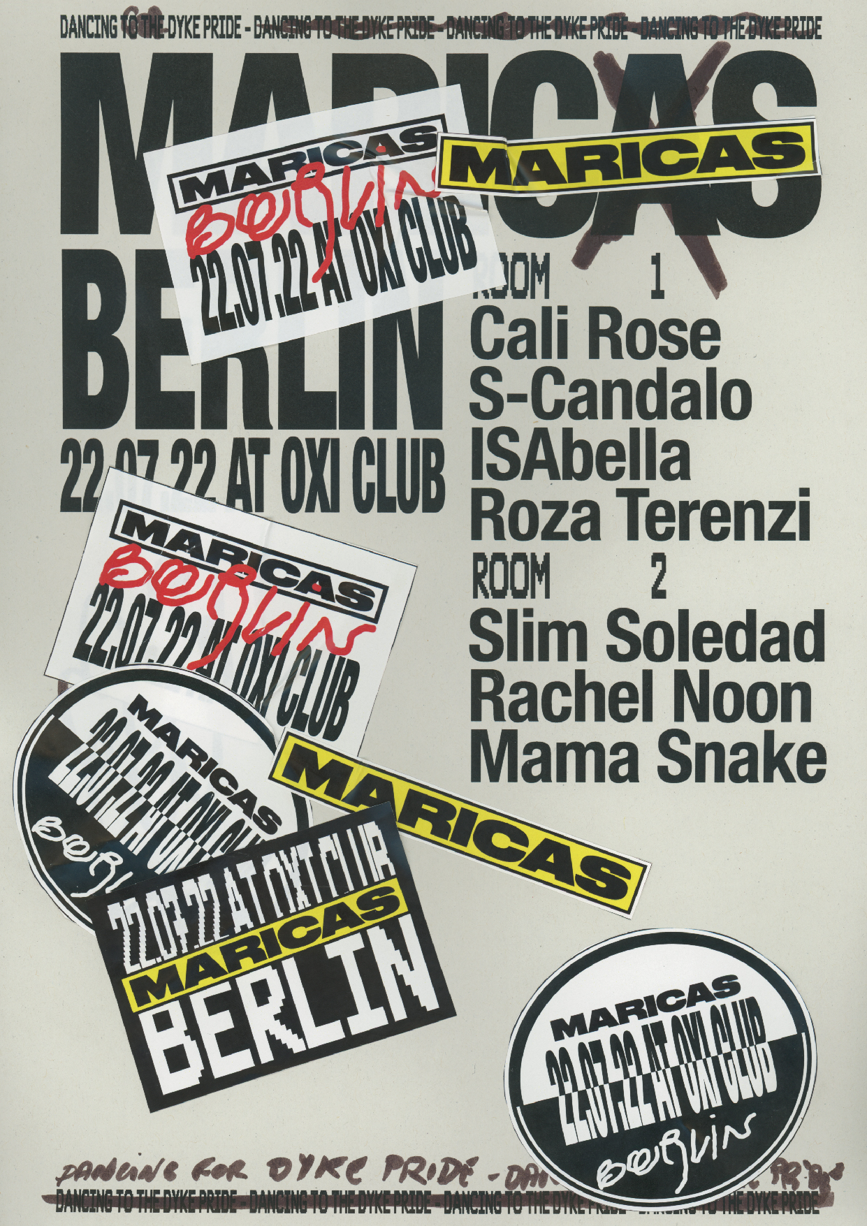
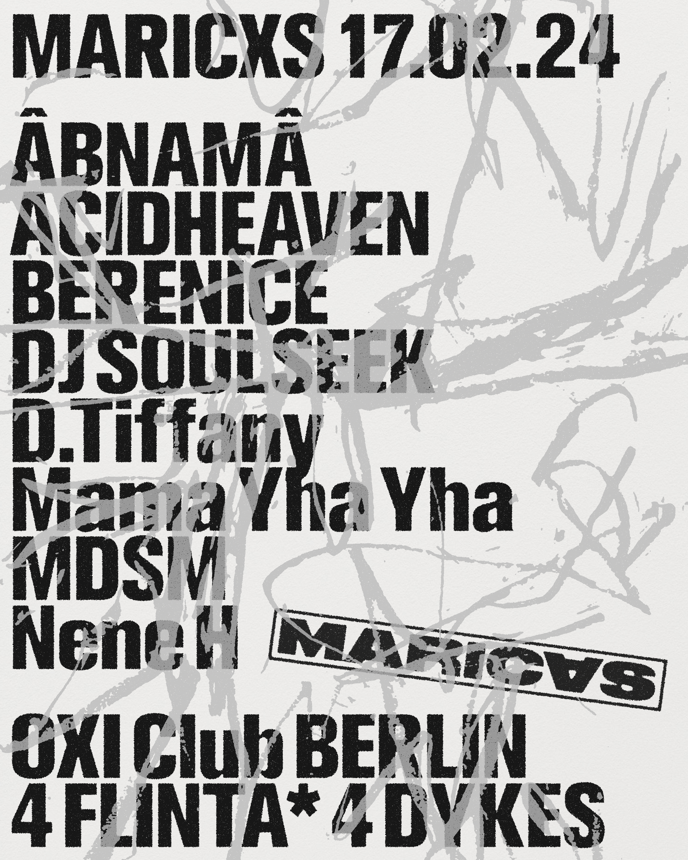
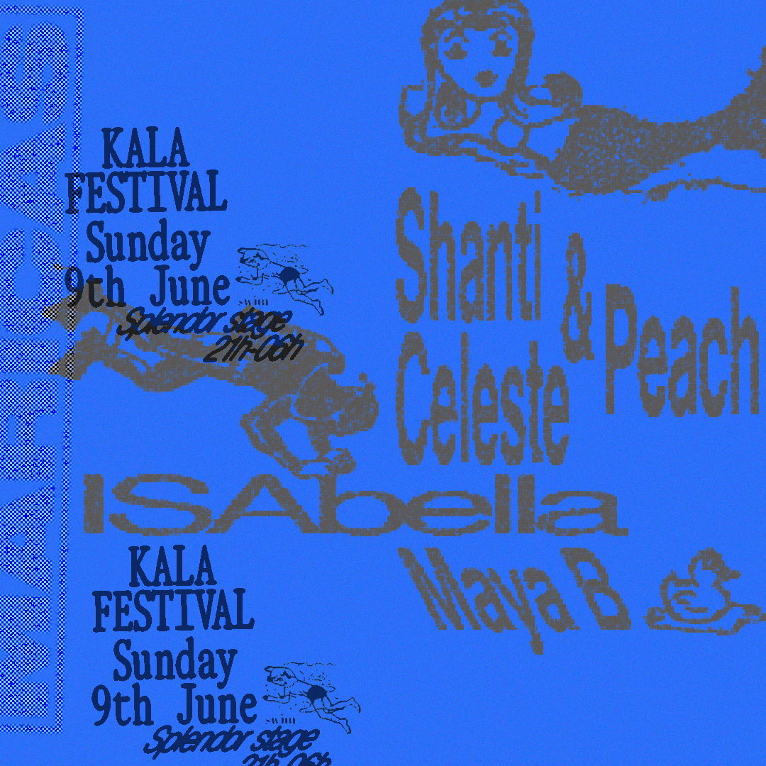
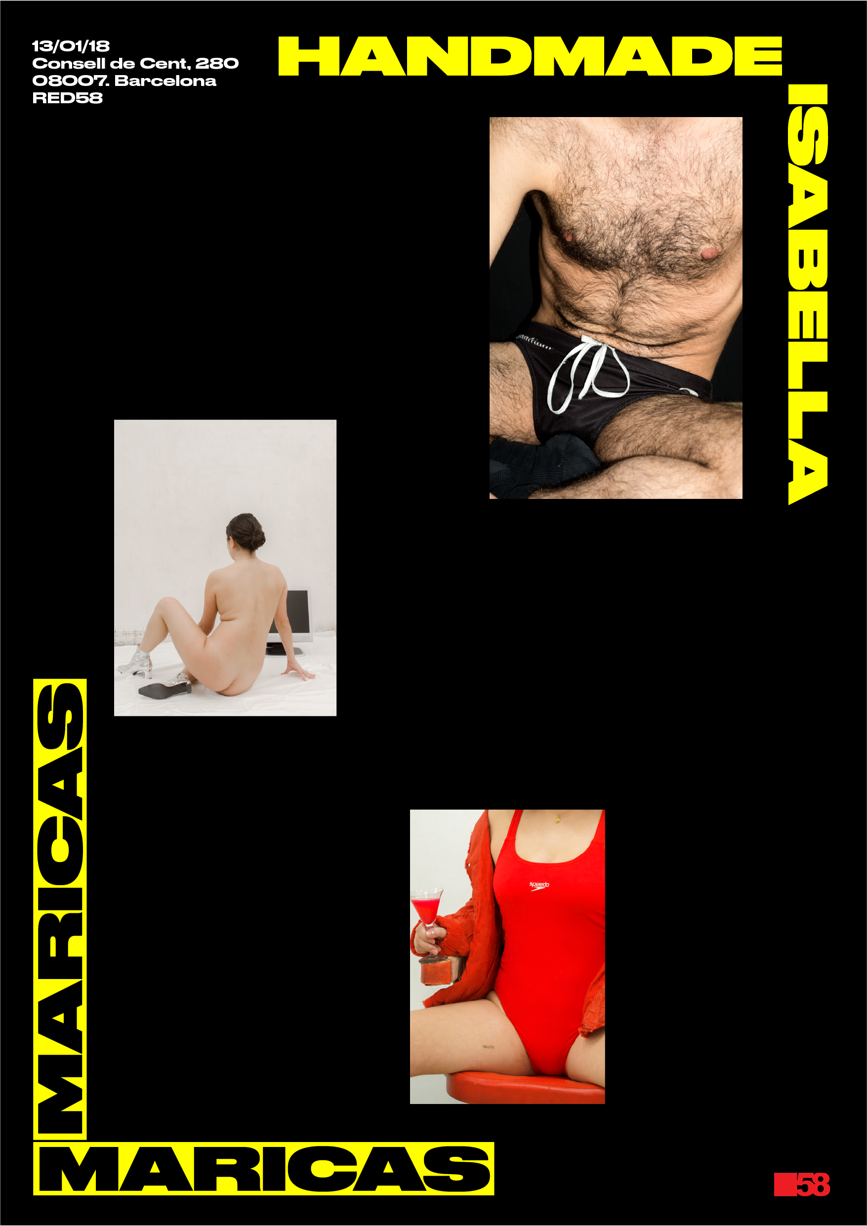
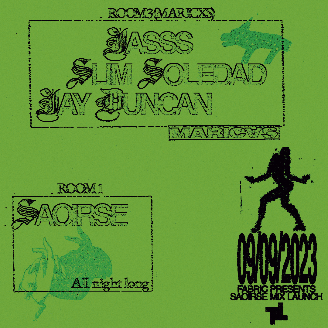
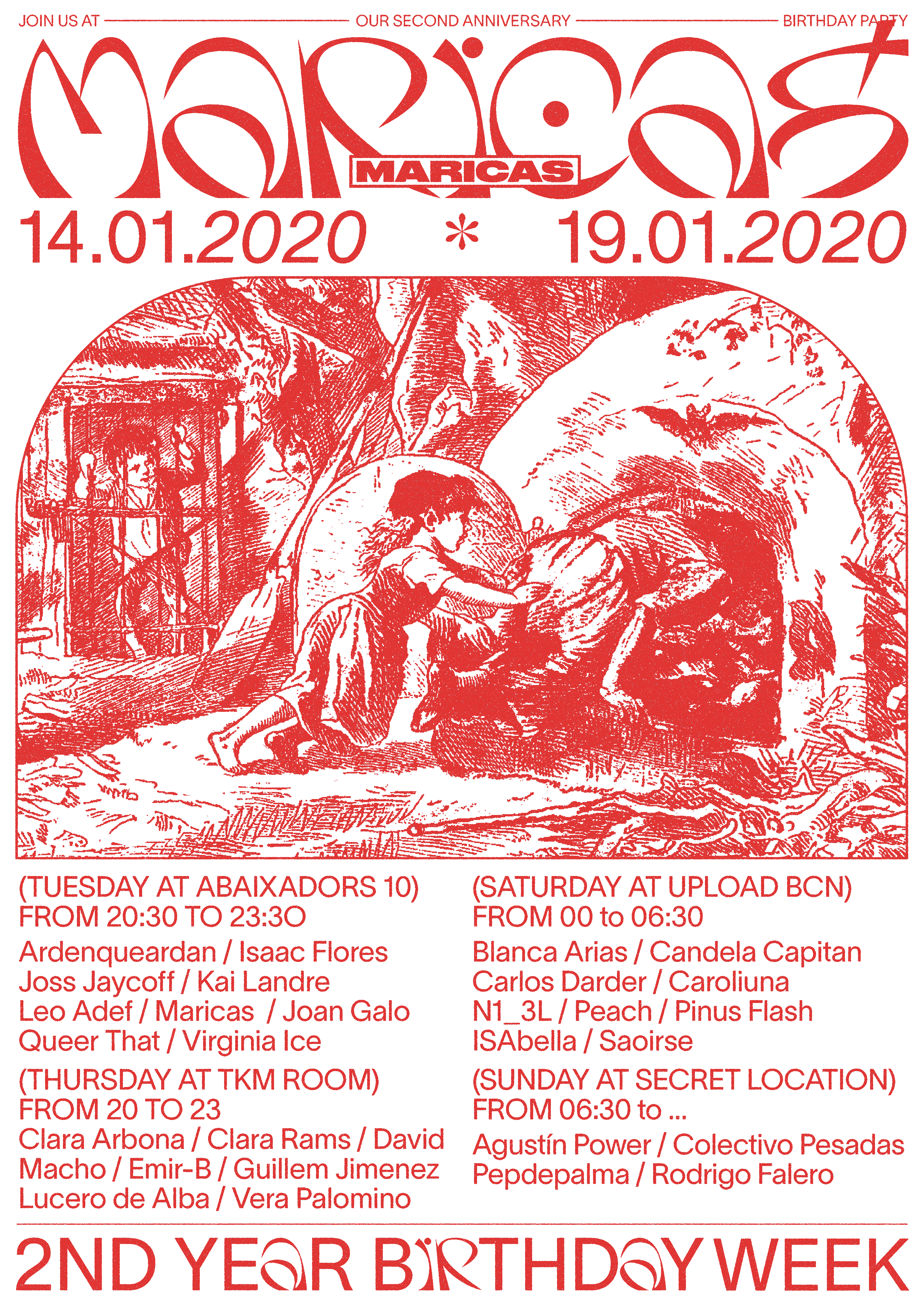
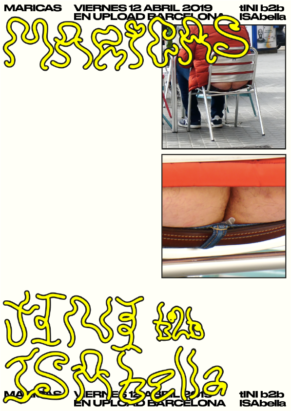
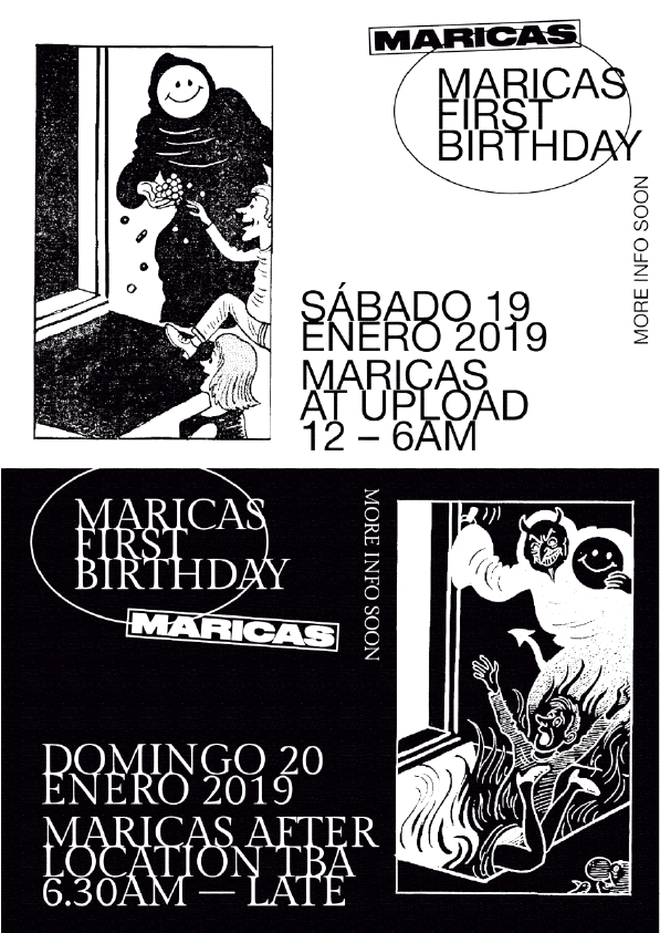
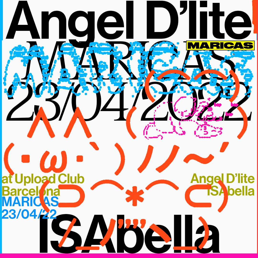
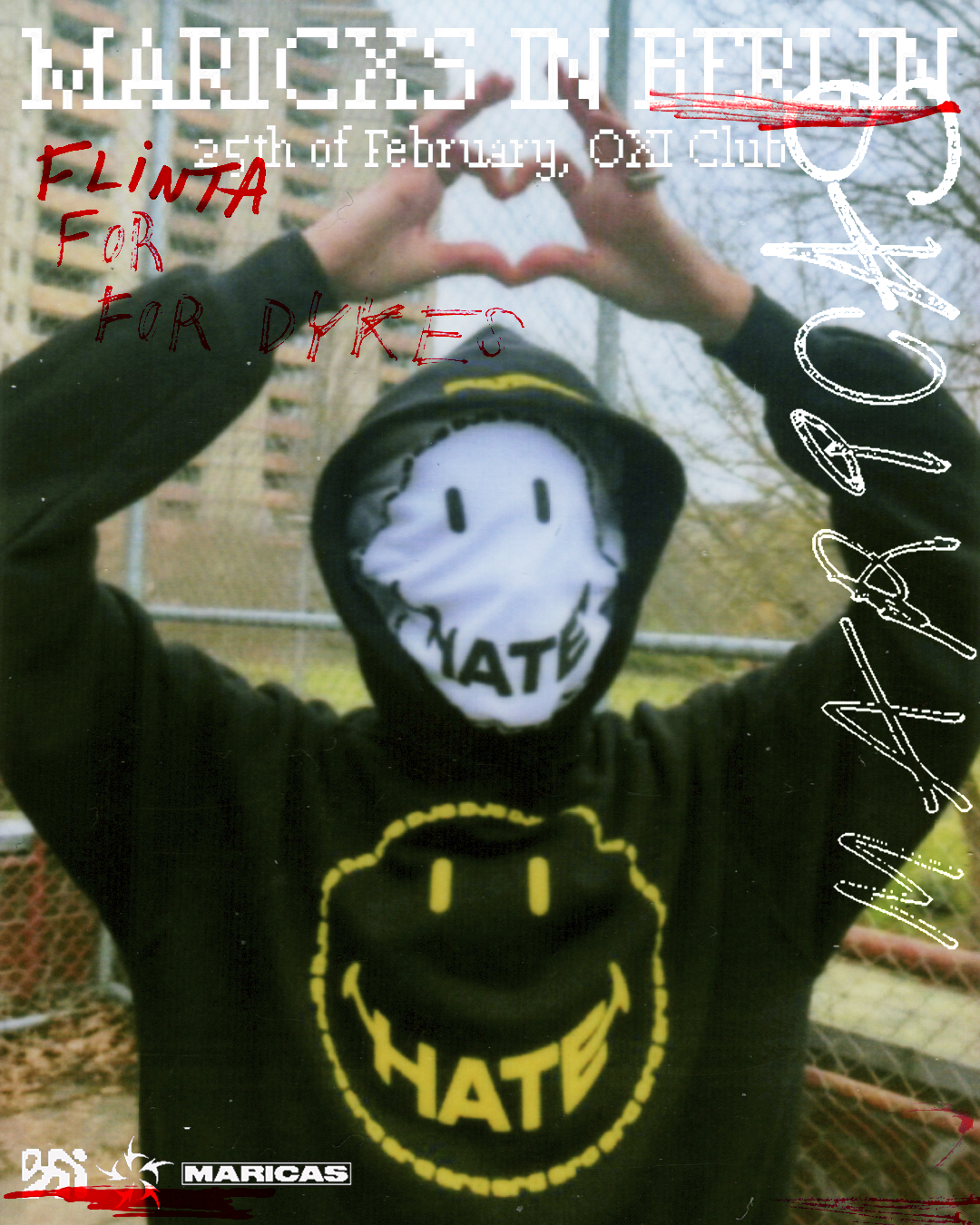
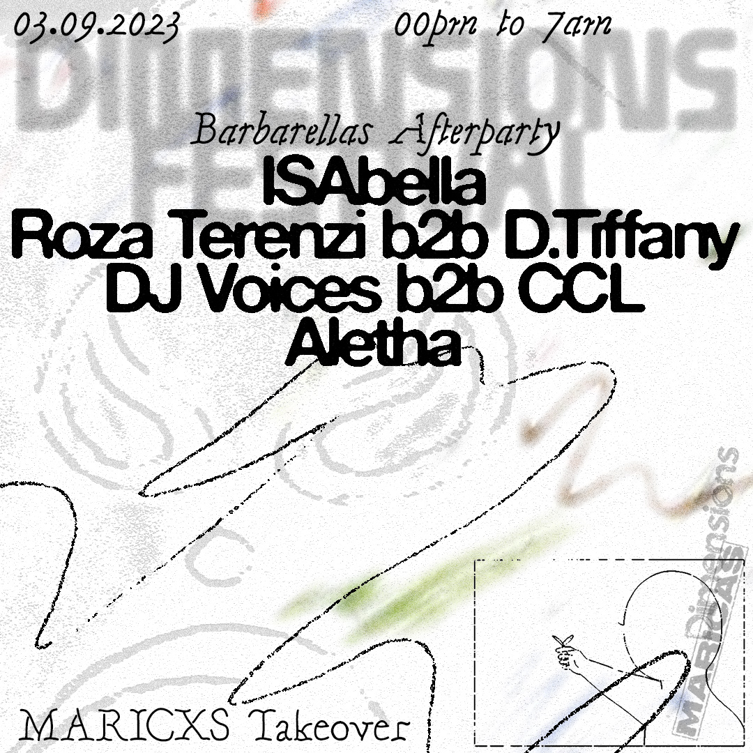
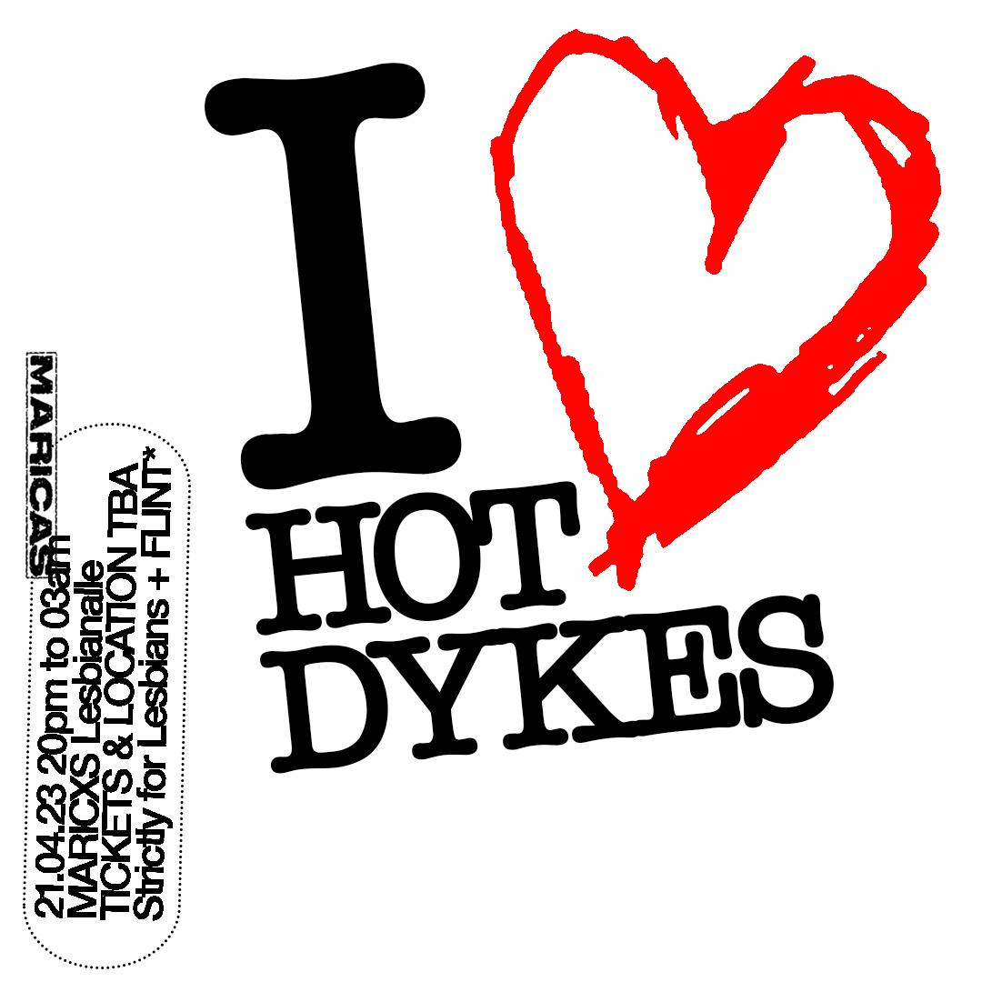
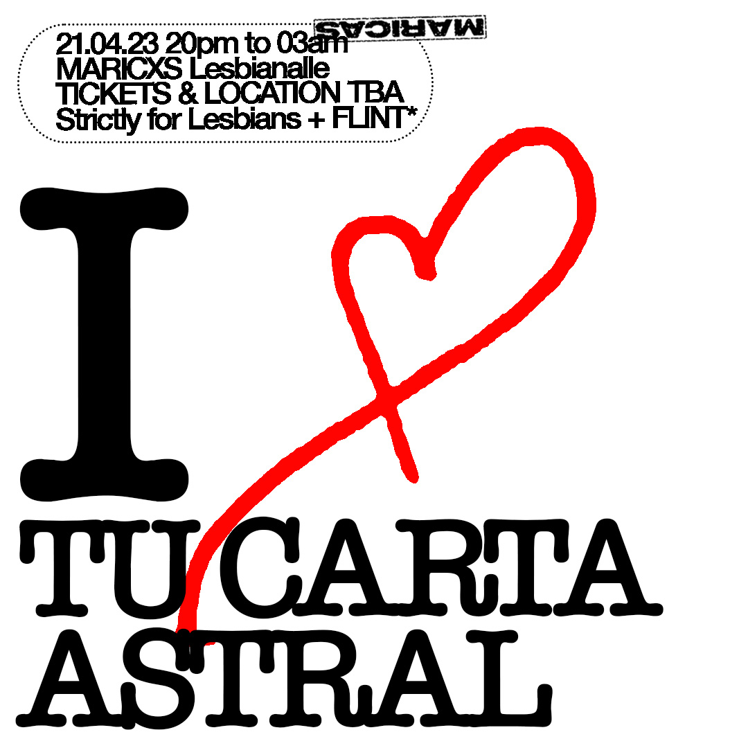
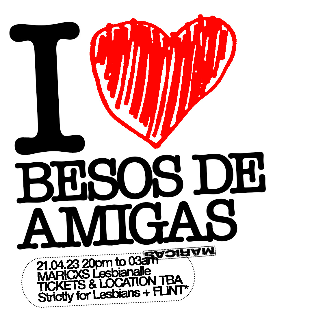
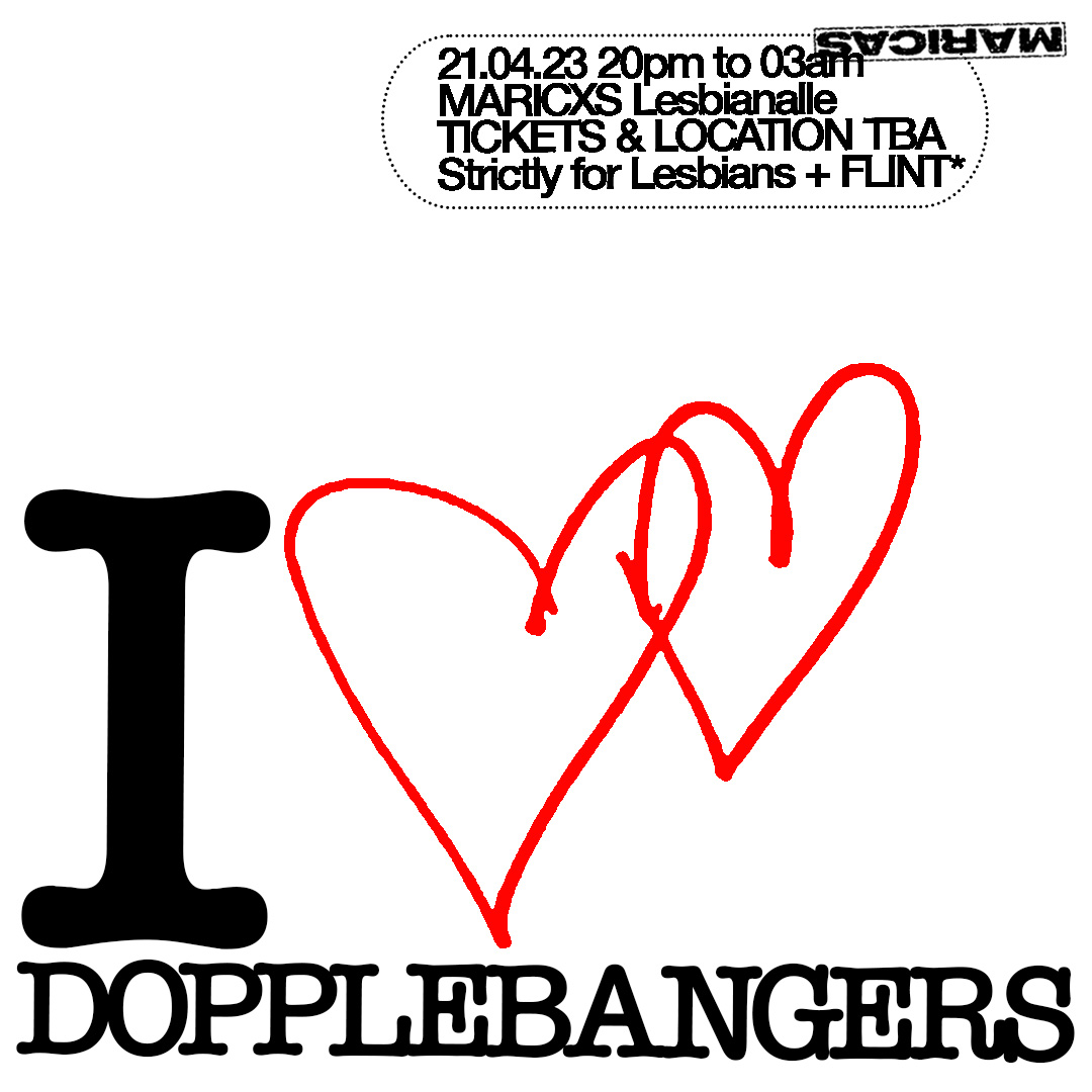
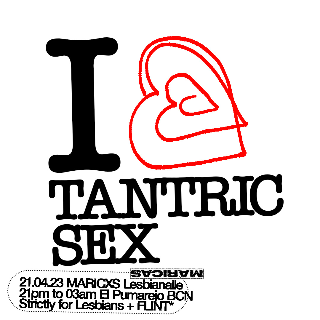
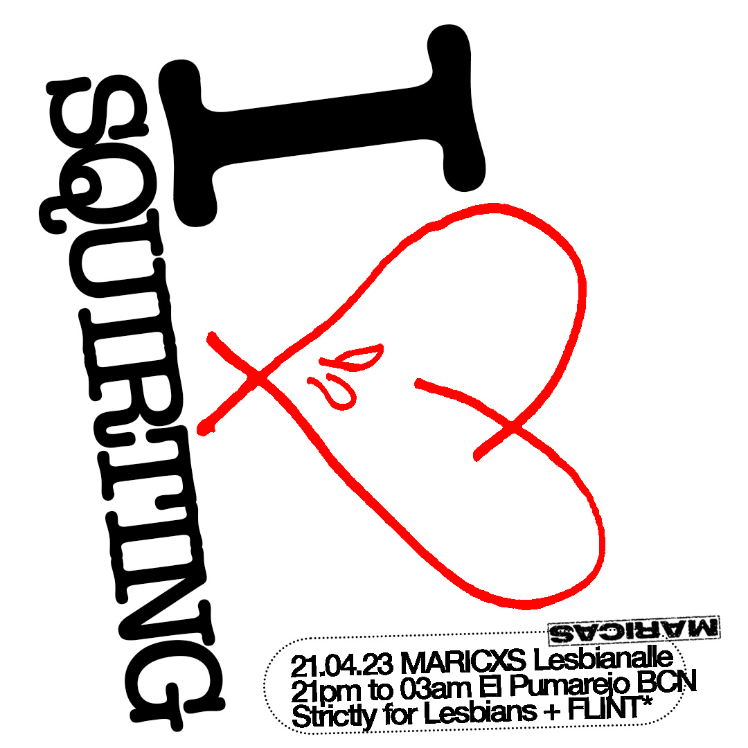
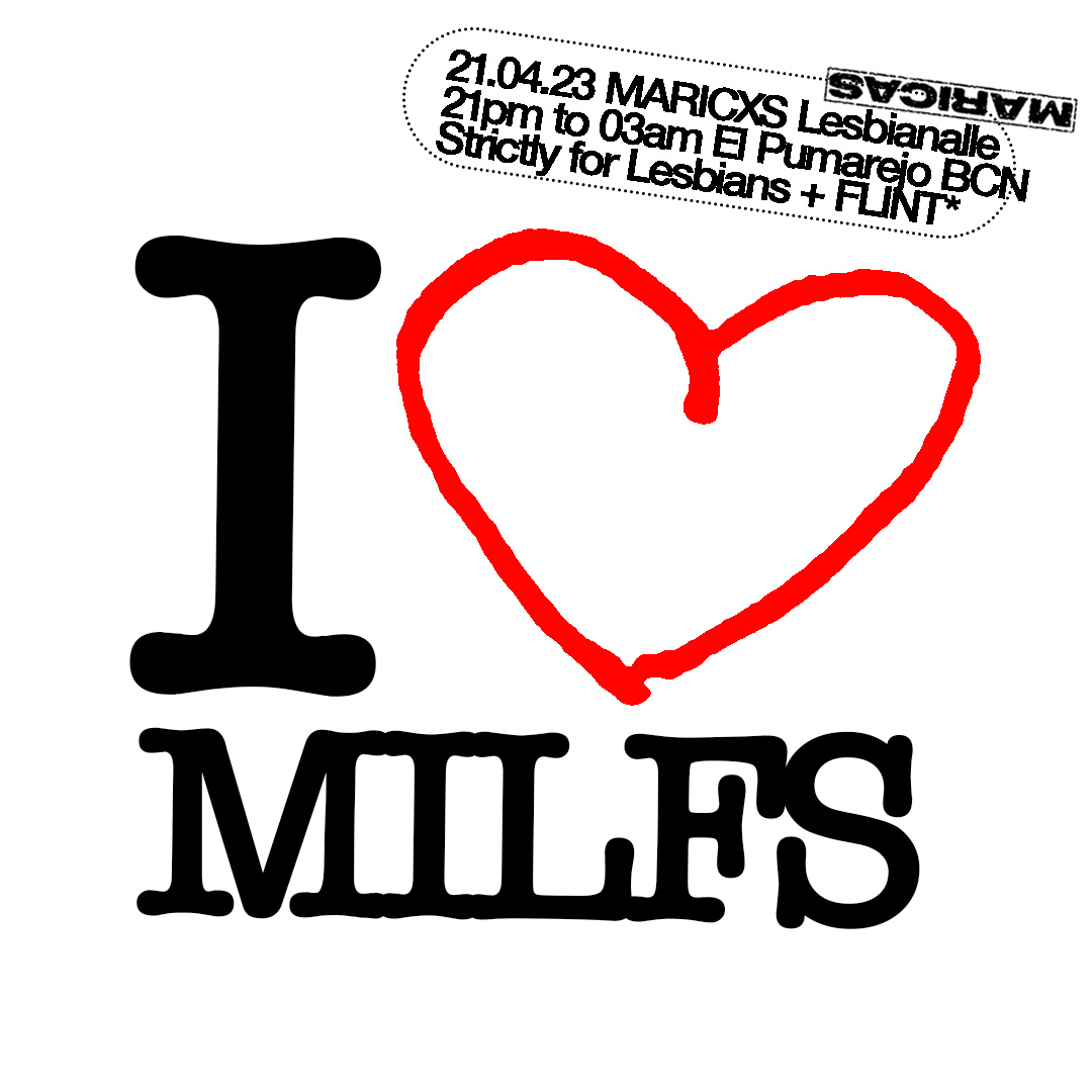
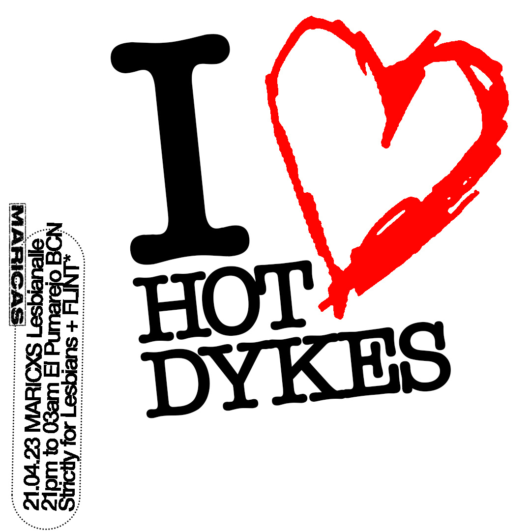
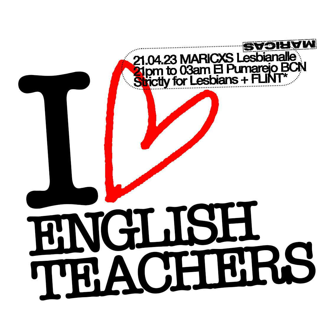
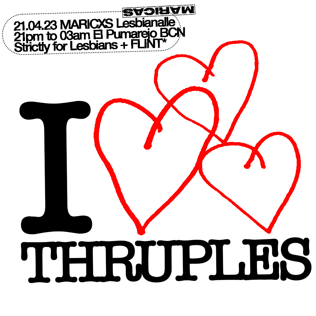
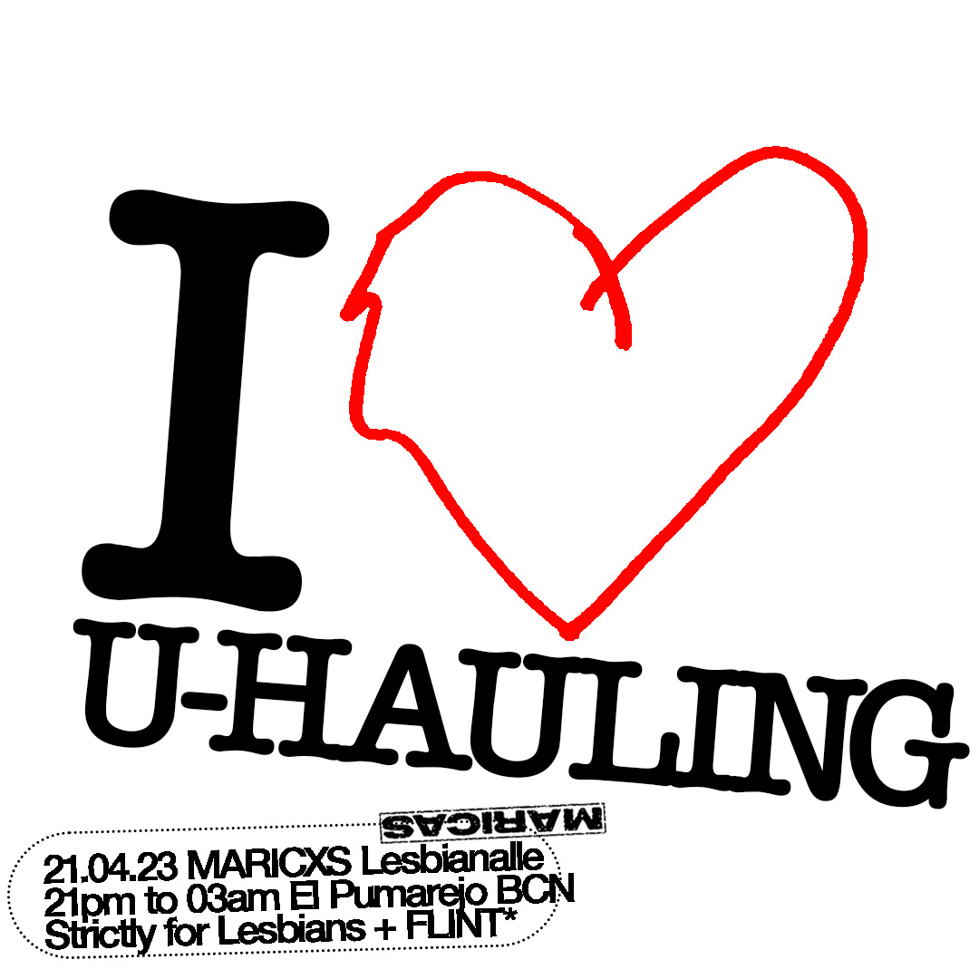
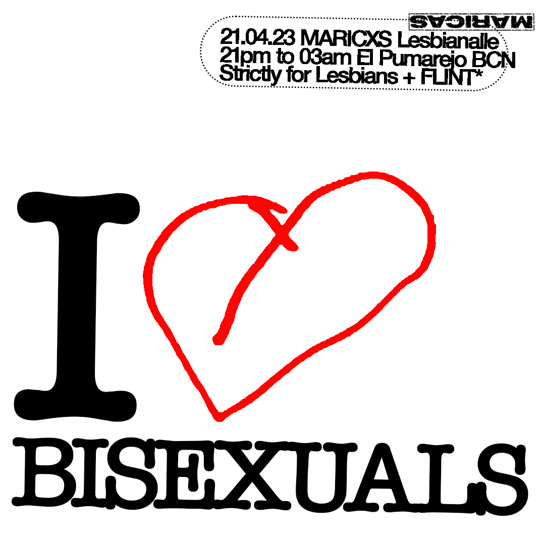
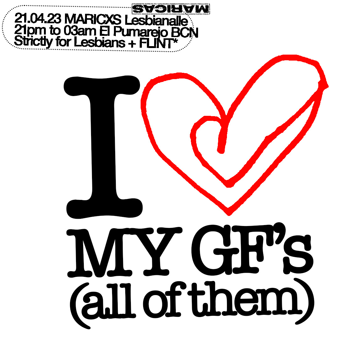
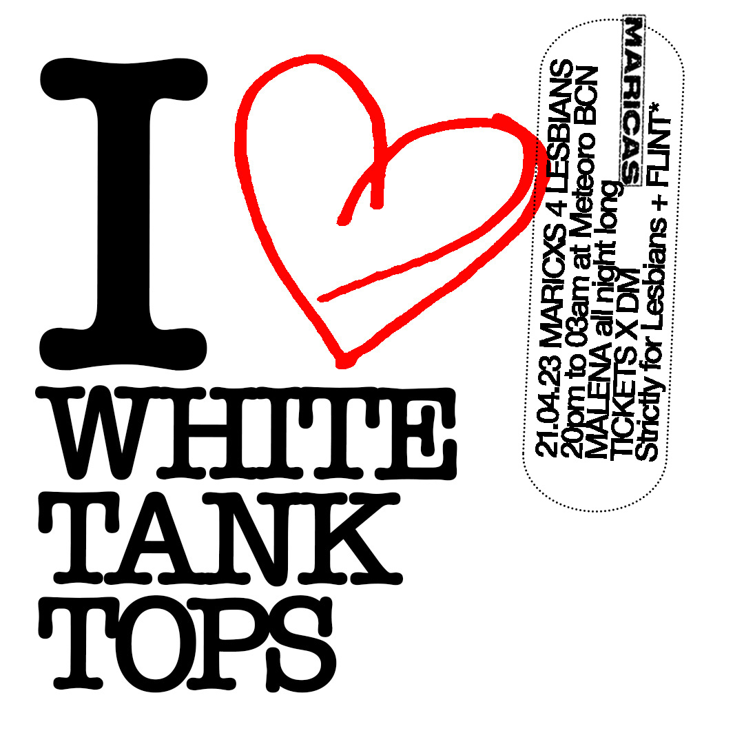
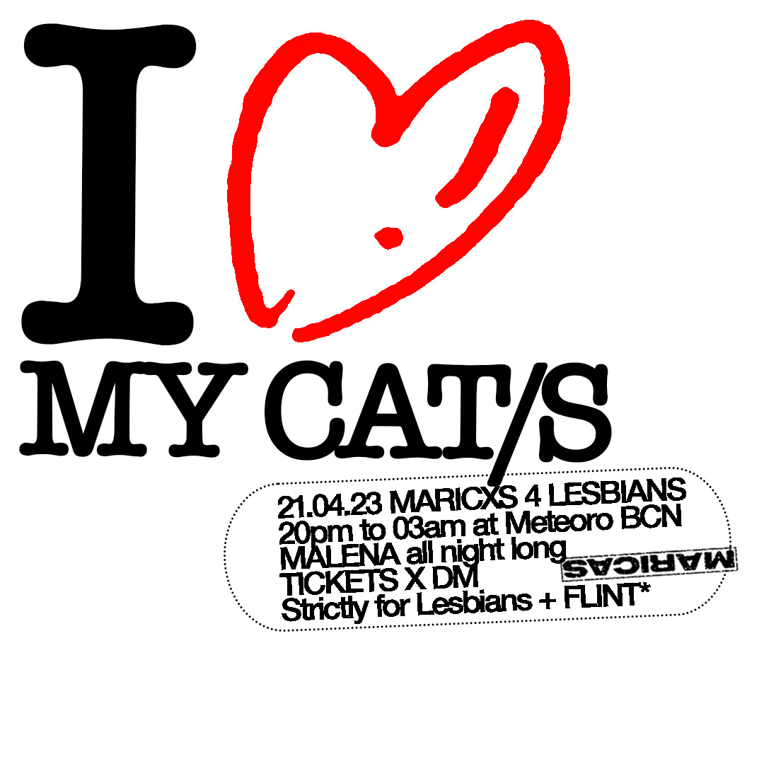
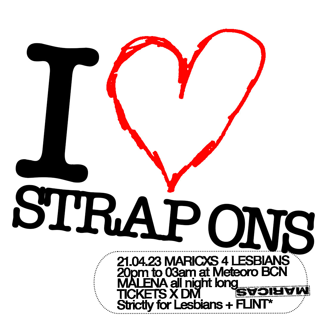
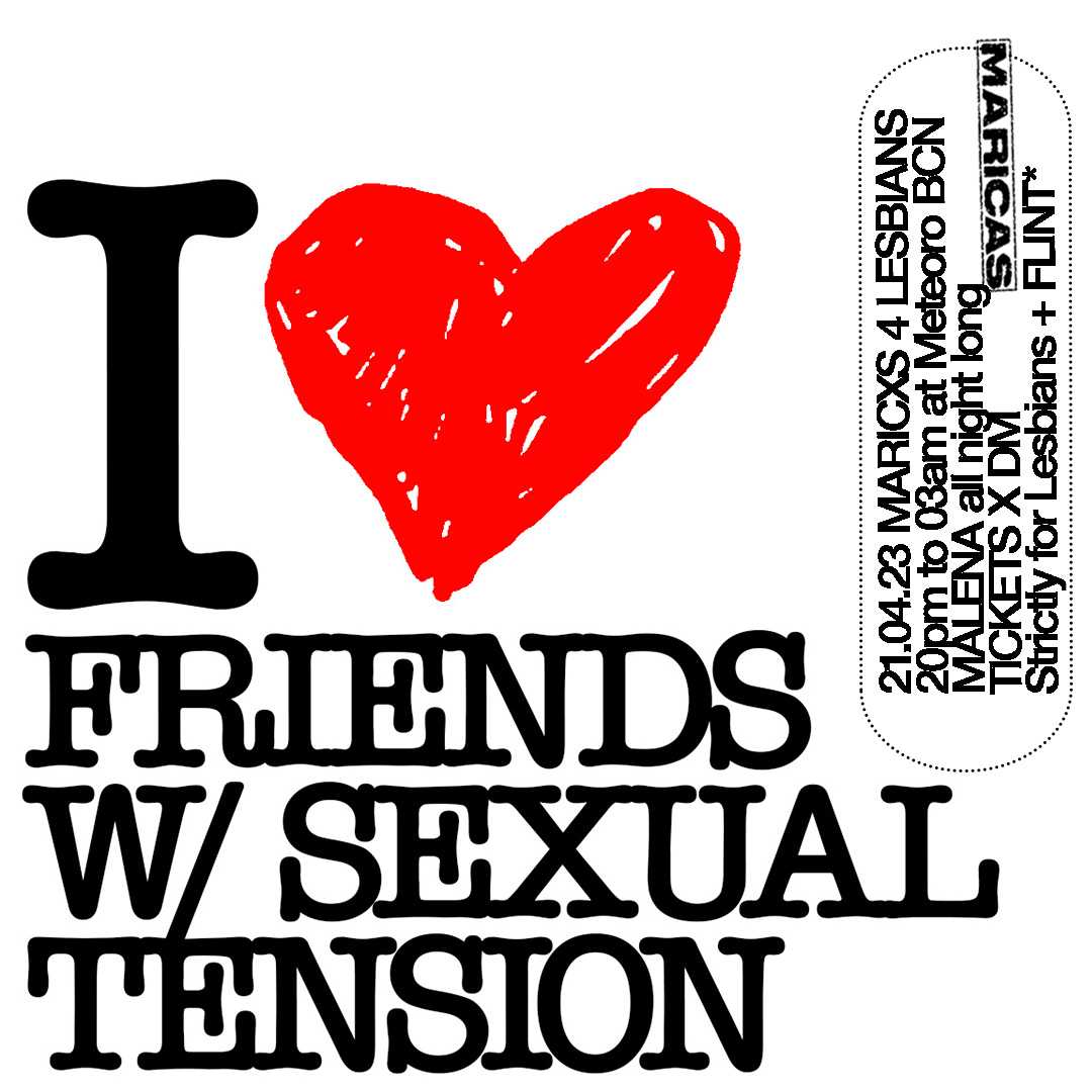
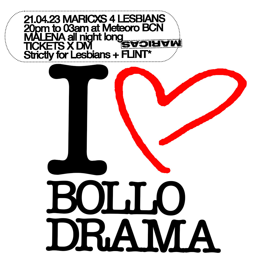
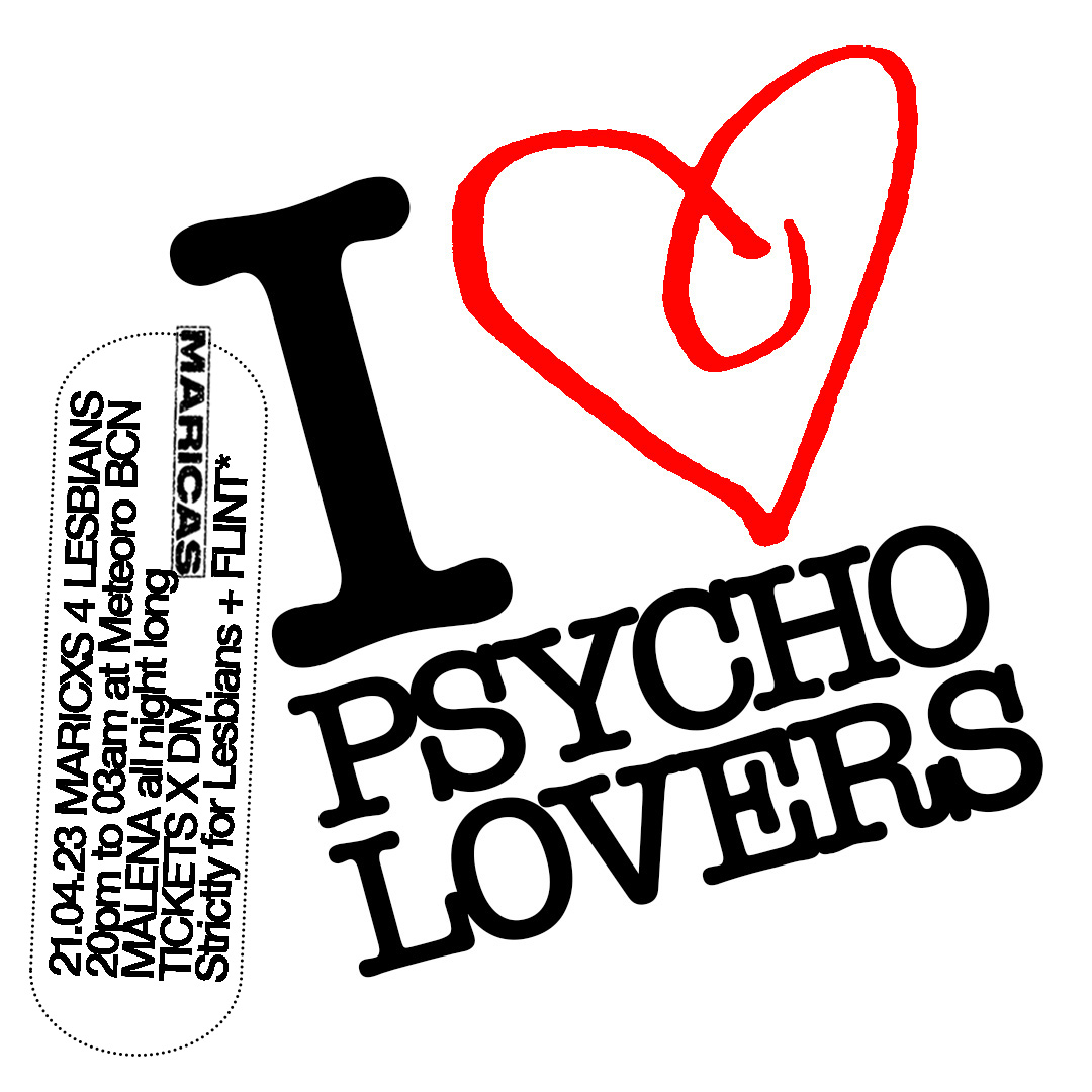
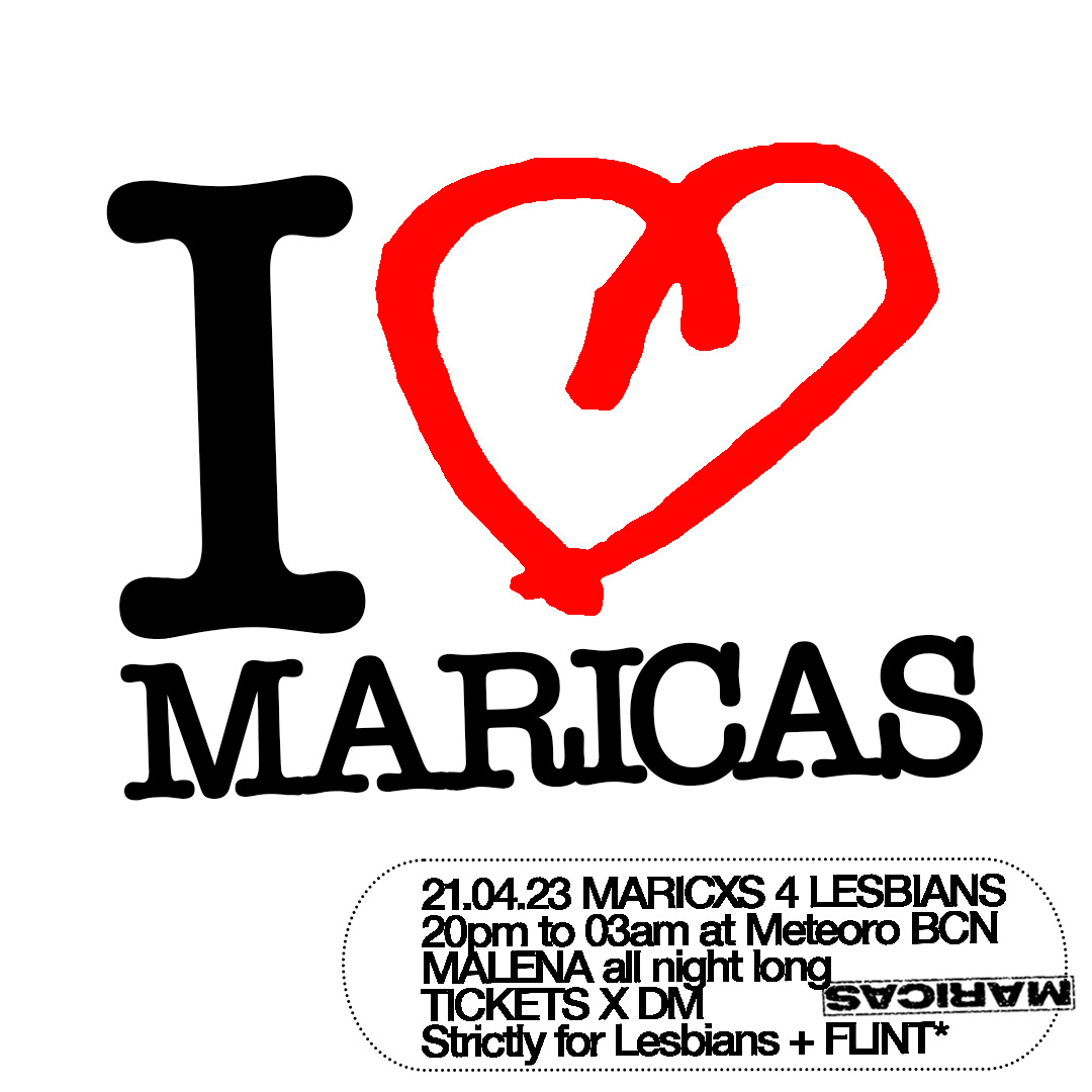
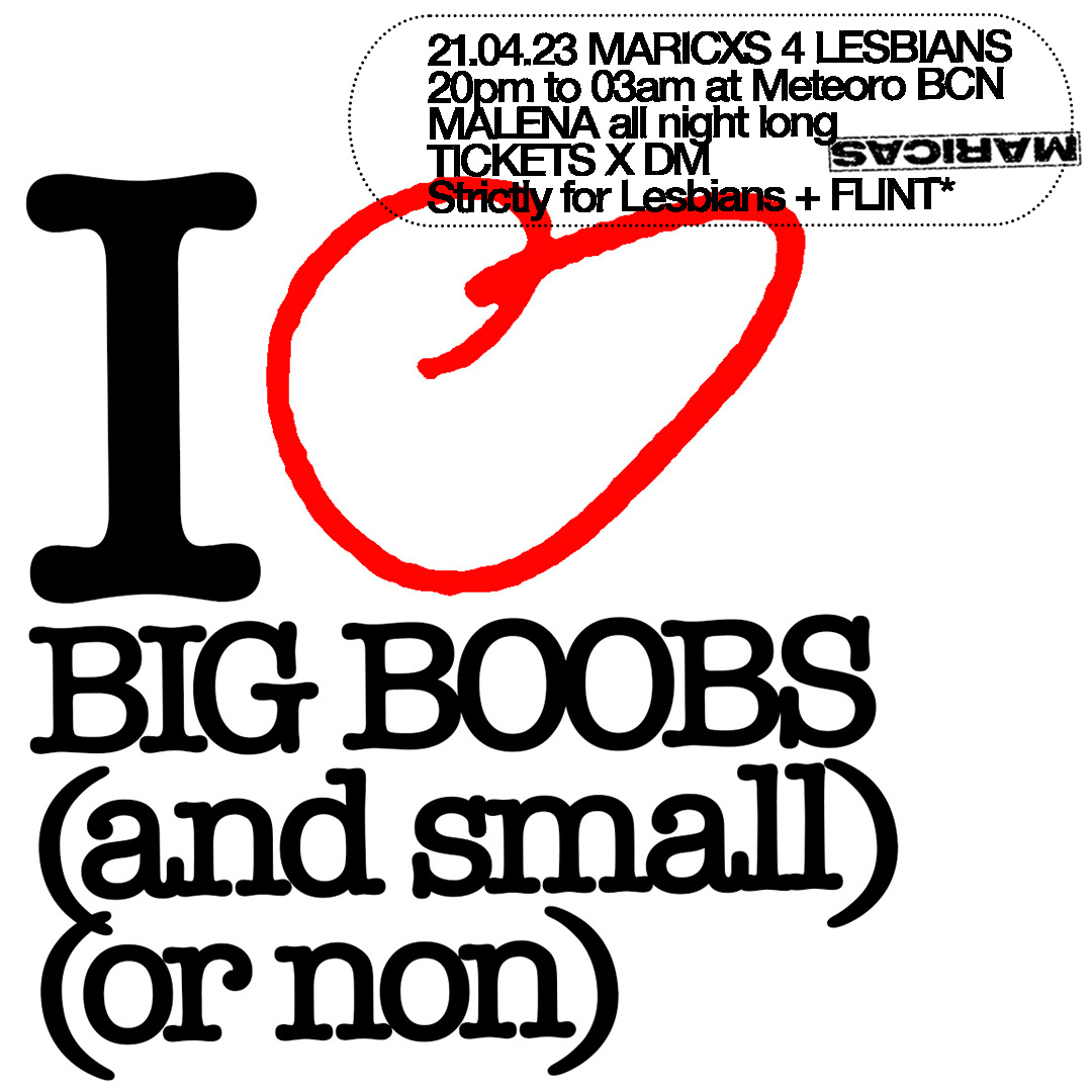
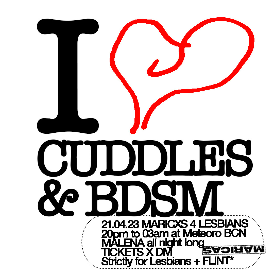
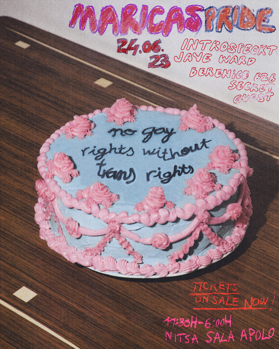
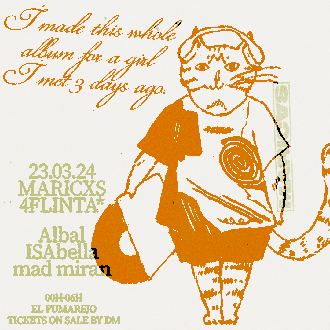
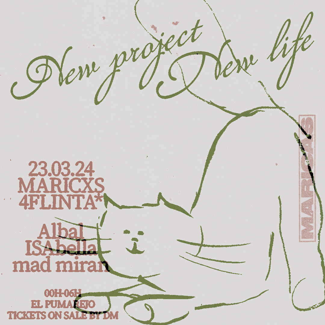
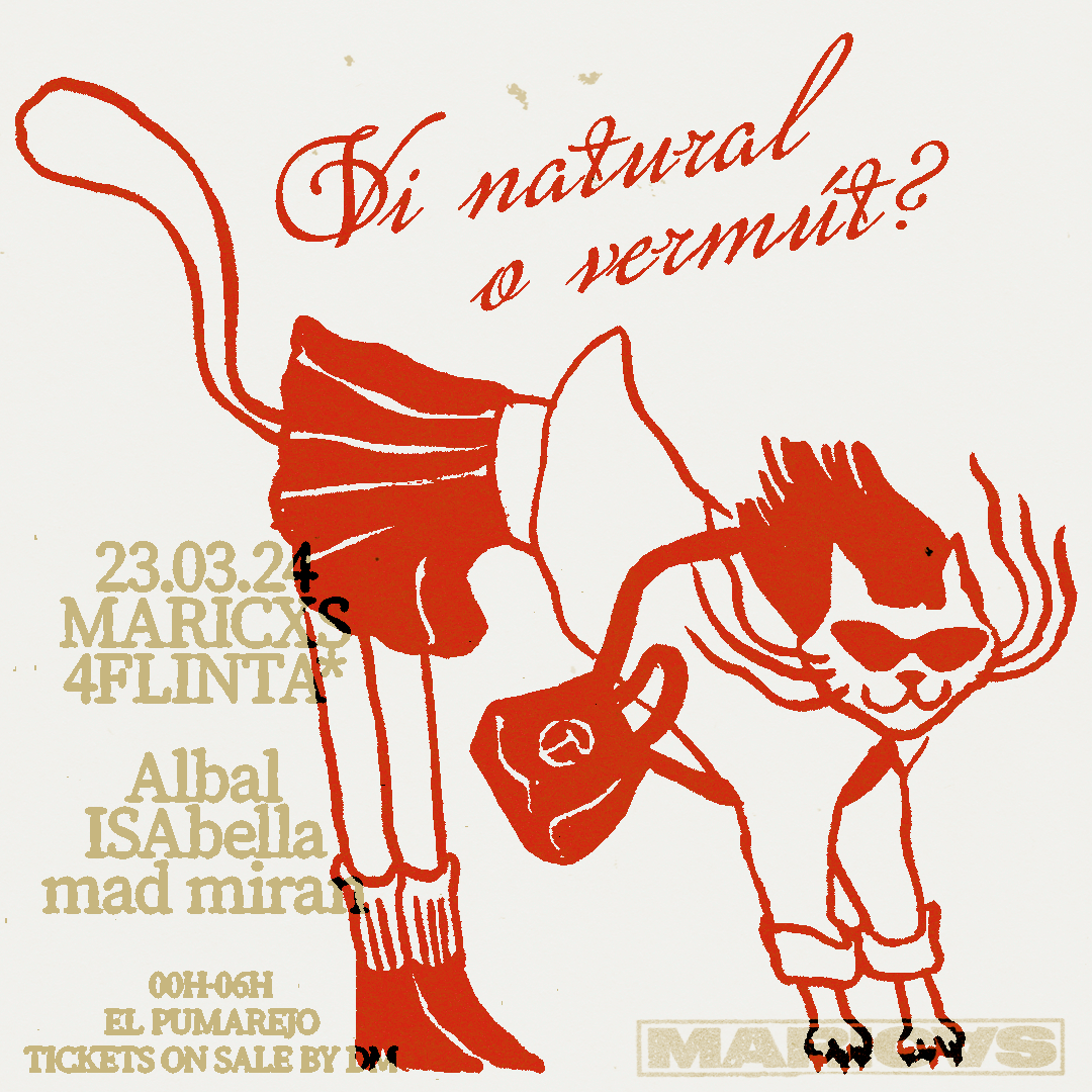
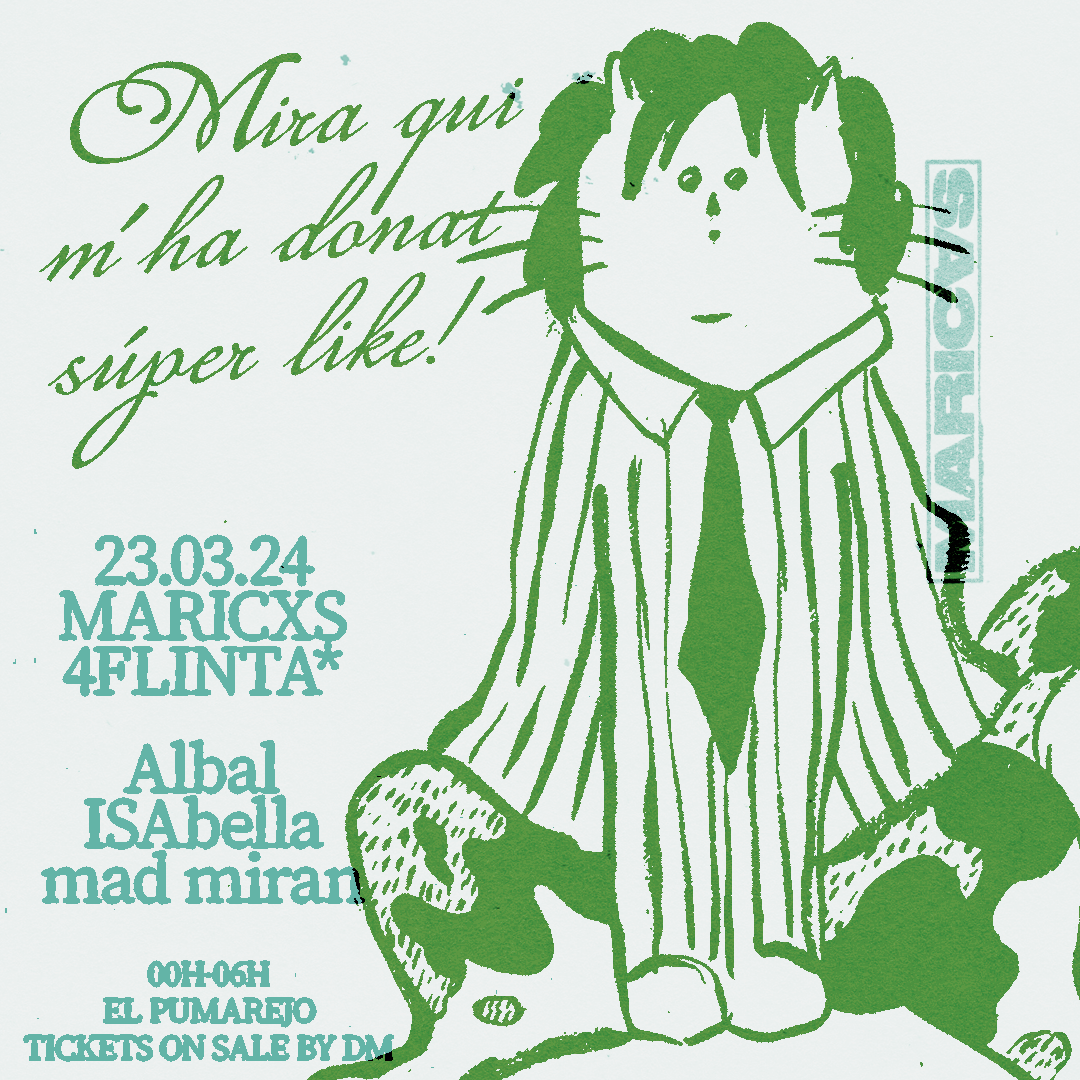
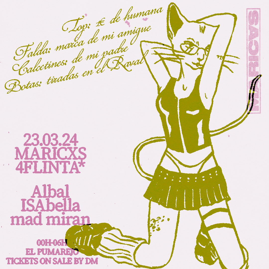
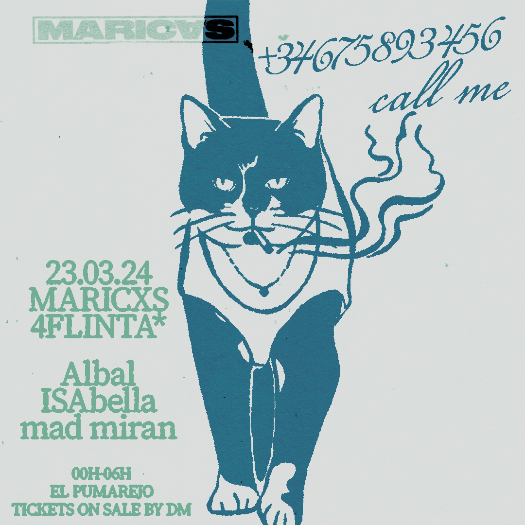
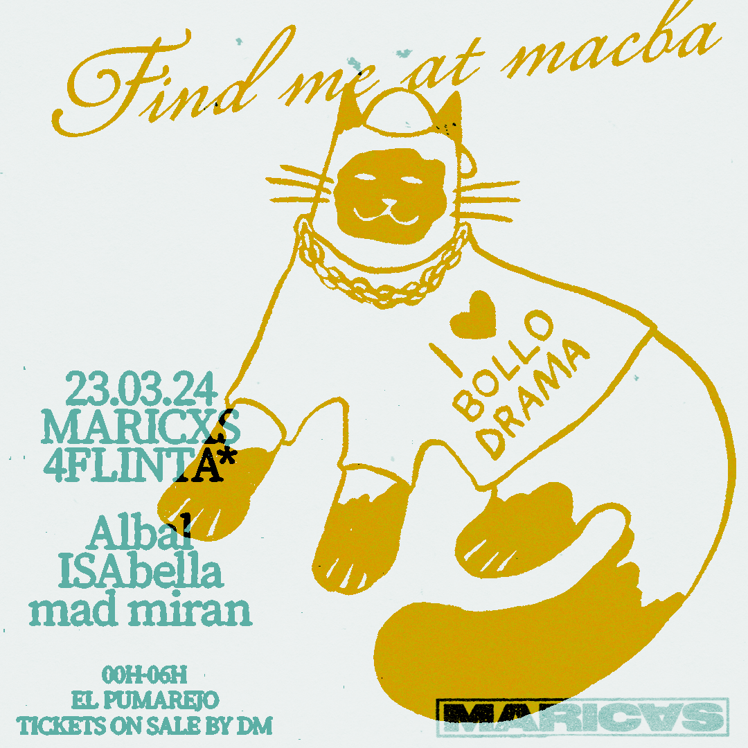
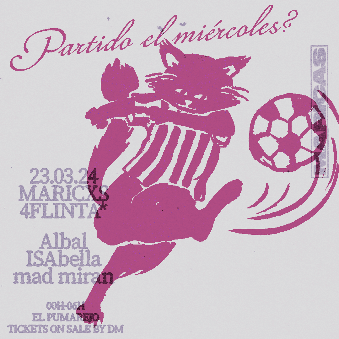
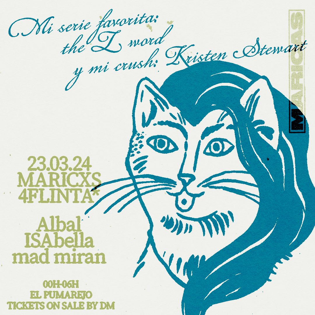
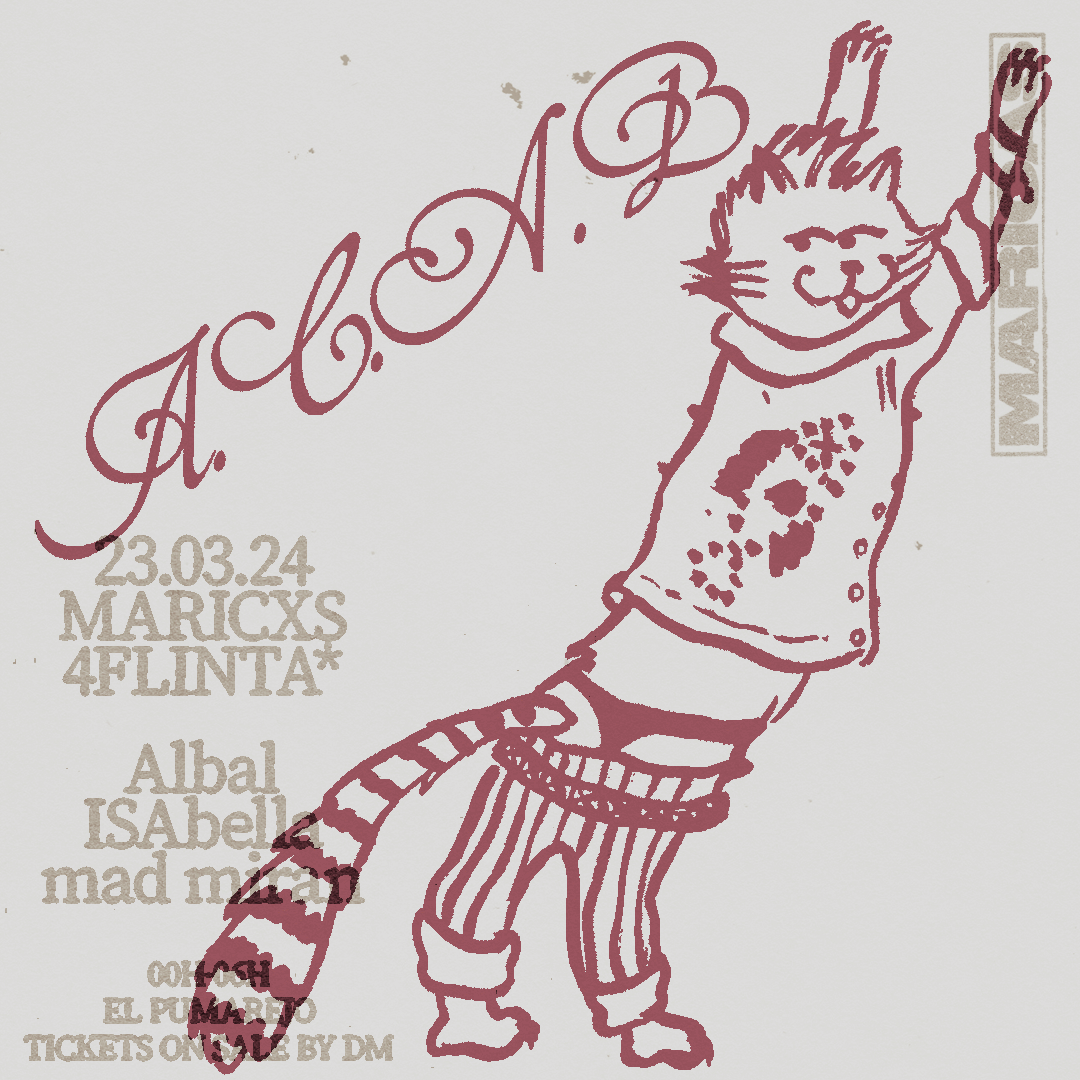
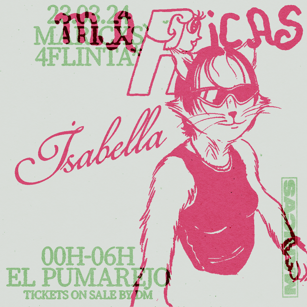
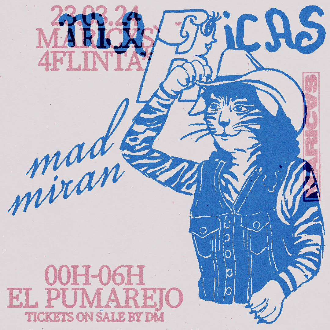
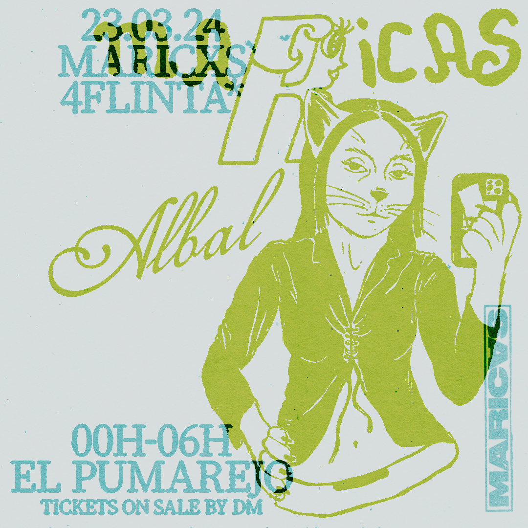
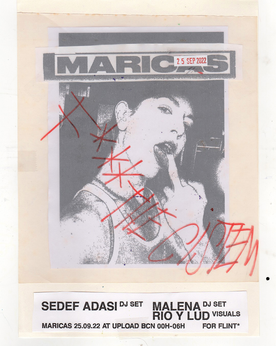
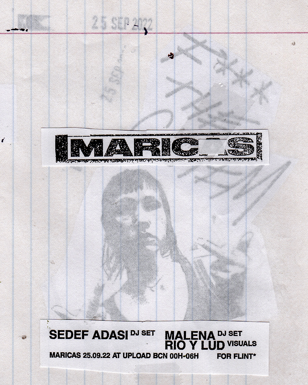
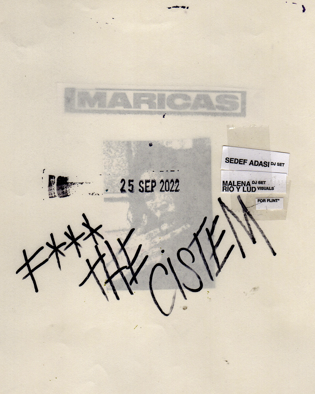
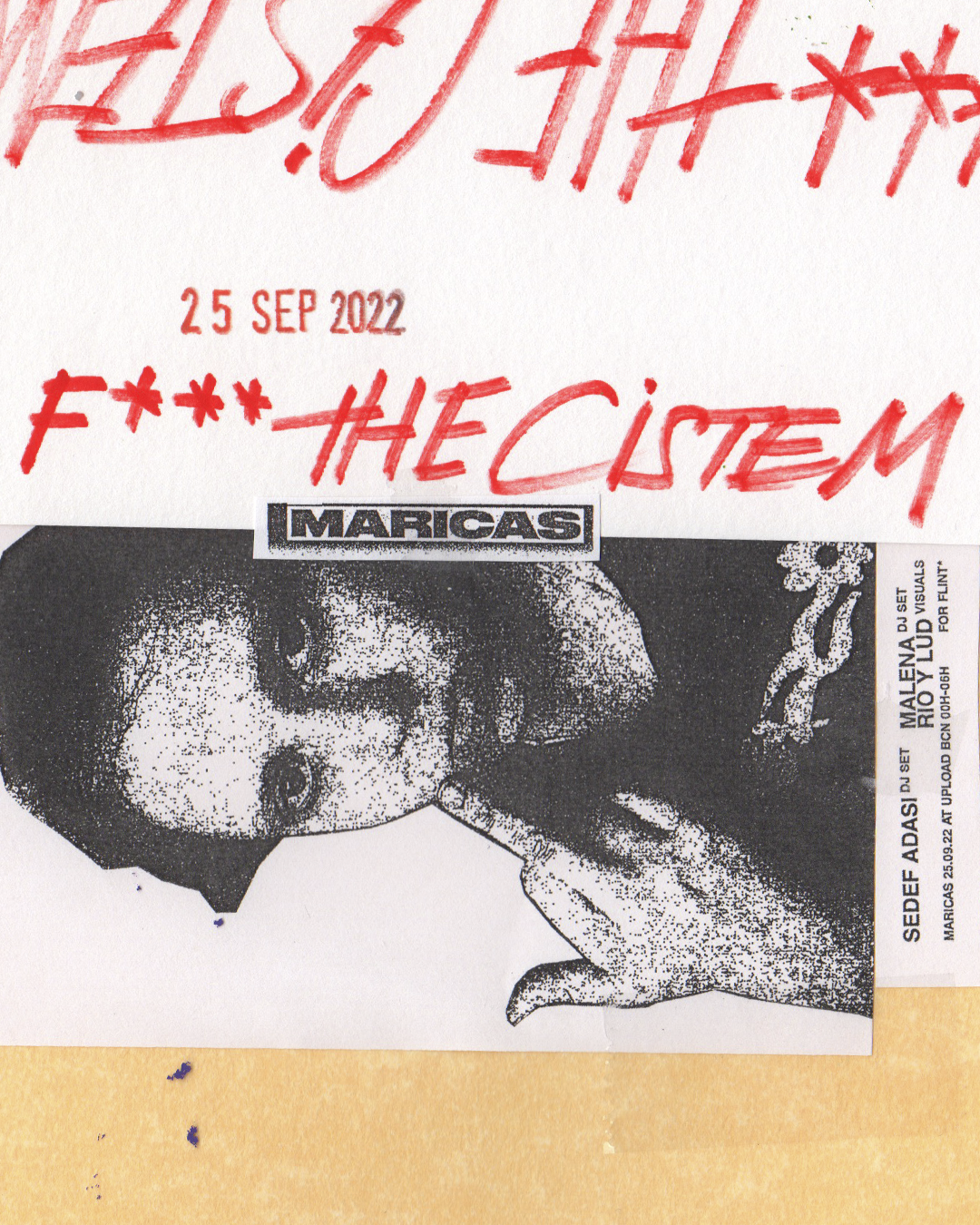
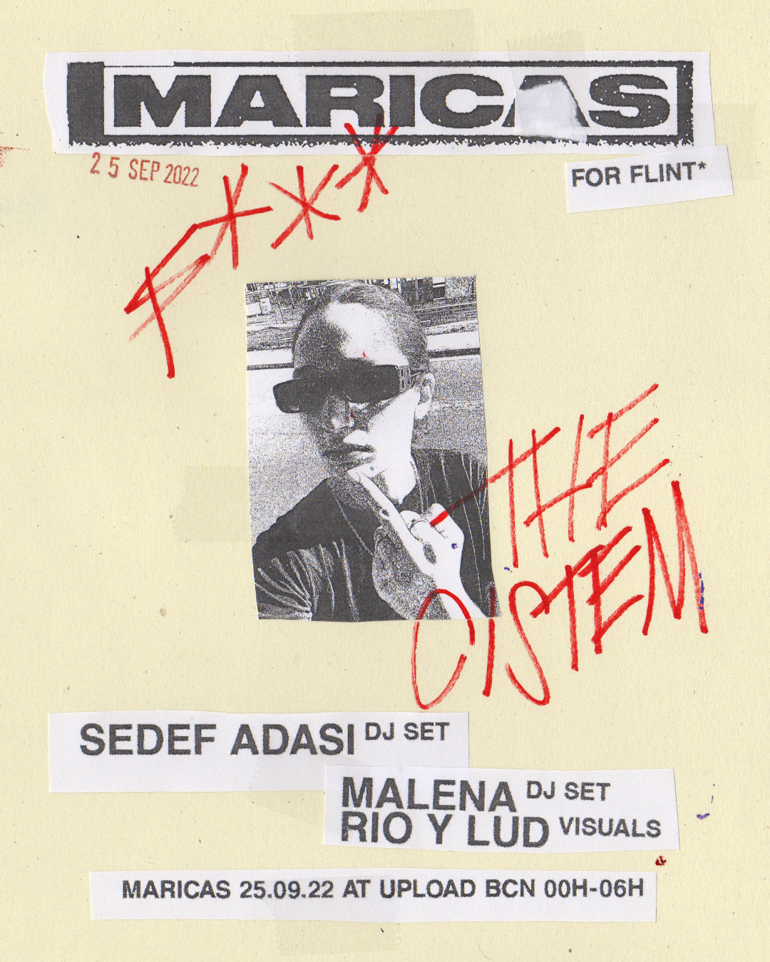
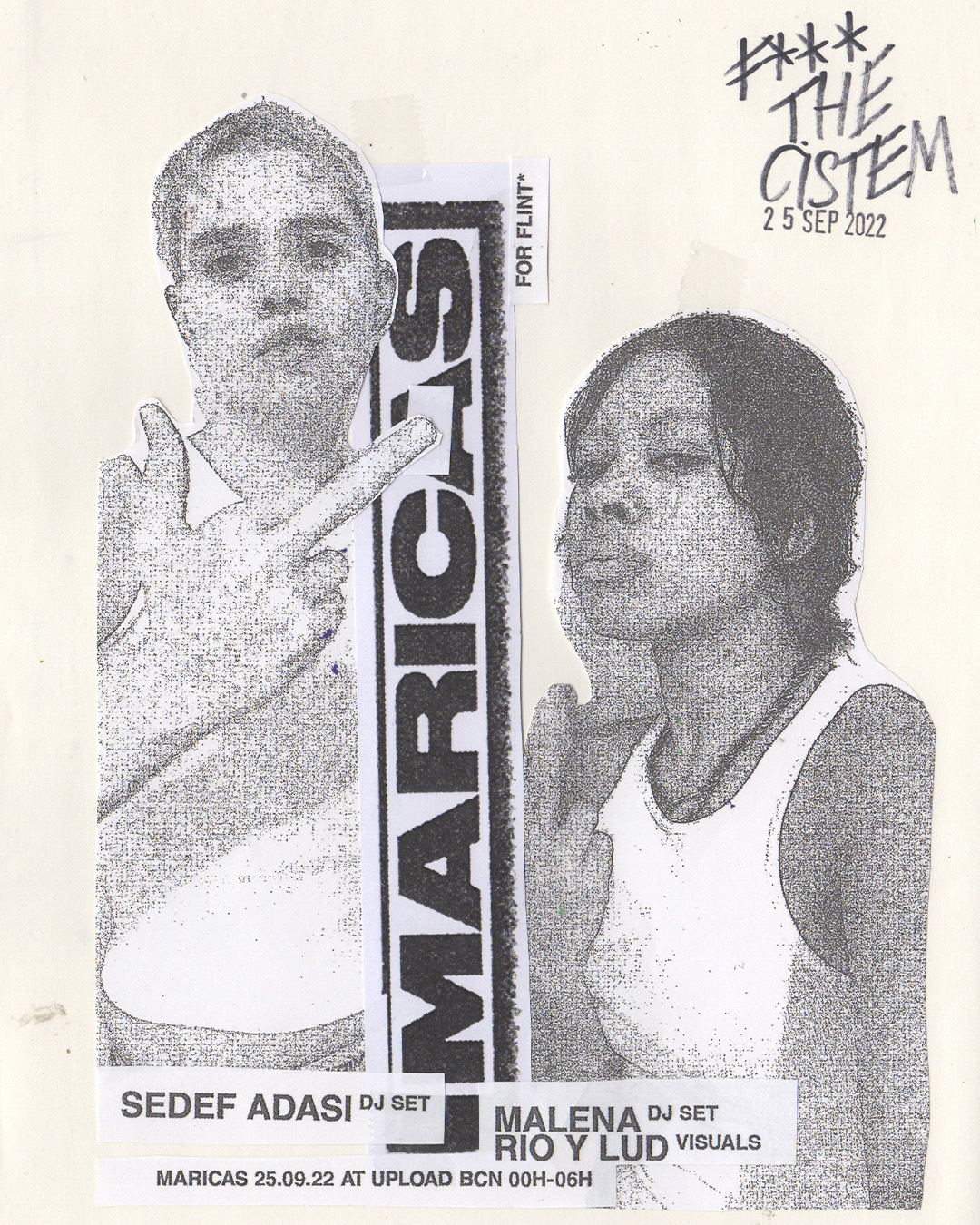
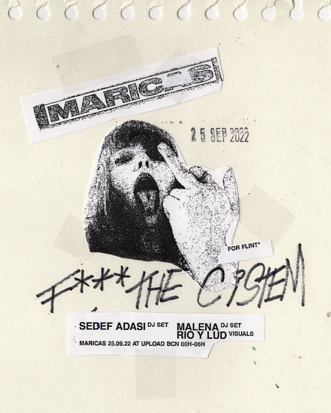
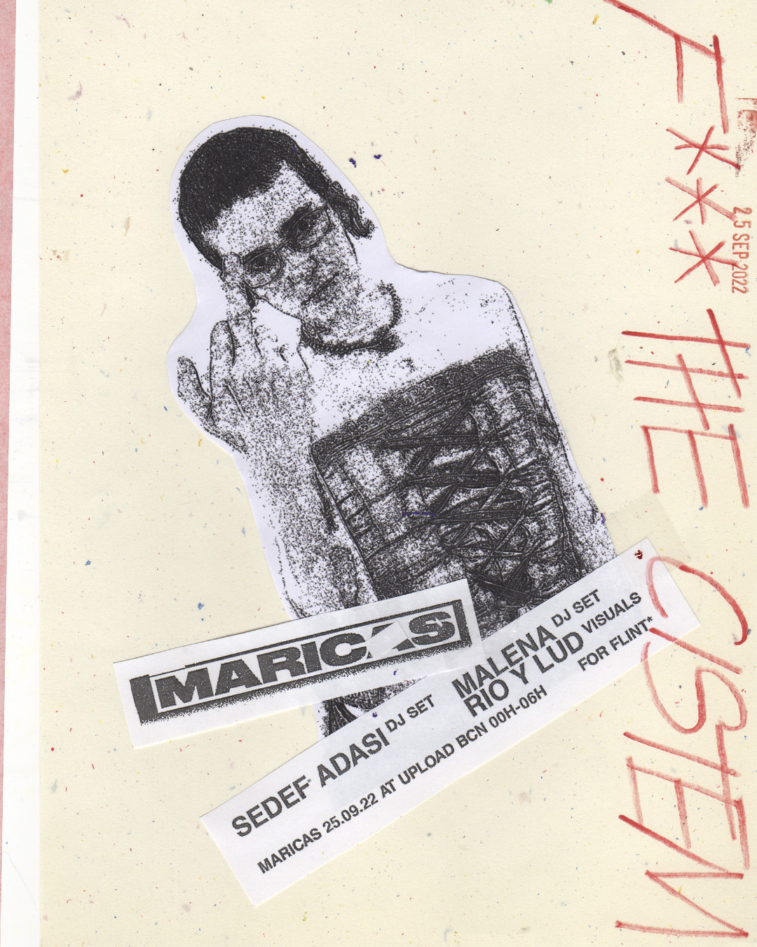
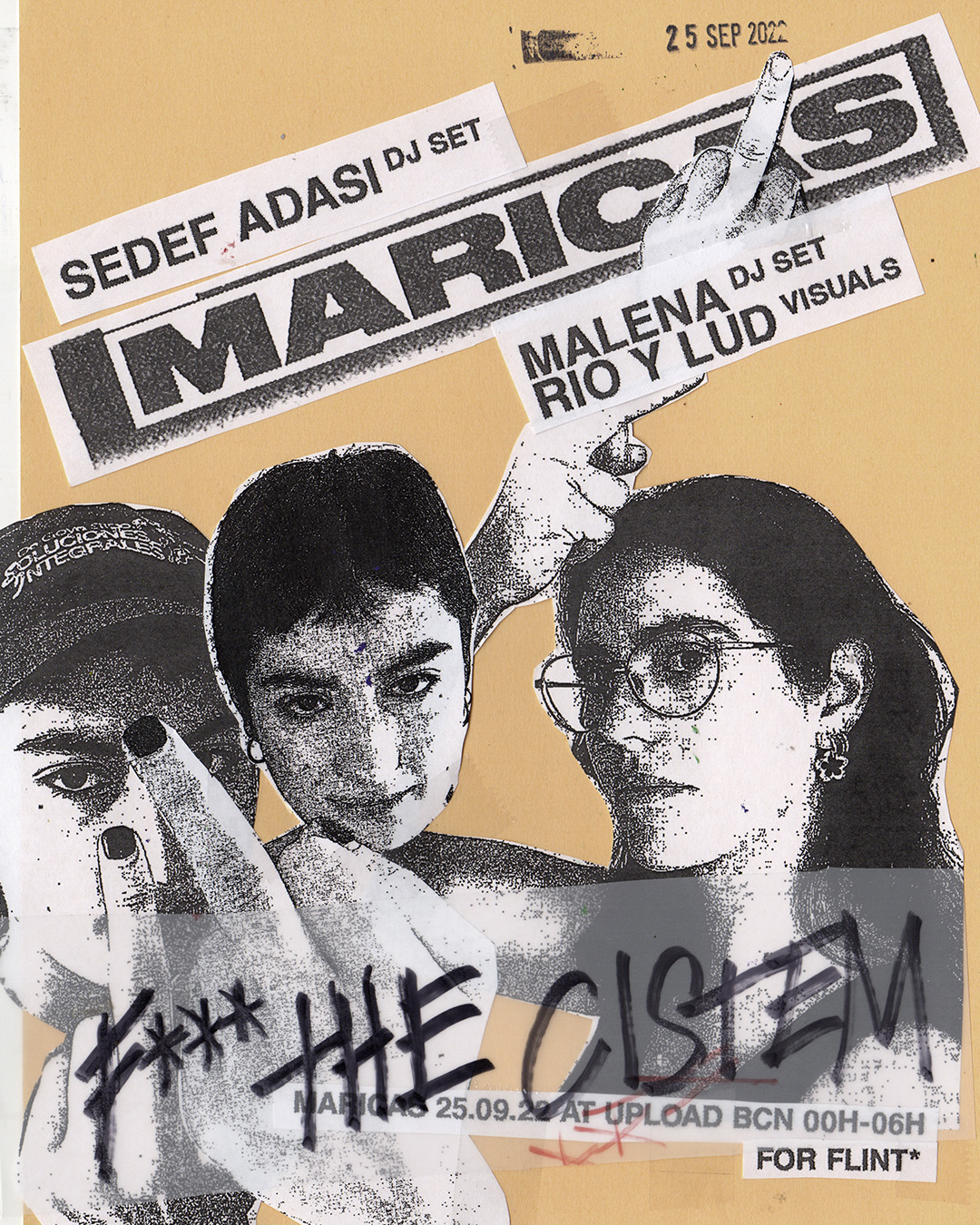
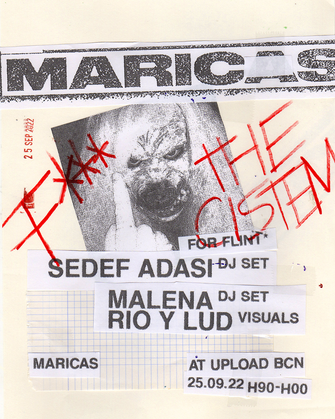
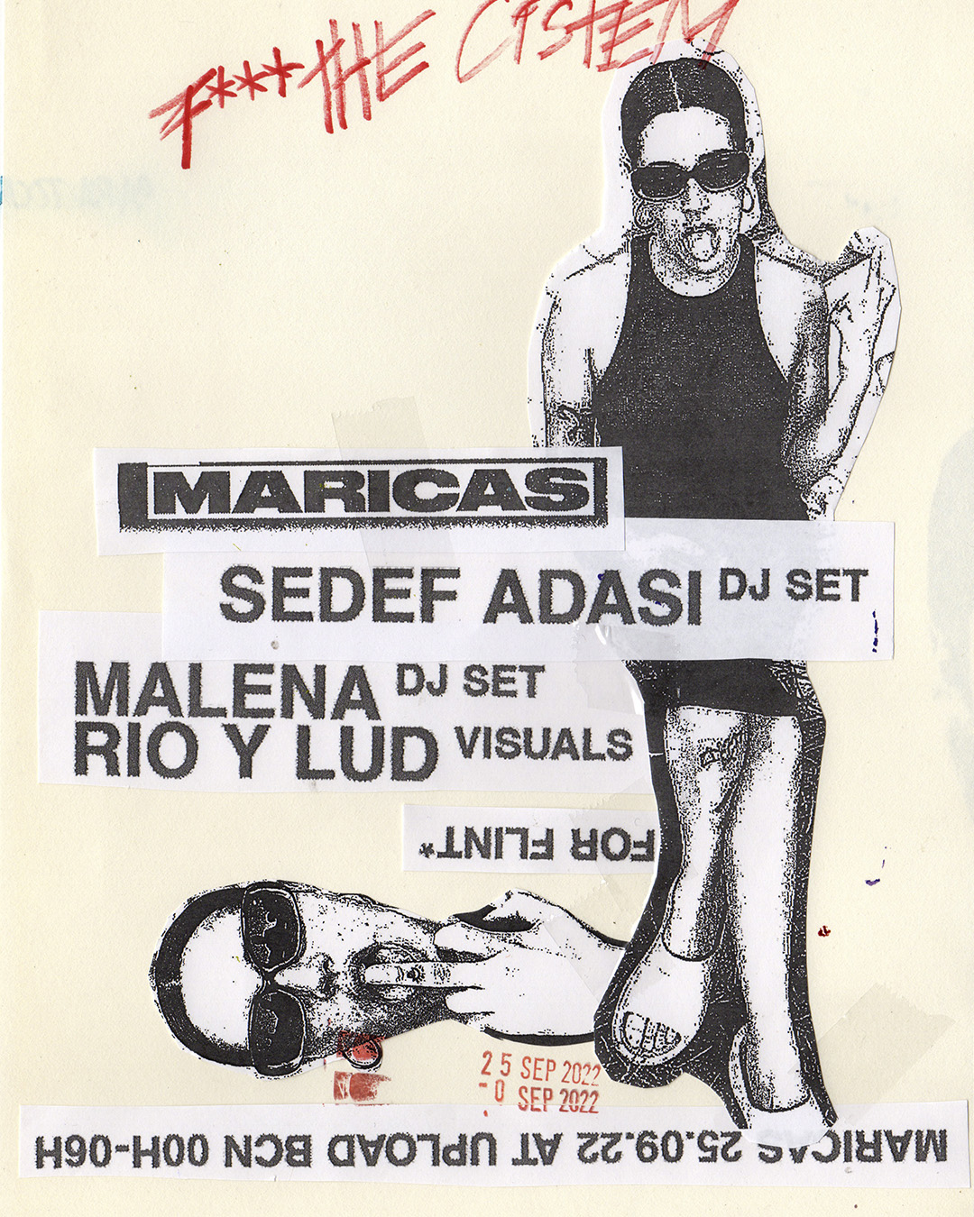
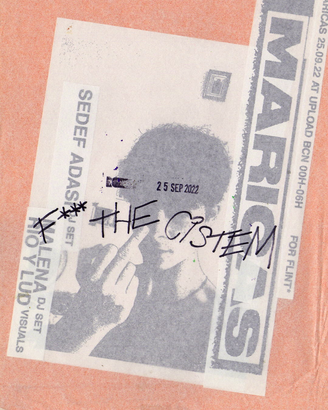
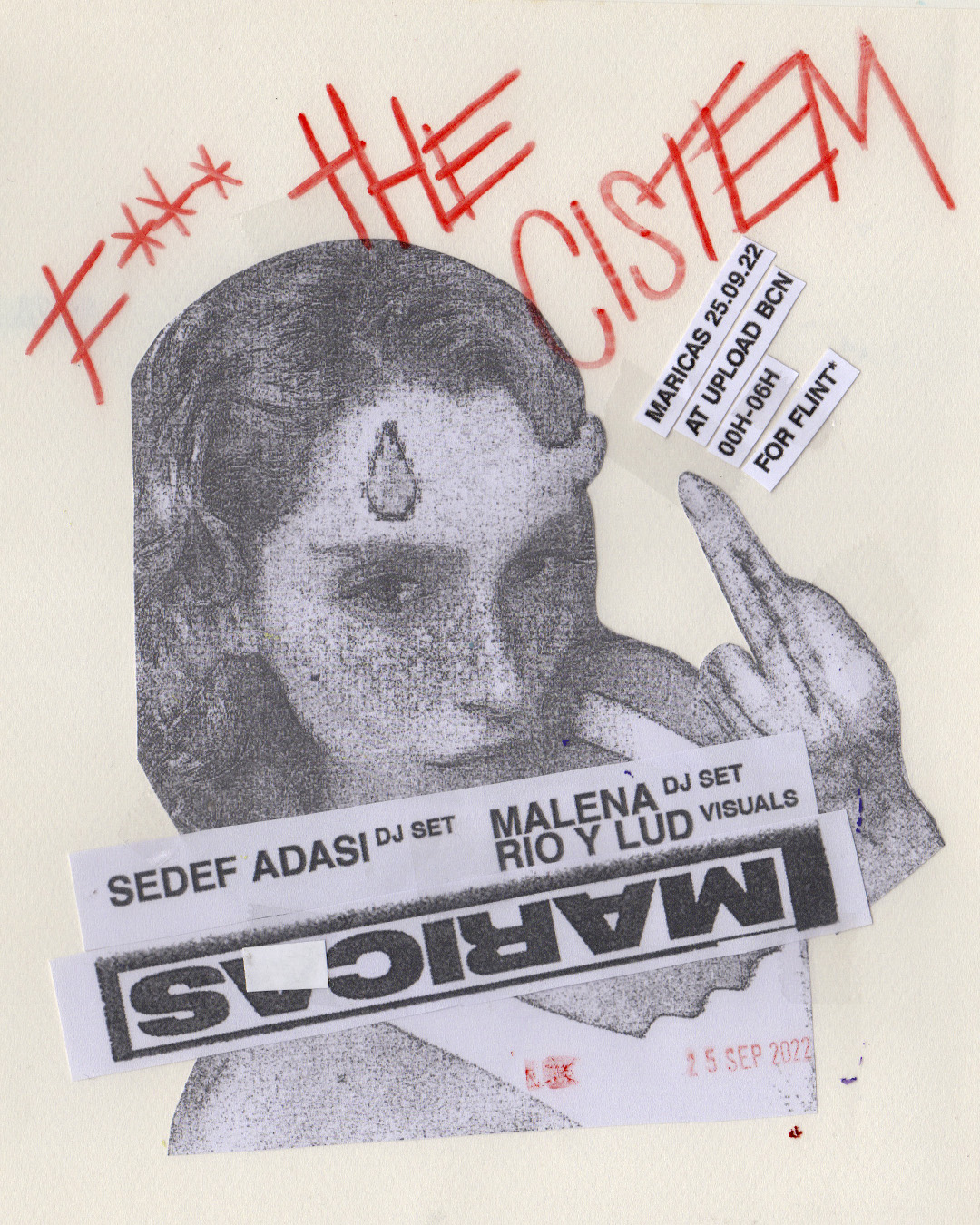
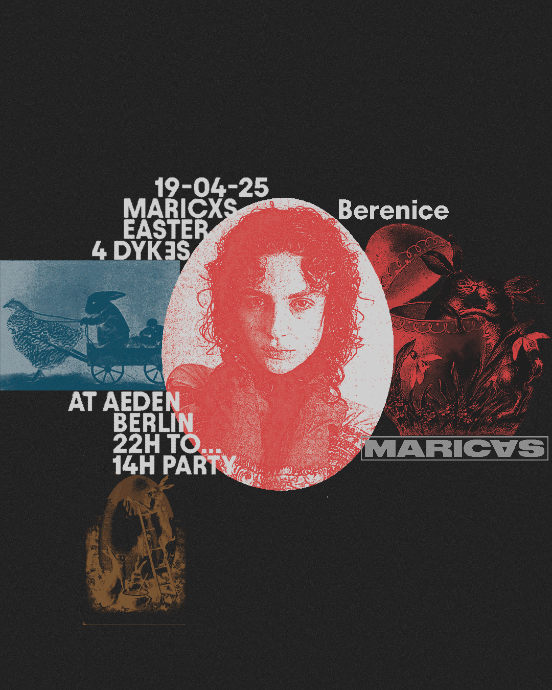
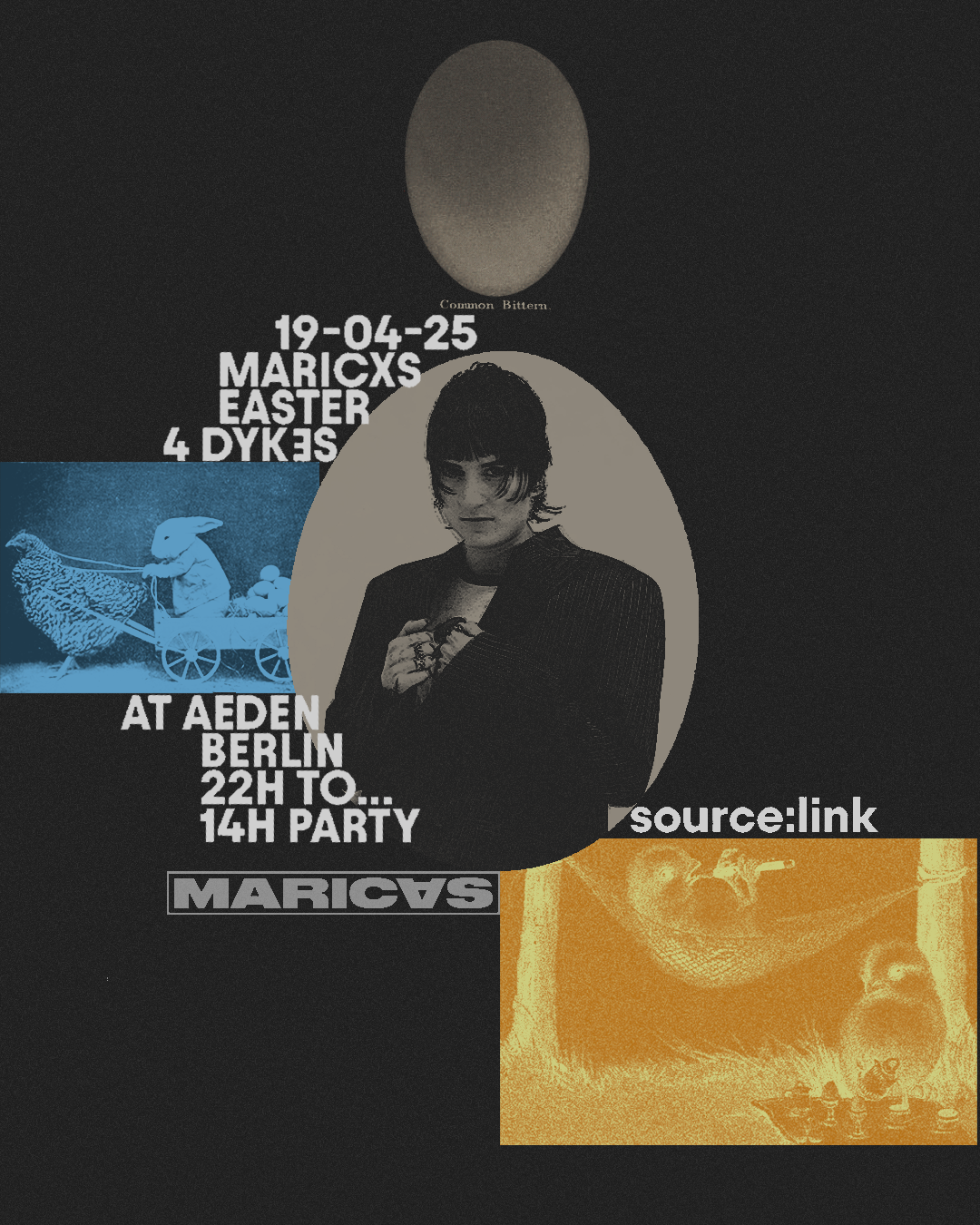
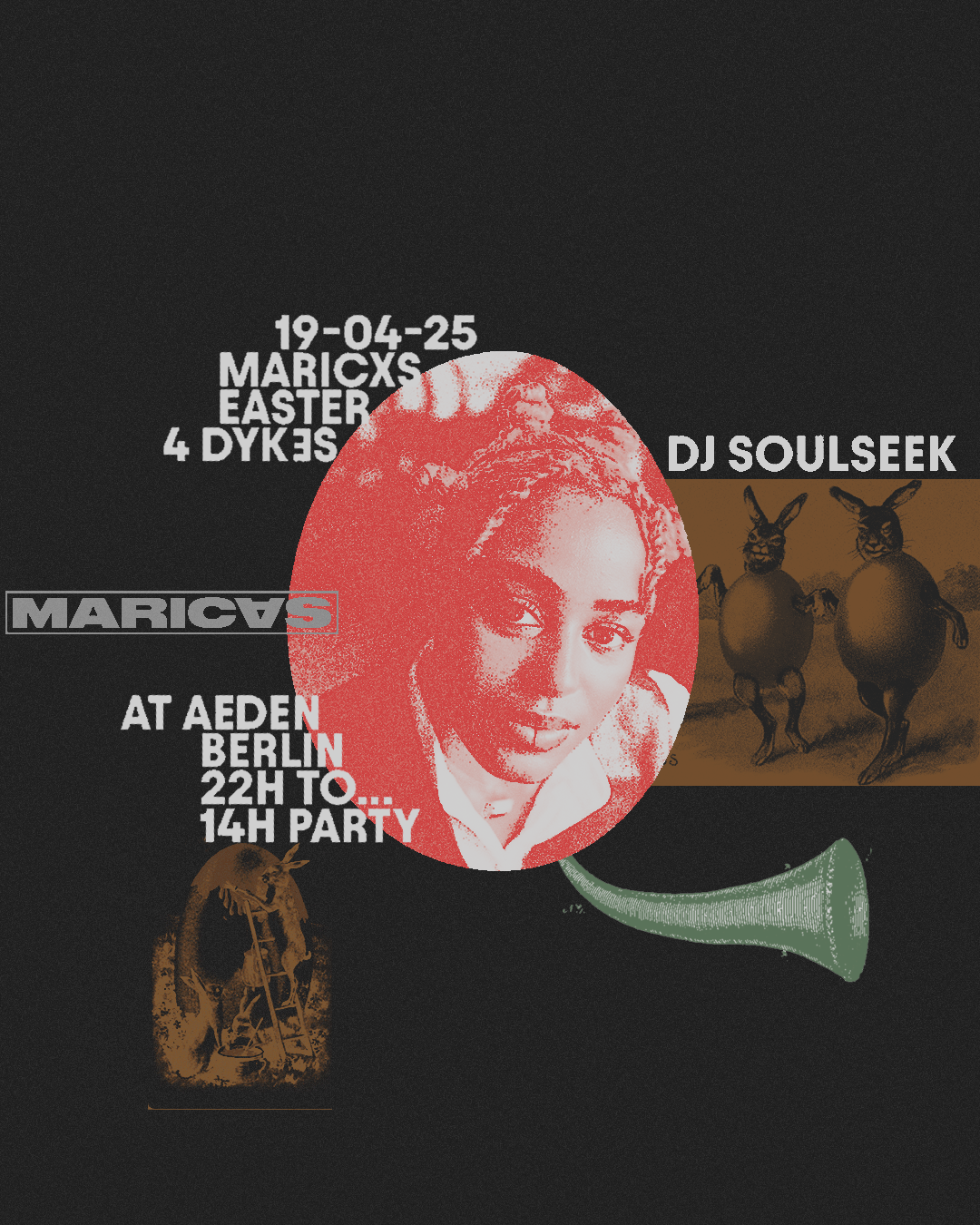
MARICAS
BRAND
MARICAS is a FLINTA* done, run and done party that collides an activist focus in creating safe spaces with a very distinctive old-school rave sound. Our party has a very special and unique way of communicating with our artworks, campaigns and art direction, experimenting with analog technics and collaborating with artists all over the world.
IDENTITY
MARICAS is a FLINTA* done, run and done party that collides an activist focus in creating safe spaces with a very distinctive old-school rave sound. Our party has a very special and unique way of communicating with our artworks, campaigns and art direction, experimenting with analog technics and collaborating with artists all over the world.
Apart from this, MARICAS has evolved into a record label, making releases both digitally and physically on vinyl.
MARICAS is an activist project with a very funny touch, and this is reflected in the whole identity of the project.
IDENTITYMARICAS in Spanish means faggot and it’s a term that it’s used as an insult to folks from the collective. Our aim behind the naming is to empower the words and shift its meaning. The typo is strong and direct with the yellow color, the representative color of MARICAS.
The identity is characterized by the use of analogical resources, provocative images and activist messages. We experiment in each campaign with new techniques and aesthetics, which is why the general image of MARICAS is eclectic.
All communication is done from humor and always in collaboration with emerging artists and queer folks.
CLIENT
Partner project
SERVICES
Creative direction
Art direction
Naiming
Identity
Creative Copywriting
Curation
Campaign
Product
Digital content
YEAR
since 2018
LINKS
Instagram
Soundcloud
Youtube
Bandcamp
Partner project
SERVICES
Creative direction
Art direction
Naiming
Identity
Creative Copywriting
Curation
Campaign
Product
Digital content
YEAR
since 2018
LINKS
Soundcloud
Youtube
Bandcamp


SELECTED CAMPAIGNS


SENTIMENTAL
BRAND
Sentimental is a booking and management agency where diverse, unique and multidisciplinary artists meet.
IDENTITY
Sentimental is a booking and management agency where diverse, unique and multidisciplinary artists meet.
It takes on alternative, innovative and emerging talents that are filled with power and freshness Diversity, inclusion, personality, weirdness and contemporaneity is what Sentimental is all about.
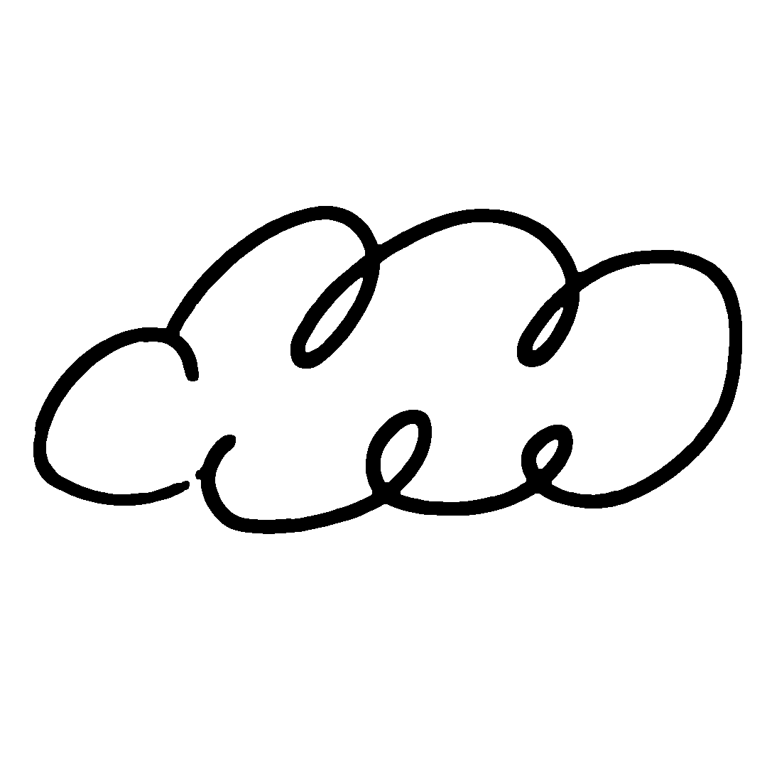
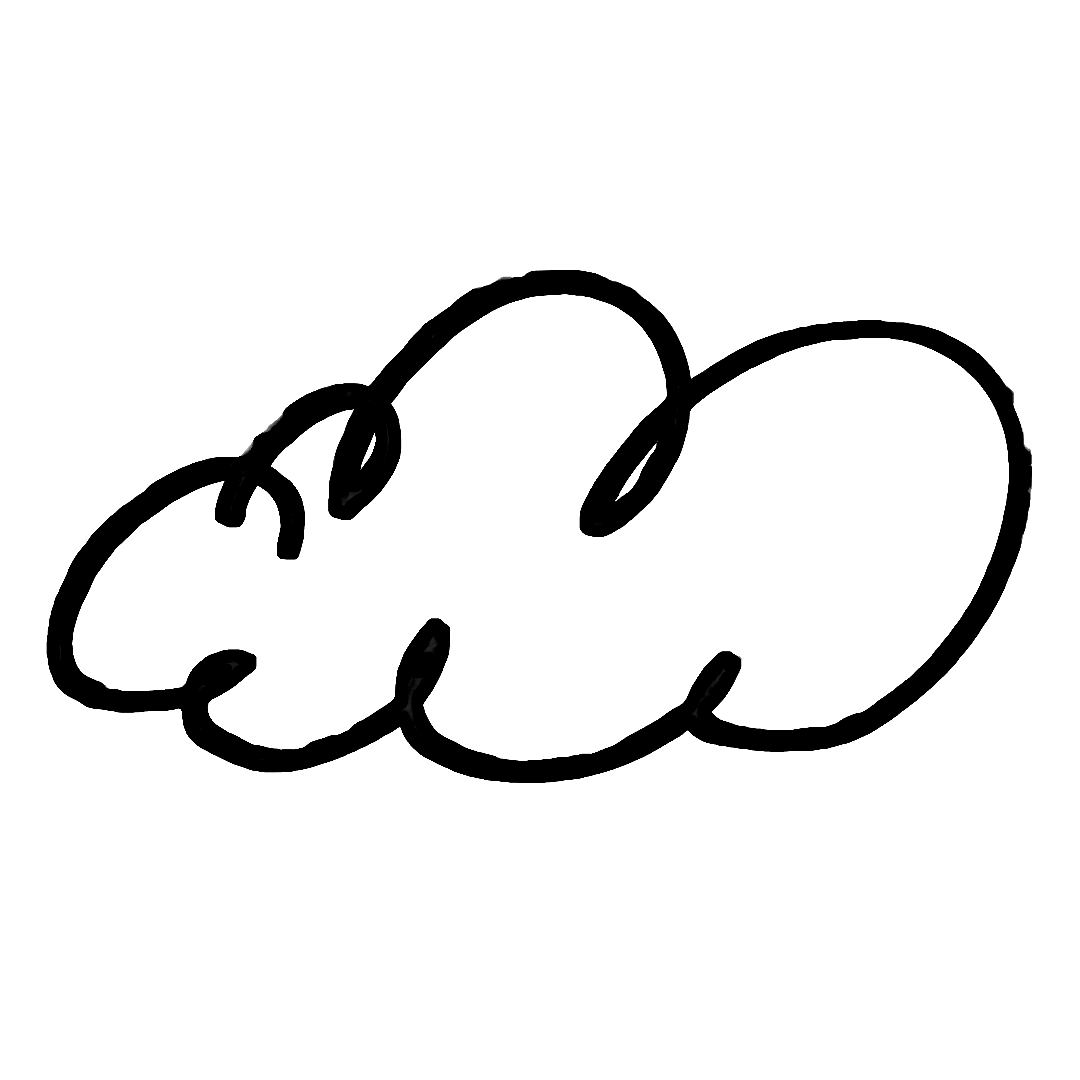
IDENTITYThe concept of the identity is born from the fetish of one of the co-founders’ with clouds and their large digital archive of them. As a result, the logo is composed of two clouds representing their union of the two co-founders.
Identity contains many clouds of different shapes to talk about the plurality of its artists, and on the website we can see the inner world of each person through their intimate moodboards.
All the identity aims to reflect the meaning of “sentimental” through colors, overlays and experimentation.
Identity contains many clouds of different shapes to talk about the plurality of its artists, and on the website we can see the inner world of each person through their intimate moodboards.
All the identity aims to reflect the meaning of “sentimental” through colors, overlays and experimentation.


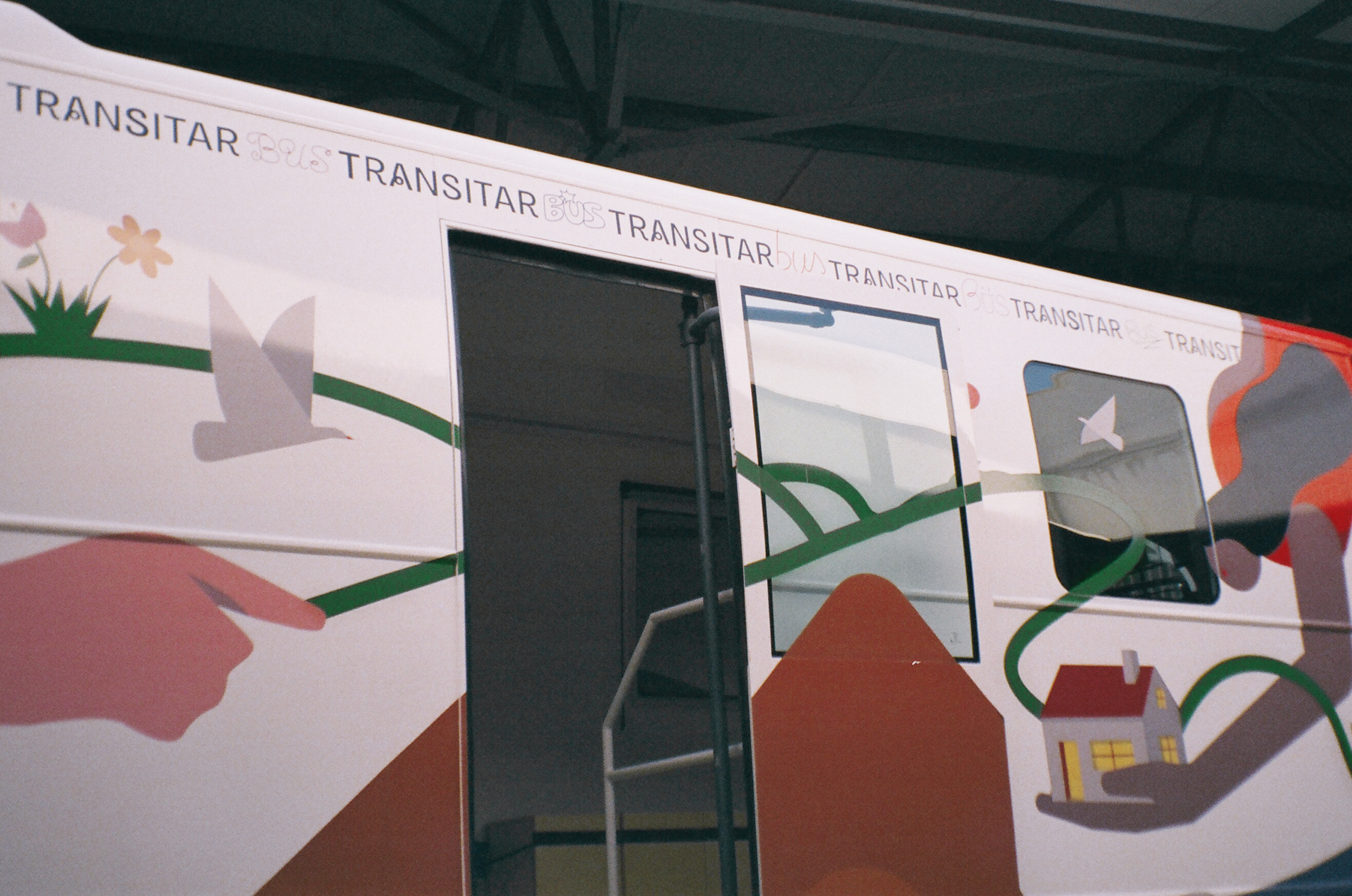
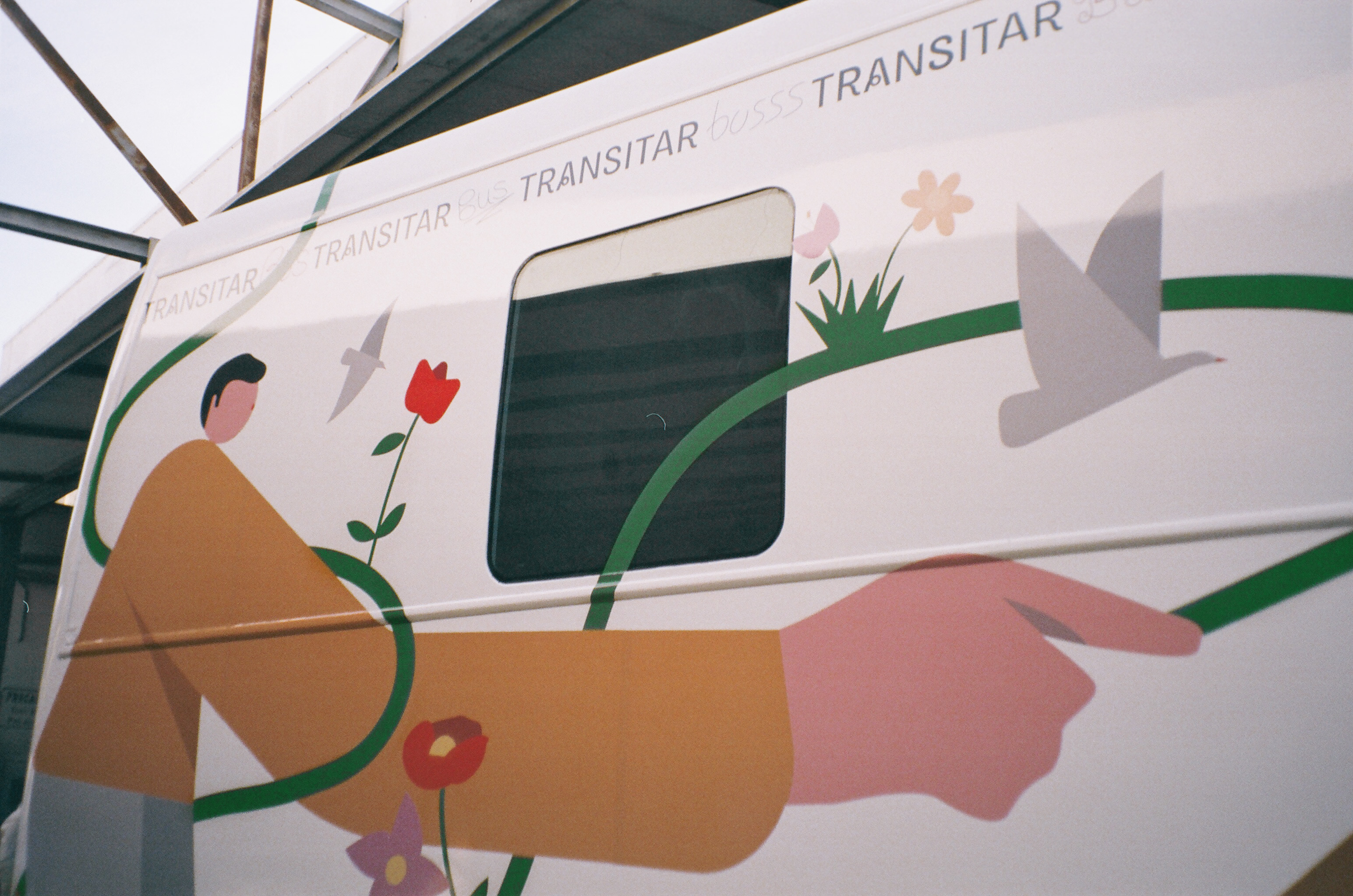
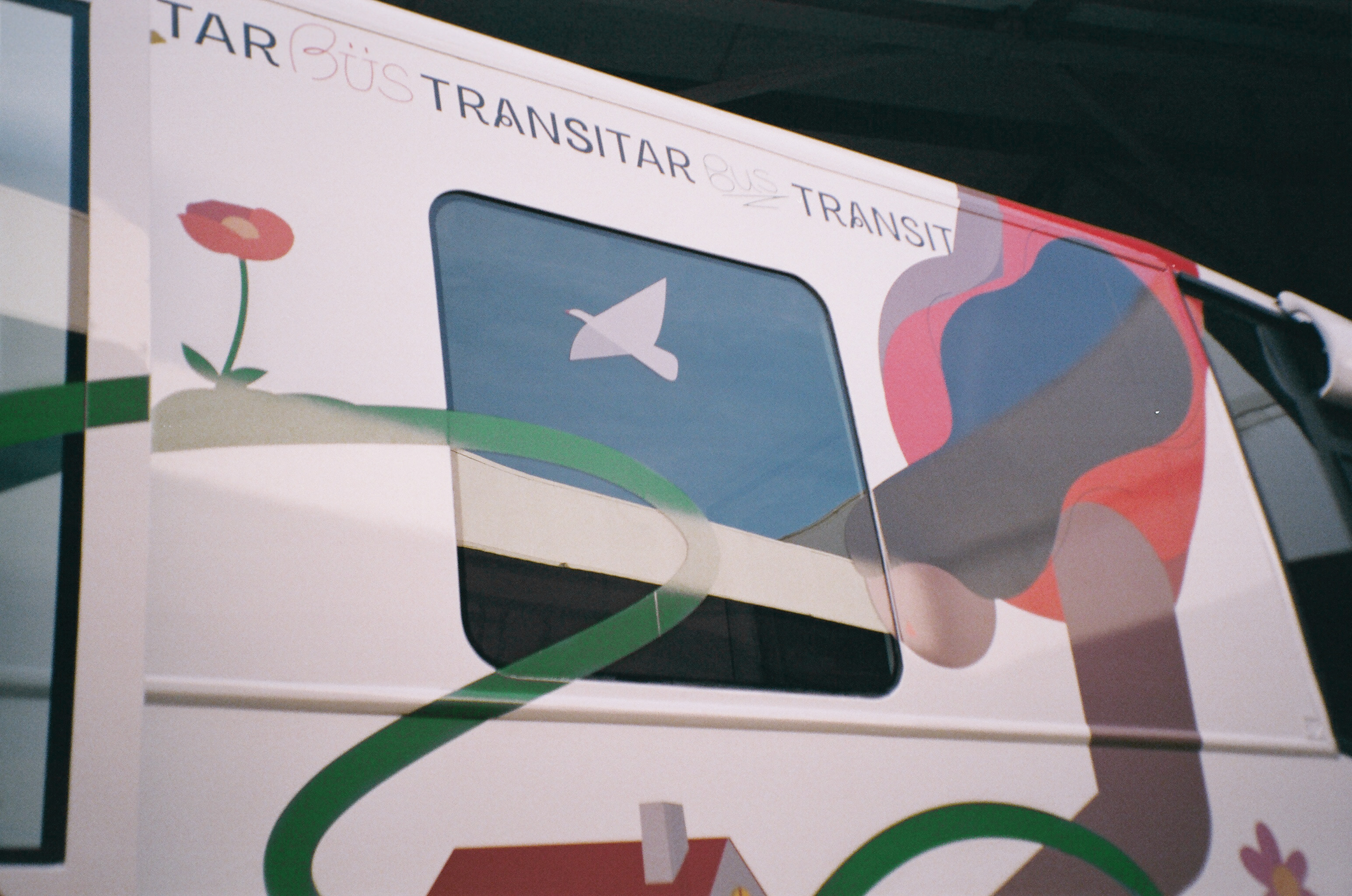
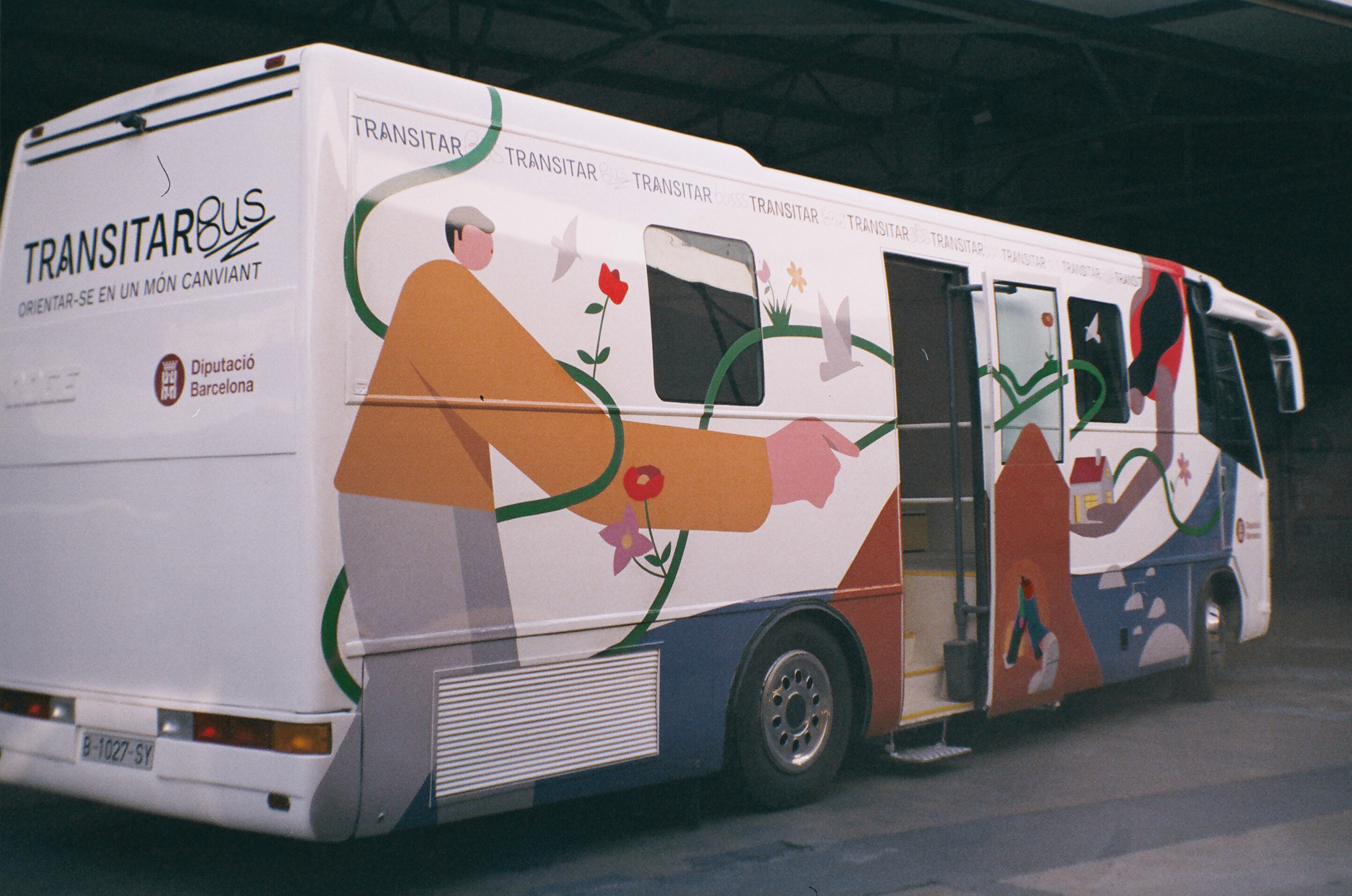
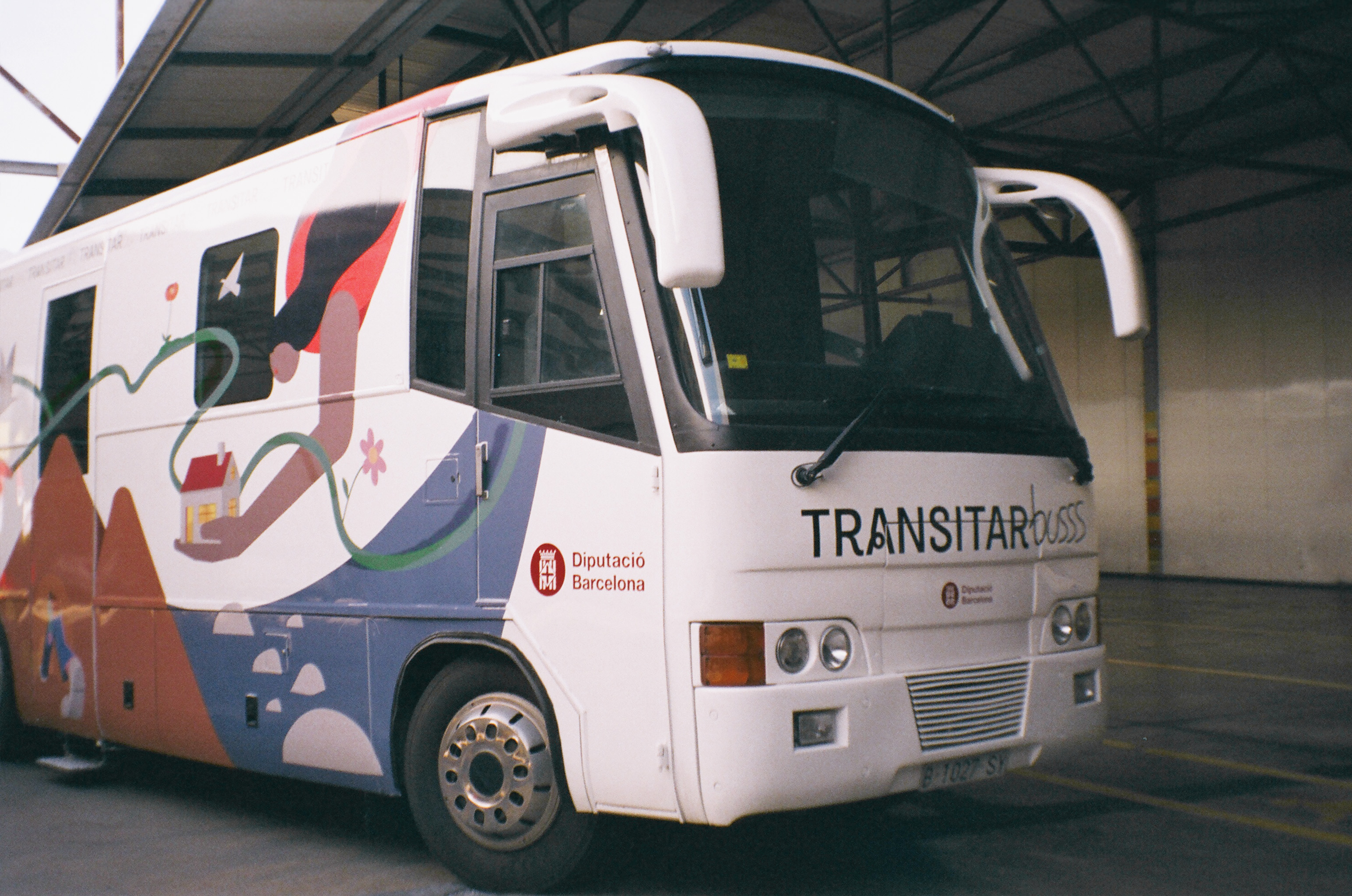
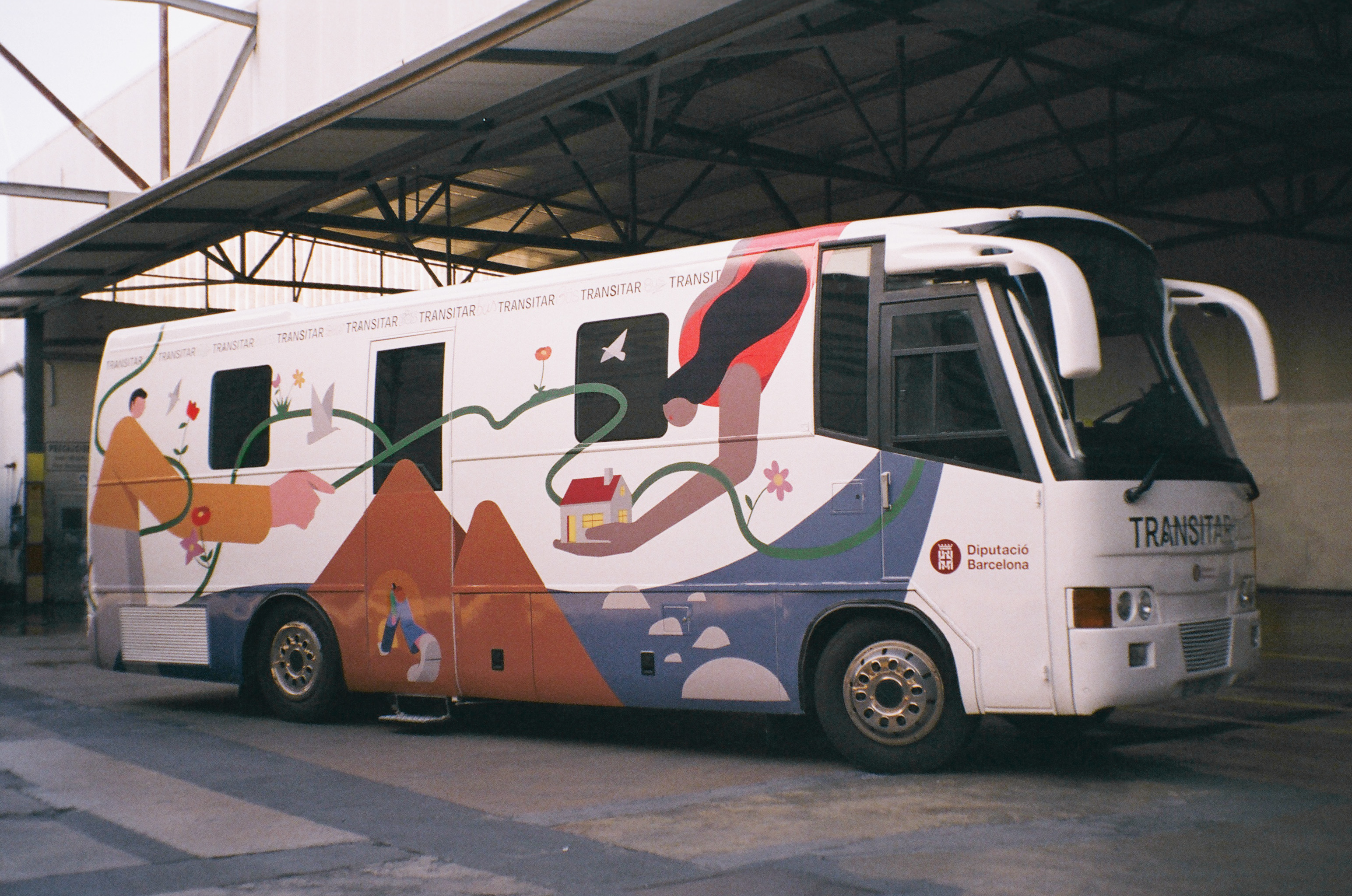
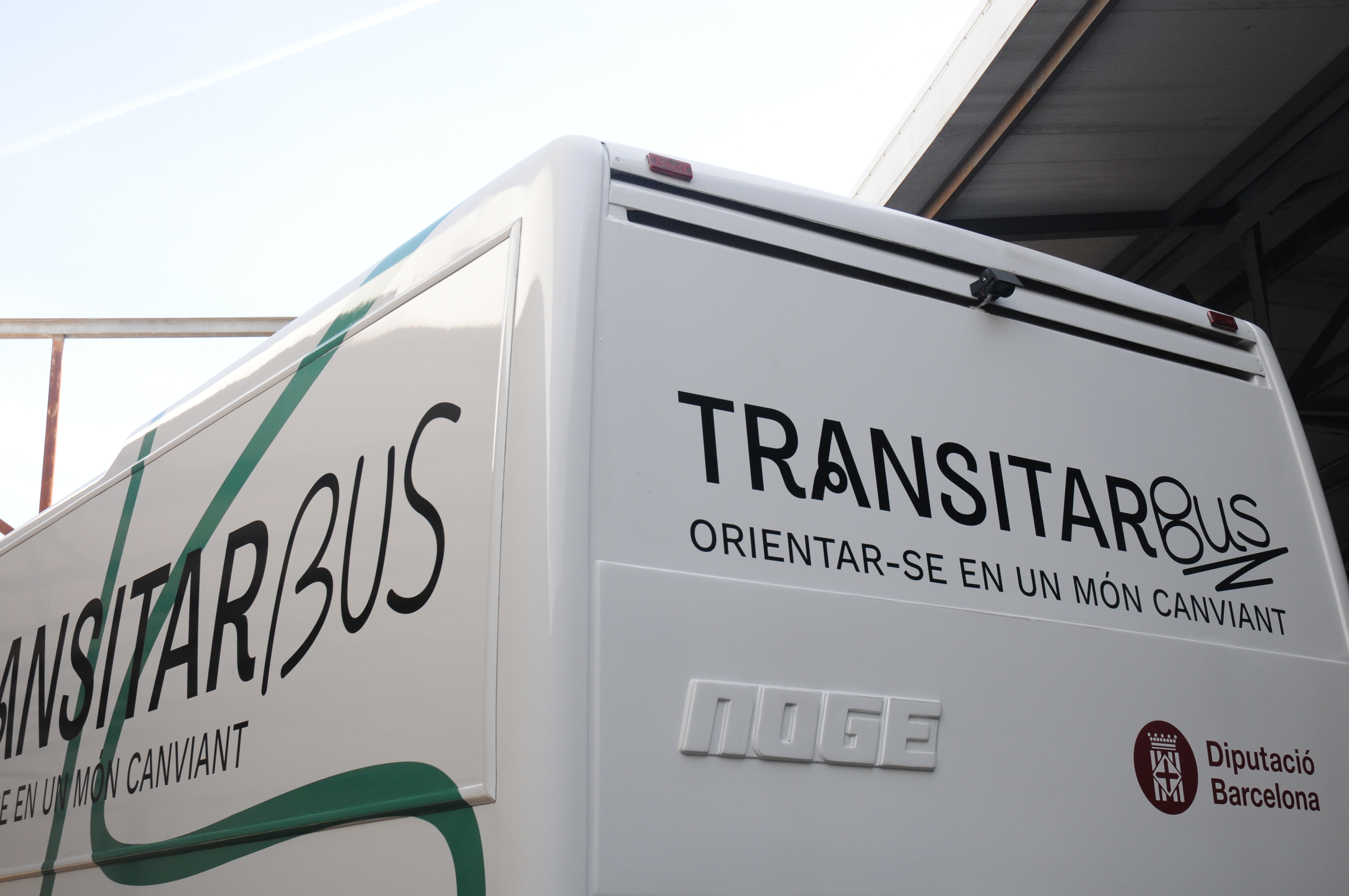
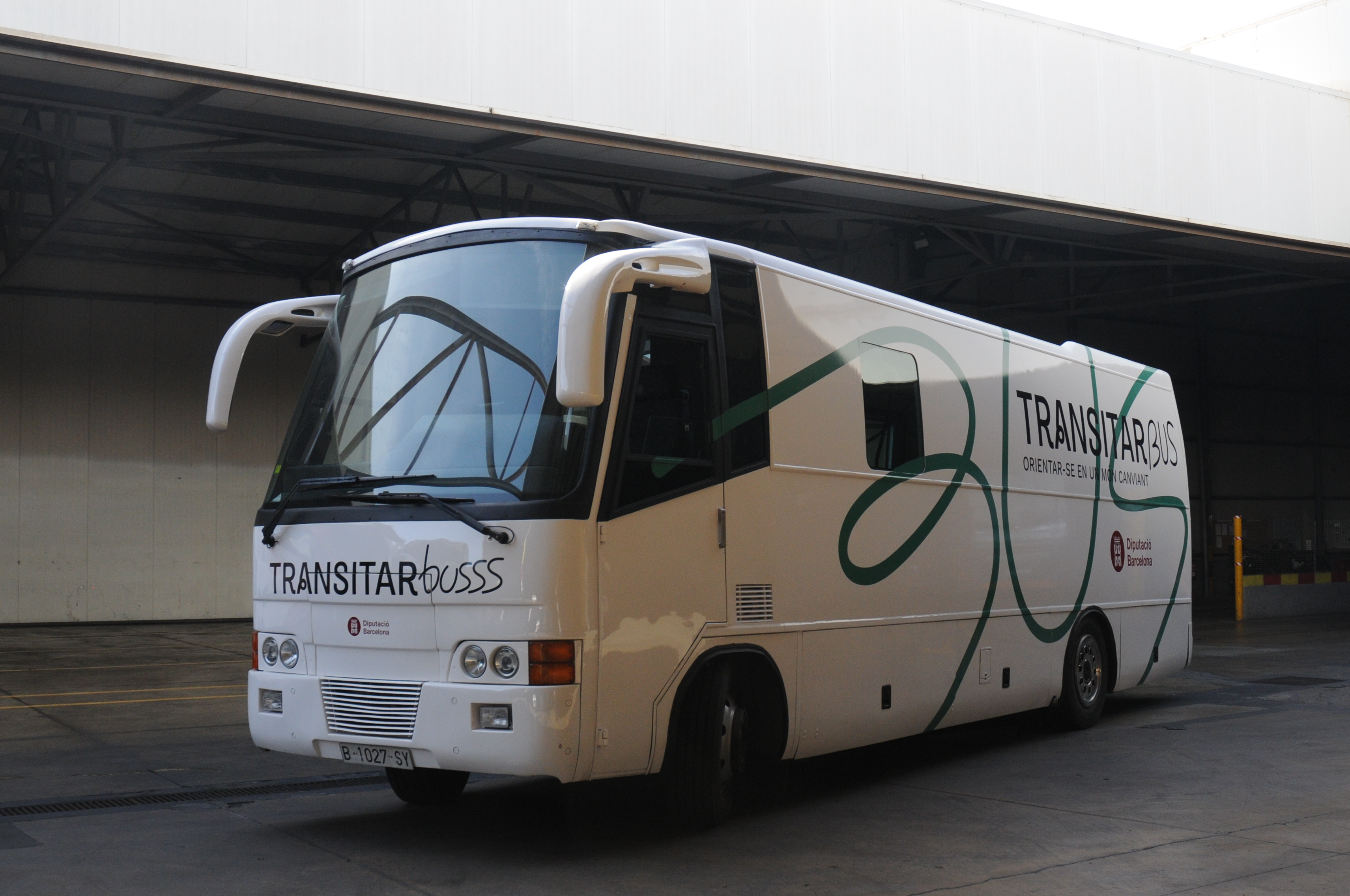
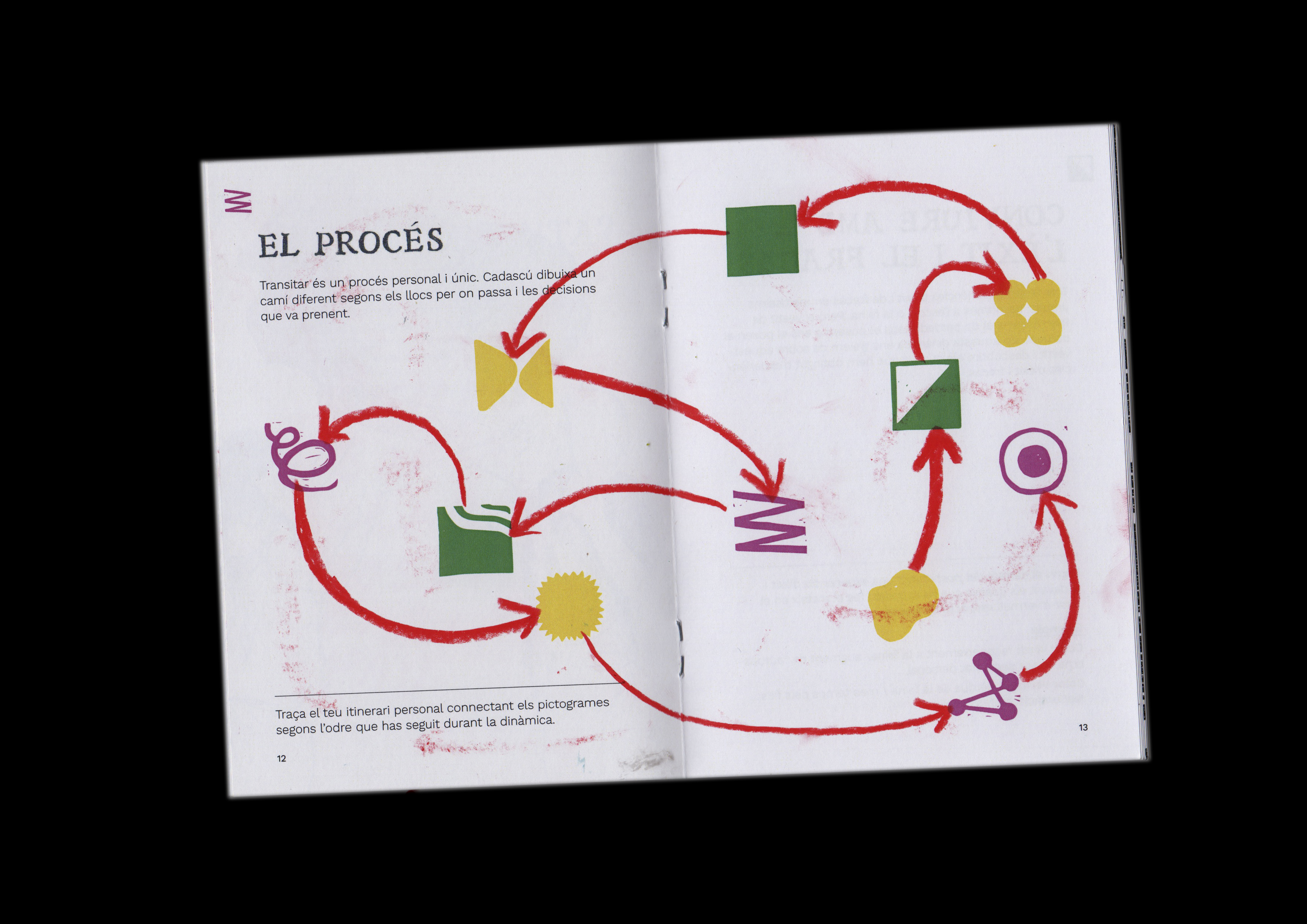
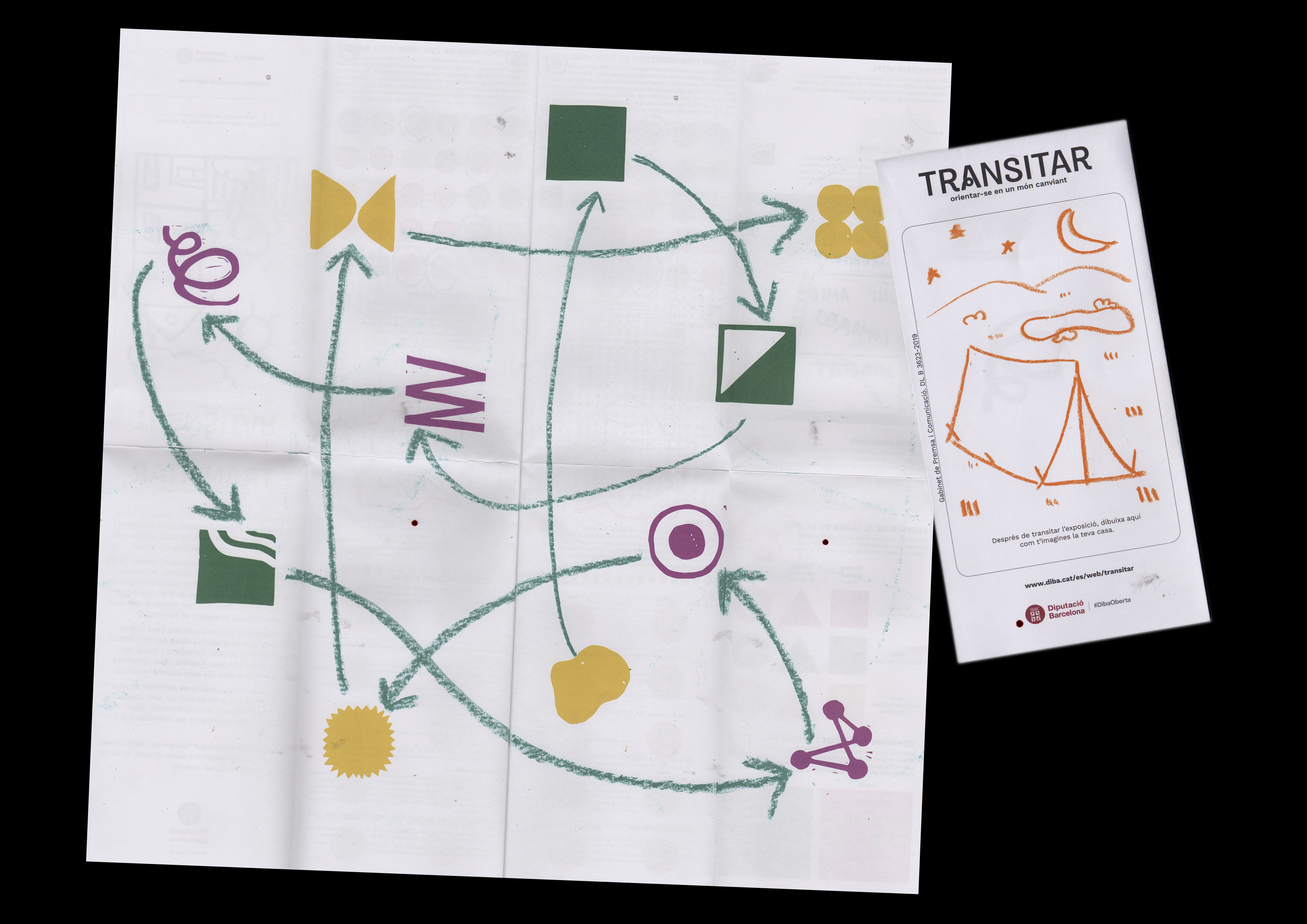
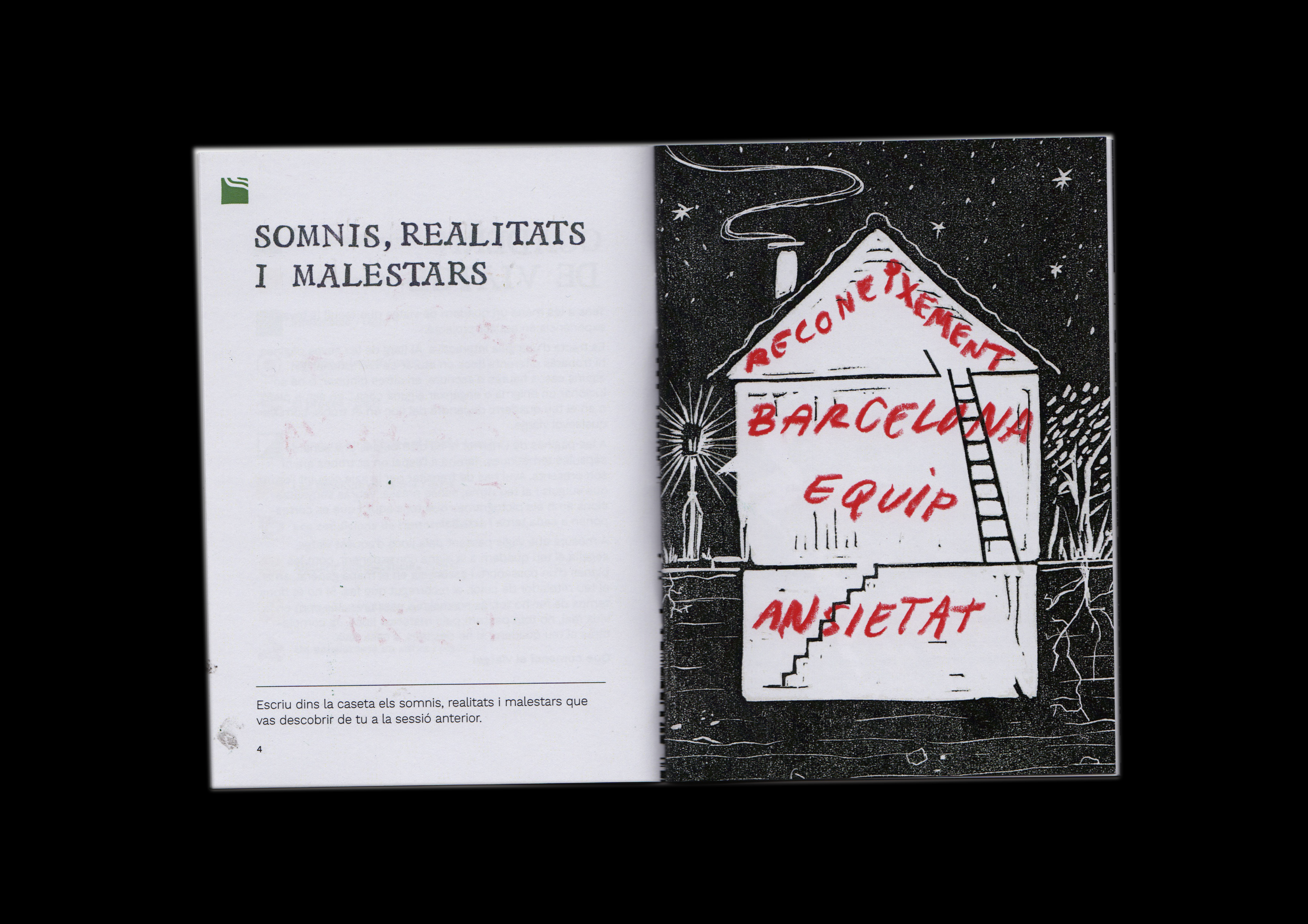
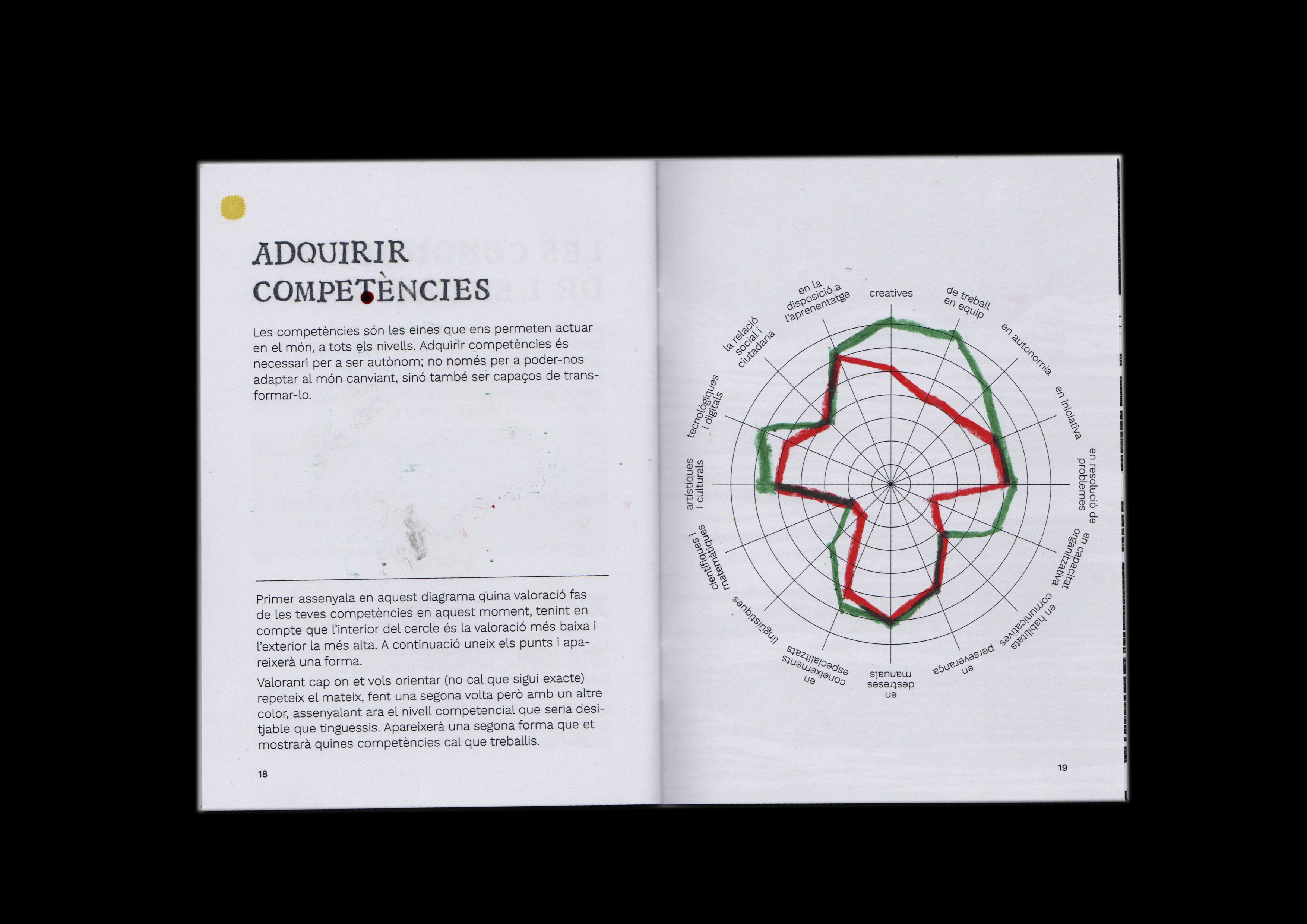
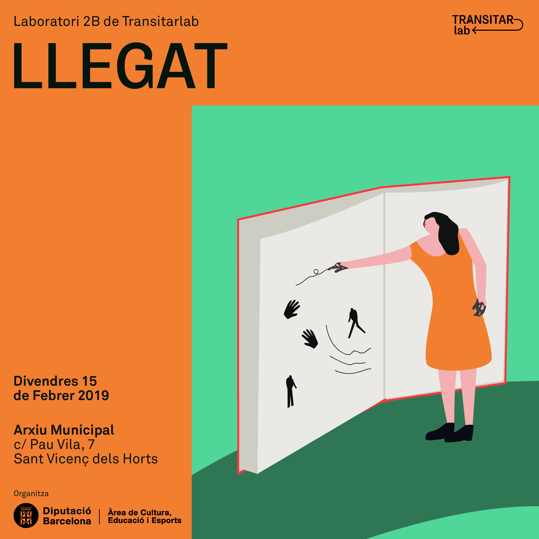
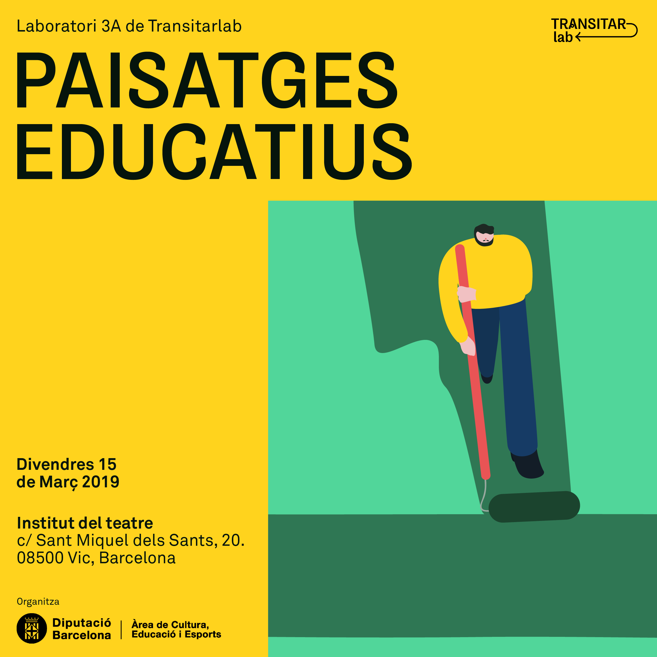
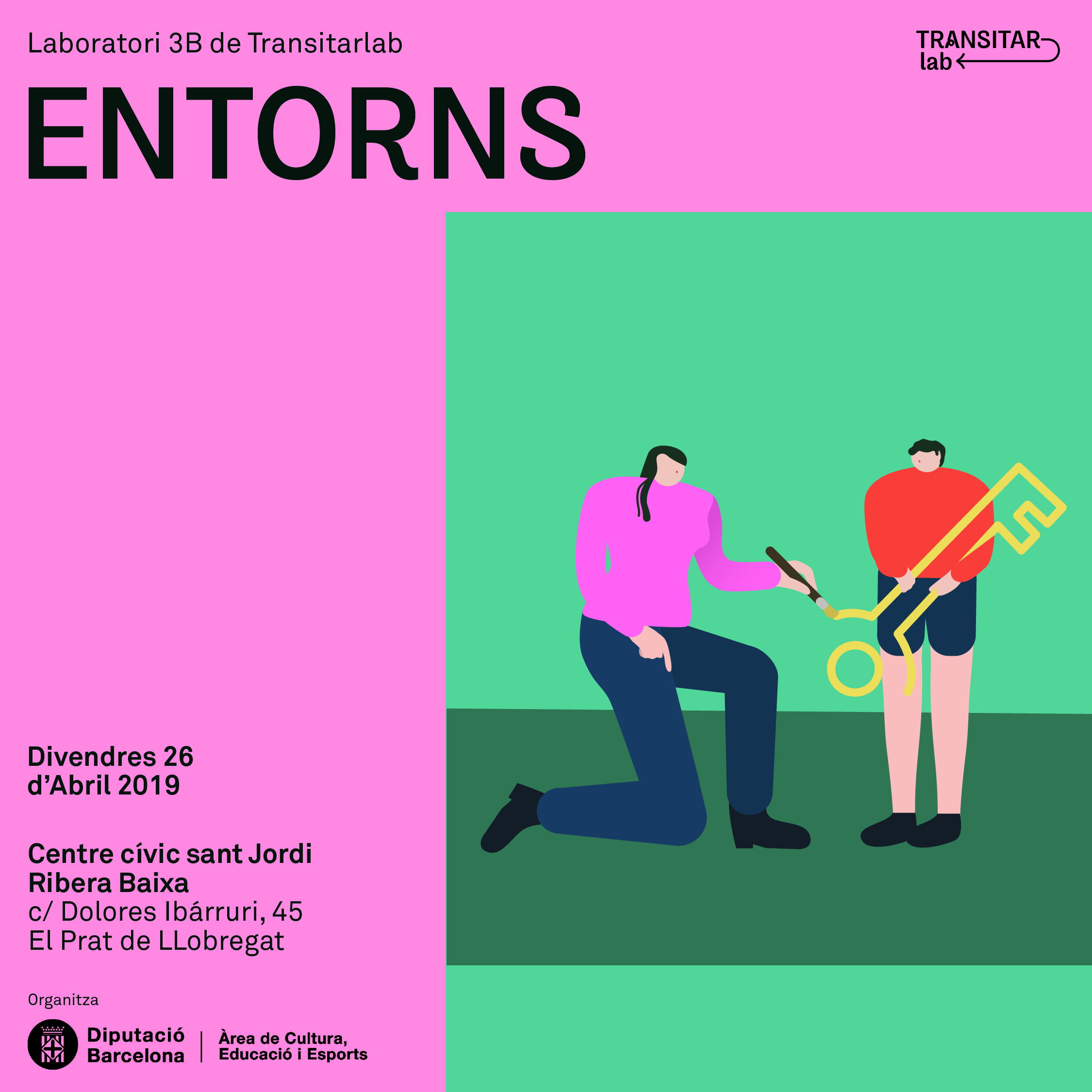
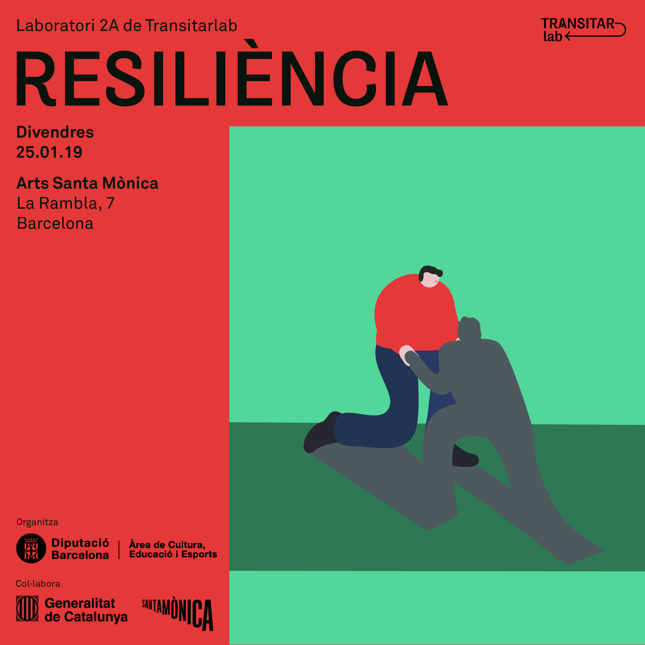
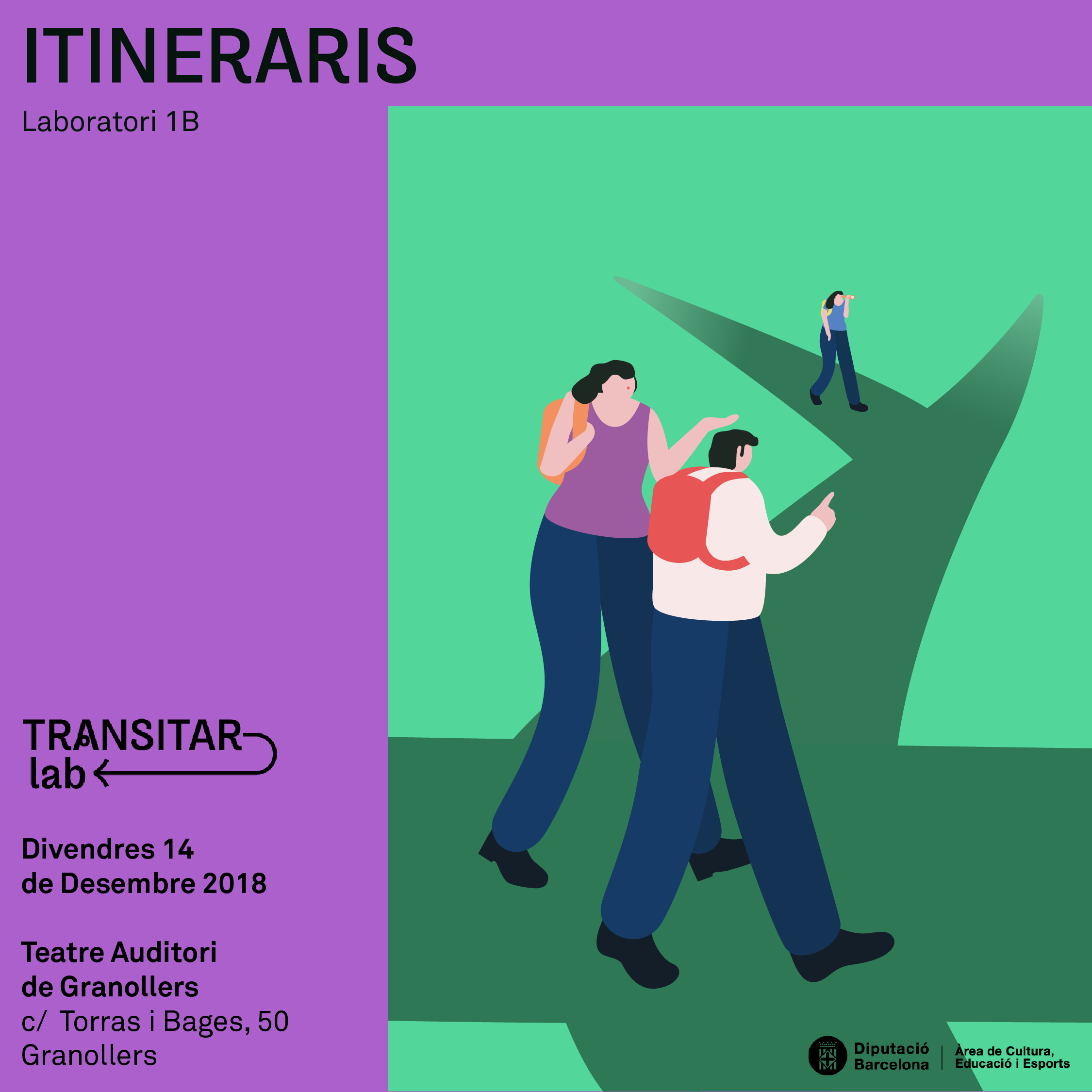
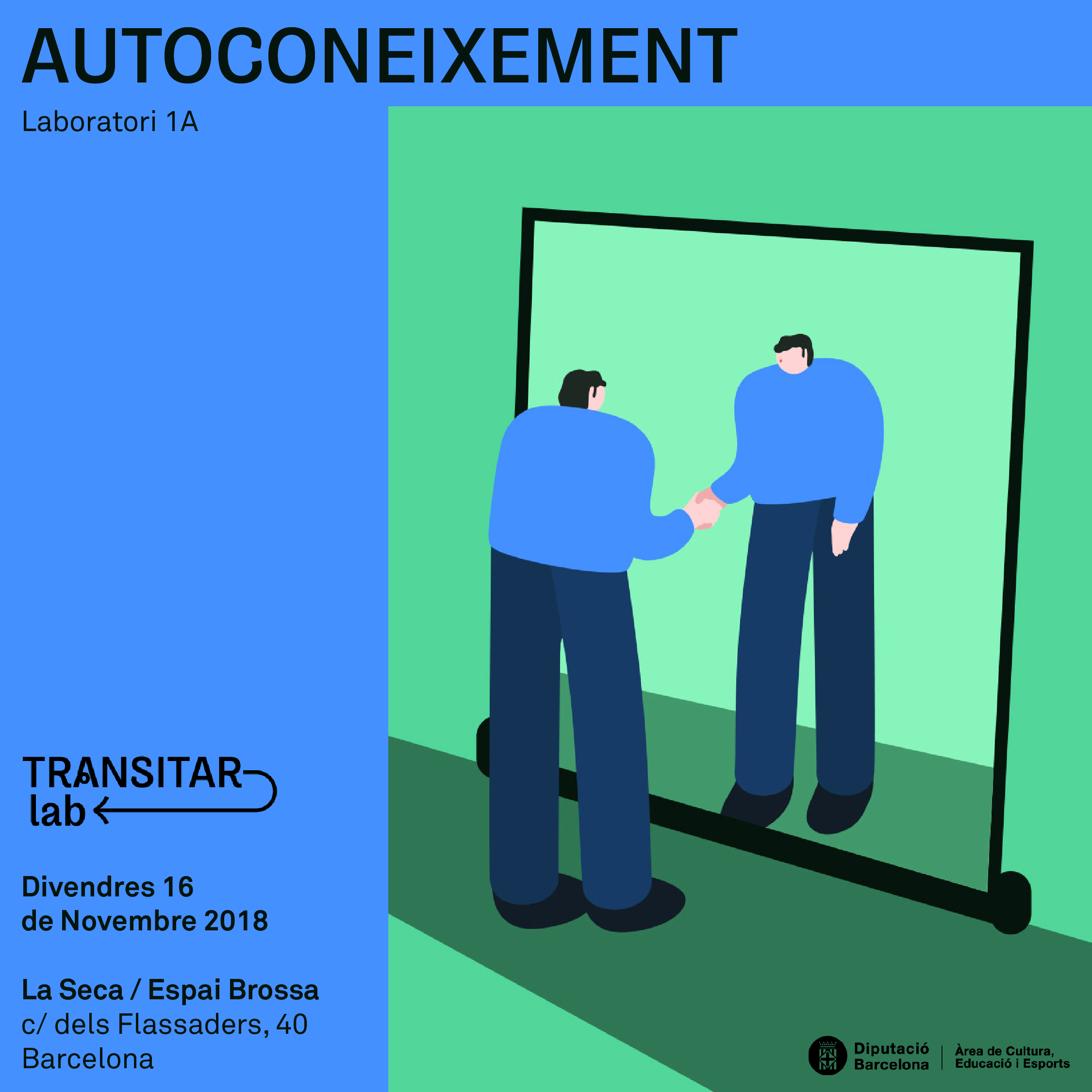
TRANSITAR
BRAND
TRANSITAR is a project from la Gerencia de Servicios de Educación to raise awareness about the importance of guidance as a personal competence that allows managing transition processes throughout life in all their scope.
IDENTITY
TRANSITAR is a project from la Gerencia de Servicios de Educación to raise awareness about the importance of guidance as a personal competence that allows managing transition processes throughout life in all their scope.
This project arises from the need to rethink the orientation in the current context of educational policies in the fight against premature school leaving and promote new educational opportunities.
From the TRANSITAR project, a traveling exhibition was born, some dynamics called transitarlab and an exhibition bus.
IDENTITYTRANSITAR means to go or pass through a place, and this has been highlighted with a dynamic typography, where the letters themselves seem like a path that we can follow, especially the A with a swirl in the middle.
The entire identity has been made in collaboration with more artists and people from the world of education. Thus giving rise to a plurality of shapes, colors and letters.
The entire identity has been made in collaboration with more artists and people from the world of education. Thus giving rise to a plurality of shapes, colors and letters.


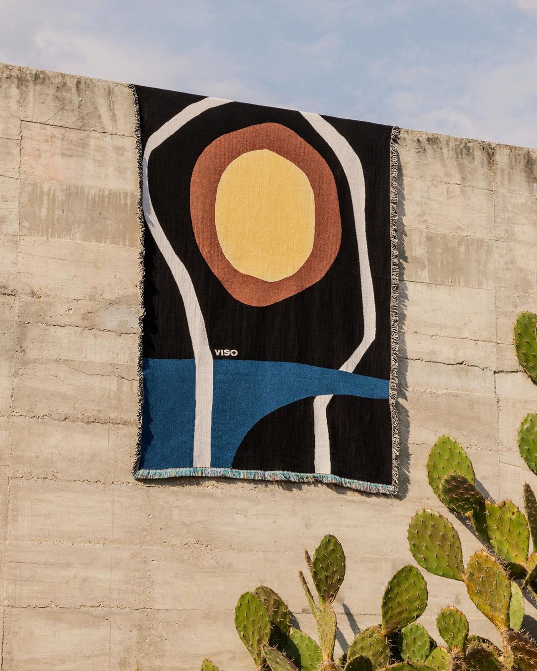
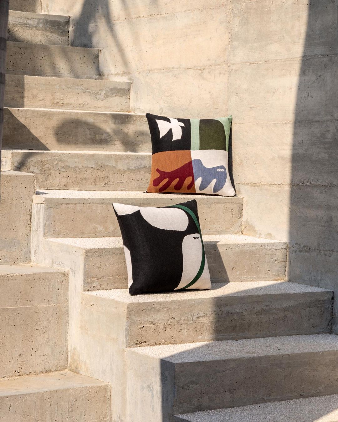
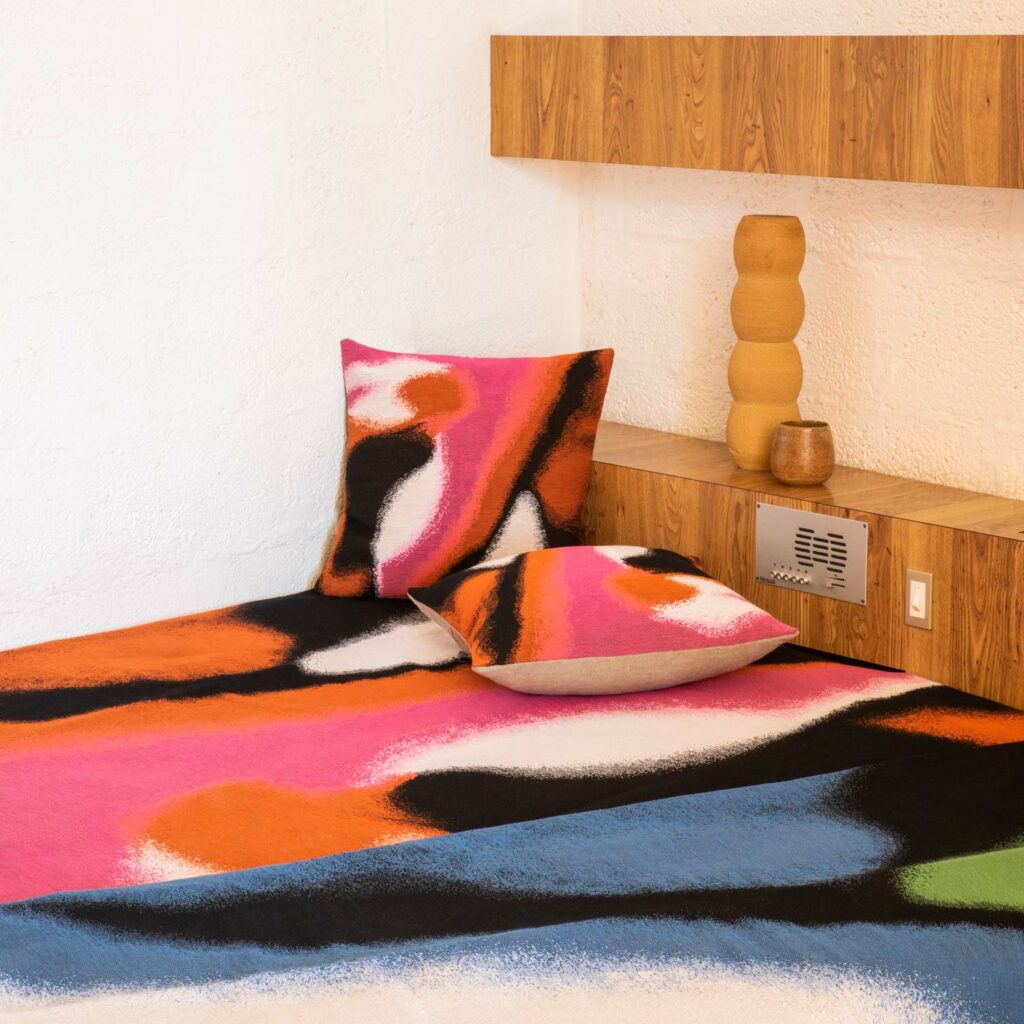
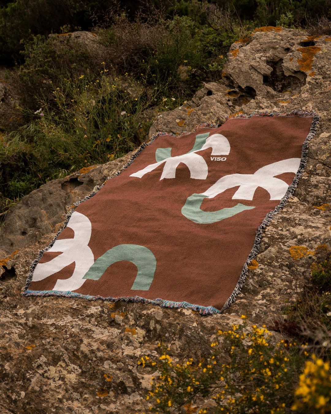
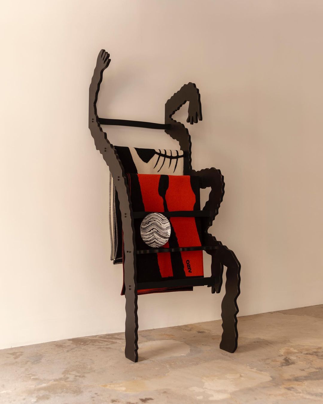
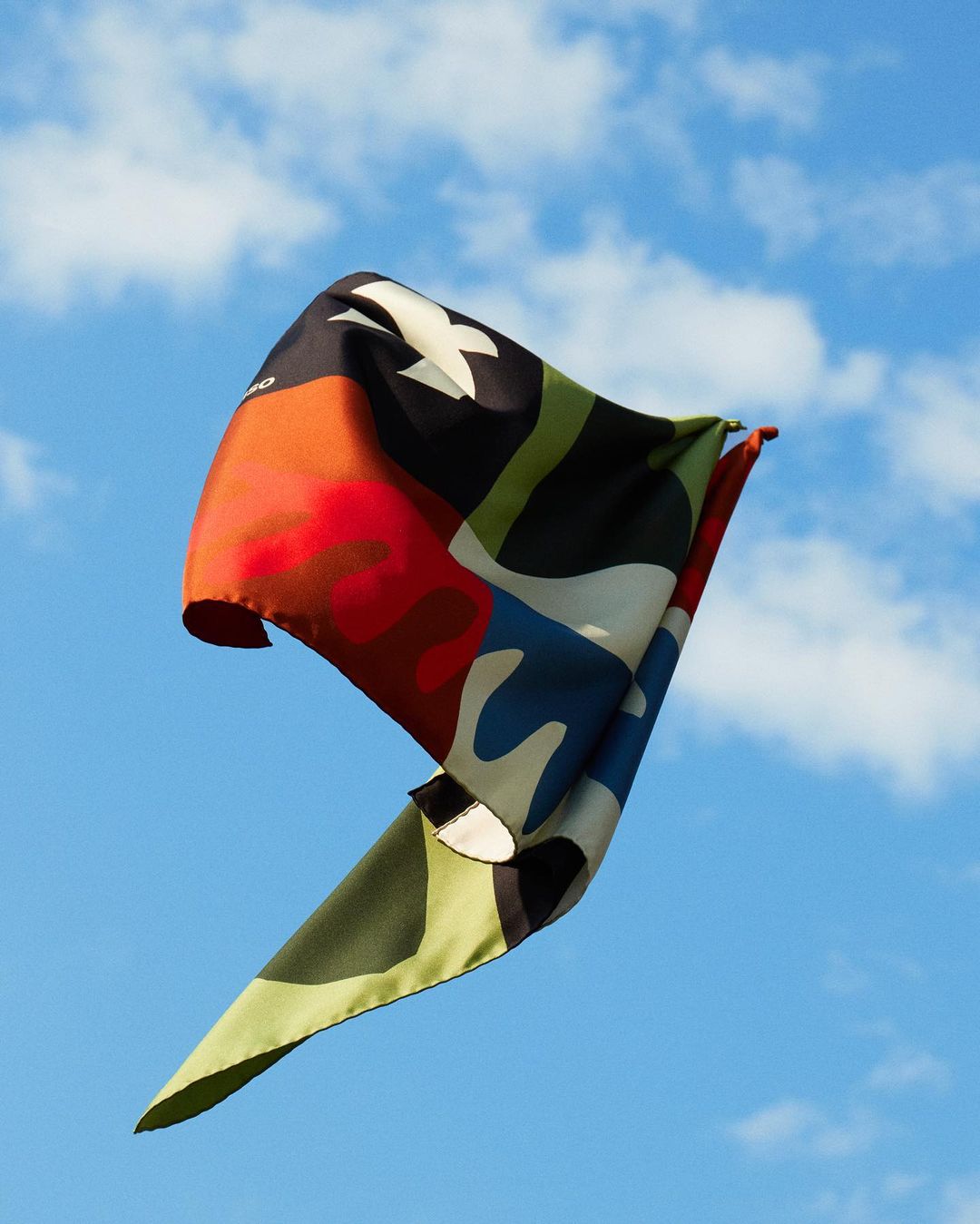
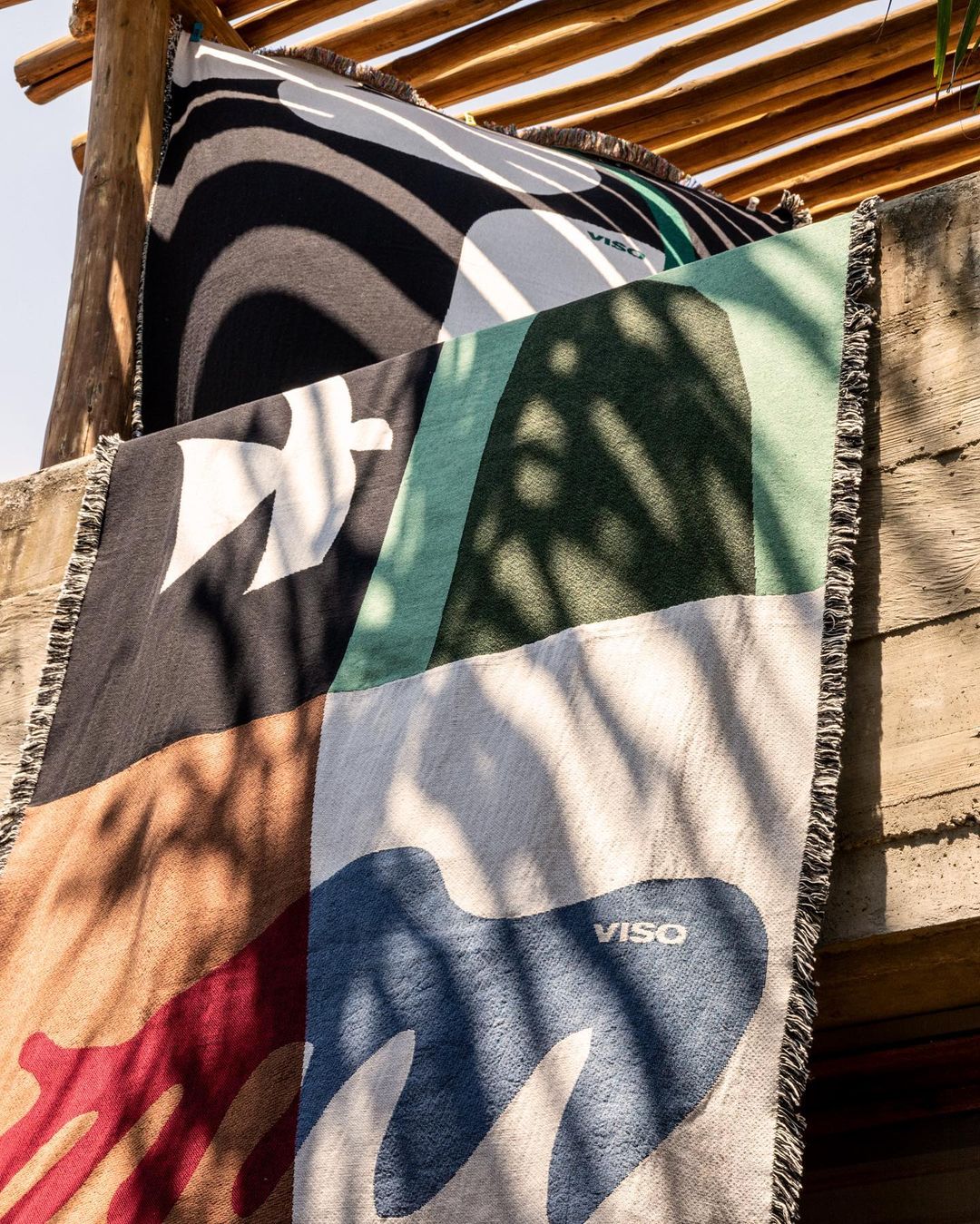
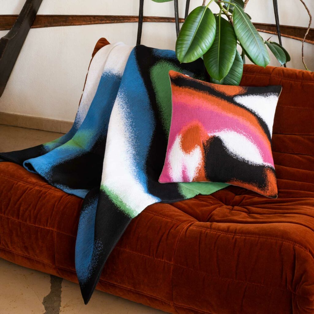
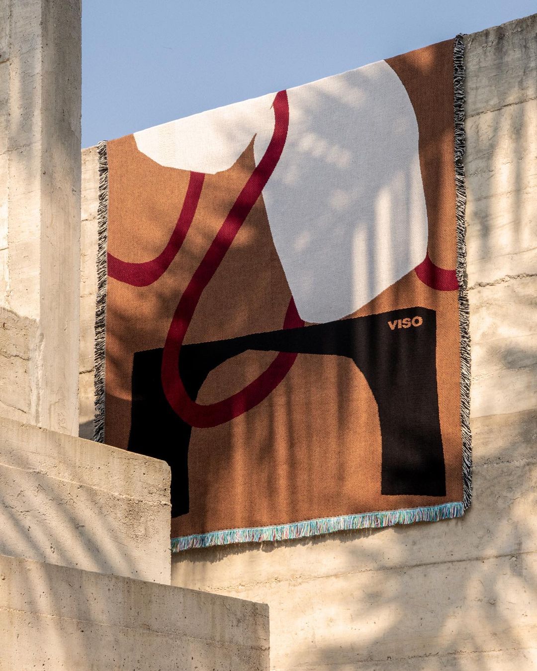
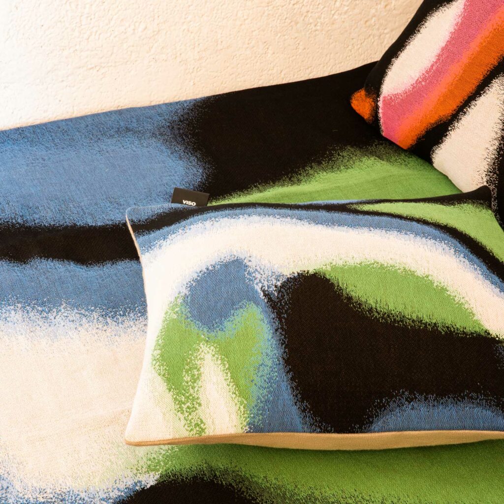
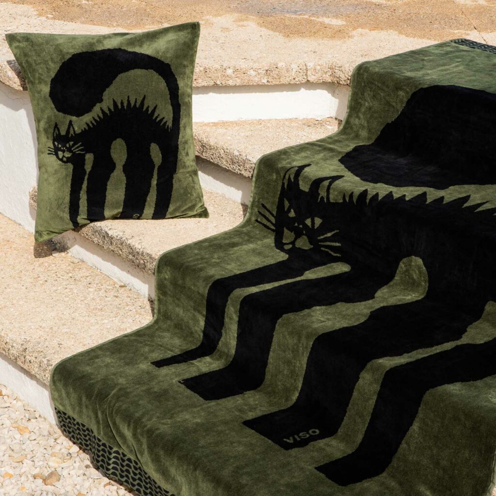
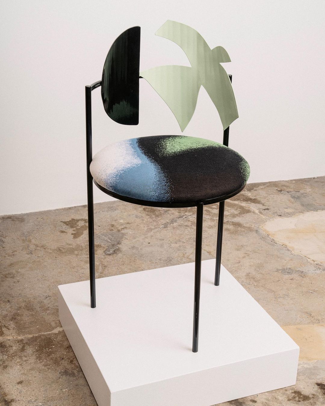
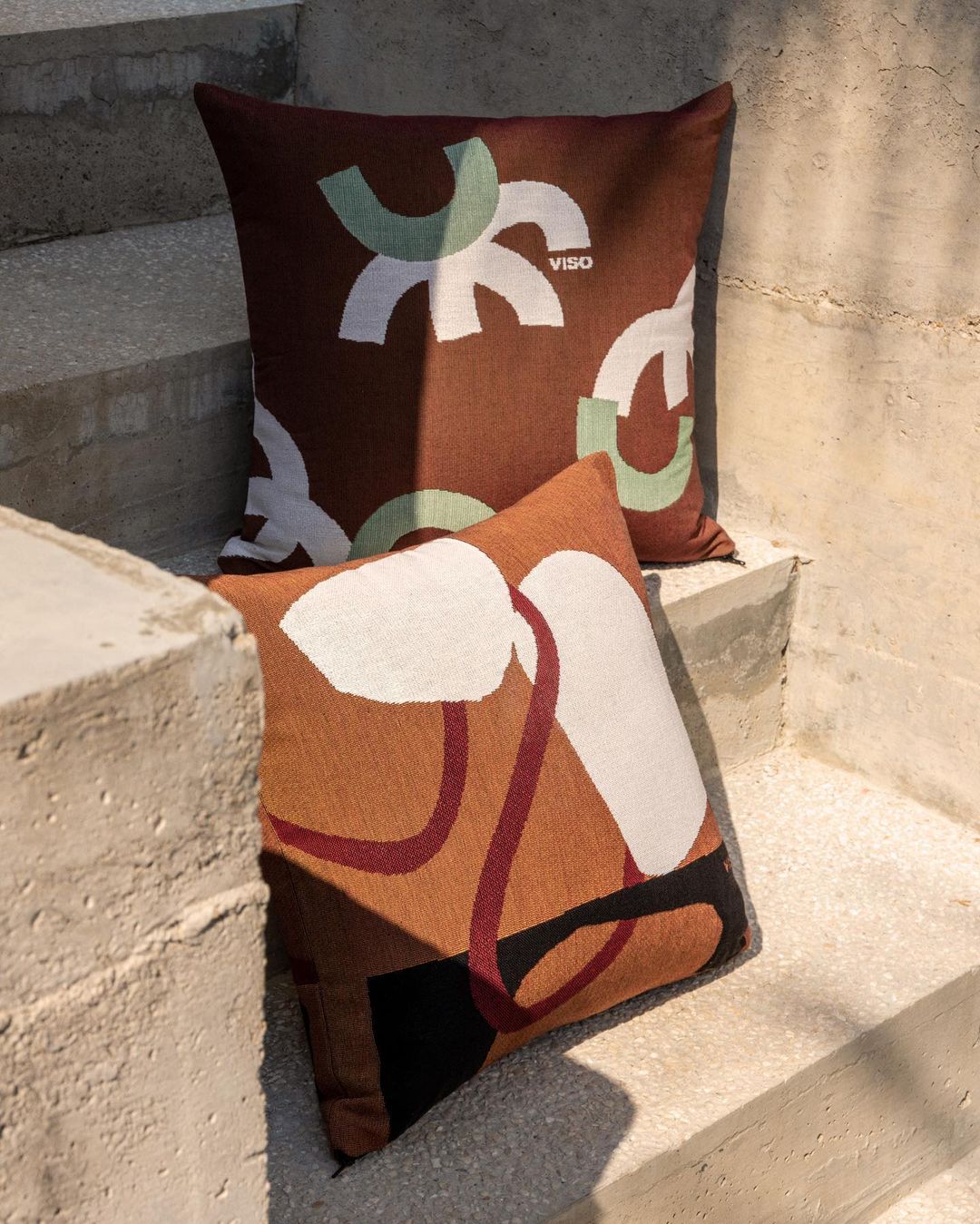
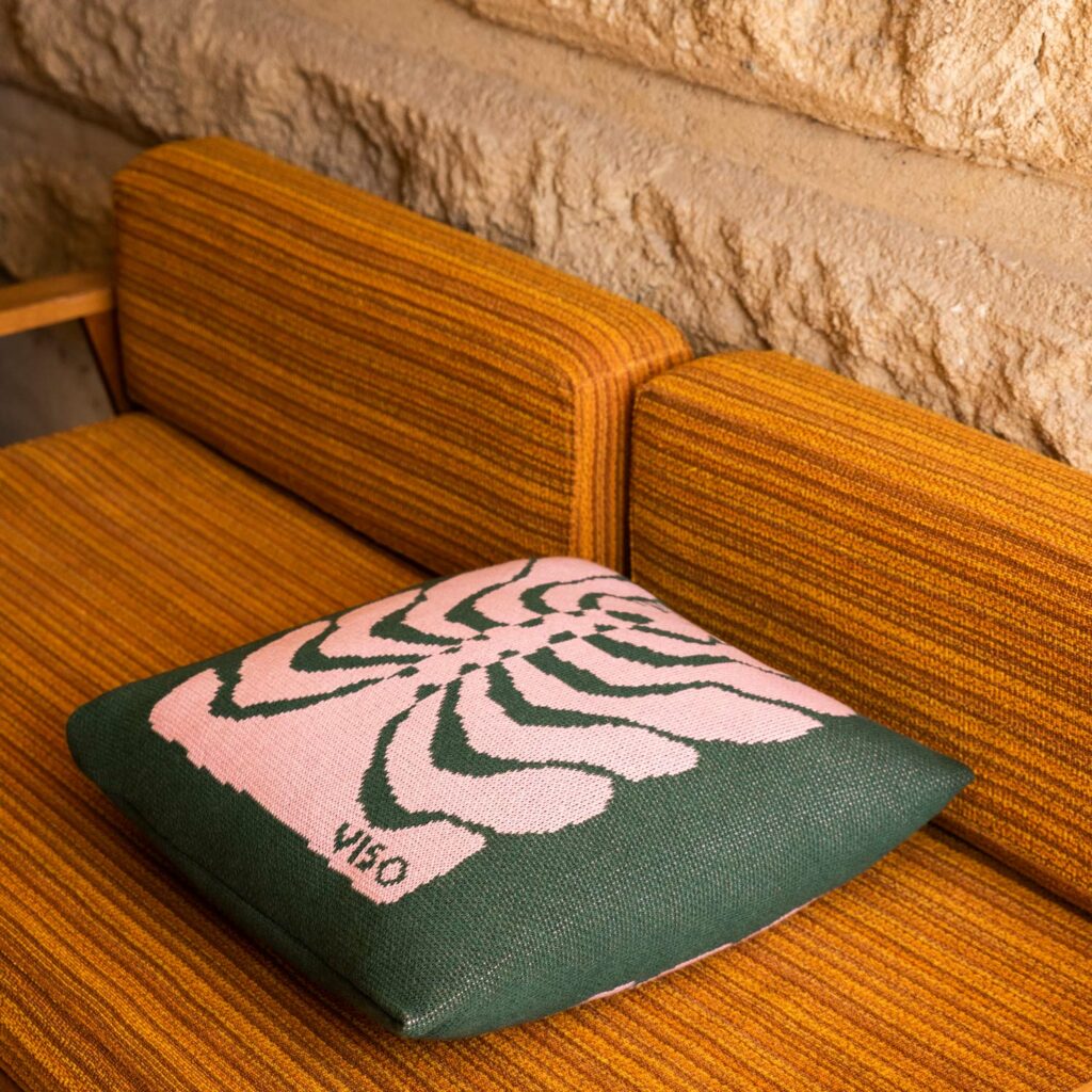
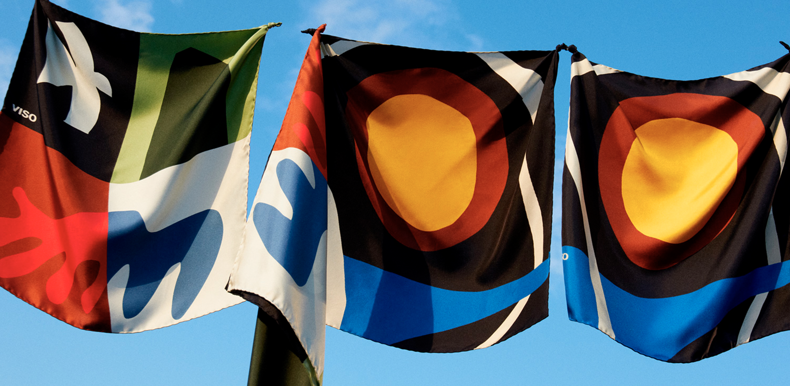
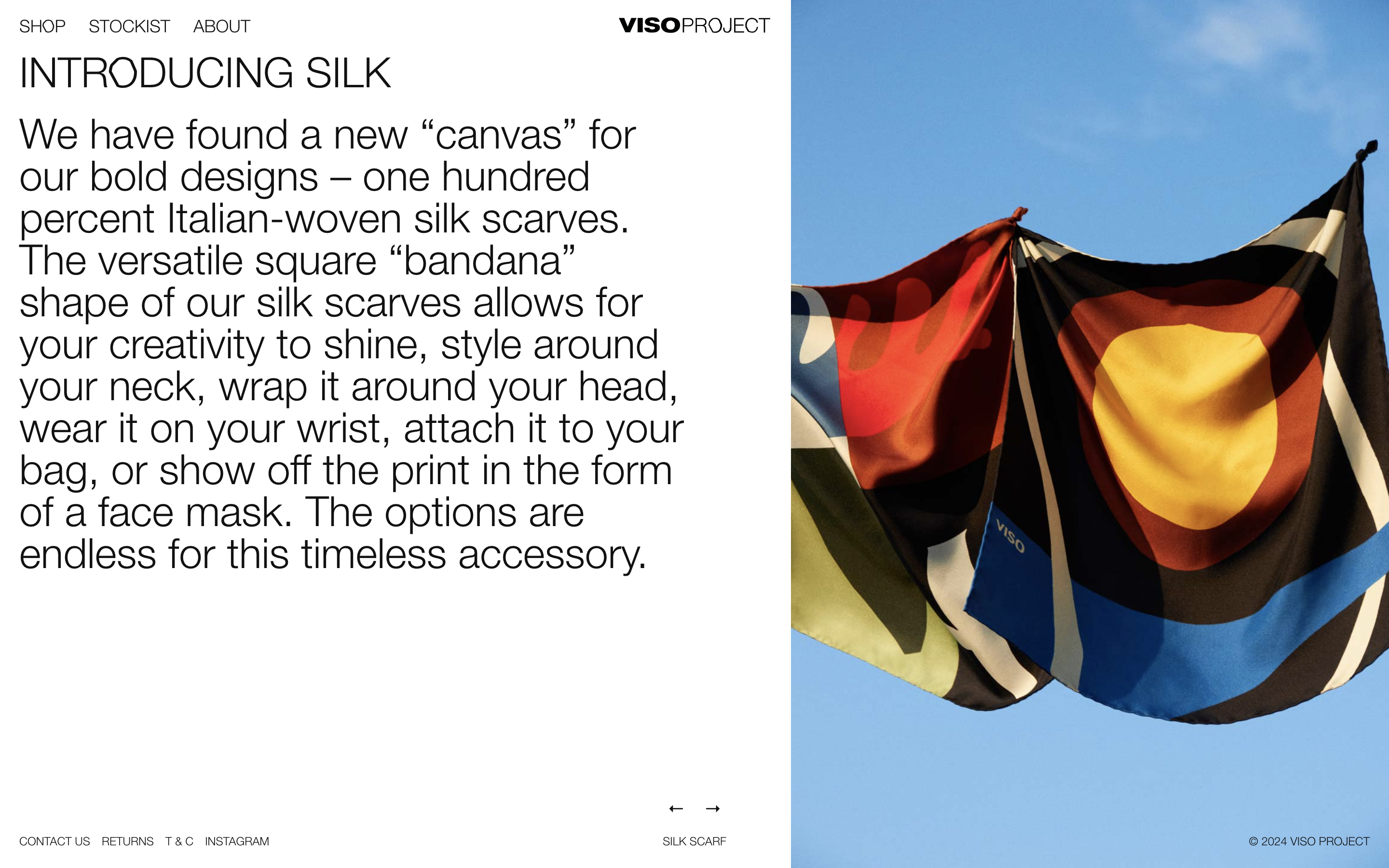
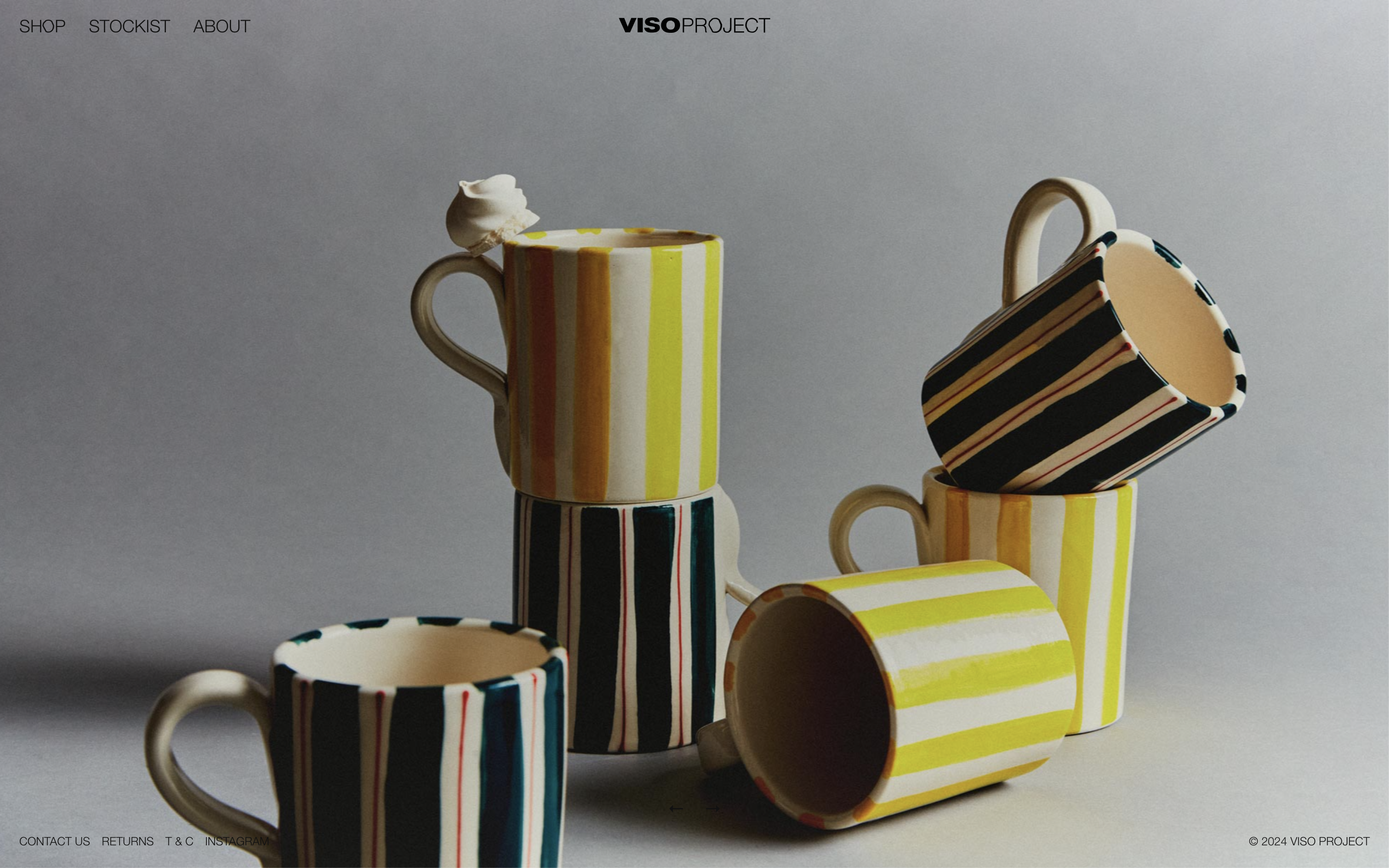
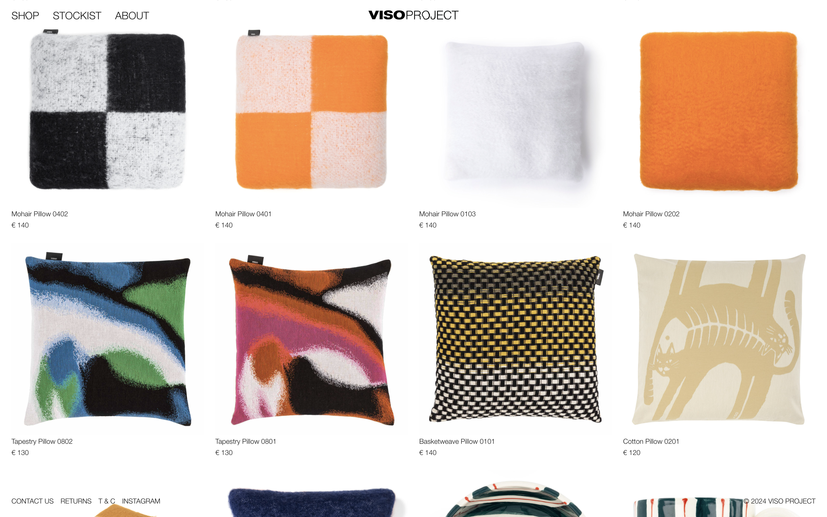
VISO PROJECT
BRAND
Viso project is a brand from Spain based in New York that seels proucts for the house with an artisan and cool touch. What makes the brand unique is their sensibility to details and their contemporaneity.
IDENTITY
Viso project is a brand from Spain based in New York that seels proucts for the house with an artisan and cool touch. What makes the brand unique is their sensibility to details and their contemporaneity.
The products have a dynamic, abstract and organic designs with a mediterranean touch.
IDENTITYWe redesigned their logo VISO adding the word PROJECT. Our aim was to make the O the most important symbol of their new identity, which was inspired by a piece of furniture.
The identity was built by geometric and abstract shapes, taken from the products, that when put together, they form the word VISO, as if they were a puzzle. The chromatic palette varies each season, but always has 4 colors that work in harmony together.
The identity was built by geometric and abstract shapes, taken from the products, that when put together, they form the word VISO, as if they were a puzzle. The chromatic palette varies each season, but always has 4 colors that work in harmony together.


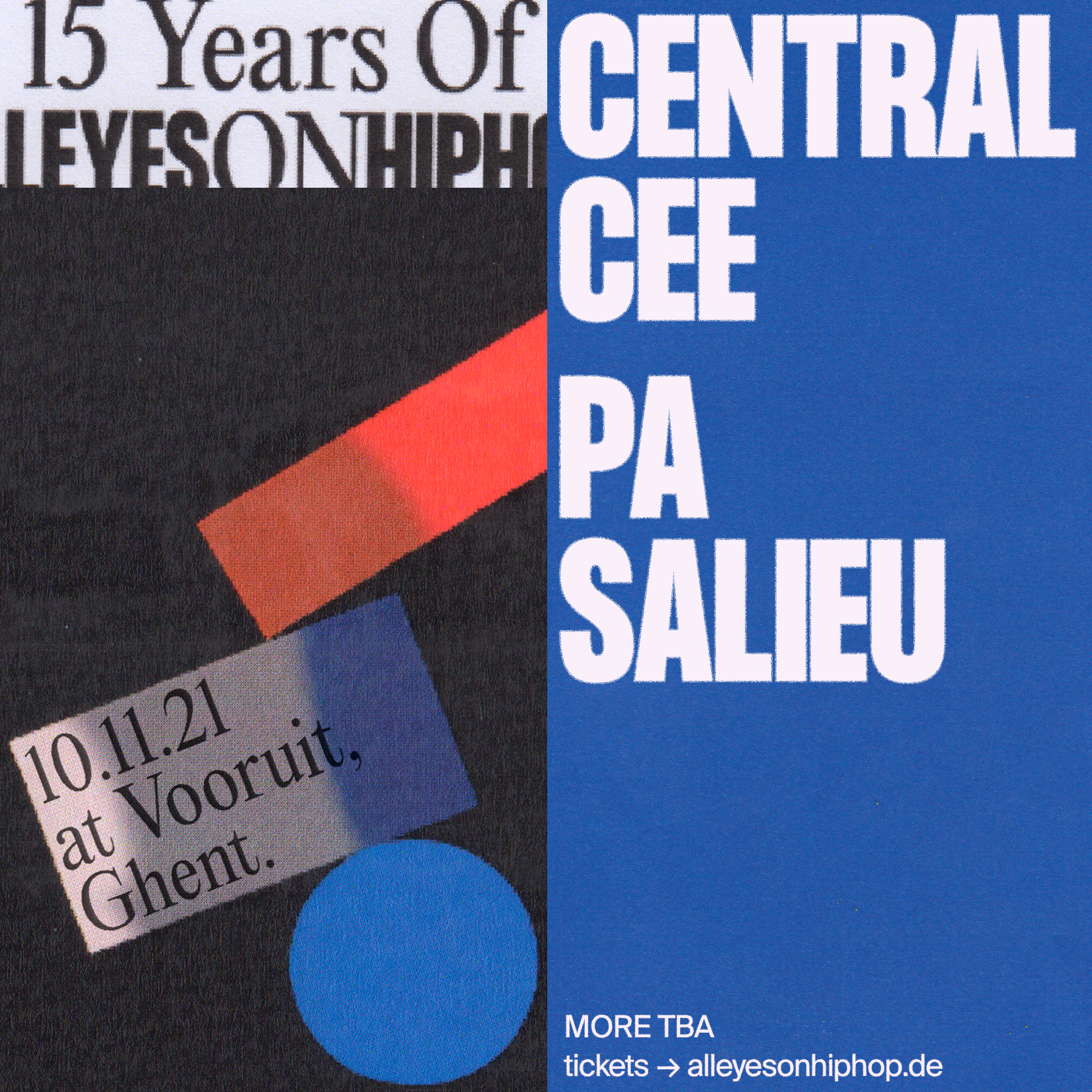
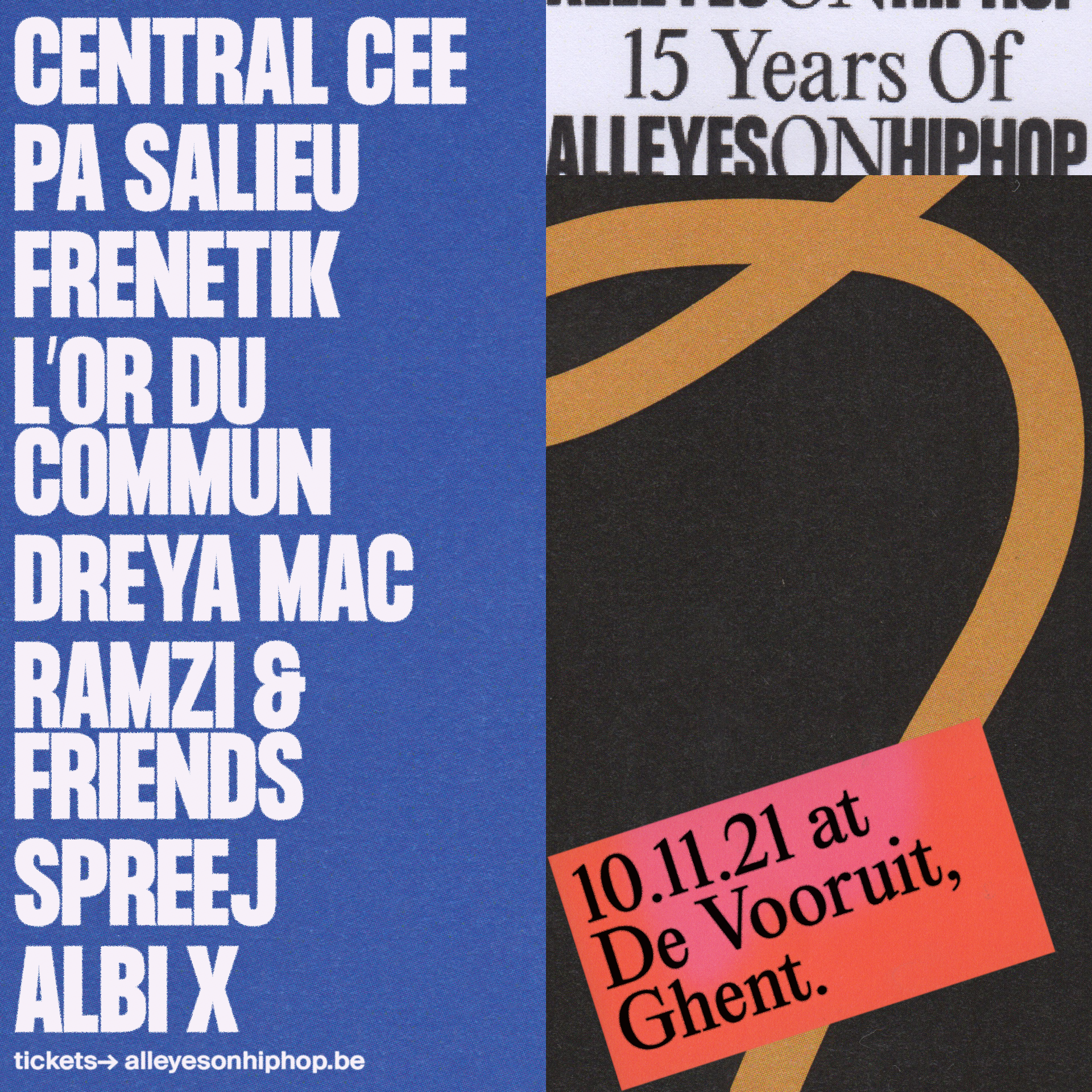
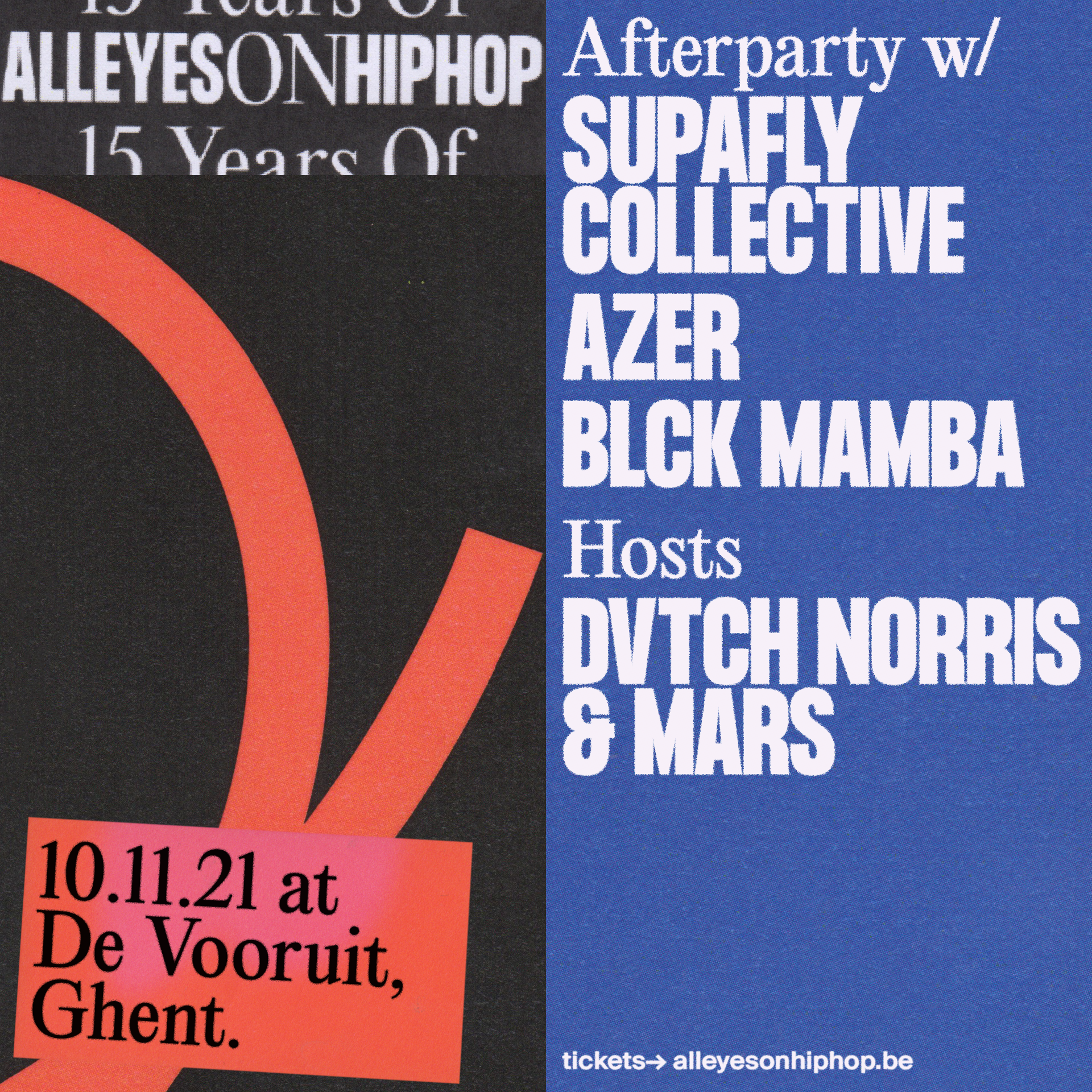
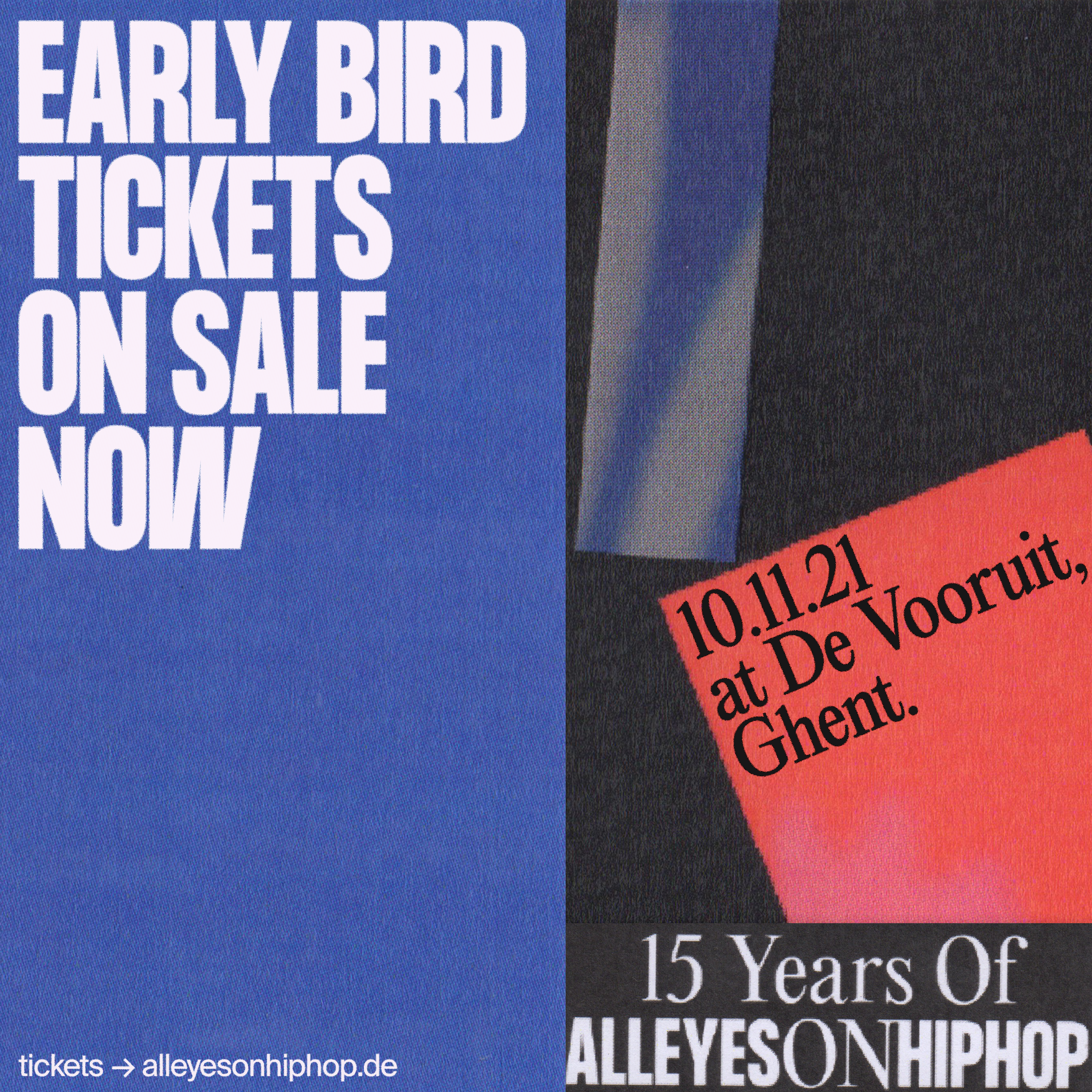
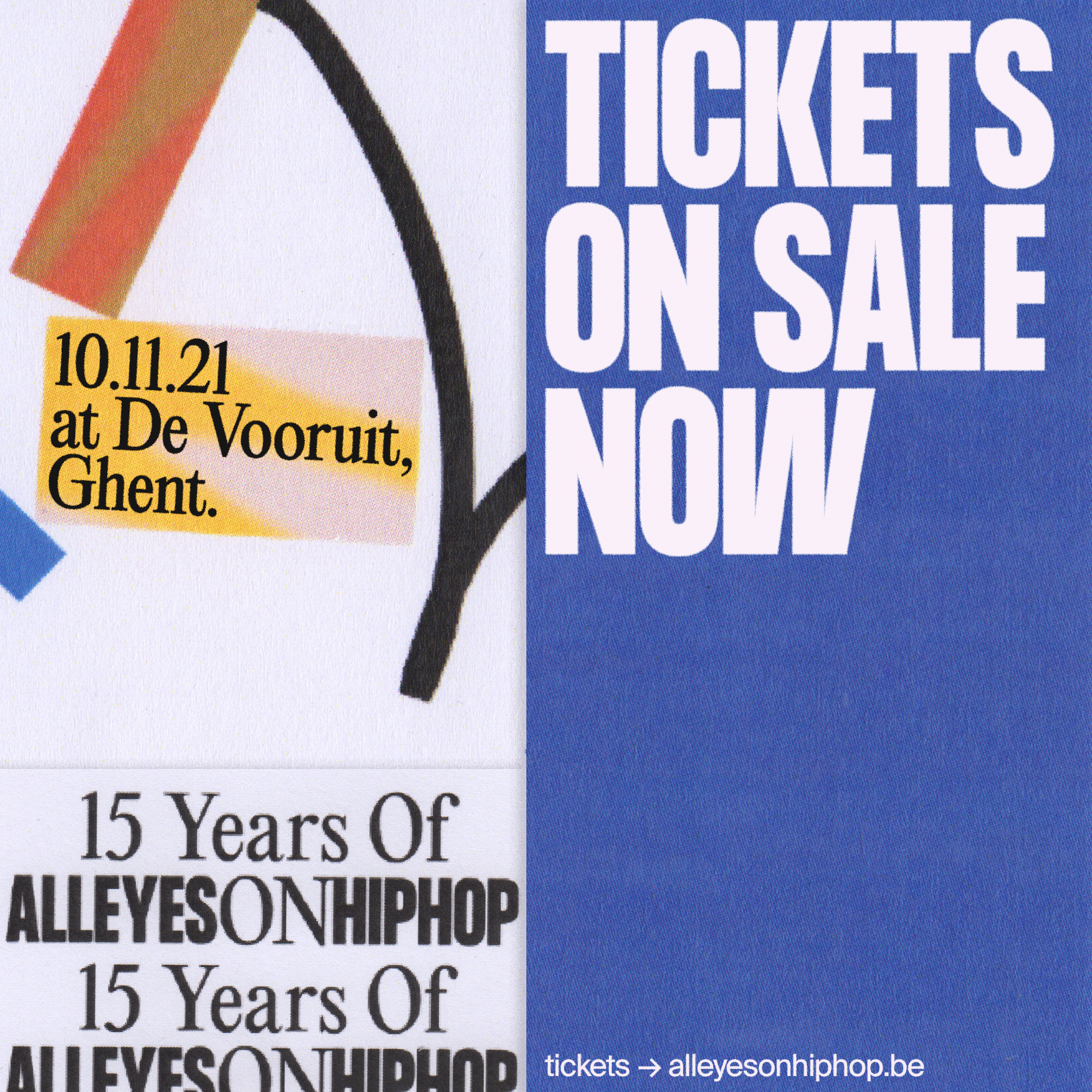
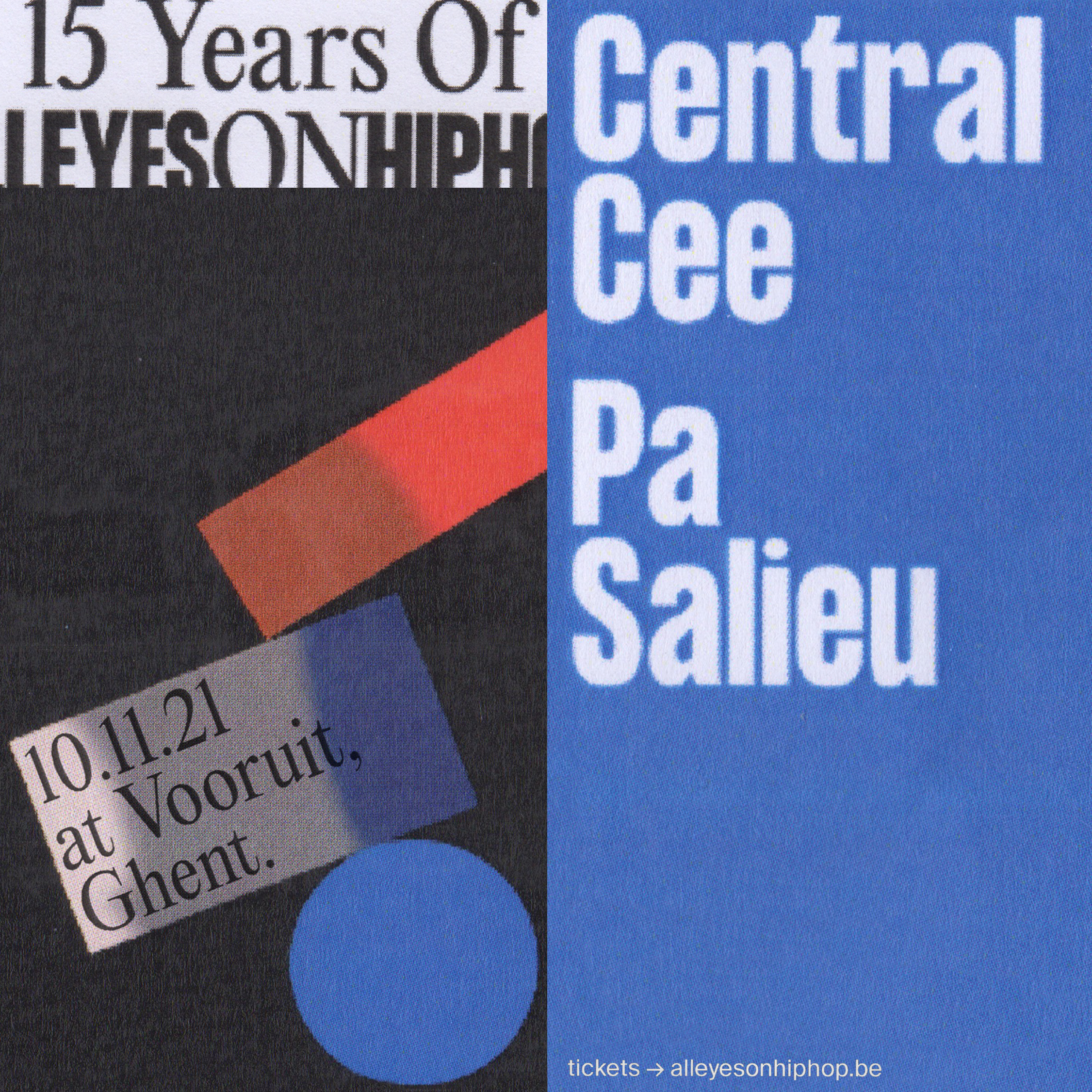
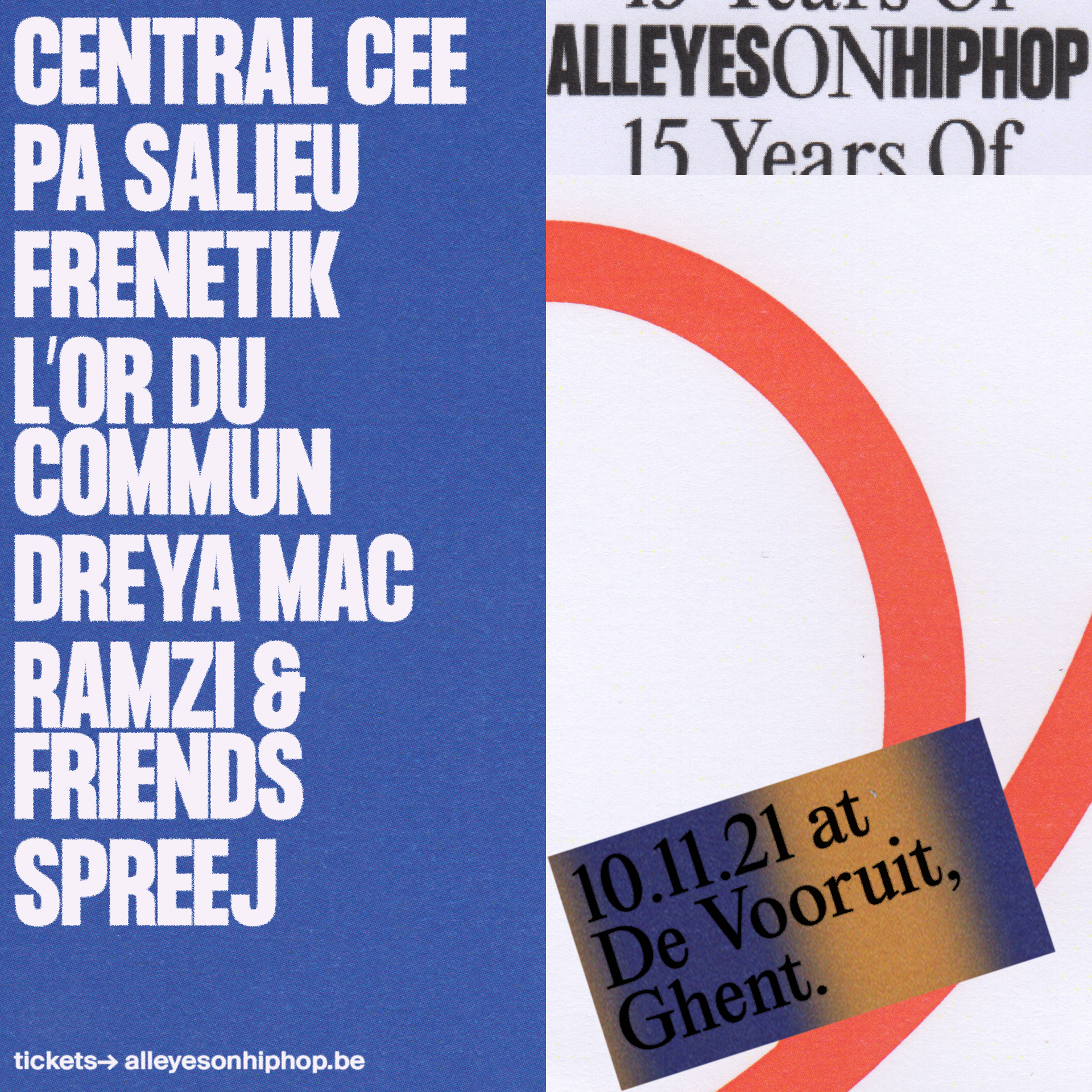
AEOHH FESTIVAL
BRAND
In 2005, All Eyes On Hip Hop began as a live music and a party concept in a small town in northern Belgium. When they moved to Ghent, their ambition and reputation grew rapidly and steadily. Today they collaborate with venues, festivals and music organizations to expand their audience and unite people from all over Belgium.
IDENTITY
In 2005, All Eyes On Hip Hop began as a live music and a party concept in a small town in northern Belgium. When they moved to Ghent, their ambition and reputation grew rapidly and steadily. Today they collaborate with venues, festivals and music organizations to expand their audience and unite people from all over Belgium.
AEOHH continues to do what it does best: creating an enjoyable and inclusive environment for everyone who loves hip hop music.
IDENTITYIt’s our first 100% analog and modular identity. Where the protagonists are geometric shapes and large, bold typography. The information is separated by blocks, thus having a dynamic and playful identity.
The letters All Eyes On Hip Hop come together to form the AEOHH festival symbol and logo.
The color palette is simple, with pure and basic colors. Each year a representative color is chosen, blue was the first color of the festival.
The letters All Eyes On Hip Hop come together to form the AEOHH festival symbol and logo.
The color palette is simple, with pure and basic colors. Each year a representative color is chosen, blue was the first color of the festival.


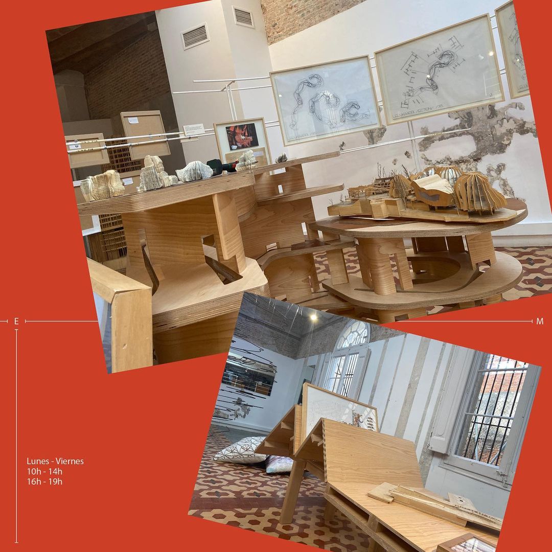
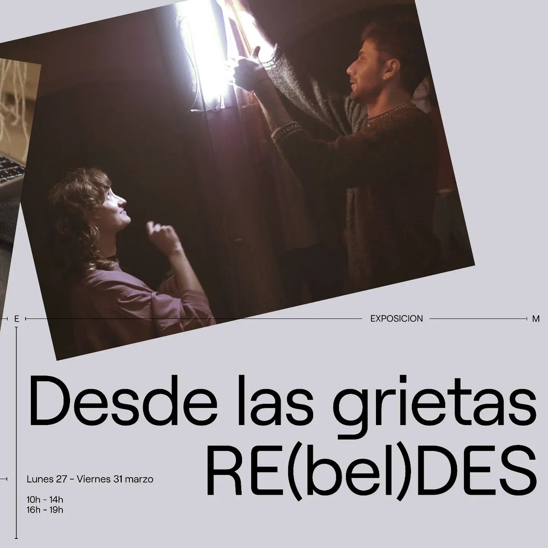
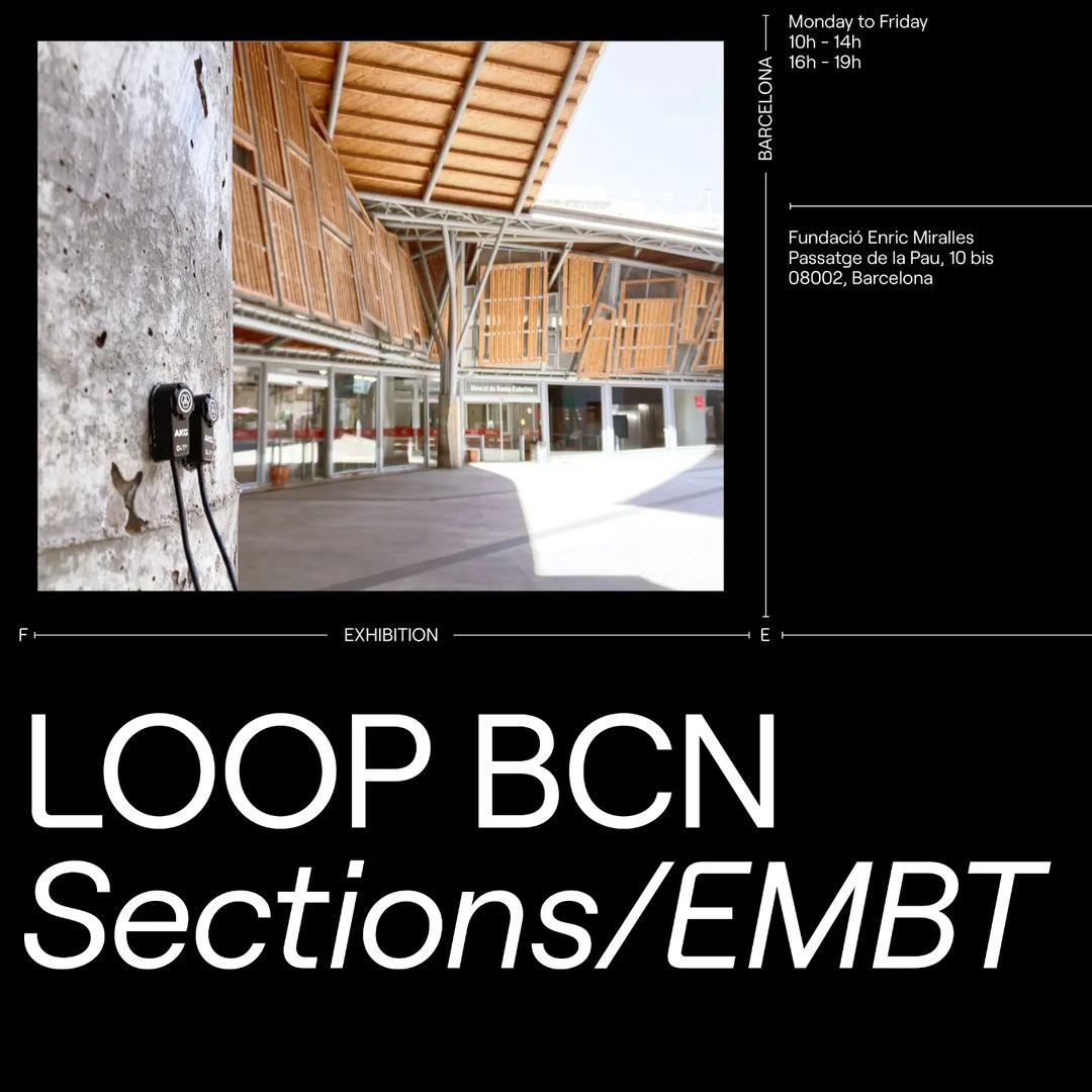
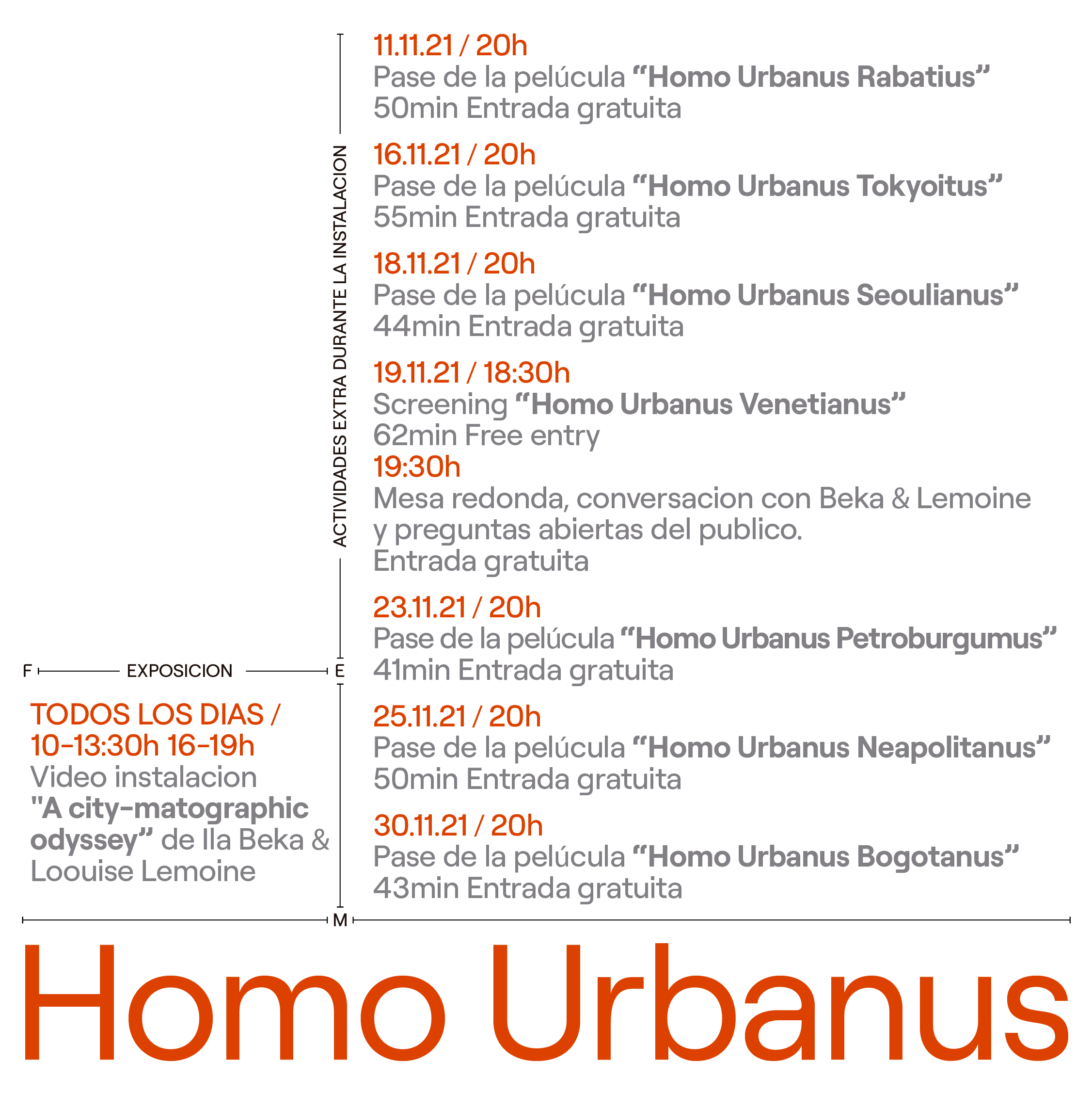
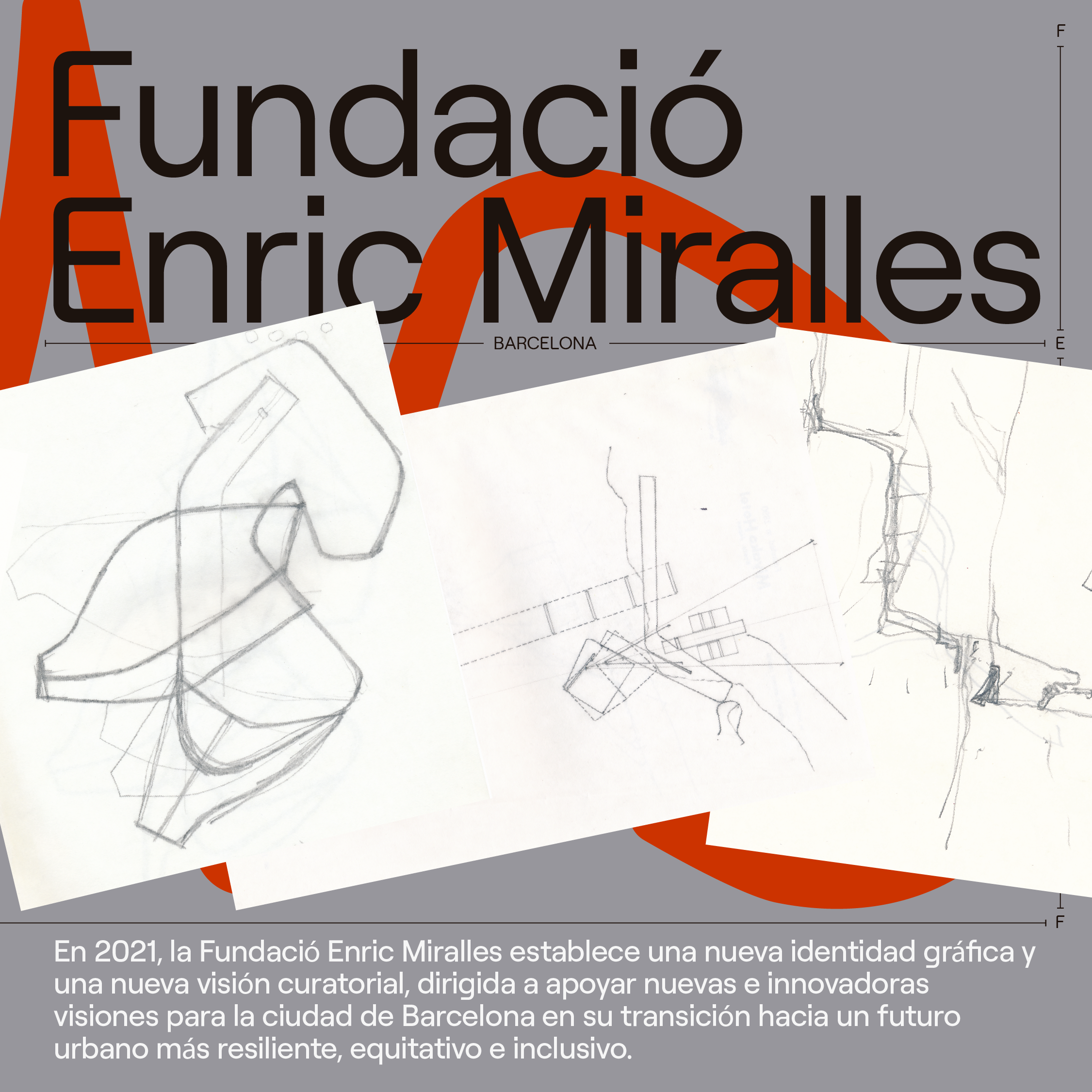
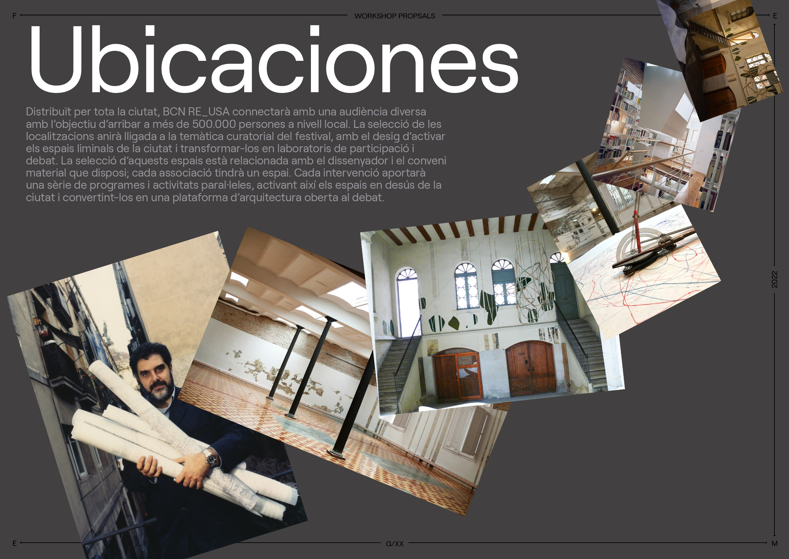
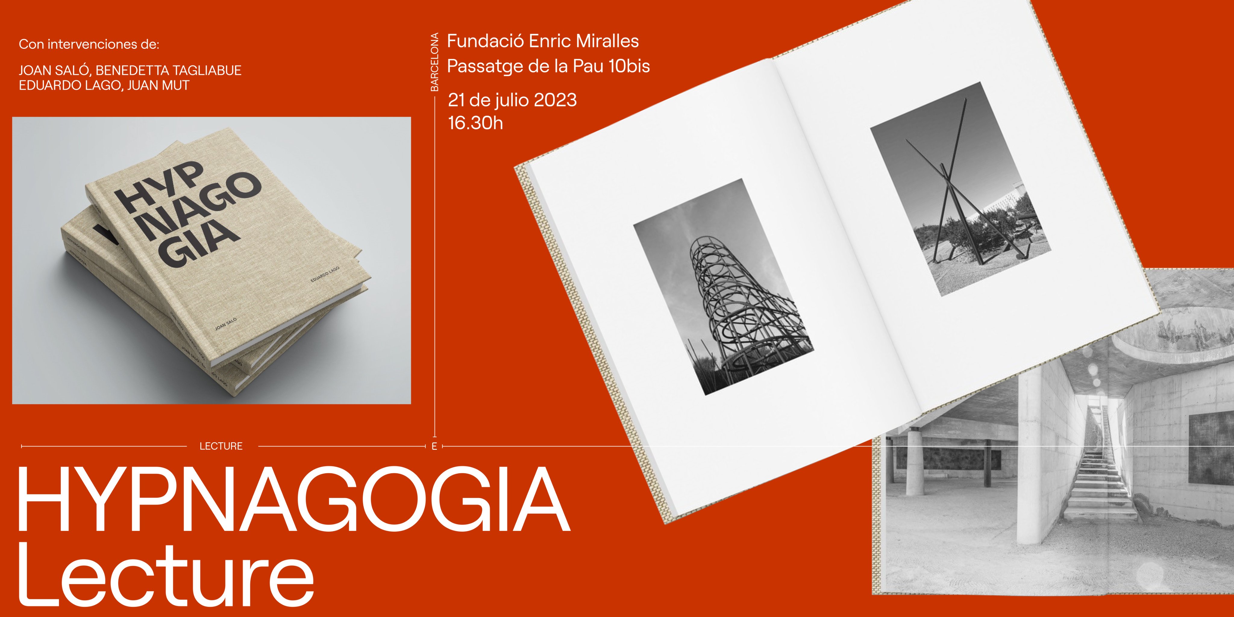
FUNDACIÓ ENRIC MIRALLES
BRAND
The Enric Miralles Foundation is a center for contemporary architecture and research, dedicated to fostering Enric Miralles’ passion for innovation and experimentation in the field of architecture and design.
IDENTITY
The Enric Miralles Foundation is a center for contemporary architecture and research, dedicated to fostering Enric Miralles’ passion for innovation and experimentation in the field of architecture and design.
In 2022 Fundació Enric Miralles released a new identity and curatorial vision, directed at supporting new and innovative visions for the city of Barcelona as we transitions towards are more resilient equitable and inclusive urban future.
IDENTITY
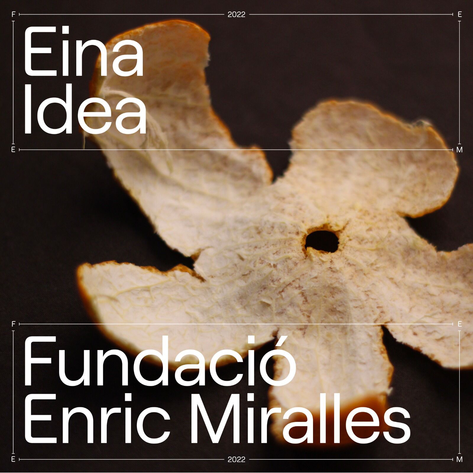
The identity is based on Enric’s work and profession, being an organic and rational identity that breaks with what is established but without losing professionalism and seriousness.
Enric’s signature serves as a logo and as a decorative element depending on the size.
The color palette is based on the colors of the foundation’s space, and the graphic elements of the identity are limits that delimit and organize the physical and digital spaces, then having images and illustrations that break with the composition in an organic way, thus remembering to Enric’s collages.


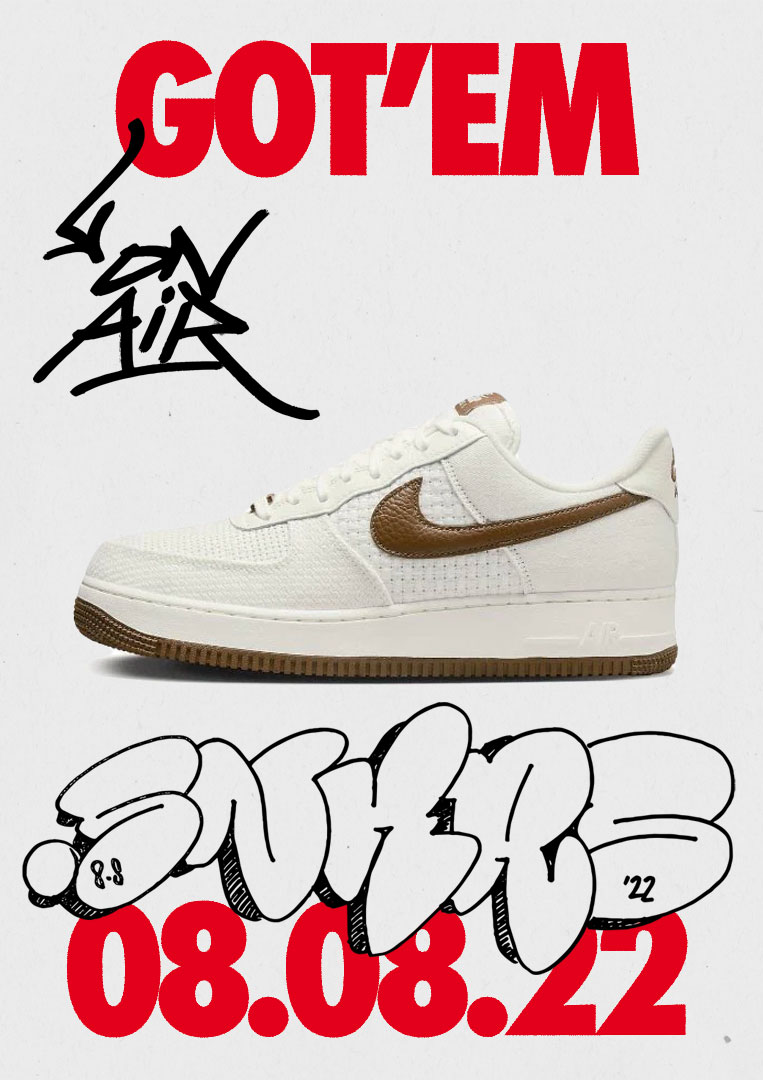
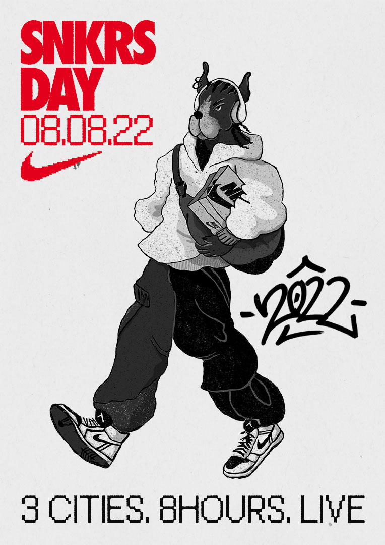
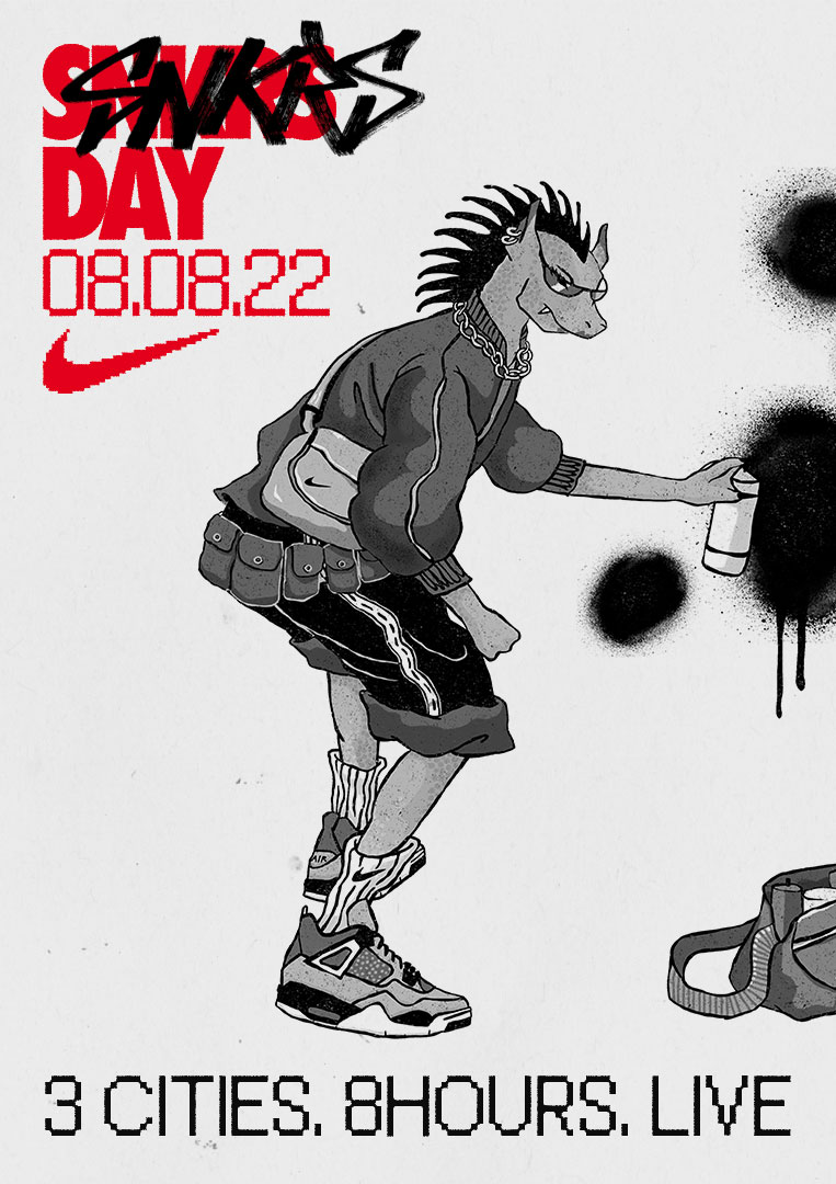
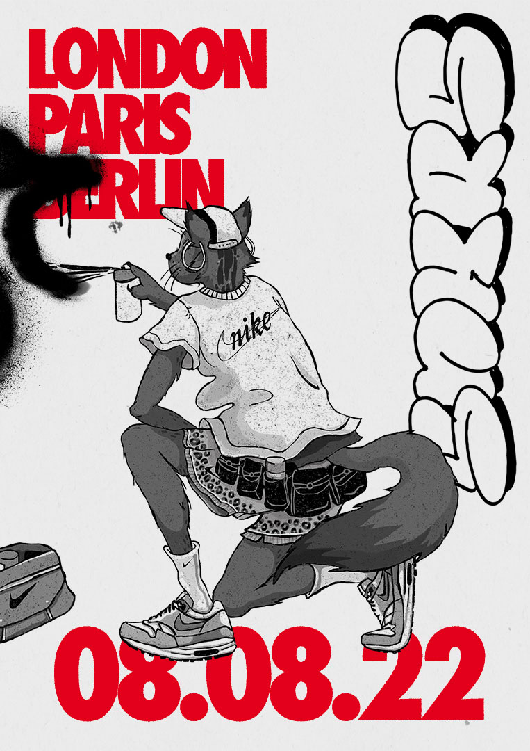
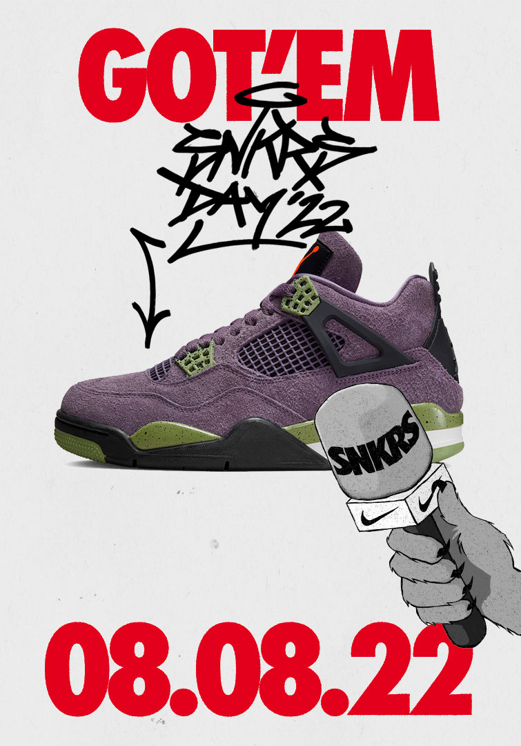
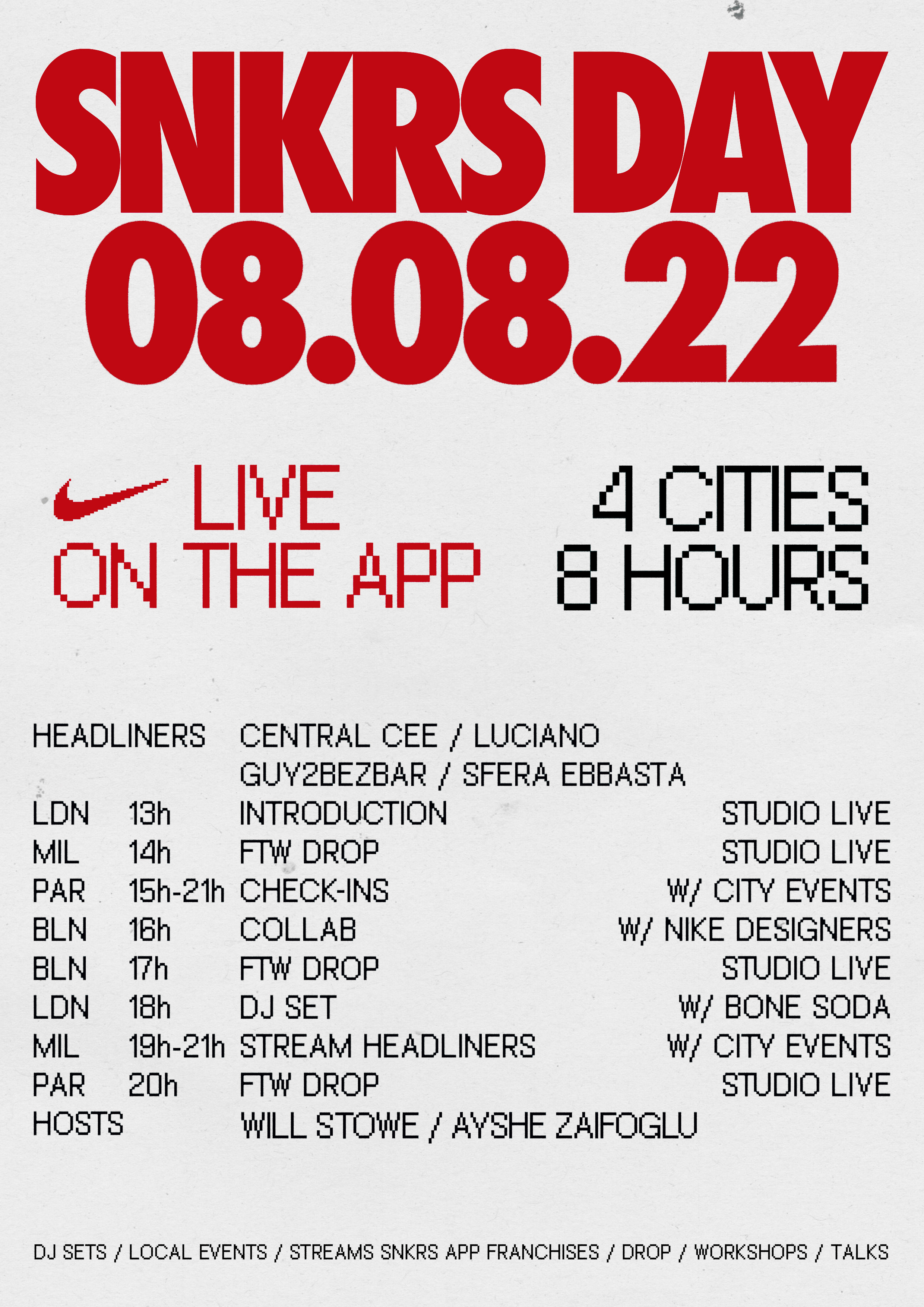
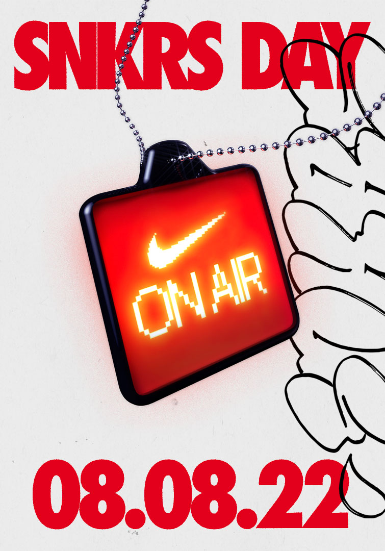
NIKE SNKRS DAY
BRAND
SNKRS DAY is an 8-hour event where you immerse yourself in sneaker culture, experienced online through the app or in person in the cities of Berlin, Paris and London.
IDENTITY
SNKRS DAY is an 8-hour event where you immerse yourself in sneaker culture, experienced online through the app or in person in the cities of Berlin, Paris and London.
For 2022 the main theme of the event was LIVE, since it was the first physical event after the pandemic.
IDENTITY
Inspired by street art and “LIVE” retroluminous posters. The campaign brings together analog street styles such as tags, streetware or textures along with digital codes with typography, rational compositions and 3D elements.
Illustrations and labels appear in black and white to emphasize the red color representative of SNKRS NIKE. These elements have a street and nostalgic aesthetic, while the typography and the pixelated logo are presented as current and digital elements.
Illustrations and labels appear in black and white to emphasize the red color representative of SNKRS NIKE. These elements have a street and nostalgic aesthetic, while the typography and the pixelated logo are presented as current and digital elements.
CLIENT
Nike EMEA
SERVICES
Identity
Campaign
Digital content
Illustrations
3D
YEAR
2022
LINKS
Higlights of the day
Nike EMEA
SERVICES
Identity
Campaign
Digital content
Illustrations
3D
YEAR
2022
LINKS
Higlights of the day


SUPERCLUSTER
BRAND
SUPERCLUSTER is a global collective formed by different production companies around the world, that come together to create original and international content. It works as a strong entity in the audiovisual industry, creating unique pieces with a refined concept and aesthetic, while portraying value.
IDENTITY
The idea behind this graphic identity comes from the conceptualization of a SUPERCLUSTER, a big gathering of galaxies that compose one big alliance.
We represent this SUPERCLUSTER with a circle, the simplest form in the universe, which can expand and then you can see all the parts that compose this alliance.
This idea is transmitted with an organic, dynamic and youthful.
We represent this SUPERCLUSTER with a circle, the simplest form in the universe, which can expand and then you can see all the parts that compose this alliance.
This idea is transmitted with an organic, dynamic and youthful.


MAYBE
BRAND
“MAYBE is a contemporary laboratory that combines strategic consultancy and R&D, working across culture, technology, design, ecology and society. The project addresses current challenges through a critical lens, generating content, research and hybrid experiences that activate new forms of participation, exchange and collective thinking.”
IDENTITY
“MAYBE is a contemporary laboratory that combines strategic consultancy and R&D, working across culture, technology, design, ecology and society. The project addresses current challenges through a critical lens, generating content, research and hybrid experiences that activate new forms of participation, exchange and collective thinking.”
They were looking for a website with a non-conventional, more experimental interface.
IDENTITY
We developed an open and flexible identity system, able to integrate diverse projects within a cohesive environment. Inspired by interface languages, it uses rounded corners, dark and light modes, modules and icons.
The logo is reduced to a question mark, used as an icon across the system. A chroma green connects with its technological imaginary.
The website is conceived as an interactive and almost customisable environment, where users navigate non-linearly and can explore or interact through a chat.
The logo is reduced to a question mark, used as an icon across the system. A chroma green connects with its technological imaginary.
The website is conceived as an interactive and almost customisable environment, where users navigate non-linearly and can explore or interact through a chat.


MIRA Festival 2018
BRAND
MIRA is a digital arts and contemporary music festival held annually in Barcelona. Focused on the intersection between art and digital culture, it presents a curated programme of live audiovisual shows, concerts, immersive installations, performances, 360º projections, DJ sets and conferences.
IDENTITY
MIRA is a digital arts and contemporary music festival held annually in Barcelona. Focused on the intersection between art and digital culture, it presents a curated programme of live audiovisual shows, concerts, immersive installations, performances, 360º projections, DJ sets and conferences.
A festival that connects the present and future of digital culture, renewing its visual identity each year to remain in constant evolution.
IDENTITY
The campaign is built around the sonic potential of everyday objects, minimal, often imperceptible sounds that form the basis of experimental music. In parallel, ASMR amplifies this listening through digital environments, creating an intimate relationship with sound. The campaign explores its extraction and recontextualisation, shifting the domestic into a new sensory dimension.
The visual identity is raw, cold and unsettling. Everyday objects are isolated and treated as sound devices, creating a constant tension between the ordinary and the experimental.
The visual identity is raw, cold and unsettling. Everyday objects are isolated and treated as sound devices, creating a constant tension between the ordinary and the experimental.
CLIENT
MIRA Festival
SERVICES
Creative direction
Art direction
Campaign
Digital content
YEAR
2018
LINKS
Instagram
Website
Teaser
Aftermovie
MIRA Festival
SERVICES
Creative direction
Art direction
Campaign
Digital content
YEAR
2018
LINKS
Website
Teaser
Aftermovie


